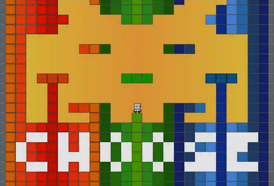
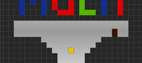
Introduction: Multi is a game built on Game Maker for Windows using Game Makers scripting language. Players control a character who traverses a series of levels in a platformer style game play.
Platform: Windows | Time: 3 weeks | Roles: Programmer – Game Designer – Artist – Sound Designer | Team Size: 1
Design Goal: The primary ‘design goal’ with this project was to further my design skills whilst practicing level and mechanic design.
Design Challenges:
- Creating levels that were interesting to play with the mechanics I created.
- Difficulty design.
- Teaching players how to play.
- Audio which included, character, and environment sound design.
My Contributions:
- Programmed the code of the game (adapting some freely available physics code). I completely designed the game.
- Made the majority of art assets (character art and animation taken from a game maker tutorial)
- Collected audio that suited the game play from free sources (credits bundled with Multi).
- Conducted play testing with younger audiences which I believed would be interested in the game.
Download:
Follow the link below to download a .zip file containing the game. When the download is complete, unzip the file then have a look the read-me and, then run the .exe file to play the game.
Download Multi!
Development
Multi started as a desire to develop my level design and mechanics design skills.

At the start of the project I brainstormed a number of mechanics including:
- Teleport
- Gravity
- Platform movement
- Wall-walking
- Platform jumping
From these mechanics I choose to implemented 1, 3, and 4 (5 would be through out the game). I then worked on creating various levels in a manner with which I intended to ultimately offer an interesting experience of increasing difficulty.
Difficulty Design
In designing the difficulty of Multi I wanted to create an difficulty curve with increasing difficulty for each color, then a period of rest before the next mechanic. This learning pattern I would repeat until reaching dual colors, then finally multiple colors.
Having each color introduced separately meant complexity was low, and players had the chance to learn the mechanics of the game before proceeding to multiple colored levels.
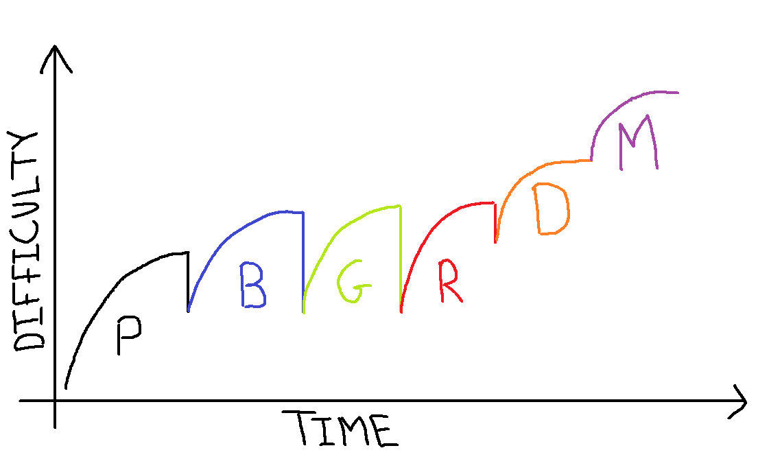
- P – Plain
- B – Blue
- G – Green
- R – Red
- D – Dual
- M – Multiple colors
Levels
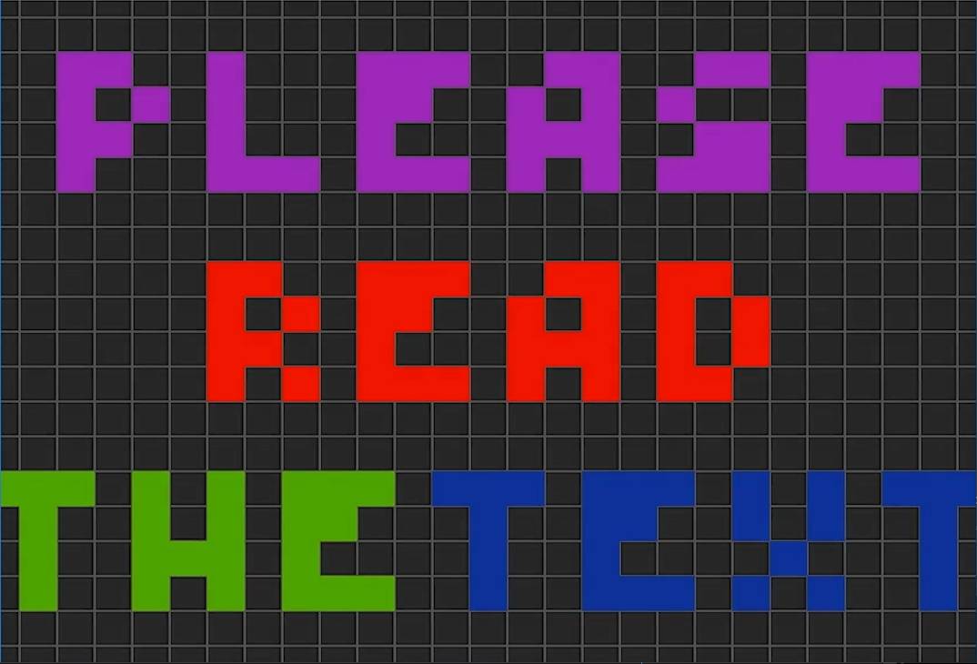
The first scene of the game requested players read the text as play testing found that often players did not, and so became stuck.
Following this the beginning ‘plain’ levels required teaching players the basic controls of the game. Each level gave the player instructions that were placed inside the design of the level, and were visible/made visible when the player would need the additional instruction.
- D key level – Clear instructions, and only pressing D is required to win the level.
- This was repeated for for the A and W key levels.
Next I introduced a level that required the player to restart the game to familiarize the player with the feature (on hindsight one issue was no reminder of the restart button was placed in the Restart Level).
Following this I introduced levels that required the combination of skills that were taught in the previous levels in-order to improve the players mastery of basic controls.
Blue
Next the blue levels were introduced. The initial blue level required the player to explore the new object that they were trapped with (the blue power). On touching the object instructions on how to use the blue power were shown.
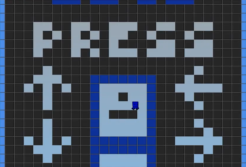
Levels following this had players re-use the blue power in challenges of increasing difficulty. One level in particular required the player to re-visit a level they had seen before, requiring them to find a ‘hidden area’ which I hoped would create a sense of satisfaction.
Green
On completing the blue levels the green power was introduced. The initial green level I designed to have players have to go out of their comfort zone to get the green power. I attempted to do this by placing the power block in a seemingly inescapable position. Play tests revealed this generally worked as players were put in an unfamiliar scenario, and were initially unwilling to make a ‘leap of faith’.
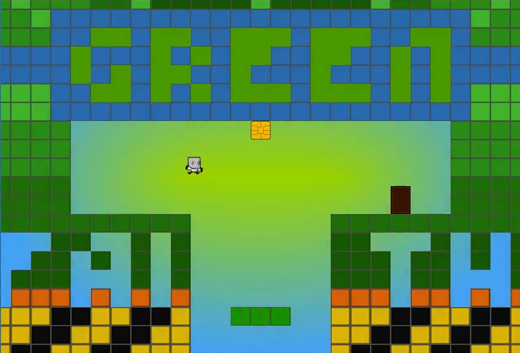 Once the player became familiar with the green power I next introduced levels which had them use it, as well as the wall jump feature.
Red
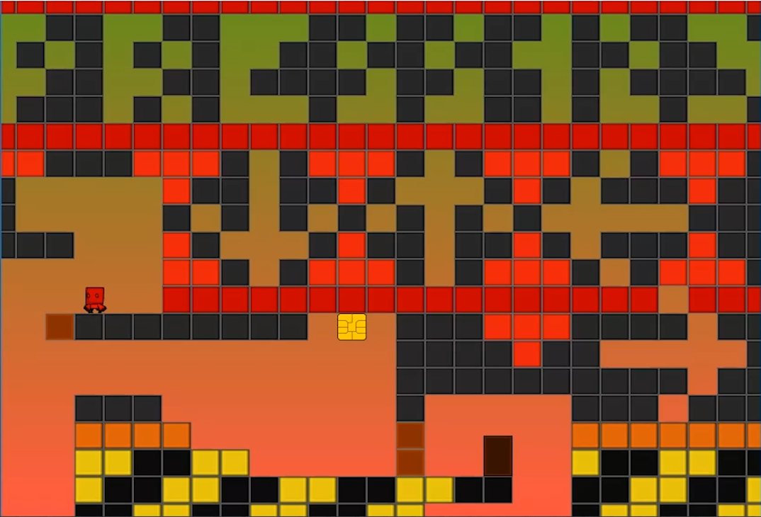
Lastly the red levels were introduced following the same teaching pattern I had established with blue and green.
Dual
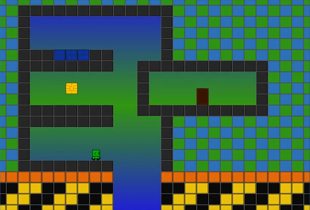
Once every power was introduced, and players were given a number of levels to master the mechanics I introduced multi-colored levels. This began with dual colored levels to keep the complexity of the level down.
Multi
Once players had mastered these levels I then introduced levels which required the mastery of all the mechanics I had introduced. By the end of the game levels included all three color types requiring players to use their mastery of the skills they had trained throughout the game.
