Tag Archives: WIT

WIT – Stubbs Rebel Without a Pulse

Preface: Making games is hard. So any endeavor I applaud. The game I will be writing a few notes on is Stubbs Rebel Without a Pulse.

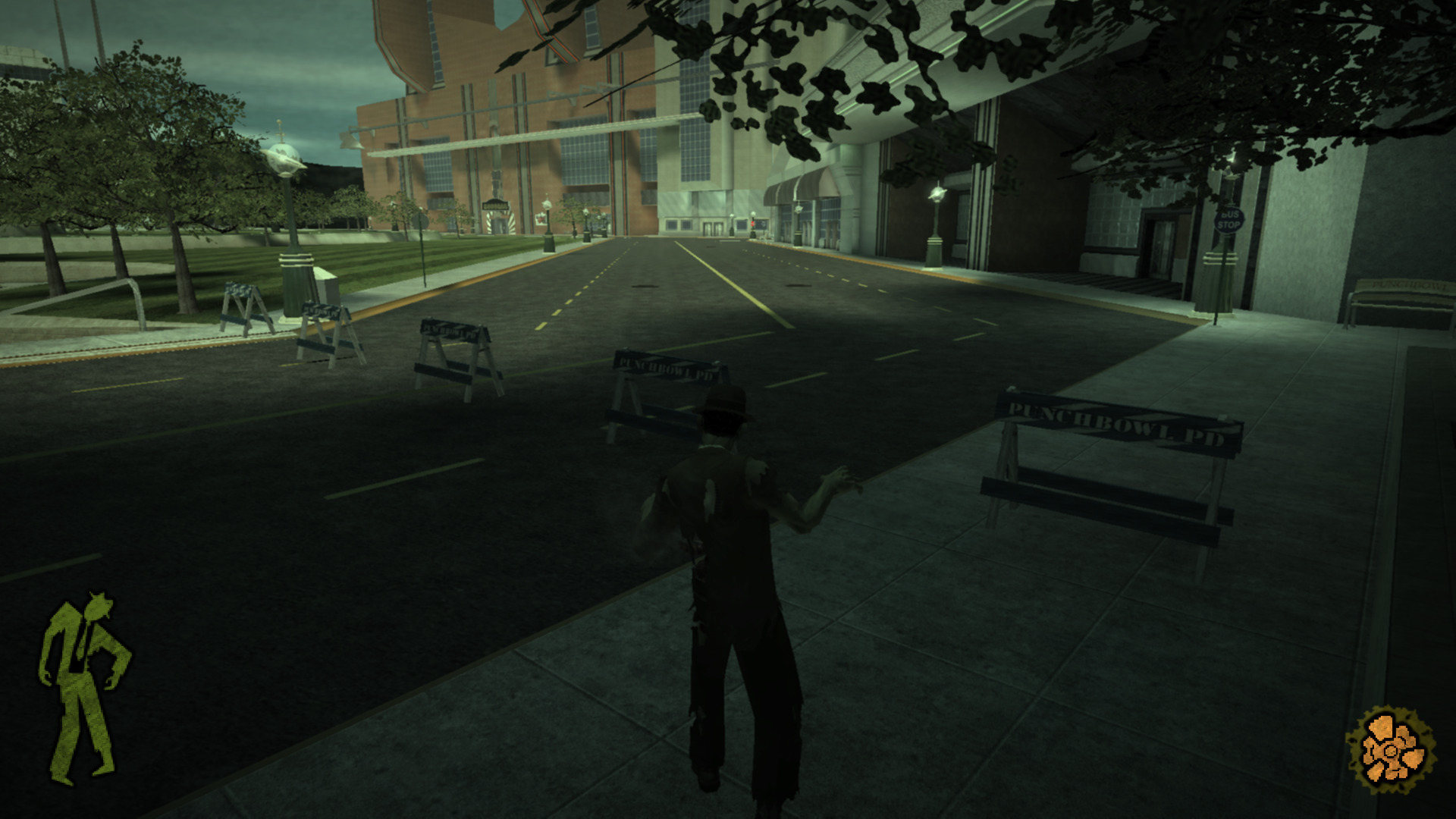
Boundary Signaling

A simplistic means to convey blocked off area which uses police barriers, and invisible collision heavily in a manner that is immersion breaking.
Modes

Stubb’s showcases a number of modes fairly early to keep things interesting.

Vehicle

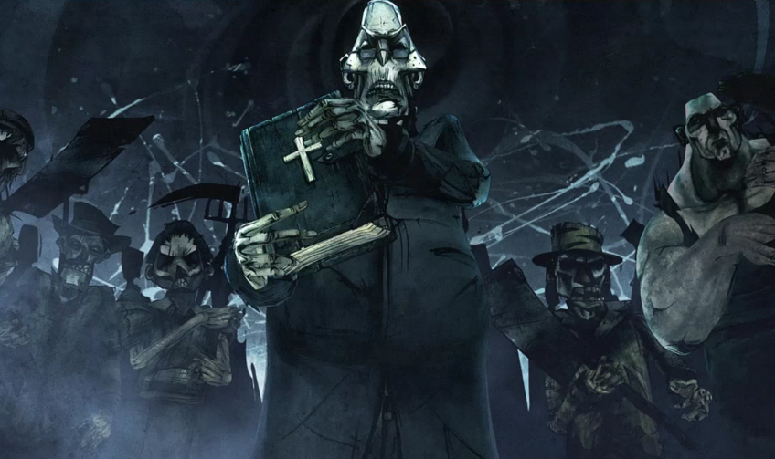
An mode where players pilot a vehicle.

Dancing

A minigame where the player engages in a dance office with a boss.
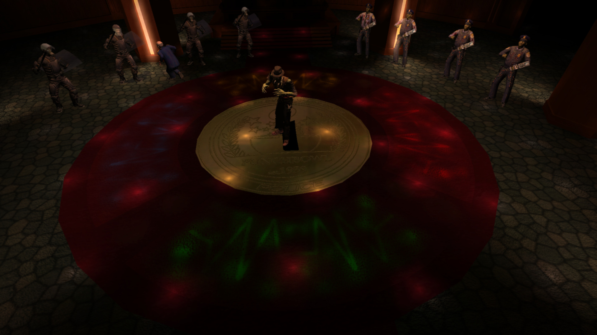
The game begins with simplistic patterns that go around the gamepad. Patterns such as:

  • 2 lefts then 2 ups.
  • 2 downs then 2 rights.
Speed Increase

To increase difficulty the mini game increases the speed of input.

I have mixed feeling about this minigame. It’s very unforgiving. One has to memorize the pattern, and I had great difficulty if I didn’t have the pattern in mind.

To improve this section the game could increase the time for input or better foreshadow the next button press. Other games have done this with visualizing future button presses.
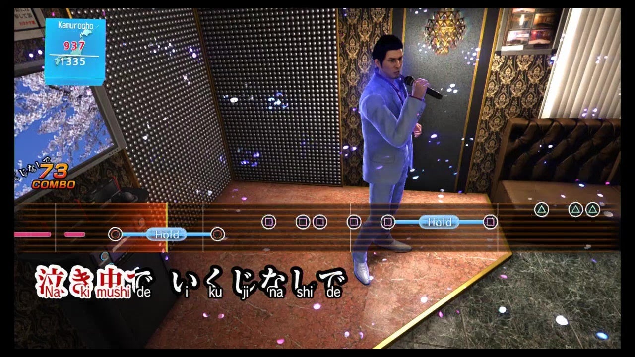
Additionally the mini-game has an unclear end state. When do I know when I win or lose? How many rounds left?

Hand

An alternate mode where the player controls Stubb’s hand. This mode is interesting in that the players:

  • Scale is changed.
  • Has a new means to navigate being able to crawl along surfaces.
  • Is able to mind control enemies

One improvement I would make here is having the surface crawling be connected to a player input rather than automatically occur when approaching a surface.
Continue reading WIT – Stubbs Rebel Without a Pulse

WIT – Shadow Warrior

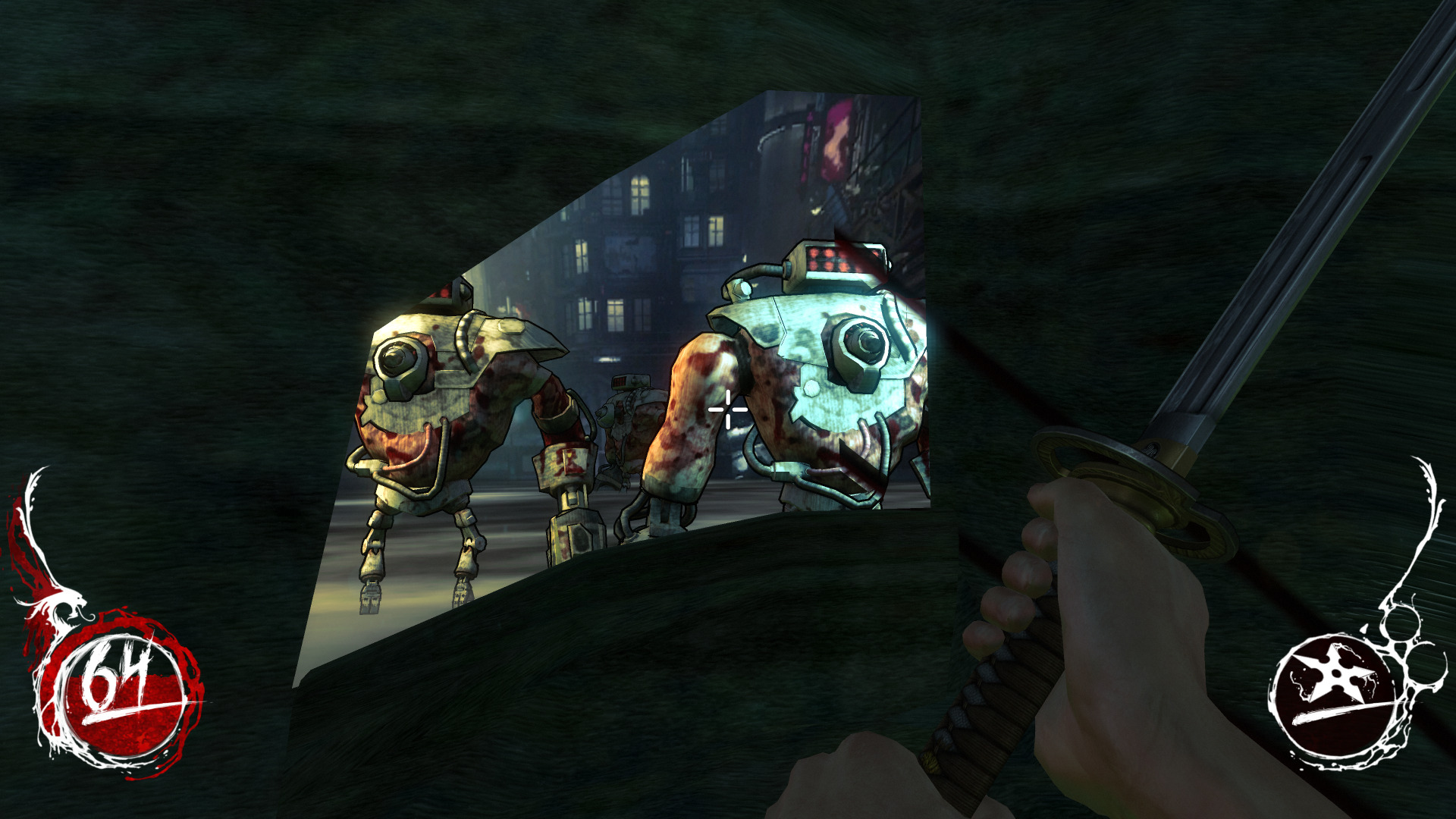
Preface: Making games is hard. So any endeavor I applaud. The game I will be writing a few notes on is Shadow Warrior.

NPC Implicit Navigation Technique

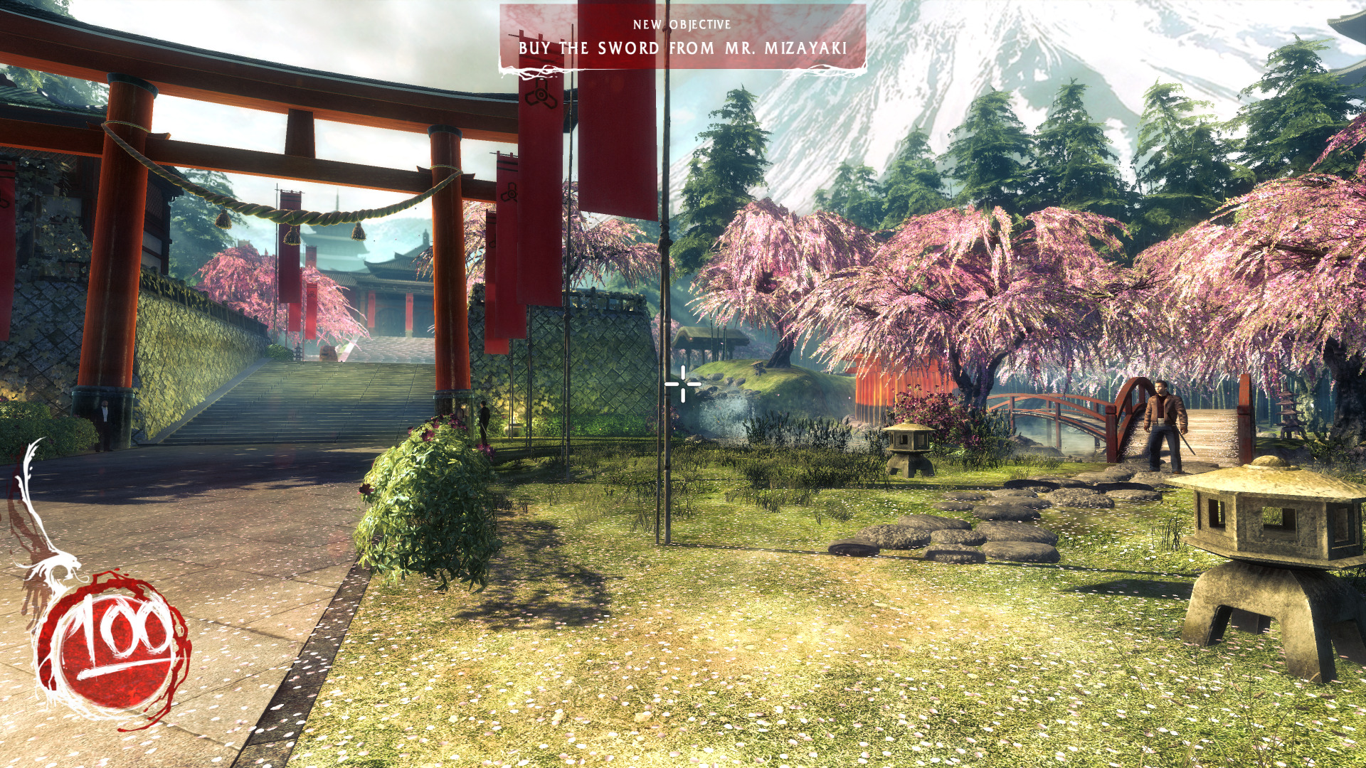
Nice framing here. Though one can go right devs used the guy to the side who I believe subconsciously pushes you up the main path which is to the left.

Vista at the Fringes

I appreciate how the devs took time to create a static vignette on the fringes of the map. The image though is quite contrasting with the temple road and the bamboo abruptly ends. The transition could have been done better, but I understand a low value return on investment here.

Minor Note

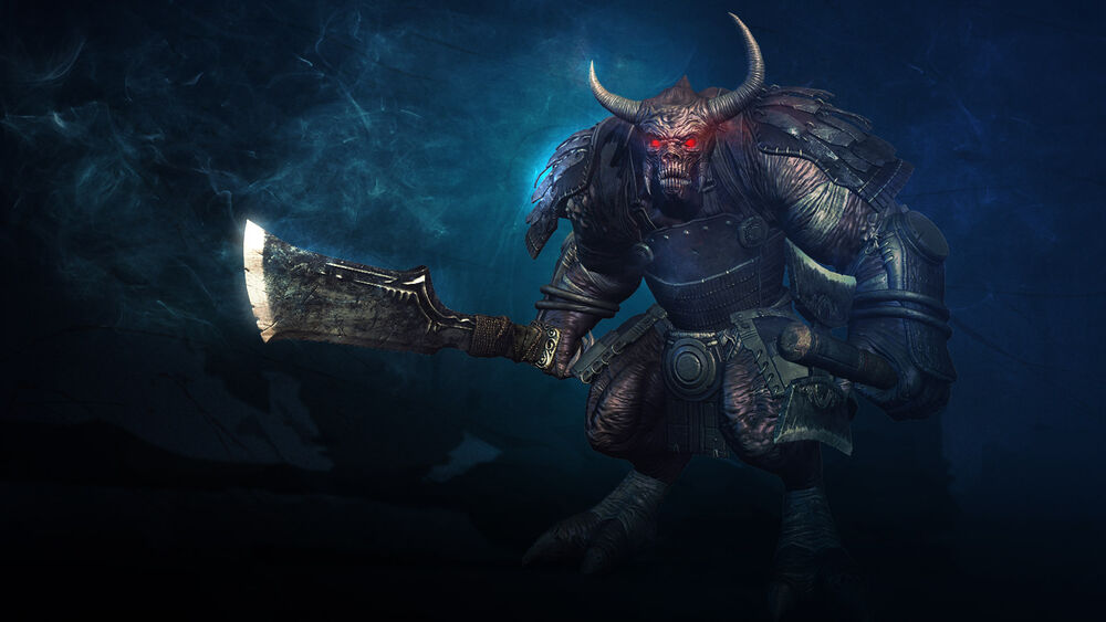
The AOE of the attack of the Warlord was troublesome to dodge. Wish it was something like it created VFX crack projections that if the player wasn’t colliding with it would not damage them. 

WIT – Scratch X RPG Battle 2

Preface: Making a game is hard, so any endeavor I applaud. Additionally the time and Skill Level of Developer is Unknown. The game I will be writing some notes on is Scratch X RPG Battle 2 and can be played here.

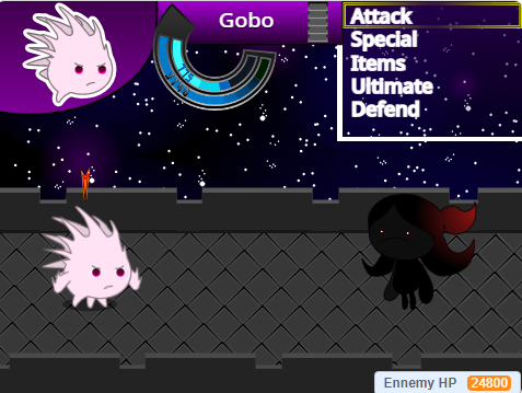
Here are some notes on the experience:

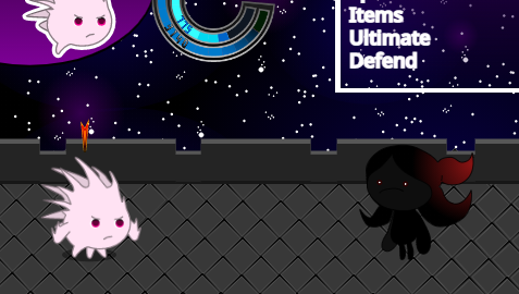
  • Enjoyed the meteorite special ability, appreciate the effort in terms of attack animations.
  • Expected ultimate to be something different from meteor.
  • Classic JRPG style action menu.
  • Like how the background is akin to some of the special moves. Helps to create a sense of a larger environment.
  • Would have like a progression of enemies, boss super powerness reduce from the impact of abilities + not sure if the enemy can be beaten.
  • Some initial backstory might be cool to setup why I’m this character, what brings me to this place.
  • Some options not functional e.g. Items – likely scope related.
  • Health and mana could be different colors instead of different shades of blue to visually show their difference in function..
  • I’d consider making the ultimate ring an inner part of the three stats ring to show association between the two.
  • Unclear how to back out of current option, could use standard key like escape, since no ability to go back in menu and was out of menu got stuck and had to quit.
  • Reminds me of Dragon Ballz for some reason.
  • Boss projecting a power attack coming is good. Dark Souls does this well for attacks in general.
  • After a couple of tries I did win. It was hard, more playtesting and tuning seem to be in-order.

Entwined, Impressions

Entwined is a rhythm game developed by PixelOpus for the PlayStation 4, PlayStation 3 and PlayStation Vita.

Warning there be spoilers ahead! Read at your own peril!

Entwined’s gameplay can be broken down into two sections:

PowerUp

  • An on the rails experience in a tube game space with a fish and bird respectively confined to a half of the tube.

  • Each side of the tube has a PowerUp bar that is filled by the player collecting objects contained on that side.
  • Objects are collected through the player moving the fish and bird using their controllers joysticks.
  • When the bar is full the player morphs into a dragon and goes into the SkyWrite section.

SkyWrite

  • A freeroam experience where players use their controllers joysticks to fly around a fixed area collecting orbs till the sections PowerUp bar is filled.
  • Once the PowerUp bar is filled the player can SkyWrite leaving a persistant trail.
  • When SkyWriting is complete the player can proceed to the next PowerUp section to continue the game.

Like

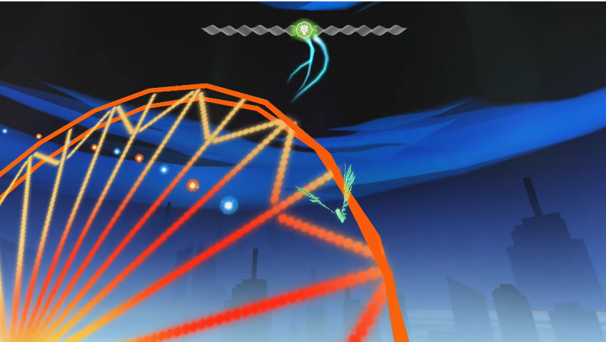
  • Beautiful visuals
  • When the bird and fish come close together their color melds into a green, which is the same color of the dragon they later morph into.

This slideshow requires JavaScript.

  • Little orbs used to direct player to fly interesting areas

  • Powerup system links into joystick controls well
  • Great tutorial. The developers employed practical examples with clear visual indicators in both PowerUp and SkyWrite sections.

This slideshow requires JavaScript.

  • Good use of orange and blue which are strong color themes throughout game

This slideshow requires JavaScript.

Continue reading Entwined, Impressions

Heart of The Swarm, Impressions

Recently I’ve been playing Starcraft 2 Heart of The Swarm, a military science fiction real-time strategy video game developed and published by Blizzard Entertainment. The following are my notes:

There be spoilers ahead, read at your own peril!

Like

  • The Hyperion mission! Having to manage one unit with a continuous stream of battling non playable characters takes away the added task of micro management and lets me enjoy a feeling of ‘distinctiveness’

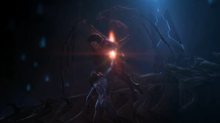
  • How ‘cutscenes’ meld into gameplay e.g when saving Raynor, Kerrigan’s Leviathan arms smash into the prison ship which then transitions into the game level

This slideshow requires JavaScript.

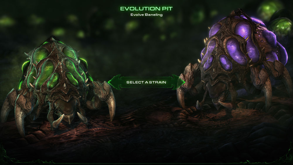
  • Evolution missions really helps players understand how an evolution works and how to use it

Dislike

  • After Kerrigan’s battle with Narud, I felt she recovered too quickly. It drew from the gravity of the fight. She should have been in an injured state for the Leviathan section where characters could comment on her fight. Then by the next mission having recovered, there would be a contextual piece of dialog about it

Continue reading Heart of The Swarm, Impressions

Dyscourse, Impressions

Recently I’ve been playing Dyscourse, a survival adventure video game developed and published by Owlchemy. The following are my notes:

There be spoilers ahead, read at your own peril!

Like

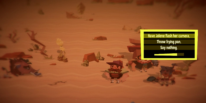
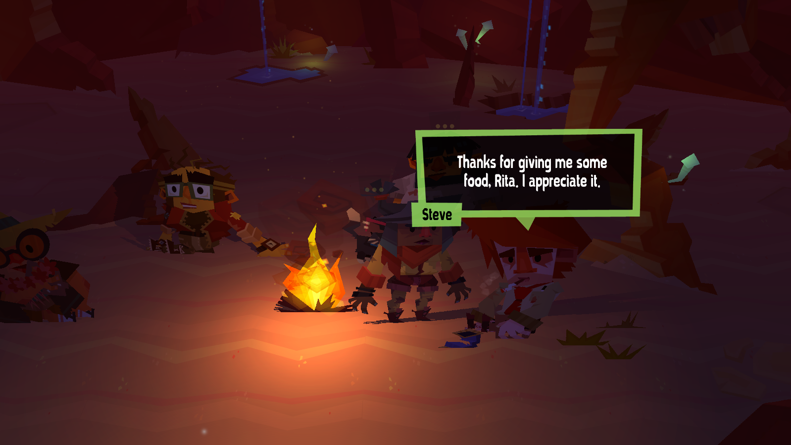
  • Effective non playable character ‘humanization’
    • Text – One character makes a reference to the main players clothes
    • Actions – Passing around of water bottles scene

This slideshow requires JavaScript.

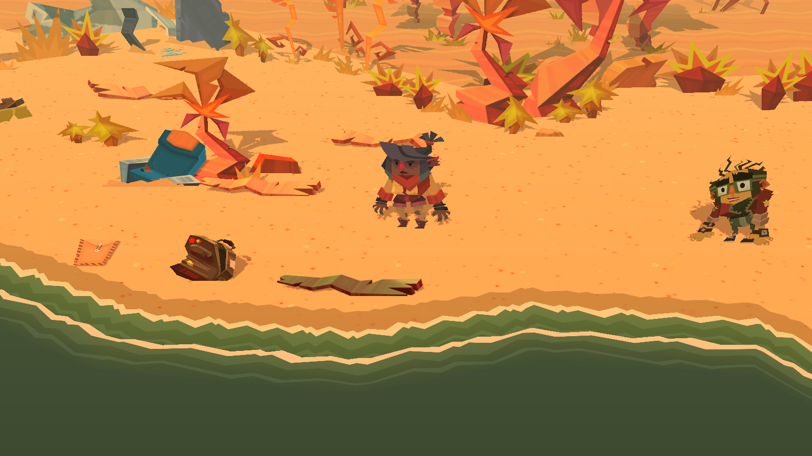
  • Warm colorful storybook art style
  • Characters reflect ‘character’ through facial expressions, walking style, and speech which conveys the characters emotion
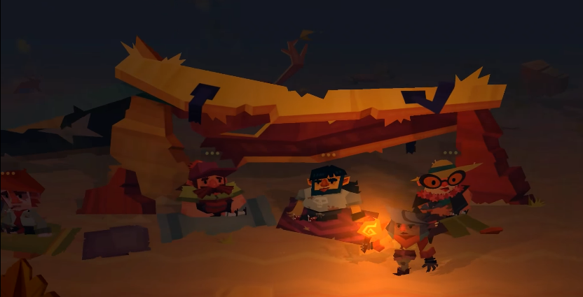
  • ‘Torchlight Talk’ mechanic, it makes sense that the fire goes out over time making talking limited

  • Time based events with clearly conveyed state e.g combo sequence required to defeat boar

  • Color coding for character dialog messages

  • Slight shine on wooden planks to attract players attention

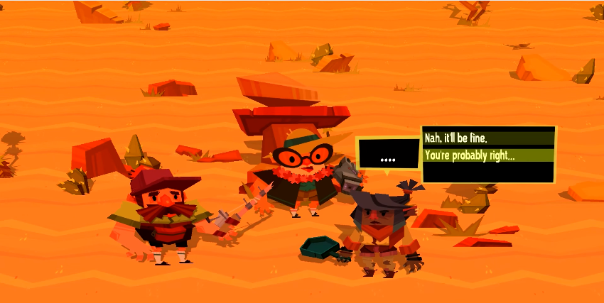
  • Choice confirmation points that give a player a chance to again consider

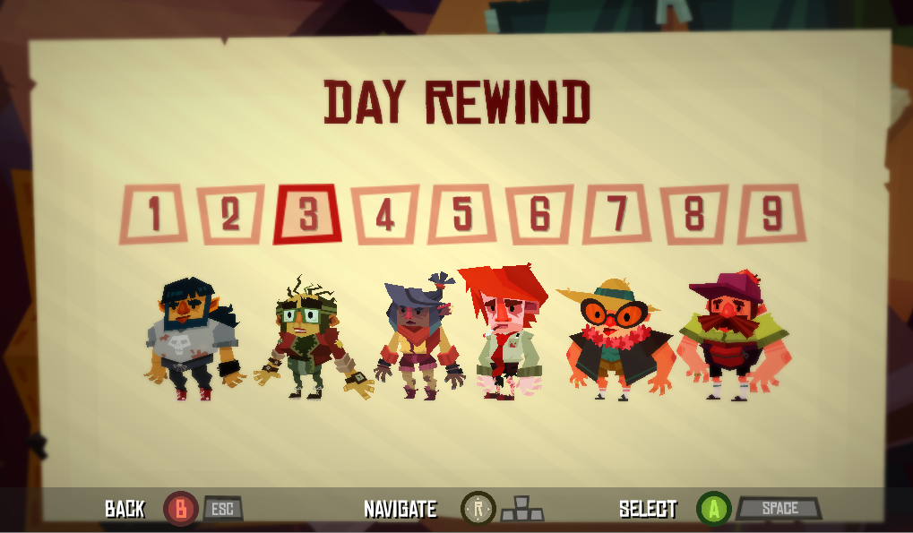
  • Rewind feature, which allows player to go through the story again and try get the outcome they actually desire

Continue reading Dyscourse, Impressions

An Impression of 140

Melding music and game play is an interesting area of game development which games such as Crypt of the NecroDancer, Beat Buddy, and Guitar Hero, have explored. Whilst exploring my own shamefully large collection of untouched games on Humble Bundle I happened upon the game 140 which makes its own contribution to this area.

140_game_logo

With lead designer Jeppe Carlson, (co-designer of the well know title Limbo) 140 was created by Carlson Games. Paraphrasing Jeppe, he describes 140 as an old school platformer, where the challenge is in syncing up your moves, and jumps to the music controlled elements.

After a short time with 140 I thought to briefly note my impressions of the game.

Disclaimer – This is not a  thorough review, but notes of an impression based on approximately 20 minutes of game play. Everyone is fallible.

Impression Notes

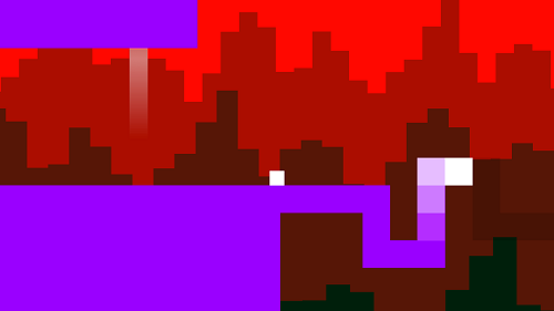
  • On launching 140, the first thing that hit me was its minimalist art style. Its distinctive color scheme made it easy to identify puzzle patterns, and game elements.
  • In 140, music is at the heart of its game-play with appropriately pulsating background, and game elements used with rhythm based mechanics to make interesting puzzles.
  • 140 relies on players exploration of controls as I noticed no traditional tutorial which can be fine. Although some helpful information based on monitoring of the game state is good e.g explain to jump or move if a player hasn’t moved for a long time.
  • Like other titles in this area 140 suffers slightly from issues of repetitive music. This issue I believe essentially stems from player progression which is something hard to control. I felt this game handled this issue well by splitting music into short levels.

140_game_elements

  • The difficulty of the game quickly ramps up, likely making it less accessible to the casual gamer. On the other hand though, this meant 140 presented more challenging puzzles, which is delight for some. It’s good that the creators of 140 realized the game difficulty, and employed frequent checkpoints through out the game.
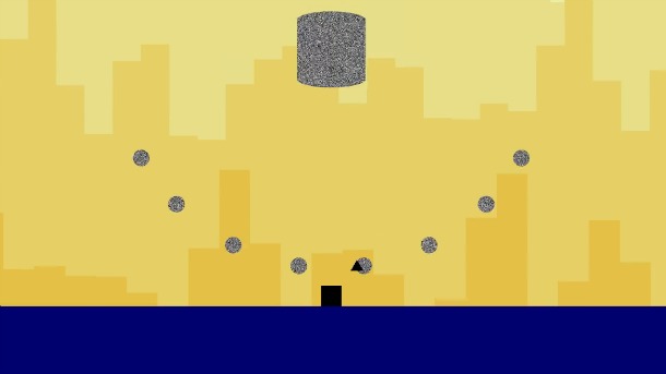
  • 140 bravely deviates off a more traditional pattern of game mastery by transitioning to a hail shooter from a rhythm based platformer at the first boss fight. I found the hail shooter boss encounter to be a disproportionately high increase in difficulty from the challenges before. The encounter left me frustrated (maybe I just sucked bad). Perhaps an easier encounter, or a series of checkpoints through the boss encounter would have been preferable.
  • Raph Koster said ‘noise is patterns we don’t understand’, and so it felt appropriate that the ‘death blocks’ were static noise. 140s creators took this concept even further during the first boss fight as static noise breaks down into music.

First Boss Fight
First Boss Fight

  • Like other titles in this area of game development, 140 suffers from issues of repetitive music. This issue I believe essentially stems from player progression which is something hard to control. 140 tackled this issue well by shortening levels, and splitting up music into those levels.
  • I liked how the levels key (item objective) was innately tied to the next level through music. When hearing the keys music was excited thinking about how it would later manifest itself as a mechanic.

Conclusion

All in all I enjoyed 140, being a nicely designed little gem it was a happy little surprise. Budding game designers should definitely give it a play as its a game well focused on how to meld music, and game-play.

Shogun 2s User Interface, Bottom Left/Middle

The Bottom Left/Middle Area of Shogun 2s Campaign Map User Interface is an elegantly designed, helpful popup filled, context sensitive area that displays key information about a players Navies, Armies, Agents, Construction, Recruitment and Battles options.

The UI element as a whole is thematically suited to the time period, incorporating a Japanese battle banner, appropriate color scheme, and style to complement the rest of the UI. In addition a neat feature of this UI area is that depending on the context of a players selection this UI area will change. For example when a player clicks an empty space on the campaign map it is hidden, if an army is selected army information will appear in the form of a Tab.

All these design decision make this UI element a screen space efficient, compact, informative, aesthetically pleasing part of the campaign map that ‘fits’ well into its surroundings, and help build the experience of a general during the Sengoku Jidai..

Army Tab

Army Tab
Army Tab

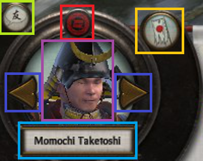
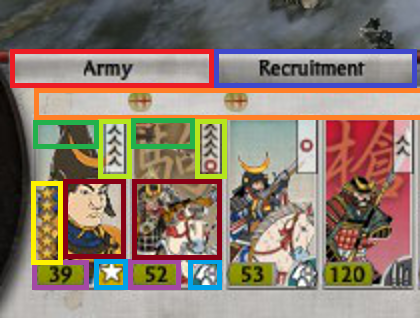
The Army Tab displays information related to the selected army. The UI element is made up of a Dial and a Banner.

Dial

Army Tab Dial
Army Tab Dial

The Army Tab Dial can be broken up into the following sub-elements:

  • Red – Clan icon.
  • Teal – Army leaders name.
  • Dark Blue – Arrows allowing cyclical cycling through units of the same type, in this case army.
  • Purple – Army leaders image.
  • Yellow – Disband button.
  • Green – Chat.

Considering this element:

  • The layout of the dial is interesting being somewhat symmetric, and the dial art asset has a shine at the top of the dial which may attract a viewers eye.
  • The Purple and Teal elements are not necessary, but are welcome as a thematic elements for a player.
  • Functionally the Dark Blue, and Yellow elements allow a player to quickly jump from army to army, and disband them if necessary.
  • The other side of the campaign map, the bottom right, features a stylistically similar dial.

Banner

Army Tab Banner
Army Tab Banner

The Army Tab Banner is jam packed with vital information that can be broken down in the following manner:

  • Orange – Used for unit replenishment indicators, where a:
    • Green circle with a + means units are replenishing.
    • Green circle with a red slash means are not replenishing.
    • Skull which means units are suffering attrition.
  • Light Green – Unit experience.
  • Dark Red – Unit portrait with color coded background (Radious’s mod added this I believe).
  • Dark Green – Special Attributes e.g Accuracy, Improved Armour.
  • Yellow – Unit Rank.
  • Purple – Unit Strength. If the unit is being replenished a dark grey area will appear with a visual indicator of the new strength at the next turn.
  • Teal – Unit Type Icon.
  • Dark Blue – Recruitment Tab. This only appears when a general is present in the selected army.

Looking at the banner in totality, all the information fits neatly, and succinctly conveys a lot of information to the player with great use of clear icons in a consistent format.

Continue reading Shogun 2s User Interface, Bottom Left/Middle

FEAR’s NPC A.I.

FEAR has been cited as one of the most influential A.I. games. FEAR’s claim to fame was its implementation of NPC A.I. using a system called Goal Oriented Action Planning.

Since I have some experience with planning in games, I wanted to have a look at the techniques used. After some digging I thought I’d put together a brief summary of what I learnt.

fear_logo

Continue reading FEAR’s NPC A.I.

The Creature A.I. of Black and White

Black and White is where my interest in A.I. in games started. (A little context) Black and White is a god game designed and created by Lionhead Studios under the directive of Peter Molyneaux. In Black and White you are a god born of the prayers of people, free to do whatever you please through the islands of the game.

In your journeys you are eventually given a creature. A tiny little thing, it behaves just like a child – curious yet inexperienced and frightened of the big bad world. Similar to a child you can teach it, it will then think and act based on what  was taught by you. Invest enough time and your creature can become your ultimate agent. It was a fascinating example of A.I. in games.

black-and-white-creature
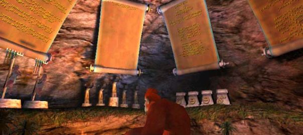
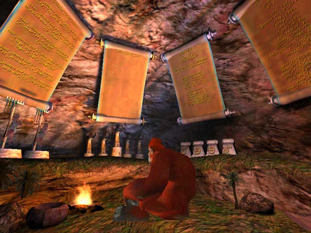
The Creature Cave

Black and White’s Artificial Intelligence was designed and implement by Richard Evans, and in my opinion it was the creature feature in particular that elevated the experience of certain aspects of the game. Employing sophisticated A.I techniques, it gave deeper meaning to your relationship with the creature, you felt responsible for it (well at least I did) having to train and look after it while it grew up.

Notable features related to the creature included:

  • Leashes – Which gave the player some behavioral control of the creature.
  • Creature Combat – Where creatures would fight autonomously when not commanded by the player.

A battle from Black and White: Creatures Isle. The Crocodile is controlled entirely by the game.

AiGameDev, who listed it as the most influential AI game, summed up the technical innovations as:

  • The gameplay is focused on the interaction with a large AI creature which can learn from examples, and takes reward and punishment.
  • The design integrates artificial life within the context of a strategy game.
  • The engine uses a solid AI architecture, rooted in cognitive science, known as belief-desire-intention (BDI).
  • Machine learning techniques such as decision trees and neural networks are used with great success.

If you are interested in learning more about the innards of Black and Whites creature A.I. then check out this great paper by James Wexler.

Game Development Society

Game Development Society is an official society at the University of Edinburgh that I help found with two good friends of mine, Nick La Rooy and Richard Cassidy.

Sadly now that I’ve graduated from the University of Edinburgh I’m no longer part of the committee, but I’m happy to say its been left in very capable hands. If your interested in game development then I highly encourage you to get in touch with them through either their website or email ([email protected]), as well as subscribe to their mailing list.

By the way they have an upcoming Game Jam sometime next week  (details are at the bottom of the page) so if your in Edinburgh around then go check it out!

 DETAILS OF GAME JAM

Hi all,

First off, welcome to all our new members, great to have you with us. This is just a quick reminder of our first (and main) event this Semester, which I’m sure Scott or Paul mentioned at the Freshers’ Fair – our 1st Semester GameJam.

So, what is a GameJam? Basically, you spend a weekend rapidly producing a short game, based on a given theme (revealed on the day). All the games are then judged by the community with a prize for the winner! The event is open to students and non-students alike, regardless of skill level, and free for members or just £3 otherwise. Turn up in a team of up to four, or on your own and we will organise teams on the day. Programmers, artists, sound designers, writers etc. are all welcome (and appreciated!).

It will be in the The Pentland Room at the Pleasance Student Union on the 21st and 22nd of September, starting at 11:00 – that’s this weekend. We have the room booked till 23:00 on the Saturday, and it will reopen at 12:00 on the Sunday. The games will need to be complete and playable (on your machine only) by 21:00 on Sunday for the judging. You will need to bring your own PC, contact us if this is a problem. Once again there will be an exciting new theme, and a fabulous cash prize.

Regarding rules, you can use any language, framework or program you like, provided you are not simply completing an existing game. We encourage everyone to judge based on the game, not the tools used to make it. As an aside, we will also be there to help novices if they choose to use GameMaker. If this is you, we recommend doing the “Your First Game” tutorial here so you’re ready to go as soon as you arrive.

As usual, if you’ve any questions, please don’t hesitate to ask us.

Cheers,

GameDevSoc

END OF DETAILS OF GAME JAM

Smooth McGroove

smooth-mcgroove

Have you ever relaxed into your chair, listening to a song that takes you somewhere far away? Somewhere simpler; carefree. A place before you knew shades of grey.

Video Game Music does this for me. It’s my music therapy.

So on my travels surfing the vast expanse of the internet I sometimes encounter music practitioners, people who give my dose. Smooth McGroove is one such person. With his all original a-capella arrangements of primarily video game music I can fly away; if only for a moment.

Thank you Smooth McGroove.

Check out his work. You wont be disappointed.

League of Legends

League of Legends is described by some as the equivalent of electronic basket ball, by others like AngryJoe as “crack”. I agree. This Multiplayer Online Battle Arena (MOBA), where team work is essential to success has players take control of a single unit in a multi-player match up, with the goal of destroying the opposing teams ‘Nexus’.

Nexus
The Nexus

A Short History

League of Legends or LOL (though well executed) is not an original idea. In fact it was originally conceived as Defense of the Ancients (DOTA). Based on a mission from Starcraft, DOTA was a custom game created by Eul on the popular Real Time Strategy game Warcraft 3: Reign of Chaos. Unfortunately Eul did not update his map, and so others created spin-offs; it was Steve ‘Guinsoo’ Freak who got it right.

Guinsoo created a variant of DOTA calling it DOTA: Allstars. He then put in an enormous amount of work in to adding new champions, items and game features. He later handed it over to Abdul ‘Icefrog’ Ismail who continued his work. At present IceFrog has gone onto become a lead designer at Valve working on the sequel DOTA 2.

DOTA: Allstars

Continue reading League of Legends

Reus

reus

In the beginning there is only an empty planet…

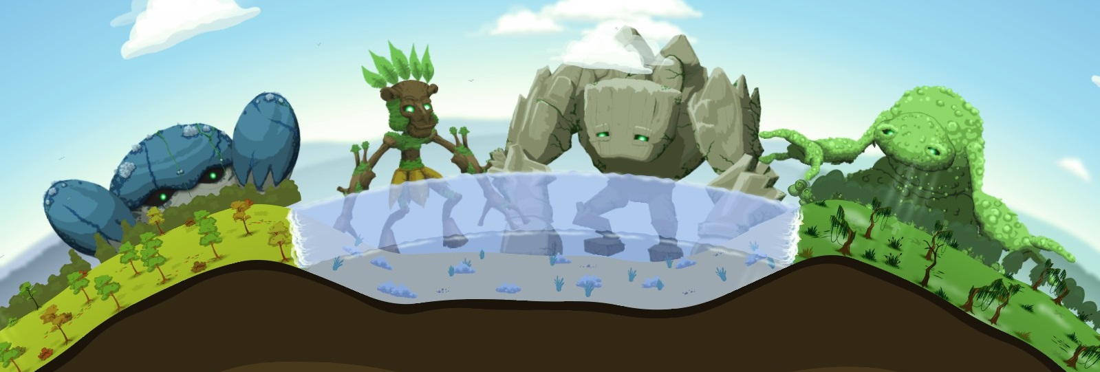
Using its last remaining power, the planet summoned four elemental giants in an attempt to restore life to it’s dead surface. These giants were charged with cultivating a suitable environment for life.
reus-four-giants

Welcome to Reus, a 2D god game by Abbey Games where under your control are these four giants; Forest, Rock, Ocean and Swamp.

Each giant has the ability to create a unique biome by terra-forming the planet. They can then place different types of resources within these biomes, and grant aspects which can augment their own, or other giants resources.

Multiple resources work together to create a ‘symbiosis’ that offers additional benefits to the surrounding area. These resources then attract nomads who settle in the cradles of life that you create, building villages that soon require more resources to grow.

The task that forms the lions share of the games complexity is a balancing act, between finding the combinations of resources that provide what a village needs, and keeping the villages ‘greed’ in check.

Simply put, greed is a mechanic where by bestowing a village with too much too quickly, they become greedy and destructive, to the point where it can result in a village destroying the very utopia you forged and even turning on you. If necessary you may have to destroy the offending village, its your choice.
Continue reading Reus

No One Has To Die

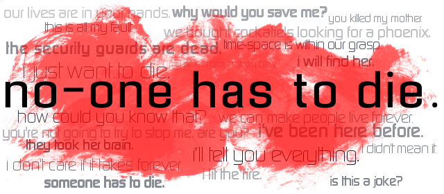
No One Has to Die’s comments on Newgrounds read “4 people are trapped in a building fire and need your help to escape”, now I’ve finished playing it, looking back it’s the tip of the iceberg… an awesome iceburg.

no-one-has-to-die-logo

An hour or so in length, this indie game manages to pack quite the punch. It isn’t particularly difficult and it’s not designed to be. The simplicity of its gameplay and mechanics, peel back to reveal the complexity one feels in considering the consequences of those simple choices, which in turn furthers the narrative in a ‘player-driven’ manner.
no-one-has-to-die

It’s art style is simple, functional, colorful and doesn’t detract from the game. The music is top notch, working well to build up an atmosphere in tune with what’s happening in-game. The writing of characters is good and given the length of game it’s enough to start to get a ‘feel’ for them.

No-One-Has-To-Die

All in all No One Has to Die is a thought provoking puzzle over life and death. Its great moments and emotional highs and lows leaves one with a joyously sweet aftertaste. This is one indie gem, is well worth your time.

So what are you waiting for! Play it!