Steams recent winter sale had Final Fantasy 9 on discount. I saw it as a great opportunity to revisit a beloved franchise. The following are ‘designery’ thoughts from the first several hours of play:
Like
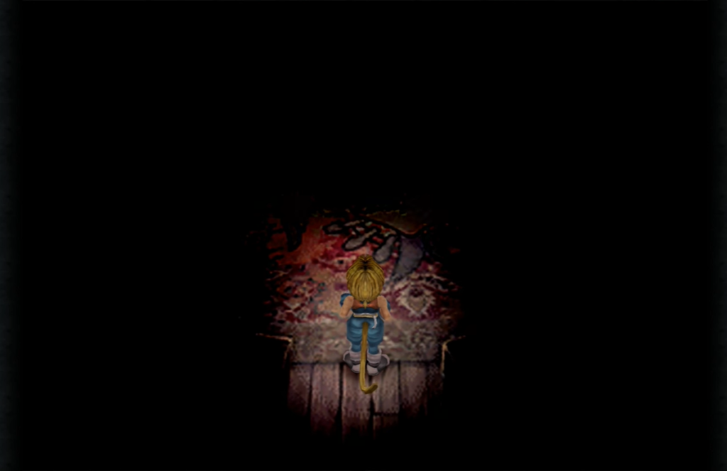
- FF9 starts you off in a dark room where it easy to focus on your player and understand movement. It then lights up the wider environment.
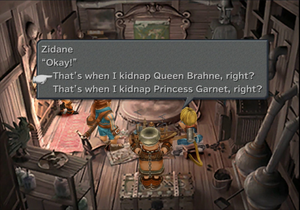
- Narrative reinforcement – One moment where the player must select the princesses name whilst going over the kidnapping plan.
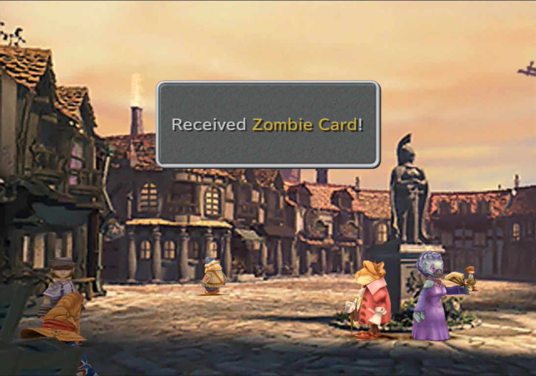
- Level Exploration – In the scene below your character enters the scene from the bottom of the screen. Once you have control of the character the world fulfills the expectation of continuity by providing an area that’s the opposite way the player is encouraged to go (using the crowd who moves forward).
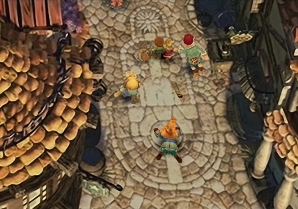
Lots of and easy to find initial pick ups from environment to quickly establish and encourage exploring the environment for rewards.
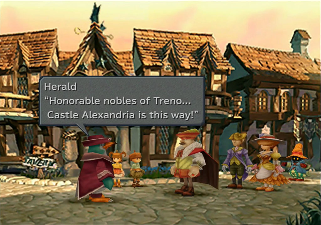
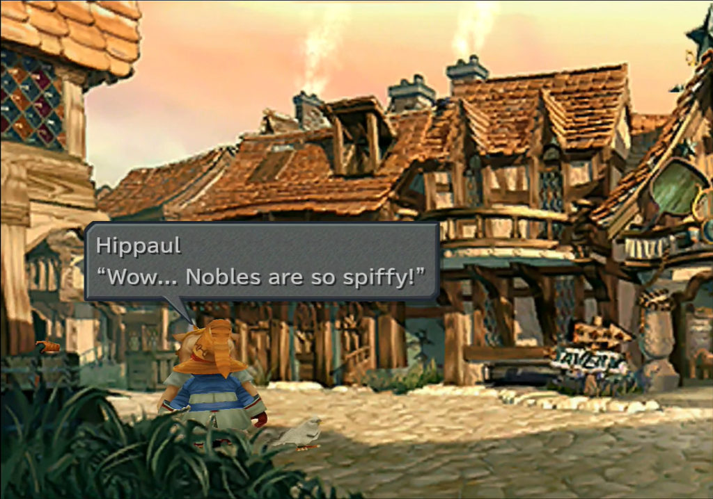
- Storytelling Moments – Initial area showcases poverty/class differences through characters in the scene.
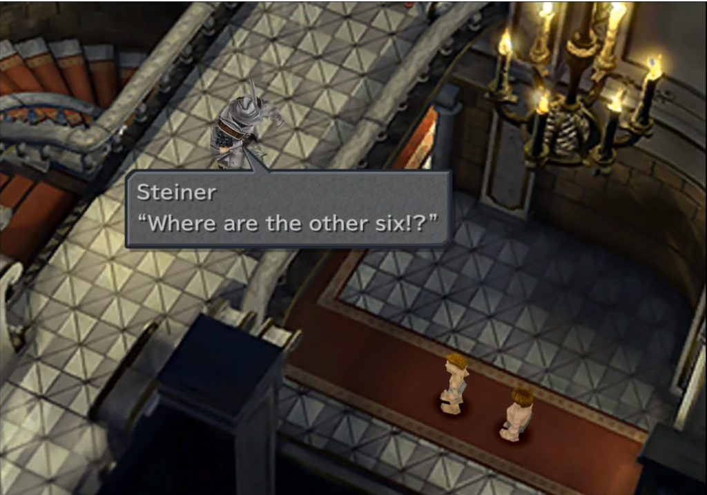
- Lots of encouragement to explore through cutscenes. For example Steiner locked in room and the cutscene shows you are treasure chest which encourages you to go there.
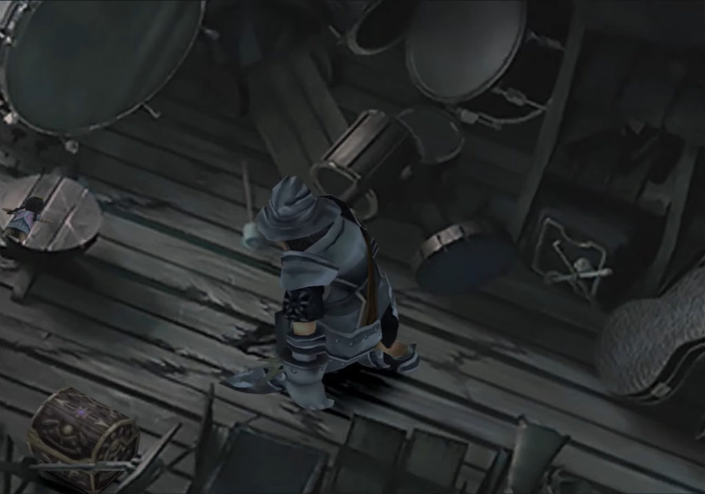
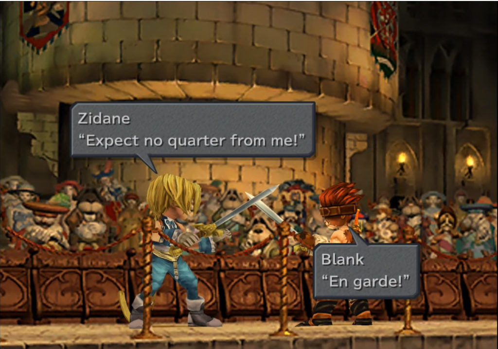
- Love the variation of activities right from the start such as finding the knights of pluto, and a scene of quick time events of sword fighting.
- Second main environment in the beginning is totally safe with no enemies but complexity is increased with lots of activity of NPCs and some sidequest stuff. For example find the cat sidequest, this quest seemingly enforces some features of the world. The idea of persistent NPC’s between scenes as well as that the world can change state. For example little Idia (girl who a dress is being made for) runs off and you can now go into the area of the house she was initially blocking, and get the reward you were initially blocked off from.
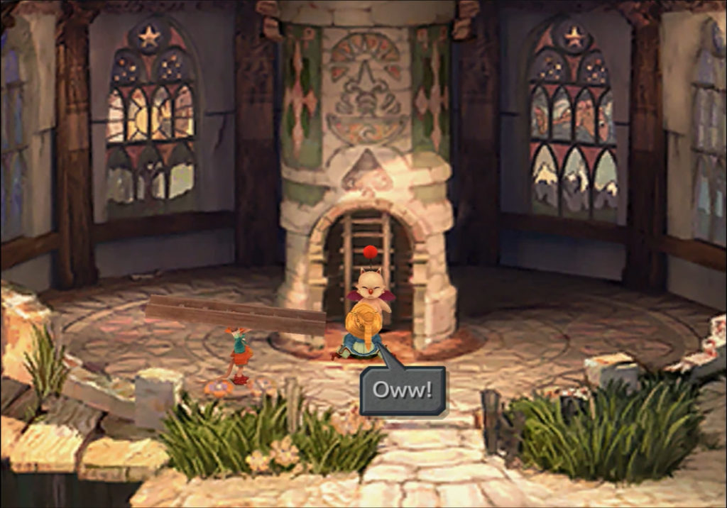
- Introduction to a Moogle is a forced occurrence which introduces you to saving.
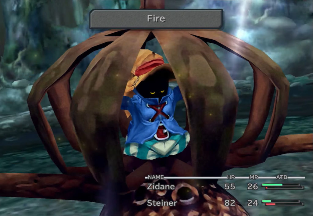
- Introduction of useful black magic, and that there are enemies it is effective on through a battle with Vivi autocasting on an enemy.
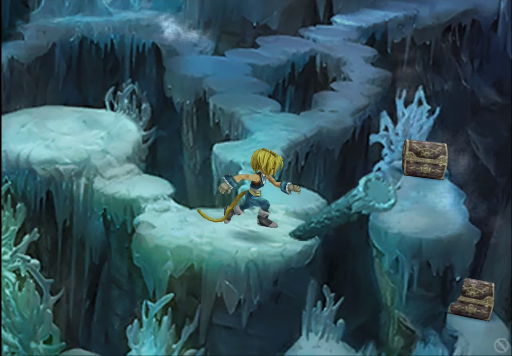
- At one point in an ice cavern you have a fork. I really like how the safe path has no icy wind and the other one has icy wind. The level communicates visually which is the dangerous path.
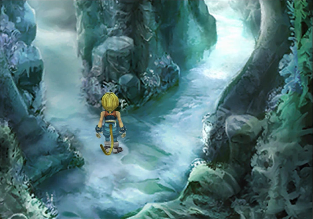
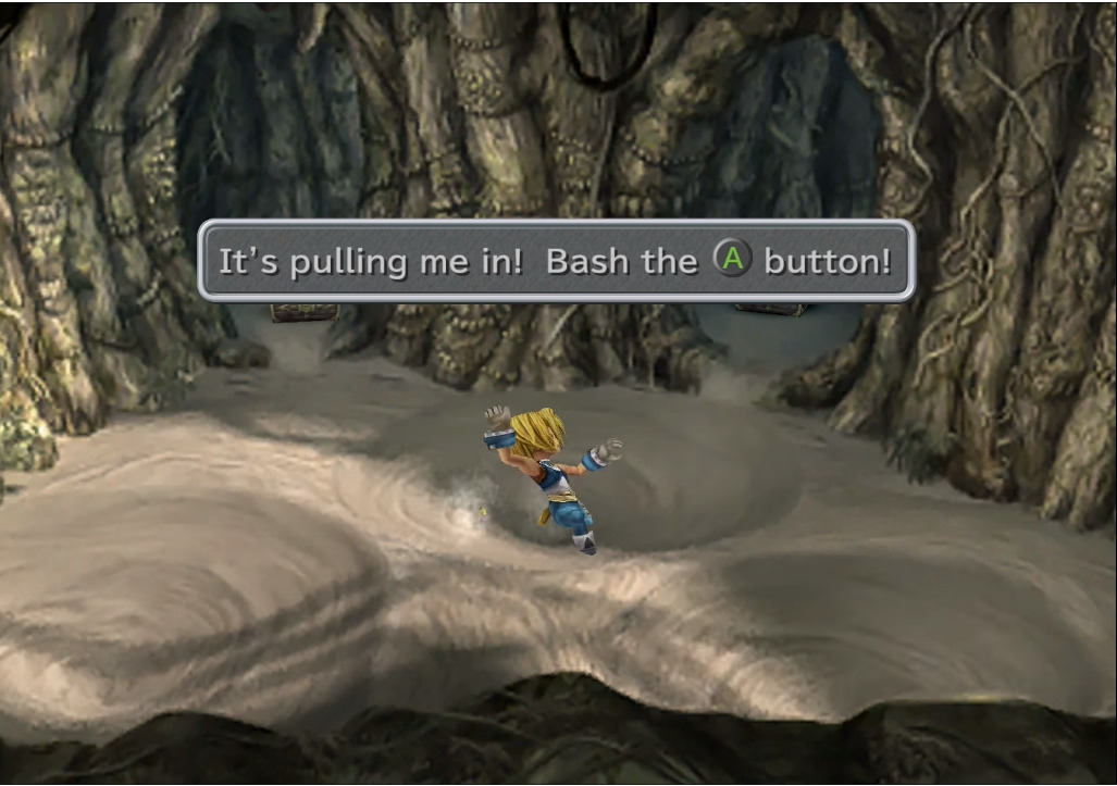
- In the ice cavern the icy wind looks perilous and actually is because if you collide with it, it is a guaranteed fight. Also that’s a point for providing obstacles that are thematically coherent with the environment. For example icy wind in a ice cavern, and sand whirlpools in a later sand dungeon.
Other Thoughts
- Lack of indication of enemy death state on the average monster – yes I understand super expensive in dev budget.
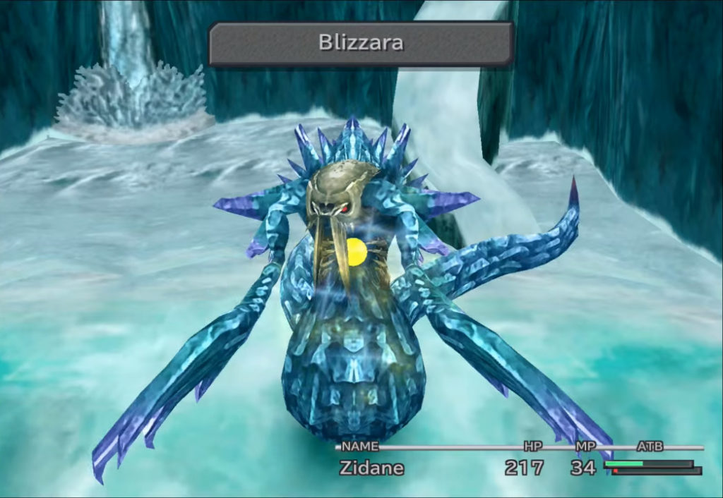
- In defense has it on some boss enemies such as in the icy cavern. Shard on chest changes color according to level of health.
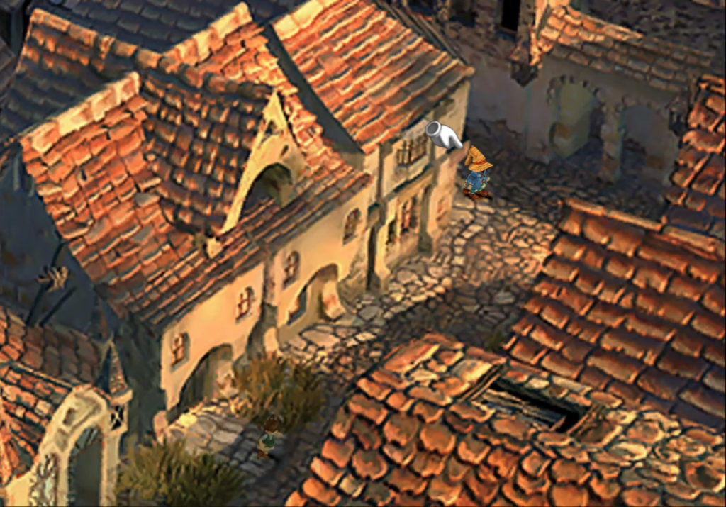
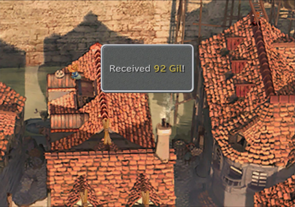
- Tough to tell when there is an item in the environment sometimes (sometimes yes e.g. nests on roof when climbing with rat dude who has ladder is easier to find – and finding something unobvious might make you feel good).
- Tough to read where there are places I can enter to go to another area sometimes. In this case the path is on the right past the NPC and behind the large object. In this case I was lost for awhile.

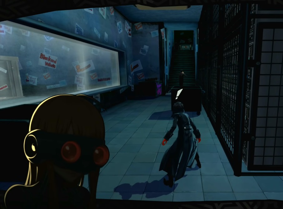
- Maybe NPC’s can use some kind of convention to display emotion (anime uses a sweat drop to show stress or exclamation to show surprise). The following is an image of such from Persona 5 (a pretty frickin good game!).
