Tag Archives: Art

Sketching Practice – 1

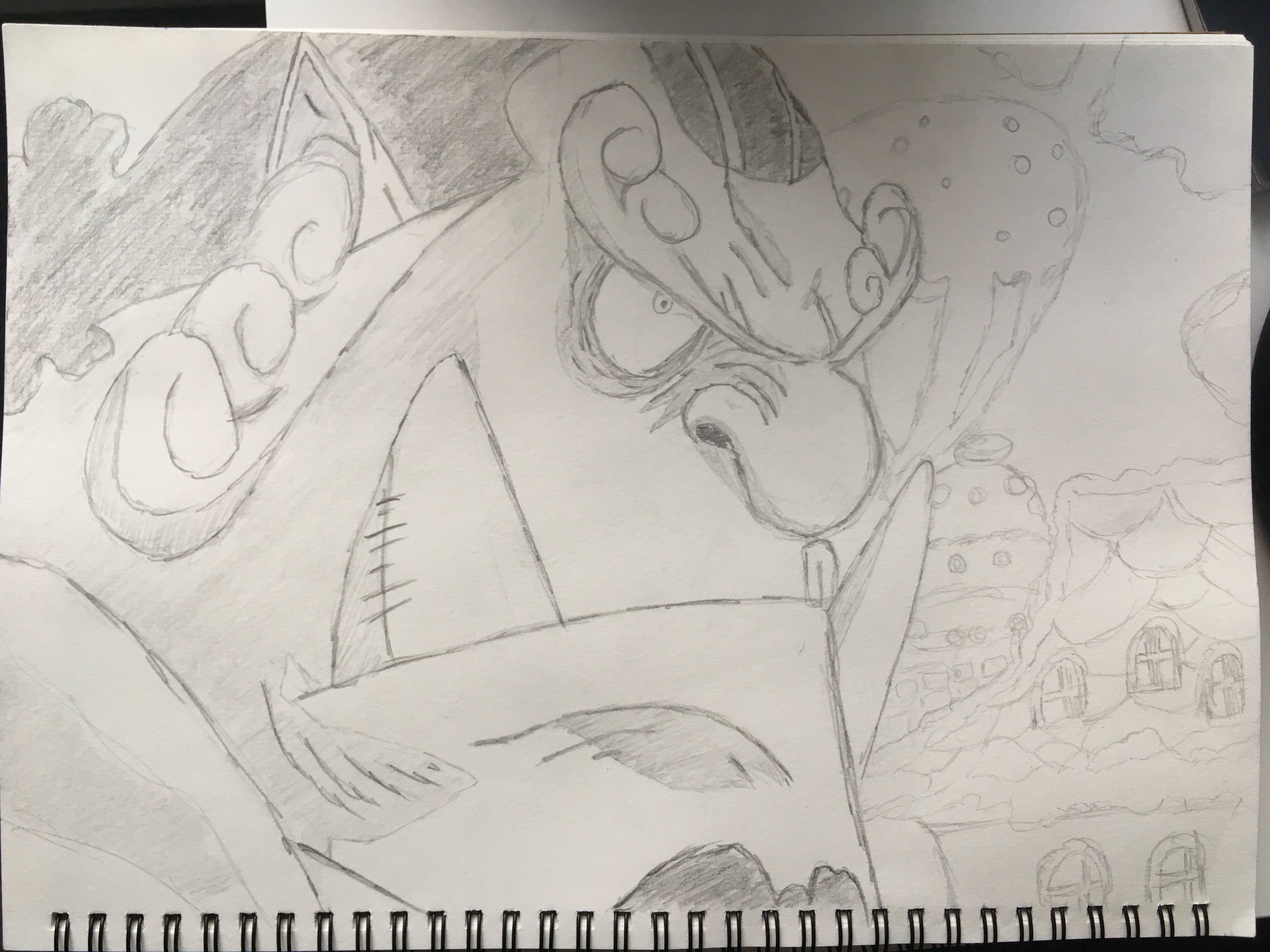
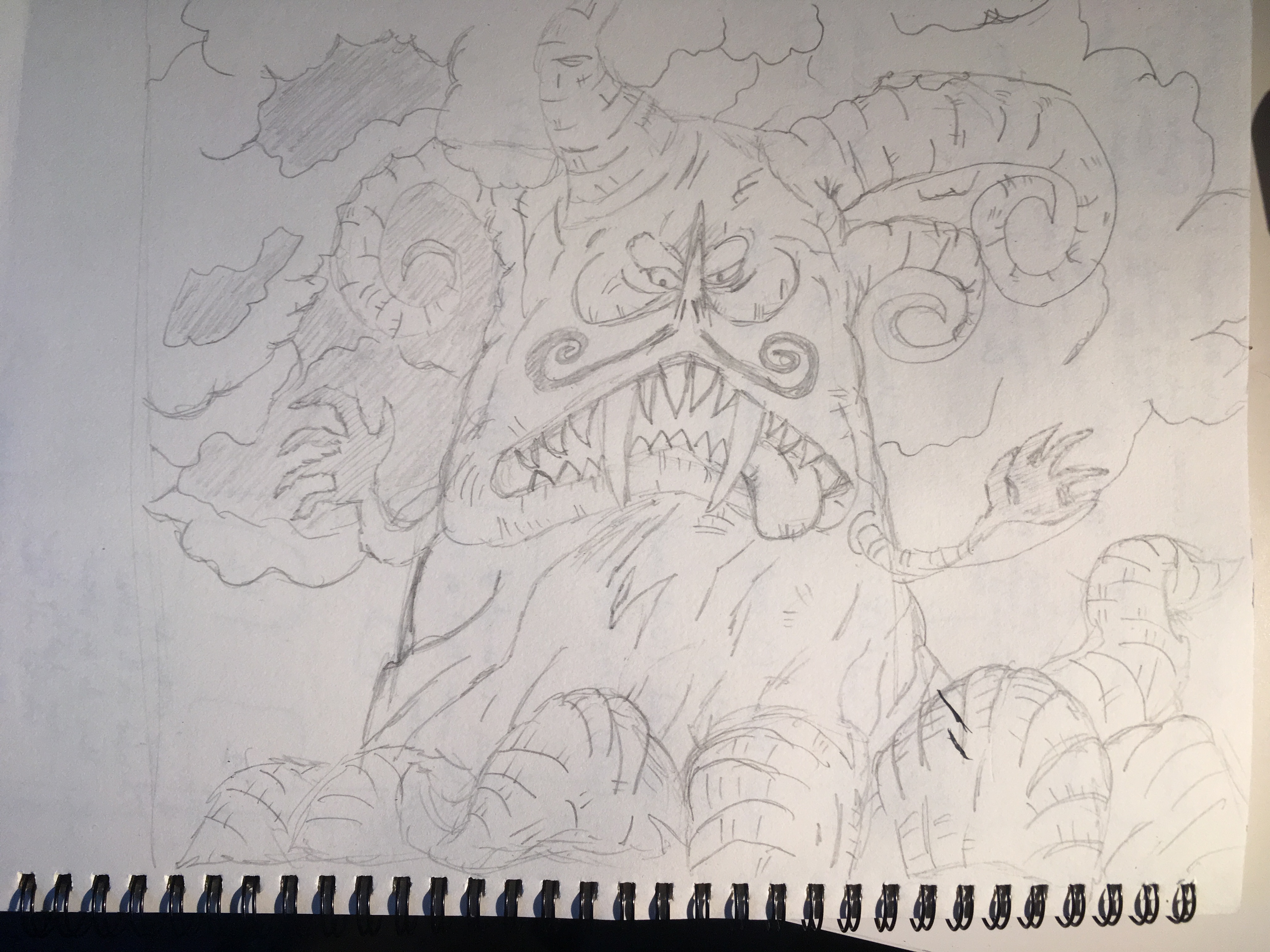
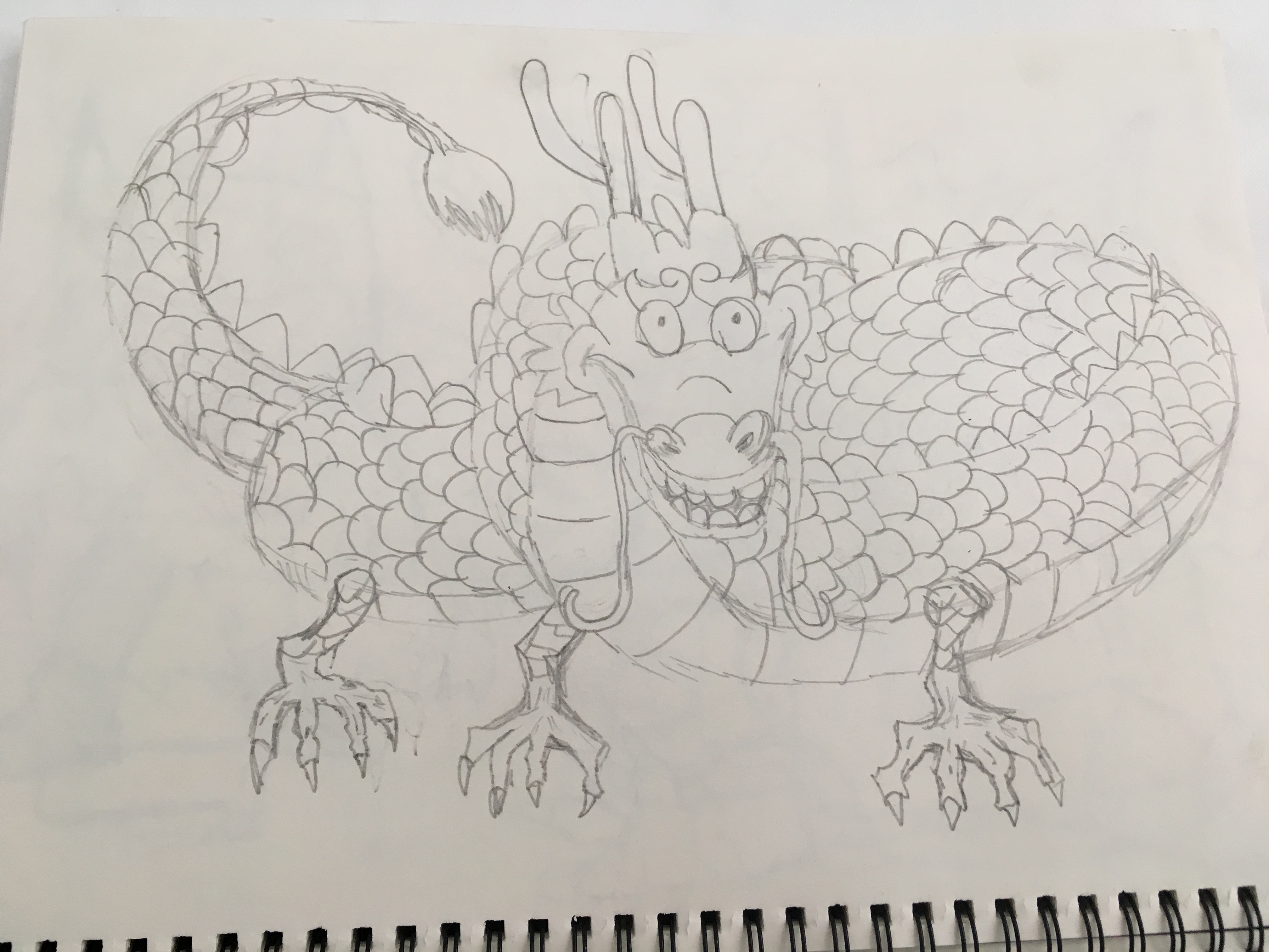
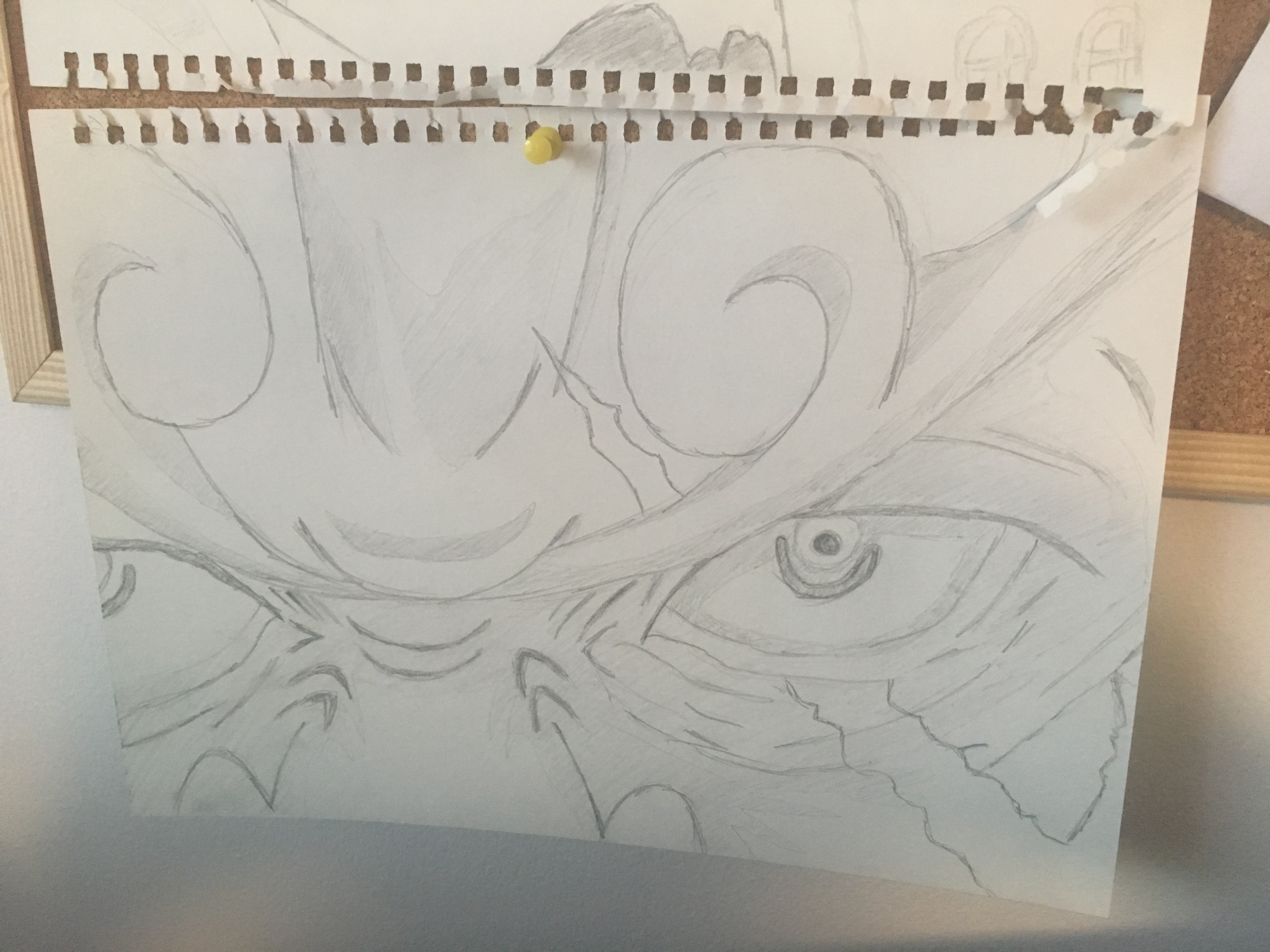
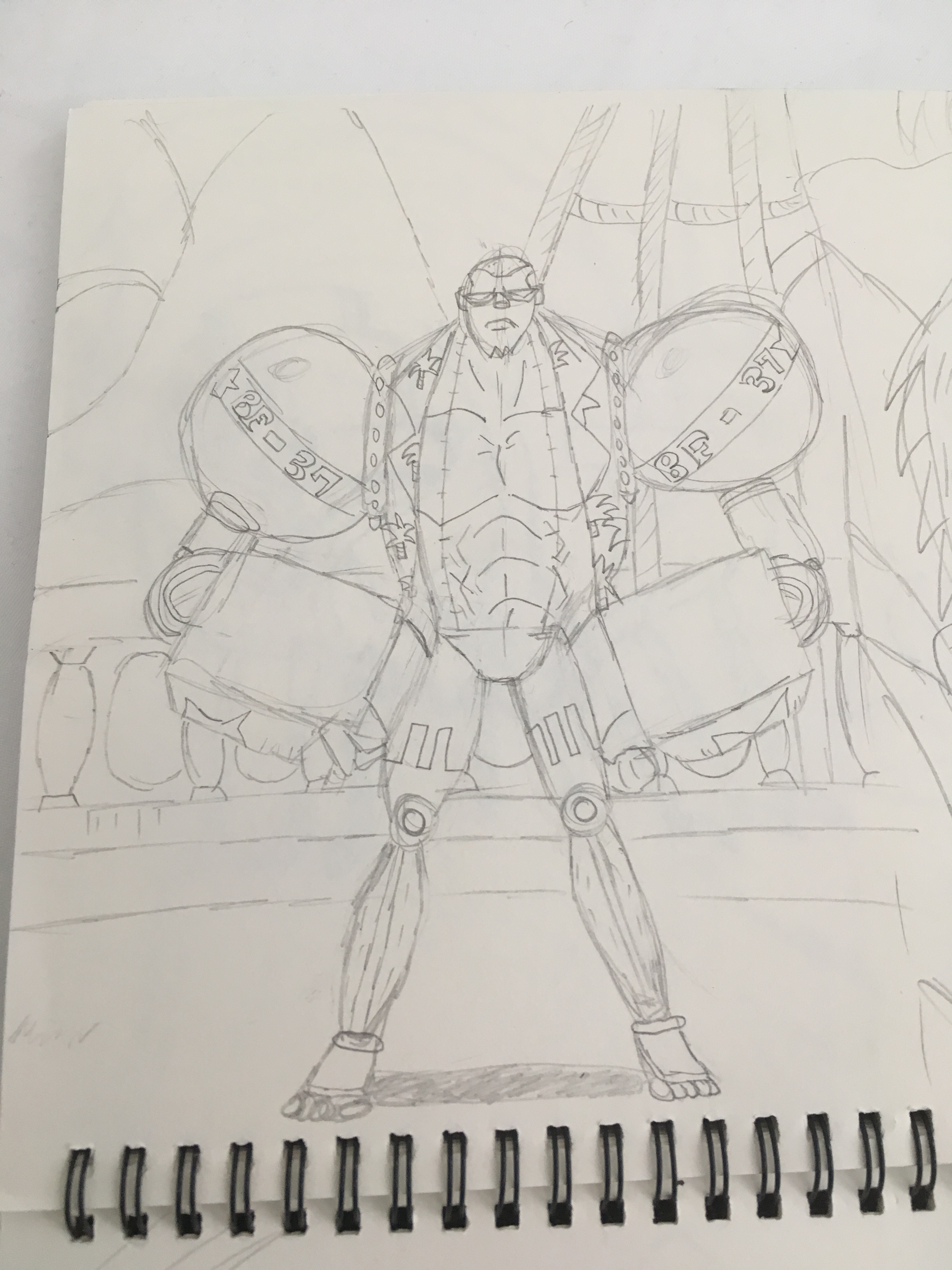
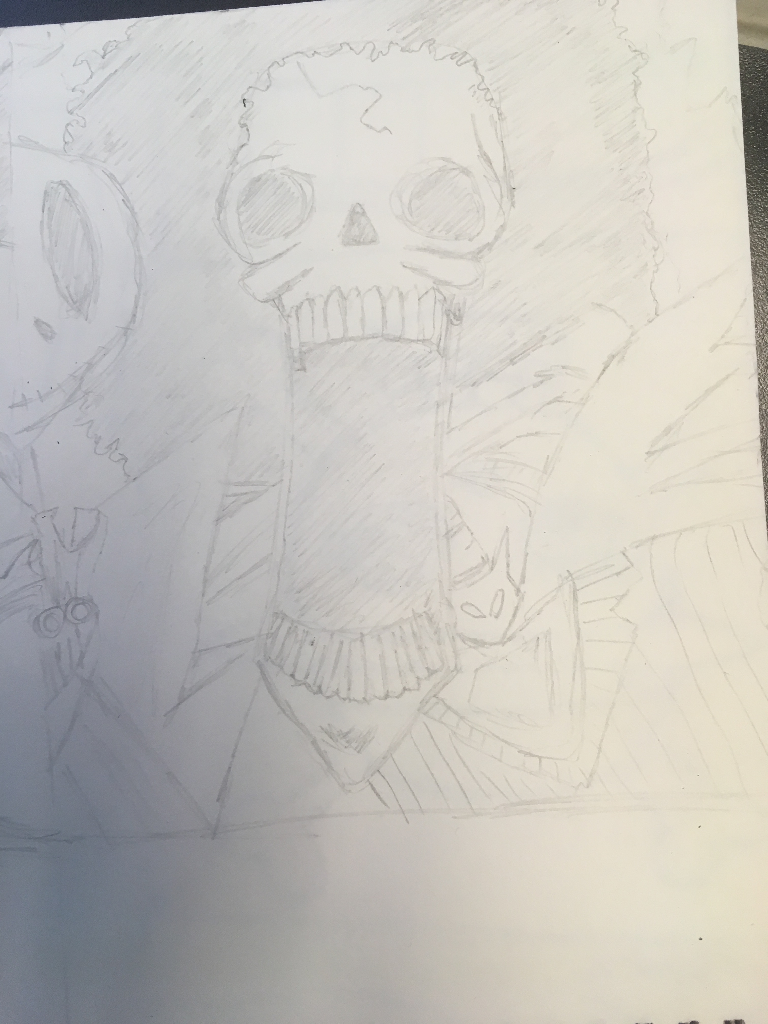
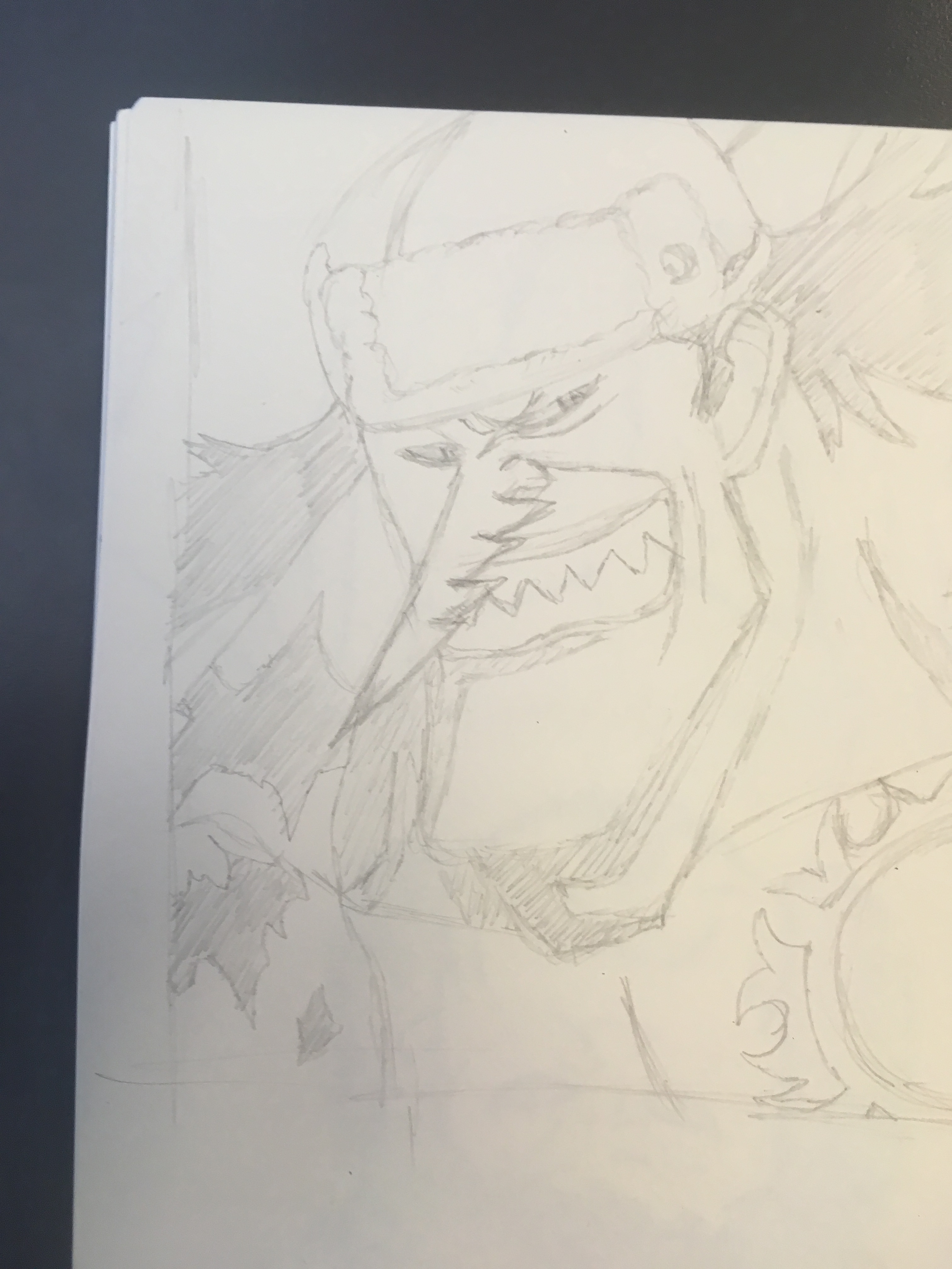
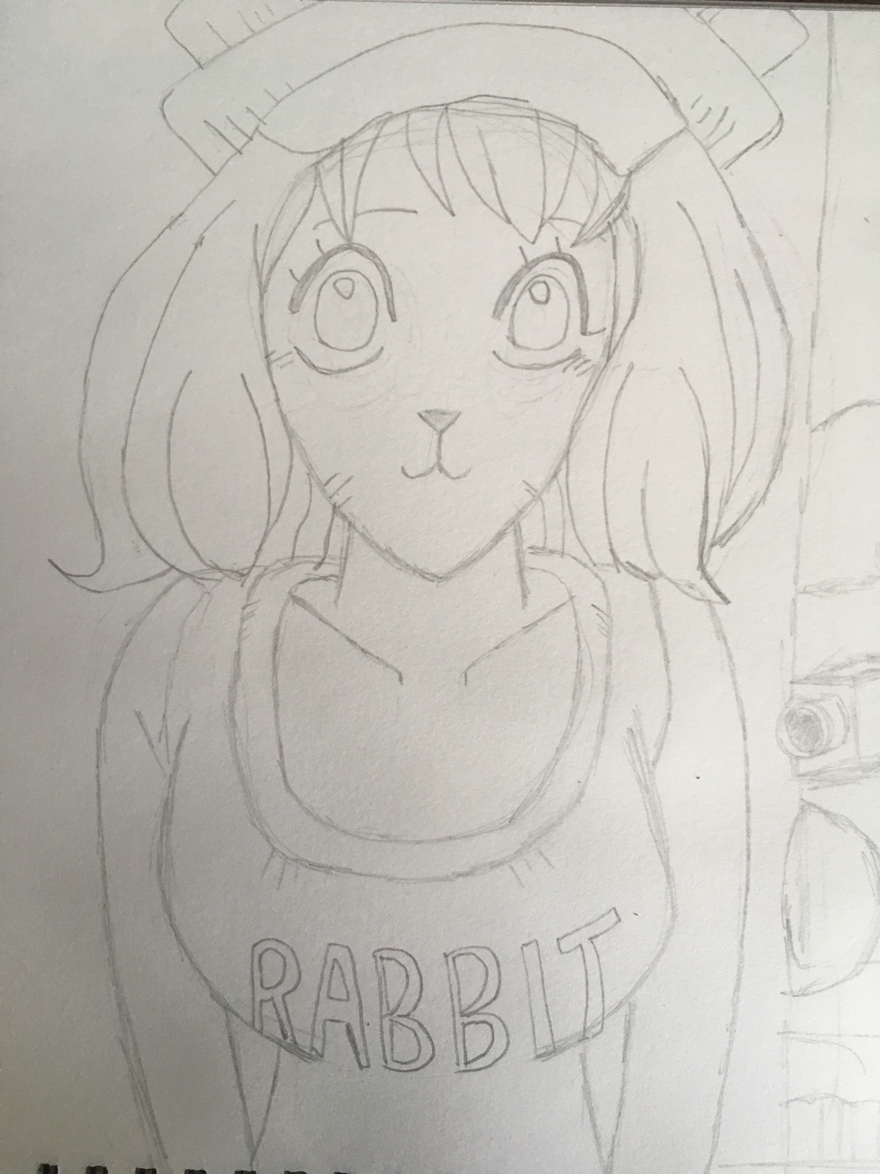
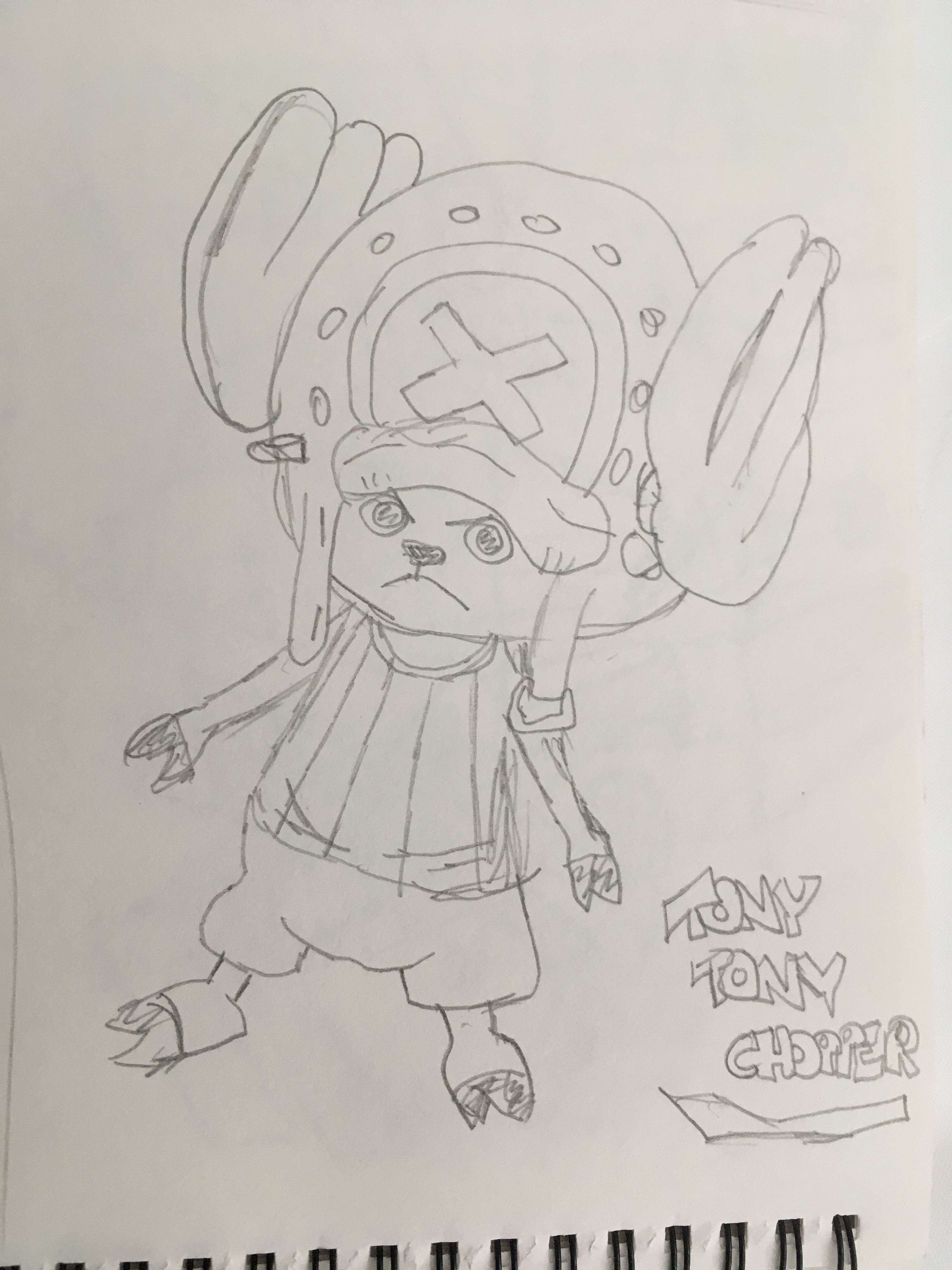
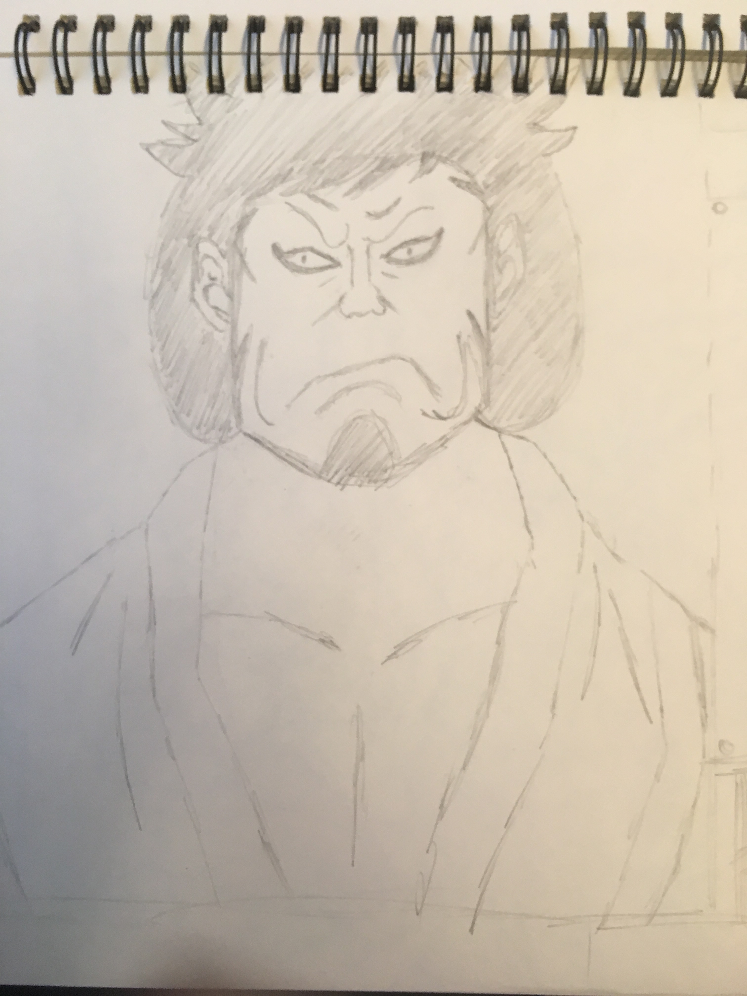
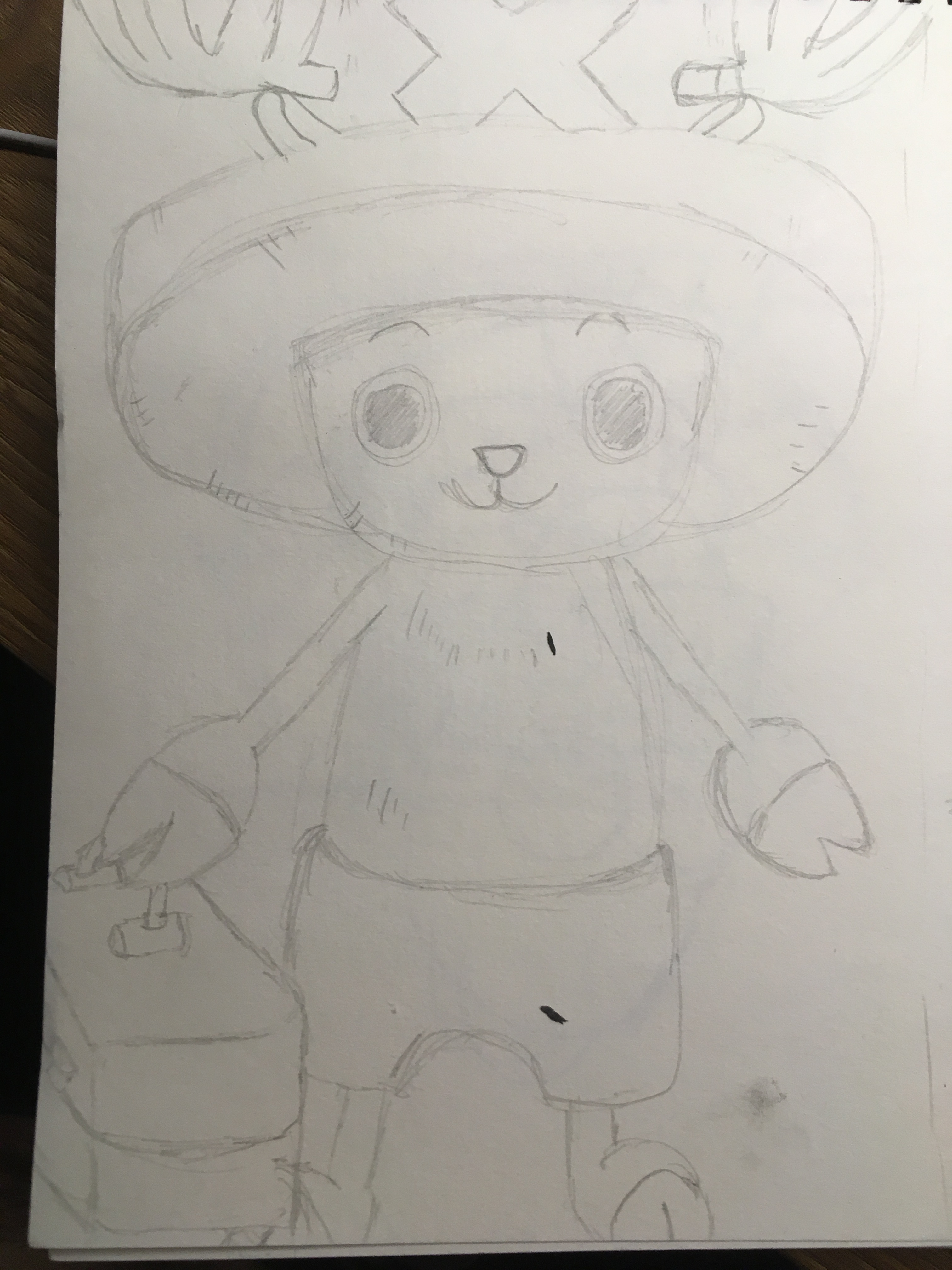
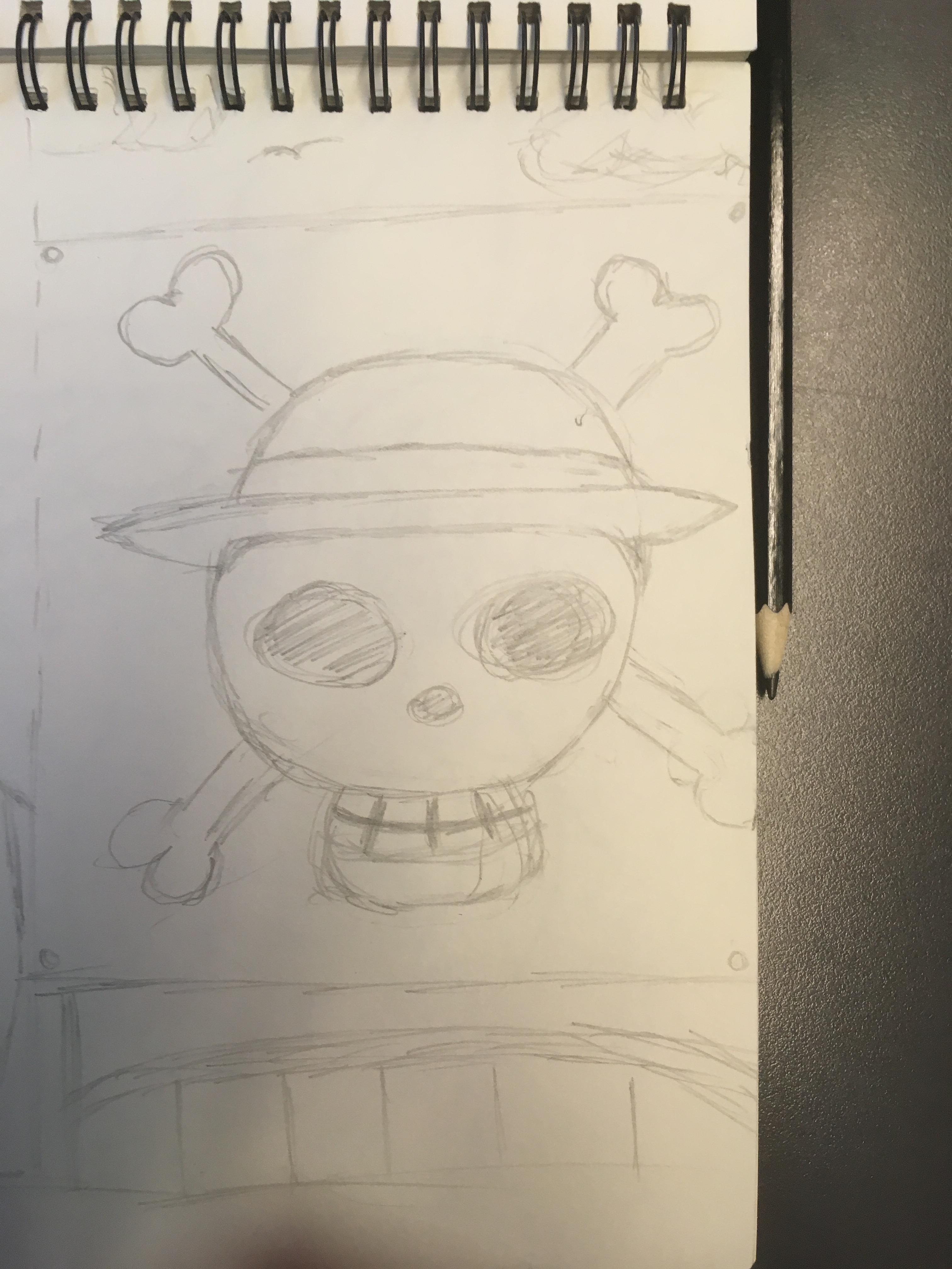
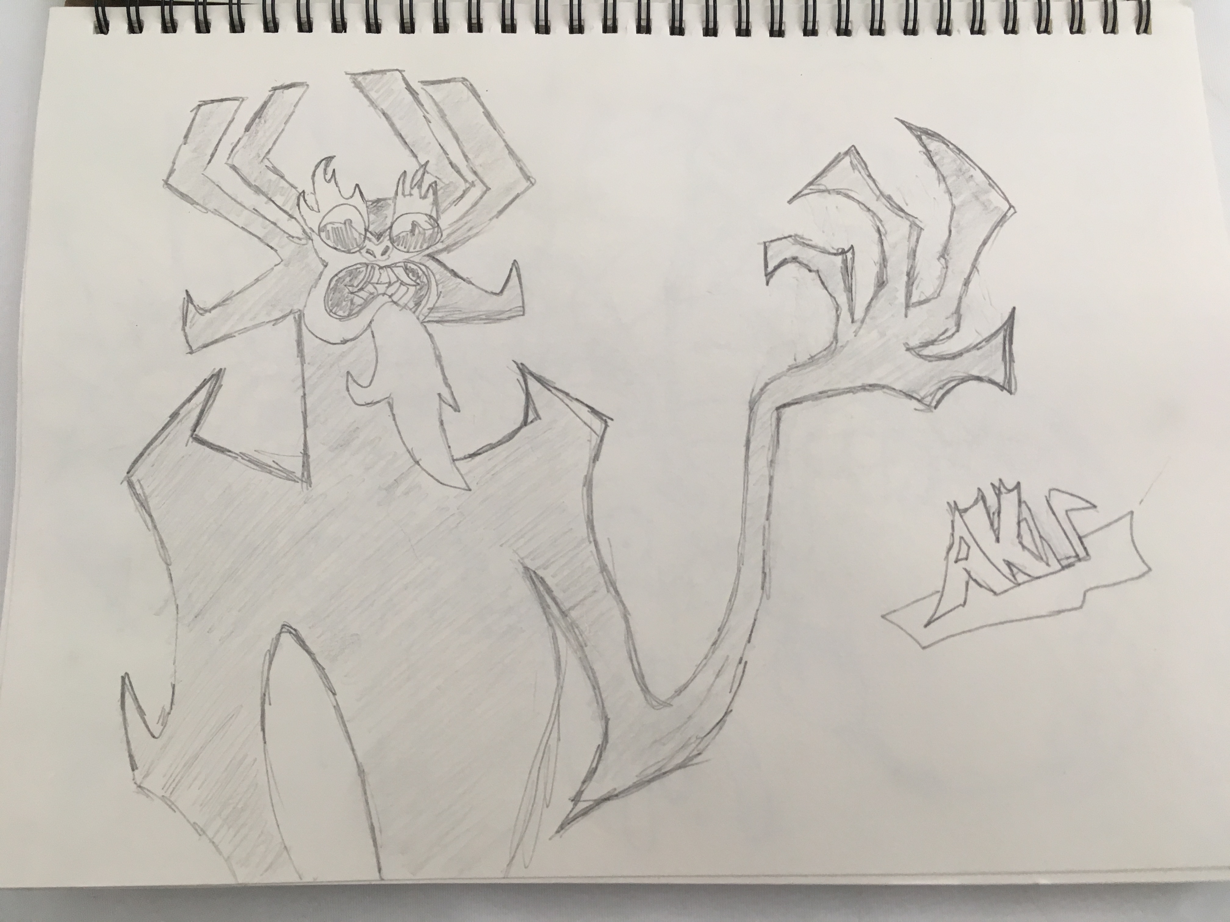
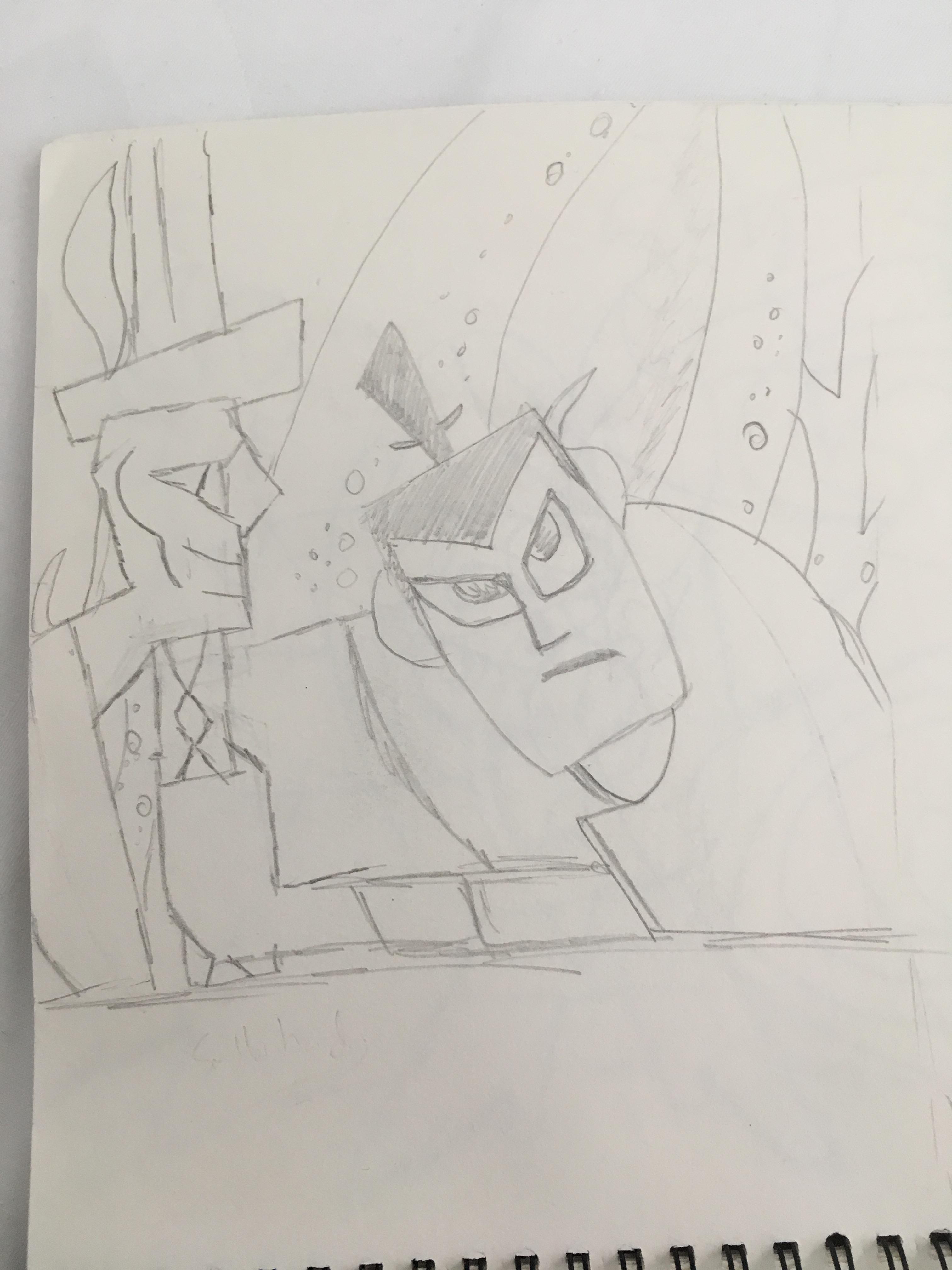
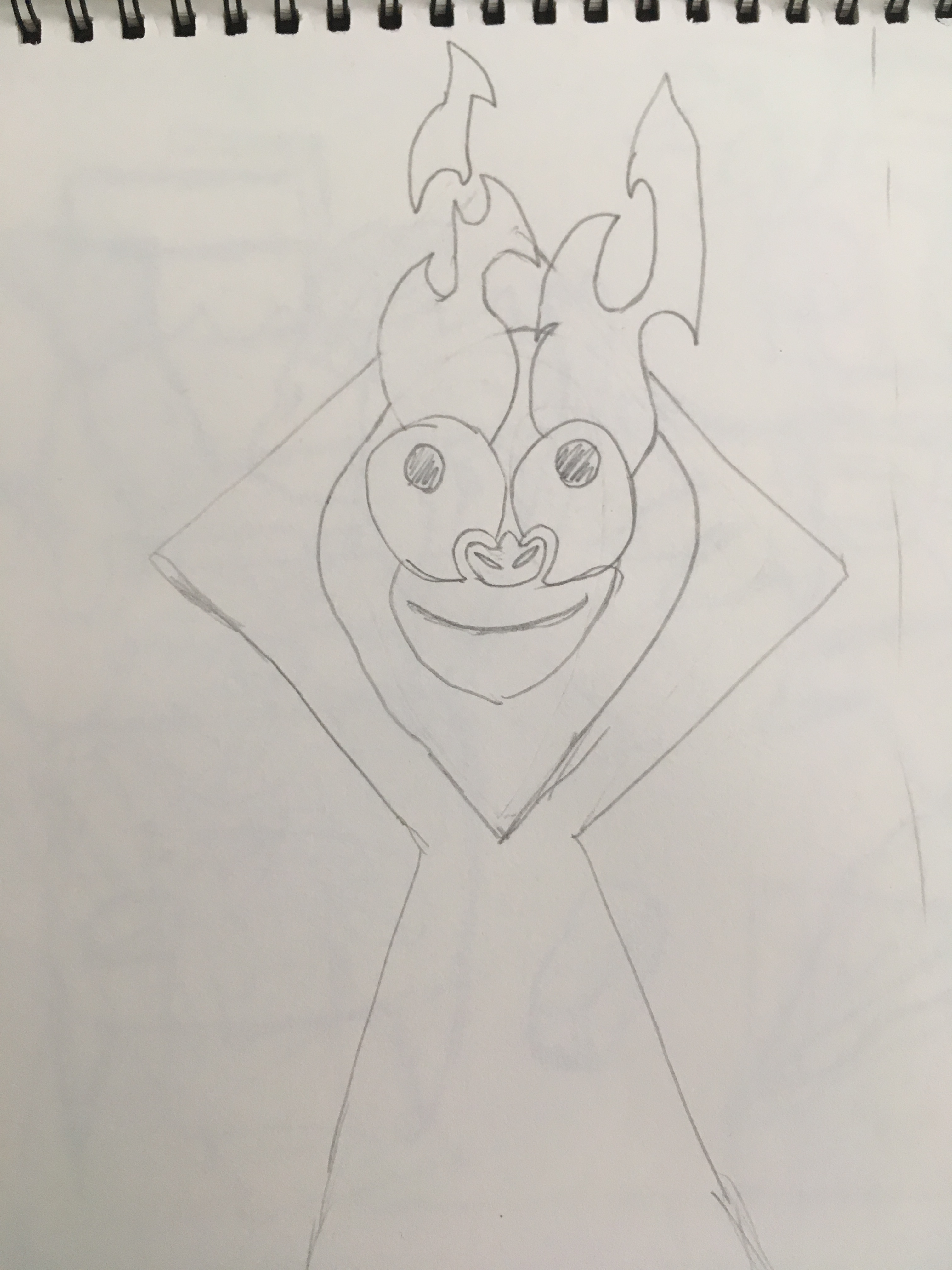
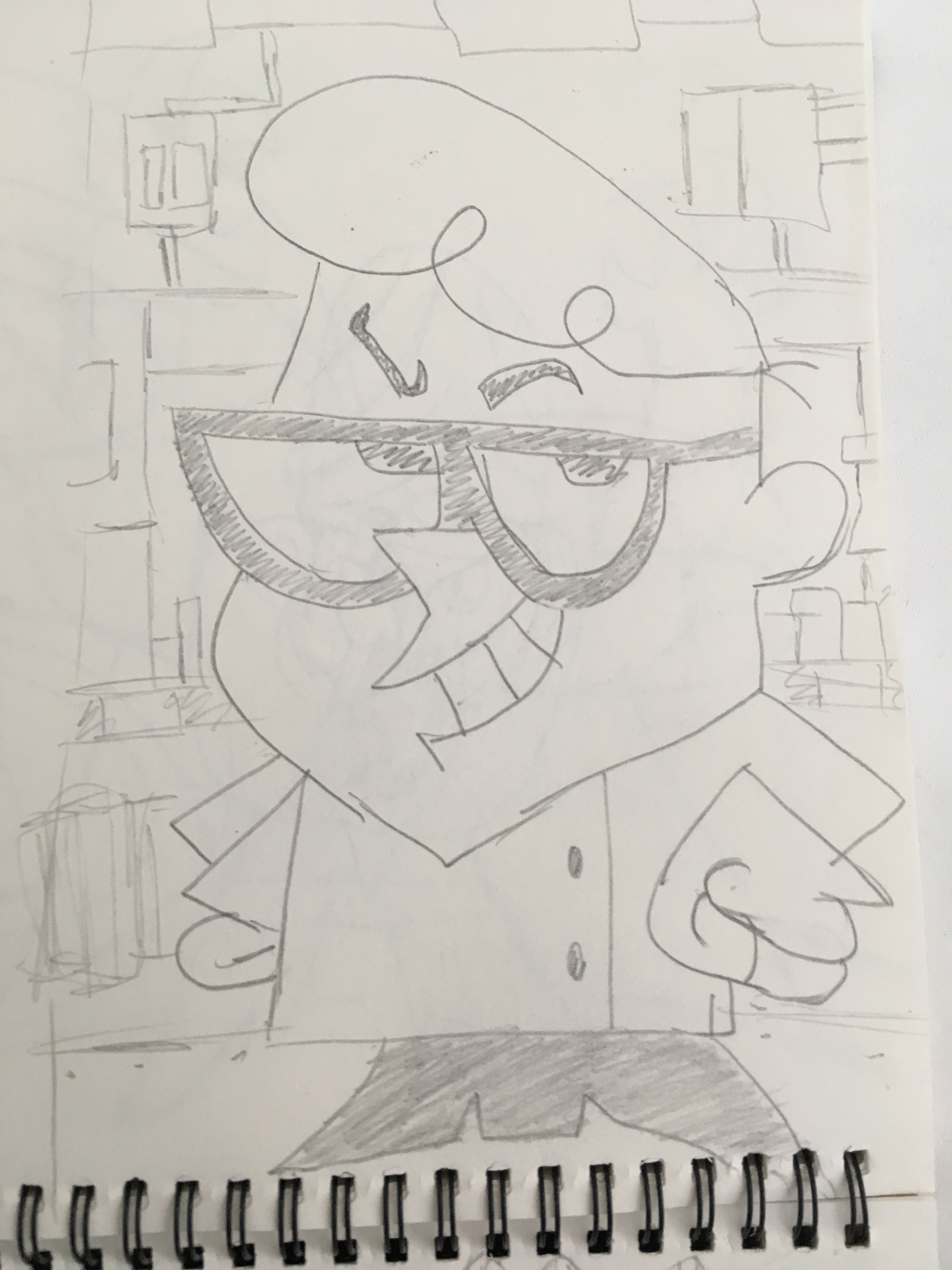
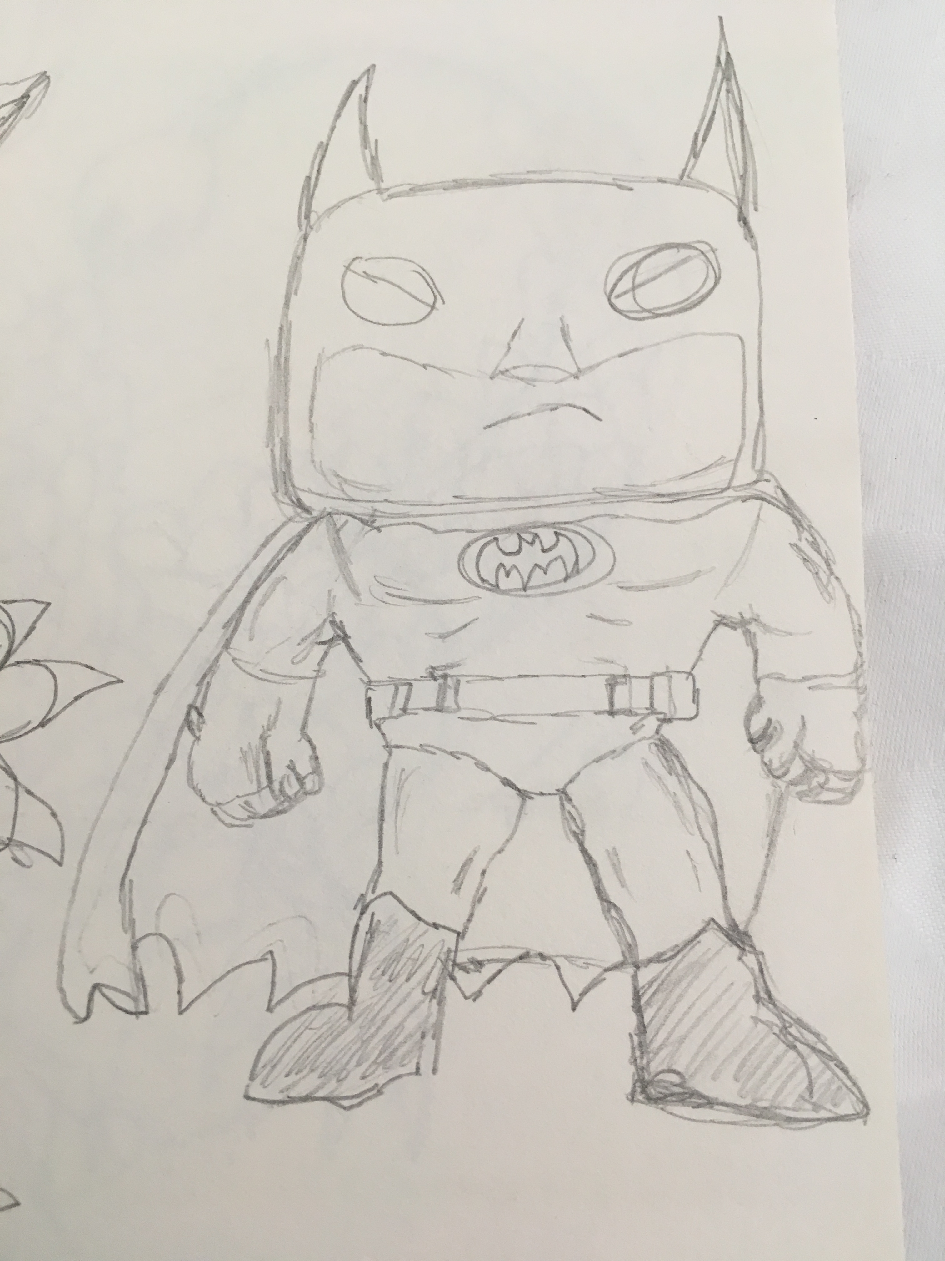
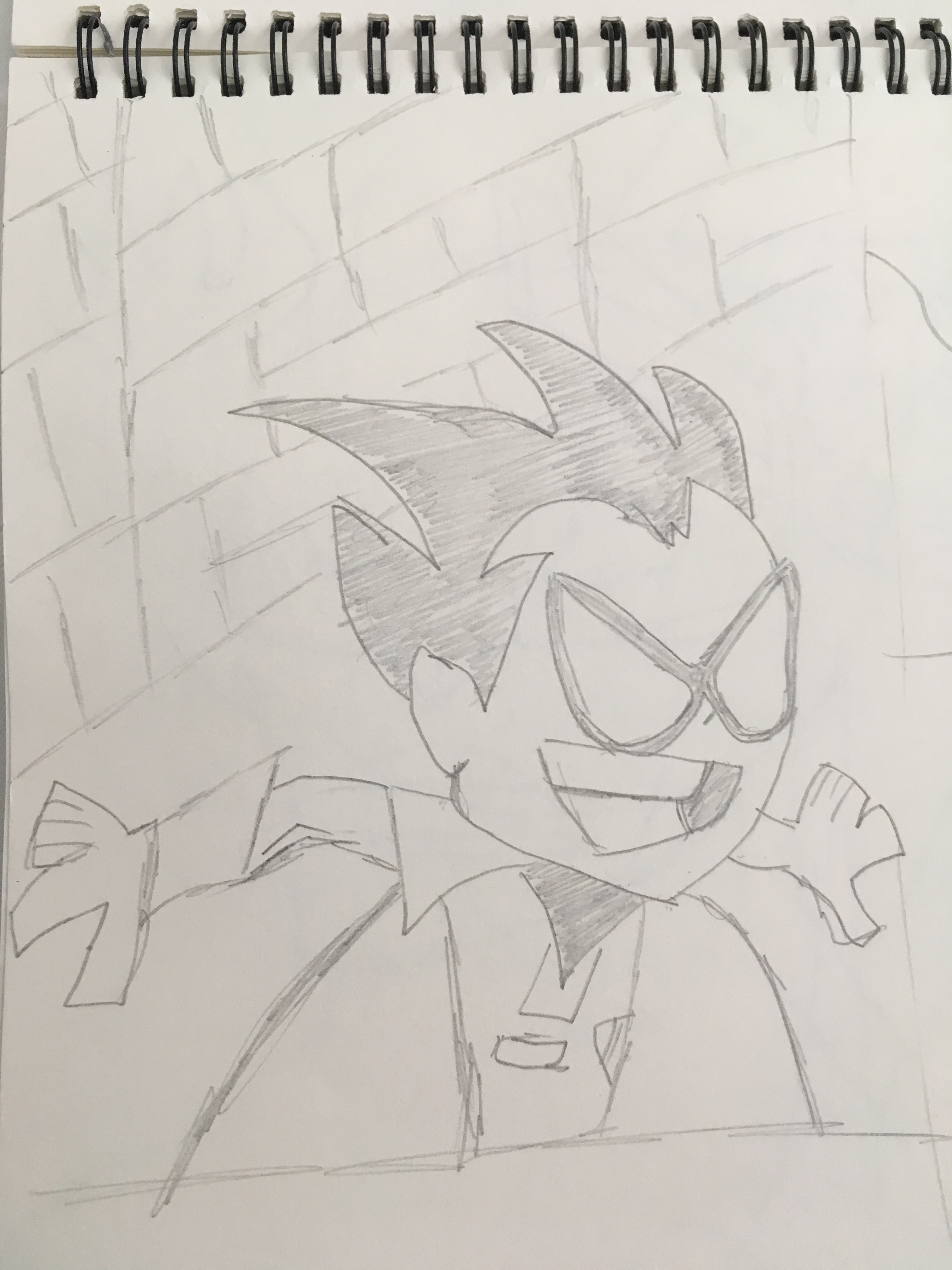
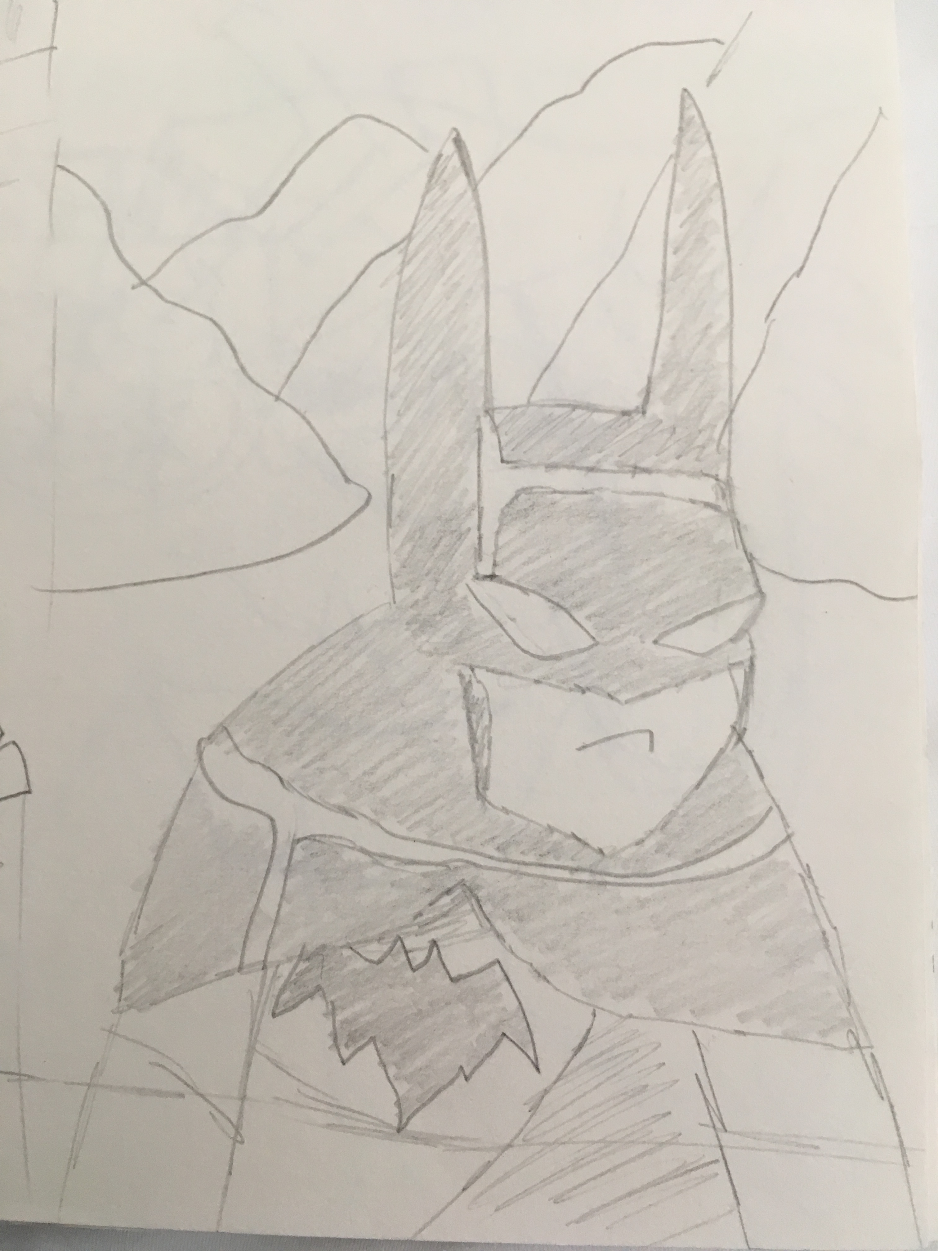
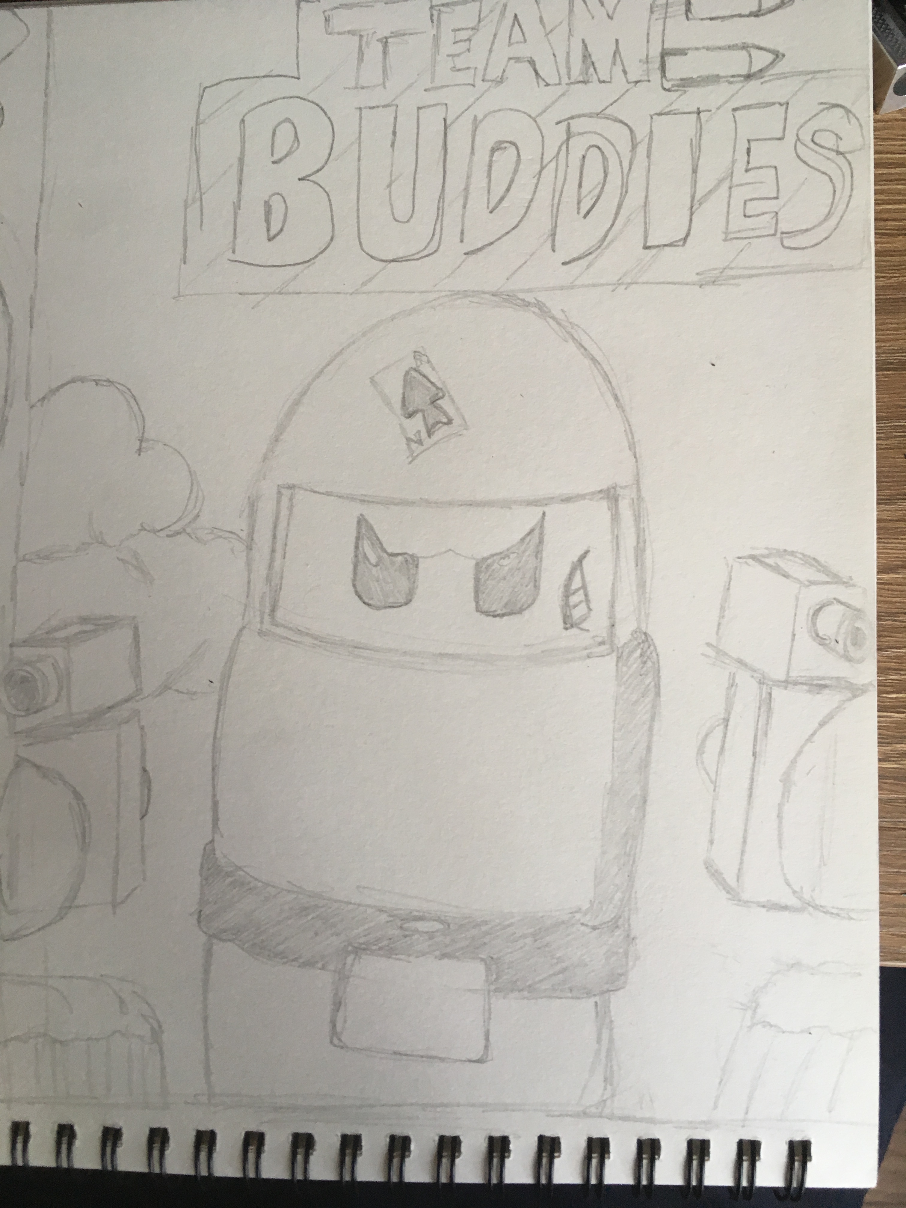
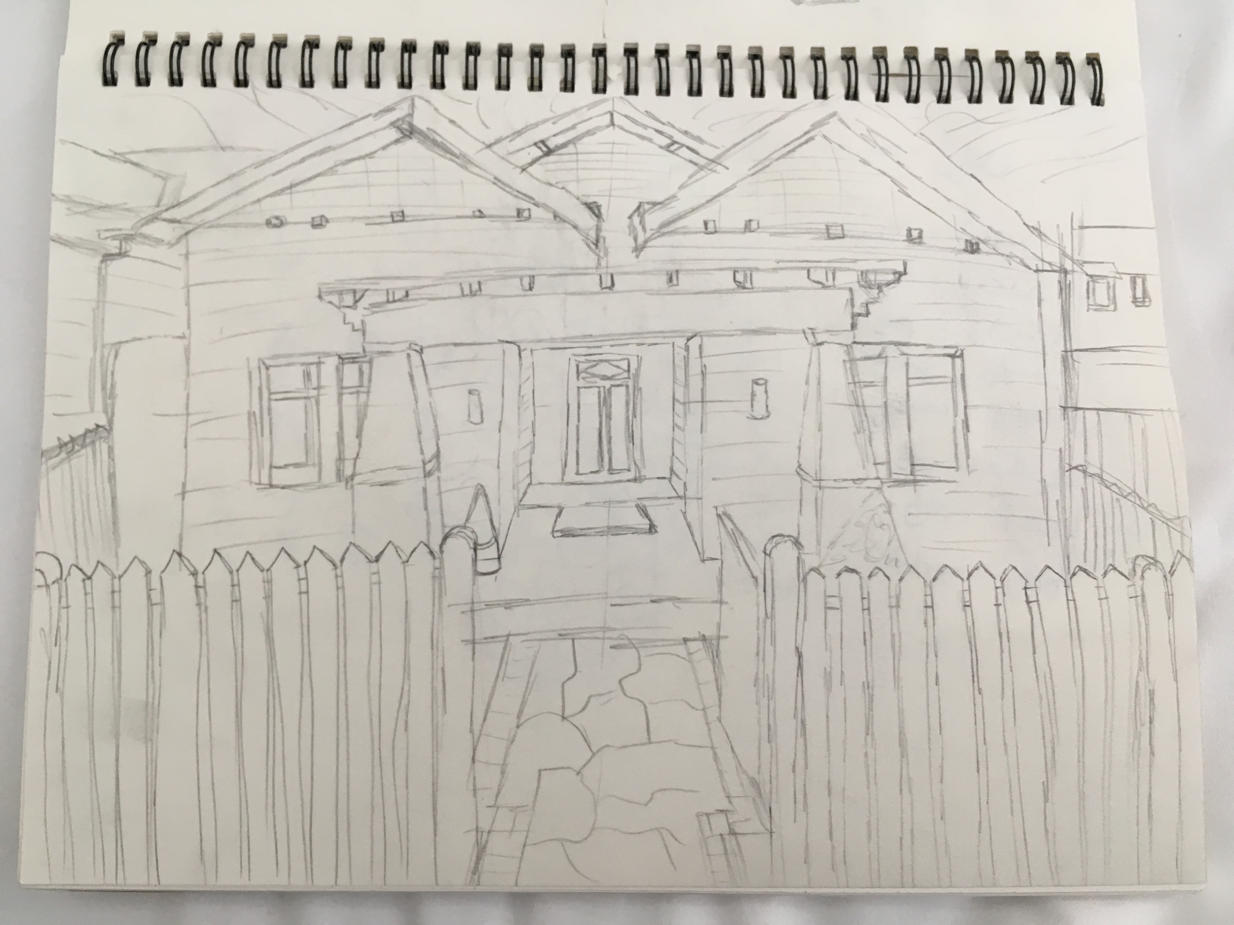
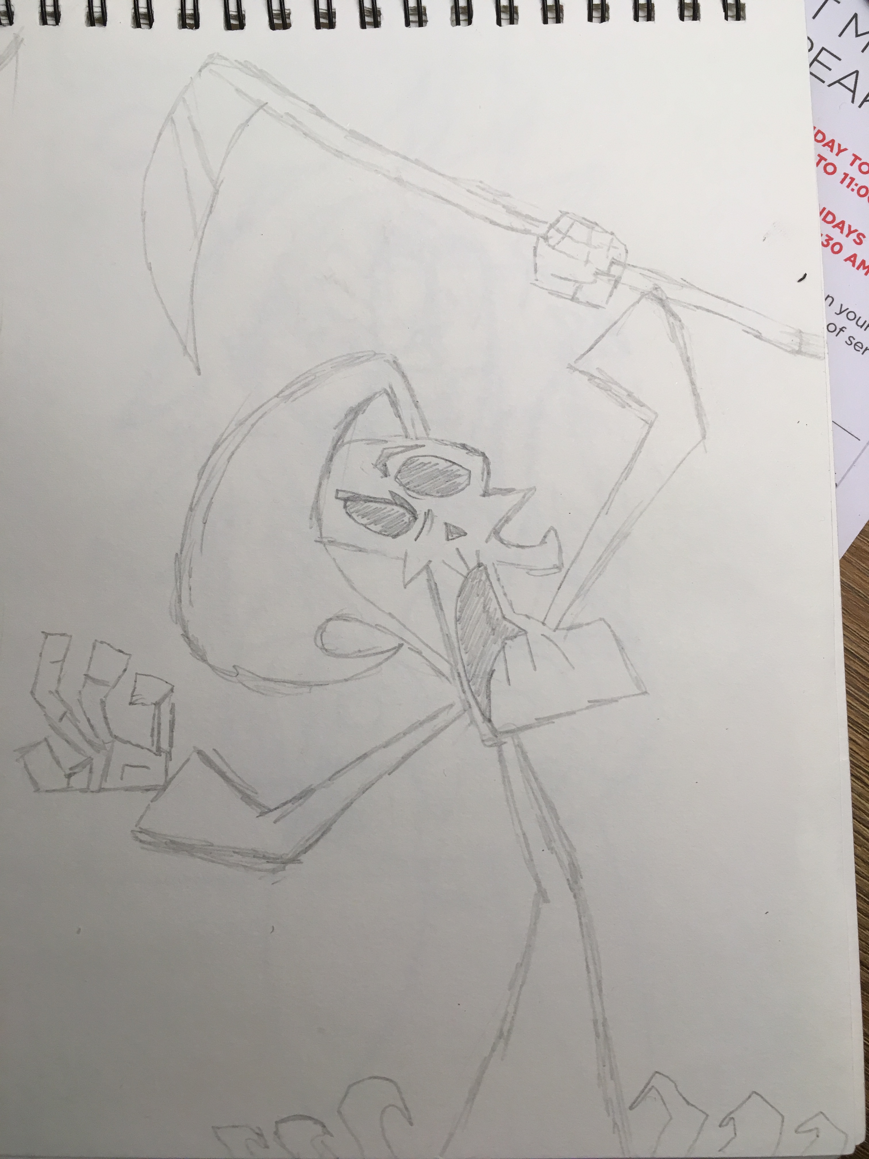
Since about over a month now I’ve started making sketching a common activity. Here are some that I’ve done.

Disclaimer: This is copy pasta art made for personal enjoyment/starting out!

One Piece

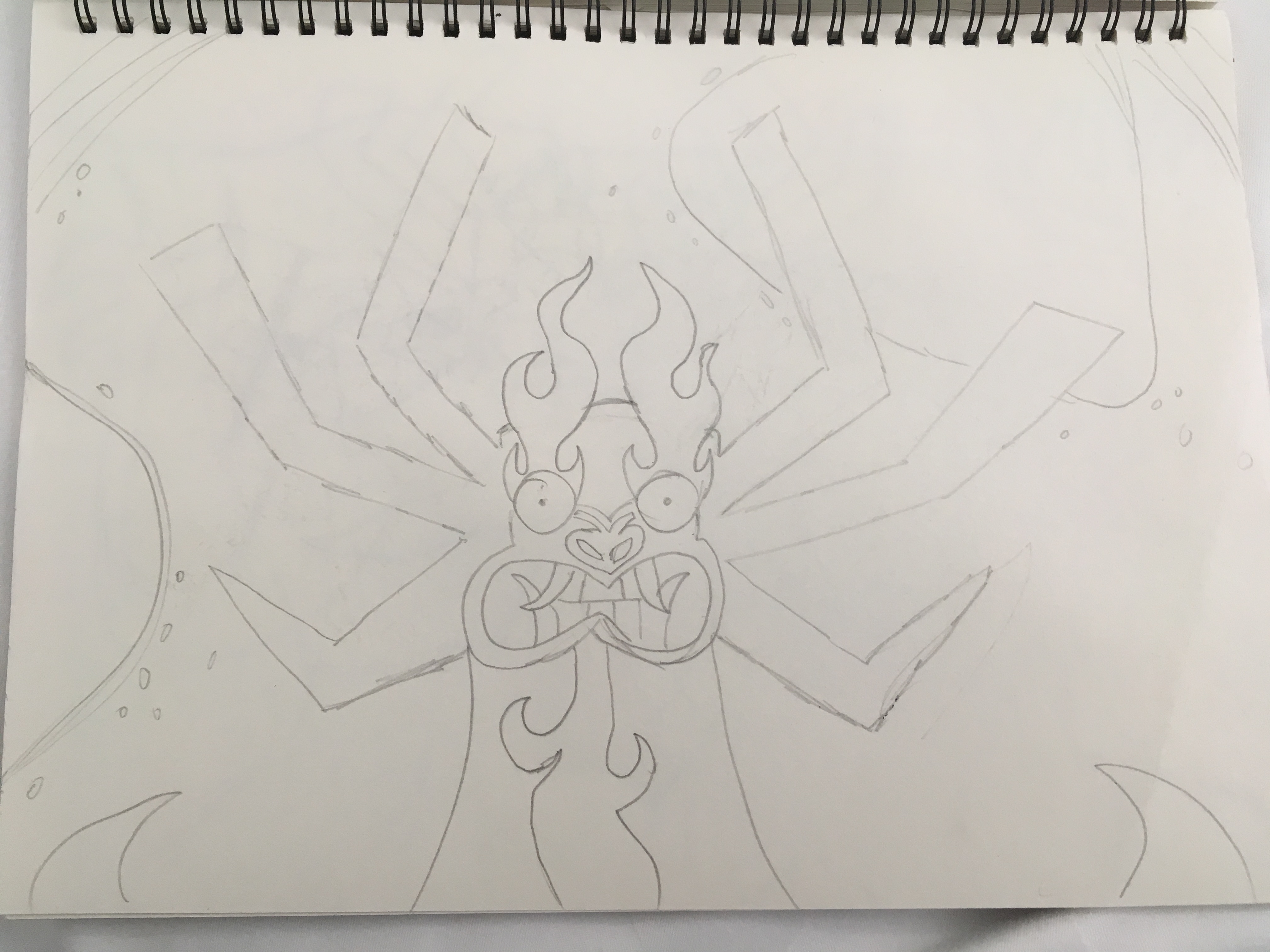
Samurai Jack

Misc

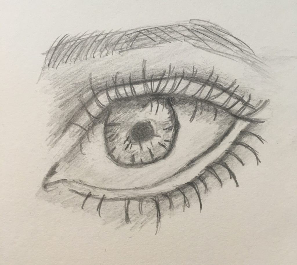
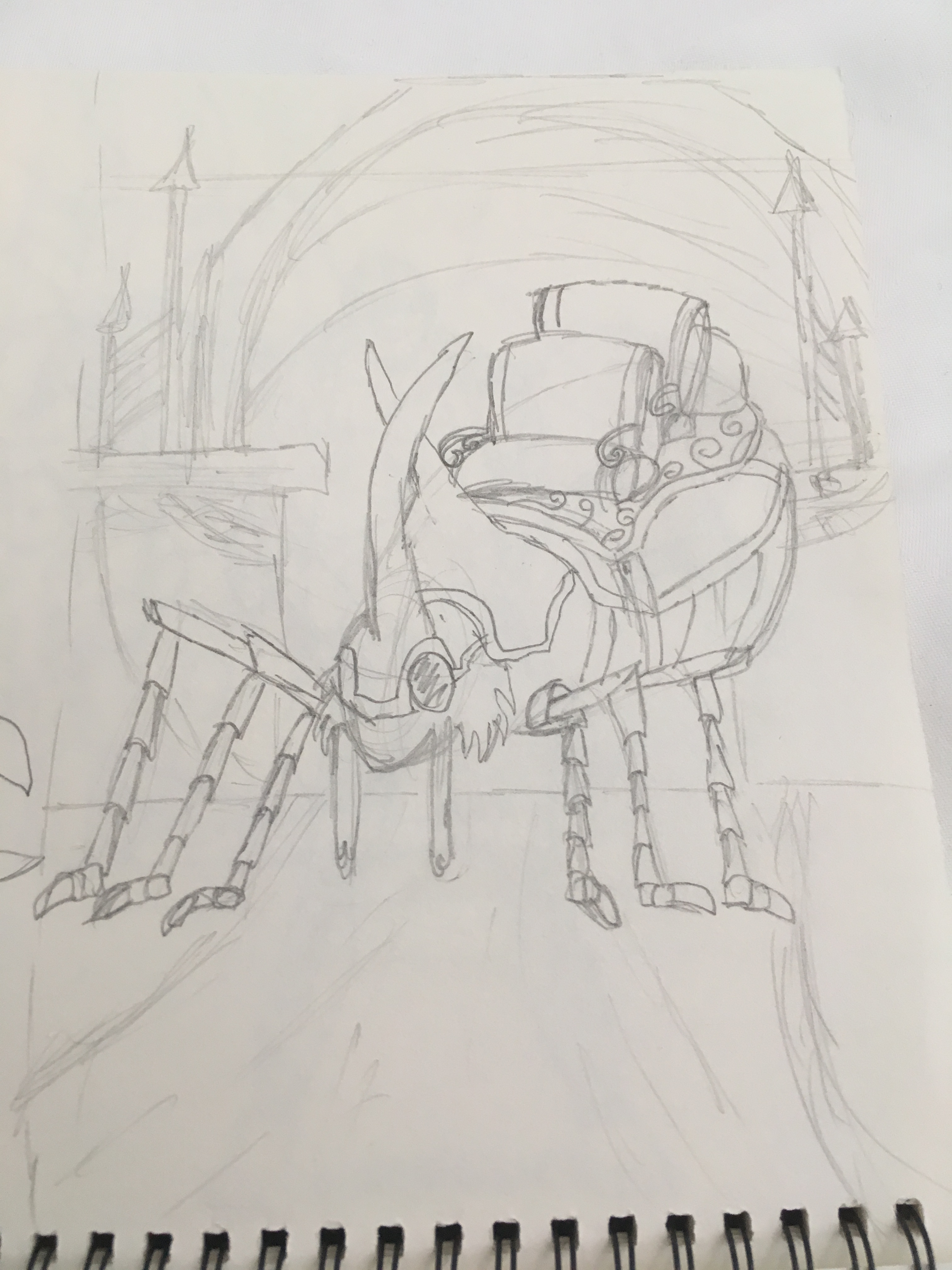
Also I’ve begun a course on Udemy to develop my drawing skills! This was the result of my first exercise!

Spider Queen and Company

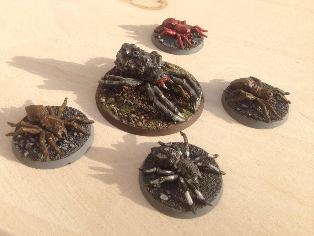
Here’s an painting project I did several years back when I was playing Games Workshop Lord of the Rings table top board game. The models are the Spider Queen (without her swarms) and four Giant Spiders.

Spider Queen and Company

To paint these models I followed the Fall of The Necromancer Sourcebook painting guide on page 25, so a big thanks to Games Workshop for such a great book. Unfortunately it’s no longer available, but there are of course still ways to get a copy…

Continue reading Spider Queen and Company

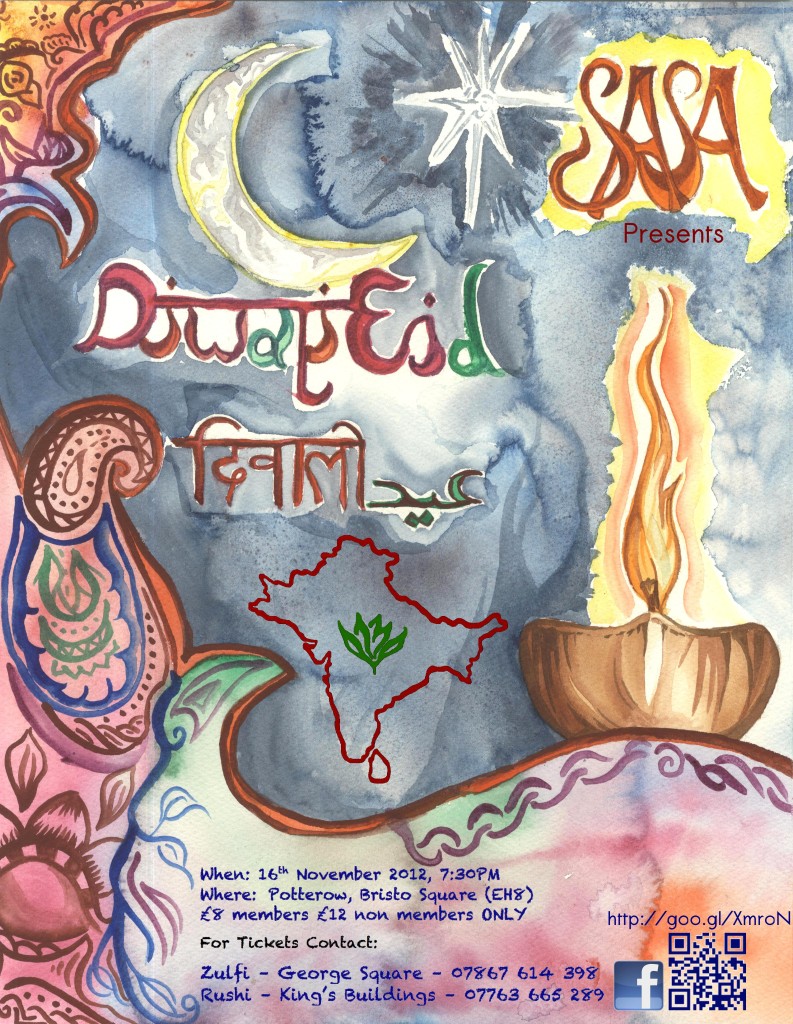
Diwali-Eid Poster for SASA 2012

Here’s a water color DiwaliEid poster created in 2012 for the University of Edinburgh‘s South Asian Students Association (SASA).

sasa-diwali-eid-poster-2012

I was responsible for the computer related art work (using Gimp). This involved adding a QR code, Facebook logo, the SASA logo, and supplementary text.

This project was done with the help of two individuals:

  • Punit Bhudia with his good advice and keen eye for editing,.
  • Anakral Frankenburger Bulhan the president of the society at the time, who as an amazing artist did a great job at designing and painting the poster that we used for our Diwali-Eid event.

I think it turned out well.

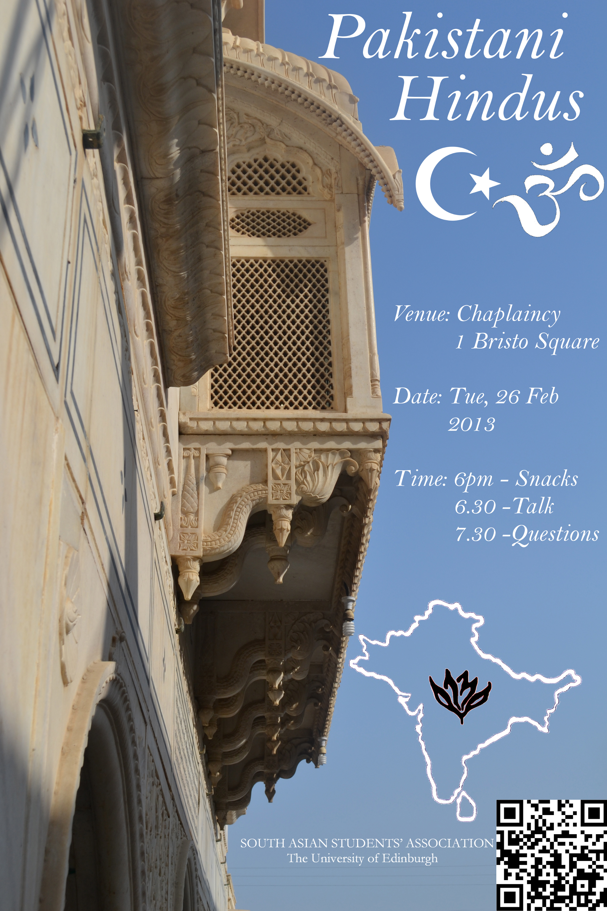
Pakistani Hindus

Here’s a poster/leaflet I worked on whilst part of The South Asian Students Association (SASA) at the University of Edinburgh. It’s the result of a collaboration of three committee members.

The picture has an aura of elegance and simplicity and the efforts in making this poster was to complement that.

Poster

The prominent color of the temple is a beige white; as the temple has ‘streaks’ of blue, the sky becomes a great addition in balancing the photo, and an ideal place for text. We avoided placing any text on the temple as to not mar it’s appearance. The color was chosen to be white, the white text on blue acts as a pleasing contrast to the blue details on the temples beige background.

The two symbols at the top are the moon and crescent of the flag of Pakistan, and Om a common sign for Hinduism. Together these symbols we hope represents a unified duality of Pakistani Hindus.

I was responsible for the computer related art work (done in Gimp) as well as the posters design, which was done in tandem with the help of Punit Bhudia. The president of the society at the time, Anakral Frankenburger Bulhan took the photo (a temple in Pakistan).

I think it turned out well.