Tag Archives: Project

Hopscotch Hamlet

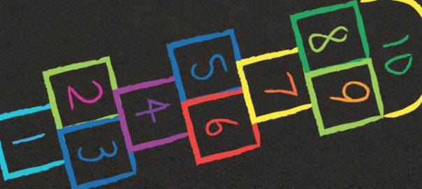
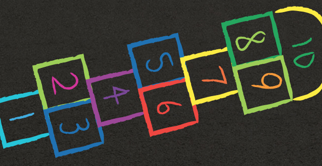
As part of Jesse Schell’s Game Design course at The Entertainment Technology Center we required to analyze and ‘improve’ the game of Hopscotch.

The goal of the game is to complete Hopscotch Toss the fastest.
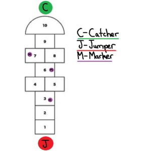
  1. In Hopscotch toss there are two teams which compete against each other on a standard Hopscotch board.
  2. Both teams have two players, a jumper and a catcher.
    1. The catcher stands at the final safe square on the Hopscotch board
    2. The jumper at the start of the Hopscotch board
  3. The jumper throws out three markers:
    1. When a marker is thrown the timer begins
    2. If a marker misses a square the marker is placed on the first square
  4. The jumper begins playing hopscotch with the aim of collecting and throwing markers to the catcher one at a time.
    1. If the catcher drops the marker the jumper must return to the start
  5. Once the jumper reaches the catcher who must have three markers in hand, the jumper turns round and continues playing Hopscotch.
  6. When the jumper reaches the start position reverse jumper and catcher roles. Now the second round of Hopscotch Toss starts.
  7. First team to complete two rounds wins.

Development

Part 1 - Analysis & Brainstorming

What makes a hopscotch a good game?

  • Simple to understand rules
  • Requires little equipment
  • Trains limb coordination
  • Easily extensible to multiplayer
  • Clear win state
  • Gamifies natural hopping movement
  • Low skill entry barrier
  • Immediate feedback on game state

Problems with the game your design might try to solve.

  1. Not friendly those with physical disabilities
  2. Can become boring due to its simple rule set
  3. Primary mechanic is jumps
  4. A static game space
  5. Minimalist Aesthetics
  6. Has no story
  7. Does not incorporate elements of modern technology
  8. Tests the body but not the mind e.g recall of facts, events etc.

Brainstorm 50 ideas on how you could improve Hopscotch

  1. Blindfolded
  2. With someone on your back while playing
  3. Jumping only when music is playing
  4. During a handstand
  5. On a climbing wall
  6. With multiple tokens
  7. Whilst singing
  8. Where you start with no squares and draw one turn by turn
  9. Three legged
  10. On stairs
  11. Backwards
  12. Eating icecream
  13. With two people at once
  14. With only one square
  15. On a board with tiles that turn in a pool
  16. Played using your fingers
  17. On a trampoline
  18. Interplanetary
  19. Over Skype in different countries
  20. Where you cant jump in squares based on a coloured dice, or coin?
  21. Story based, and where marker was thrown player has to participate in a story event and if they lose they dont get to score a point by playing a round of hopscotch
  22. Edible, where a player can eat one square but has to make another one with provided food
  23. Where the game space drawn from star constellations
  24. Meta – smaller hopscotch games feed in a larger one. Two people play against each other in each mini game, and the winner moves forward on one square on the board till they reach the meta game marker and return as in a normal game
  25. Color coded special square events which if a person steps in they have to do like shout a word, if they fail they have to go back to the start
  26. Place the marker not by a throw but by a dice roll
  27. People are put into teams based on costumes
  28. The person has to do a dance move when spinning round at the end
  29. The person has to do karate punches on each jump
  30. Throw the marker again when it is picked up
  31. Two people have to mirror each other on different games
  32. It is attached to another game that based on your speed gives you more points/ progresses more in the level
  33. In VR with rivers of lava
  34. Where each item rotates round and one has to jump from square to square
  35. One player throws the marker and stops at that position. Then throws the marker forward again. The next player jumps to the position of the last player who jumps to the next place the marker is now at. The process continues until the marker has been returns to the beginning.
  36. Competitive, two games of hopscotch, the marker can be thrown onto another hopscotch game to make it harder for them to complete the round
  37. On a dart board. Objective is to hit the center of squares avoiding the one other player threw the marker dart at.
  38. Three legged – two people tied together play
  39. Relay, where the marker has to passed from game to game.
  40. Players stand in Hopscotch squares and pass the marker to other players to complete the game.
  41. Where the panels light up and one must jump only on lit panels
  42. On the moon
  43. On a single wheel cycle
  44. With sword fighting battle rounds per block, losing sends you back to the start
  45. Complete Hopscotch in a tiger cage before the tiger is let loose in it
  46. With a slide at the end of the game
  47. There are two markers and those are the only ones that can be jumped in
  48. There are markers on every square and winning is jumping and picking up as many as possible in a given time.
  49. One person is continuously jumping and another person throws a marker and tries to have the player jumping fall on that marker.
  50. On a keyboard one has to press the 1-9 keys in the same pattern, and avoid the marker square set by the computer.

Part 2 - Selection

From your list of ideas select three and describe them in more detail

Based on number 25, 39 and 48

  1. Picto Hopscotch – Hopscotch is played in the traditional American school yard manner except for one difference. Each row has a picture associated with it. When the player jumps on any square of the row they must shout out the picture. If they do not the player has to go back to the beginning again.
  2. Relay Hopscotch – Two hopscotch play spaces are set up. One person from each hopscotch space begins playing, and completes a game and gives the marker to an awaiting second player who plays a game of Hopscotch. First team to complete both hopscotch games win.
  3. Hopscotch Toss – Two teams play Hopscotch competitively. Both teams have a jumper, and catcher. The jumper plays hopscotch and collects the markers and throws them to the catcher. The team with all the markers in the catchers hand and jumper at the end win.

Part 3 - Improvement

Hopscotch Toss

An Attempt at solving problem 3 by introducing throws

The goal of the game is to complete Hopscotch Toss the fastest.

  1. In Hopscotch Toss there are two teams which compete against each other on a standard Hopscotch board.
  2. Both teams have two players, a jumper and a catcher.
    1. The catcher stands at the final safe square on the Hopscotch board
    2. The jumper at the start of the Hopscotch board
  3. The jumper throws out three markers:
    1. If a marker misses then the player rethrows
    2. When the last marker is thrown the timer begins
  4. The jumper begin playing hopscotch with the aim of collecting and throwing markers to the catcher one at a time.
  5. The team is fastest to get all the markers in the catcher’s hand and the jumper at the end wins.

First Loop

The first iteration of gameplay showed me various areas that needed more detail and consideration. Useful moments that occurring during my playtests were:

  • Instructions should be short and concise otherwise they bore playtesters. So I should better prepare my rule for fast and easy digestion.
  • Great design moments had laughs or confusion which immediately drew my attention to areas of the game I needed to work on.
  • Playing the game exposed rules that I needed to clarify such as how to handle drops, fumbles of the jumper, missed throws.

Bad

  • I did not consider adding the throw to the timed phase of the game. Doing so might add tension to that part of the game.
  • The catcher reported wanting to do more.
  • I had only one game setup at a time, it would have been more enjoyable to have both games occurring simultaneously.

Good

  • Players clearly enjoyed throwing markers and catching them.
  • The game was picked up very quickly due to its rule set

Second Loop

With the second iteration I intend to adjust the rule set to include new cases for when the jumper and catcher fumbles.

  1. The jumper throw phase is included in timing.
  2. If the marker is thrown out of boundaries it is placed on the first Hopscotch square.
  3. If the catcher drops the marker the jumper stops moving until the catcher picks up the marker and returns to the safe zone.

Playtested with the above changes had the following effects:

  1. Heightened the tension during the beginning of the game.
  2. Made jumpers more careful with their throw. They would take safer shots, but those who successfully made riskier shots got greater rewards.
  3. Heightened the tension during drops, particularly on the catcher as they scrambled to get the marker..

Playtesters reported having an enjoyable more fluid experience. They also made two suggestions:

  1. The experience be ‘circular’. When the jumper reaches the catcher who has three markers in hand, the jumper turns round and continues their Hopscotch game (without the markers) instead of ending the game. On reaching the beginning of the Hopscotch board the Catcher now switches roles and becomes the Jumper, and the game continues.
  2. The jumper returns to the start if the catcher drops the marker.
Shogun 2s User Interface, Center

The central area of the Total War interface receives the highest attention from the player. This post will look at a number of the elements that appear there.

Total War Encyclopedia

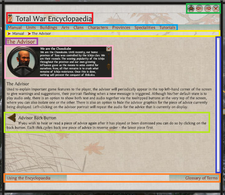
There are many pages within the encyclopedia. A look at one page gives a good understanding of the user interface (UI) element given the consistency used throughout the encyclopedia.

Encyclopedia Page

  • Light Blue – Main Subject Categories.
  • Dark Blue – Scroll Bar.
  • Green – Navigation Buttons.
  • Light Green – Part of Page Description.
  • Orange – Topic Navigation.
  • Pink – Relevant UI Image.
  • Purple – Page Title.
  • Red – Main Title.
  • Yellow – Browser Breadcrumb.

Notes

  • The scroll bar (Dark Blue) is not themed, resulting in it looking quite out of place. Perhaps this area was not given as much priority which is understandable as perhaps players don’t use the encyclopedia so much? From my experience I didn’t, and that is a sign of good game design.
  • The designers used the encyclopedia icon next to the UI elements main title (Red) likely to subtly have a player associate the image with the words Total War Encyclopedia.
  • The cancel button, and the navigation buttons are grouped together (Green) in the top left. For this area the designers have used the Main Menu button for the Home Button in the encyclopedia, they rely an understanding of ‘importance’.
  • The use of bread crumbs is good for players to quickly backtrack when navigating (Yellow).
  • The on hover underlining used for the main page categories is more link like (Light Blue).
  • There is a further reading tab located at the bottom of the page (Orange) which makes sense since the read is likely to look there. At the bottom of the page, the left and right topic options are displayed based on related topics in the manual.
  • For the main article they used topic headings, text descriptions with images, and icons which prove to be very helpful (Pink & Light Green) in conveying the point of the article.

Continue reading Shogun 2s User Interface, Center

Shogun 2s User Interface, Bottom Right

Bottom Right UI Element

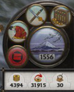
The bottom right UI element is located in a circular image that suits a dial design. It balances well the circular dial located on the opposite side of the campaign map page. The UI element can be split into two major parts.

First is the management dial which contains the vast majority of this UI elements functionality. Secondly is the resource pane which includes an overview of the most important resources used in the game, money and food.

Management Dial

Management Dial
Management Dial
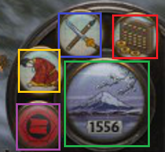
  • Blue – Technology.
  • Green – Turn.
  • Purple – Clan Management.
  • Red – Finance.
  • Yellow – Diplomacy.

The UI element is compact, containing a number of icons that are representative of their function. There is though a small risk of accidentally hitting the turn button given its size and position.

  • Diplomacy (Yellow) uses a bowing person which appears to be an envoy.
  • Clan Management (Purple) uses a Clan flag which is the best representative of a Clan, and since the image is used in many other places in game the player is familiar with the image.
  • Finance (Red), uses an abacus looking instrument which is a tool used for accounting, as well as images of the currency to associate the button with in-game money.
  • Technology (Blue) uses a picture of a sword and another item representative presumably related to technology.
  • The turn button (Green) reflects the season as well as the year written clearly in black.

Management Pages

A standard used throughout the management pages is the location of the help and exit buttons. The help icon is located on the top right, and the action buttons are centered at the bottom of the page. Perhaps the help button would have been better located on the top left to coincide with the position of the help button on the main campaign map page.

Clan (Purple)

On pressing the purple icon a clan management page opens that has a number of tabs.

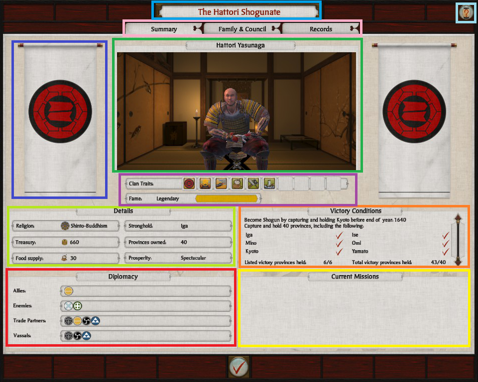
Summary

The summary tab is the default tab that opens. The page includes several clan related thematic elements namely the clans symbol (Blue), the name of the daimyo and an in game image (Green).

shogun_2_interface_clan_management_summary

Continue reading Shogun 2s User Interface, Bottom Right

Shogun 2s User Interface, Top Right

The Top Right UI Element in Shogun 2s Sengoku Jidai Campaign Map consists of three primary elements.

Top Right UI Element

Map & Global Effects

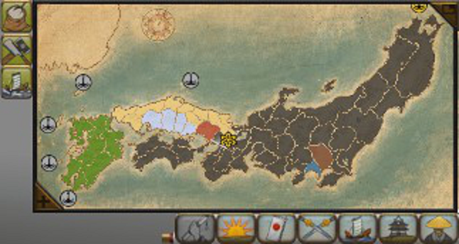
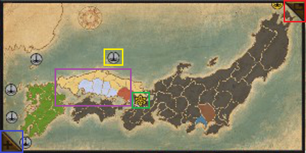
The first element is a Map of Japan. Known clans territories are marked with a representative color (e.g Purple), and clicking the elements of the map takes you to that element on the 3-D map.

In addition selecting the Map Tabs results in icons appearing on the map e.g Navy, and Army symbols which when pressed take you to the unit. Certain symbols are given different styles depending on whether they are ‘active’ or not. An example of an inactive symbol is the trading post (Yellow), an example for active is the symbol used for the city of Kyoto which has been captured in this Campaign (Green).

shogun_2_interface_top_right_map

  • Blue – Expand Button.
  • Green – Active Icon Style.
  • Purple – Multiple Clan Colors.
  • Red – Minimize Button.
  • Yellow – Inactive Icon Style.

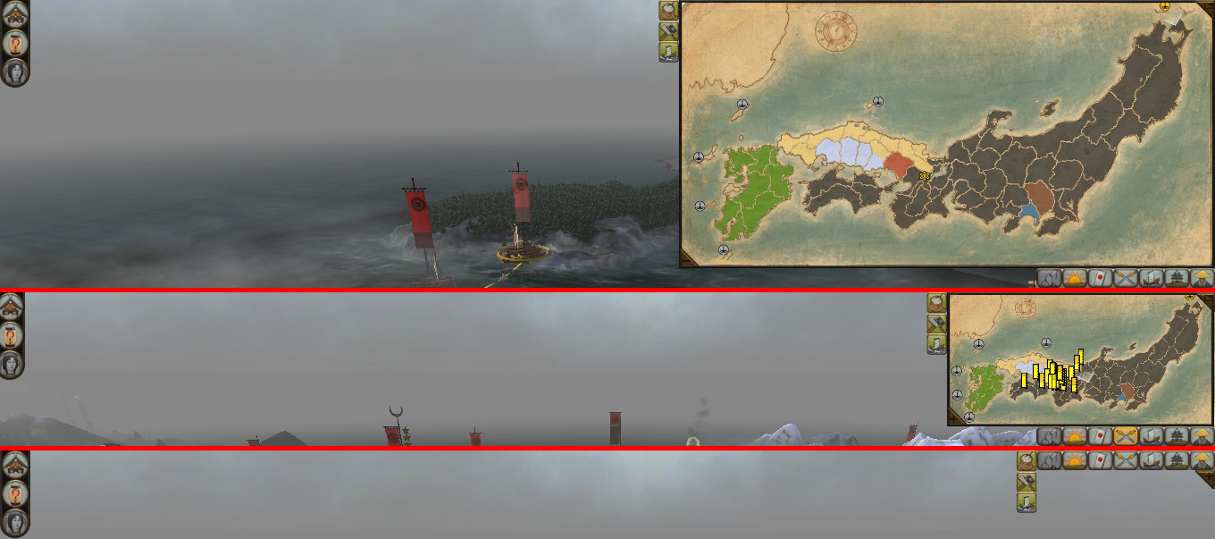
The Map can be expanded and minimized with the button in the top right corner (Red) of the Map (placement follow a standard for window closing making it more intuitive), and expand (Blue) is located in the bottom left corner which makes sense given it expands in that direction.

Map Resizing: Expanded(Top)/Default(Middle)/Minimized(Bottom)

The space difference when resizing can be somewhat judged by the above diagram. When expanded the Map takes up approximately a quarter of the screen, when minimized it disappears completely leaving only the Map Tabs and Global-Effects.

Global Effects
Global Effects

The second element is a list of Global Effects located at the top left corner of Map. This area displays an icon for each Global effect e.g. Master Builders which reduces construction costs. Perhaps leveraging perceptions of color, positive effects are displayed with a green background.

Continue reading Shogun 2s User Interface, Top Right

Shogun 2s User Interface, Top Left

Top Left UI Element
Top Left UI Element

The Top Left User Interface (UI) element of Shogun 2s Sengoku Jidai Campaign Map consists of three equally sized icons. Pressing these icons open up the Game Menu, Total War Encyclopedia, and Game Menu UI elements.

  • Blue – Adviser Toggle.
  • Green – Encyclopedia.
  • Red – Game Menu.

The Top Left UI Element is never hidden, and when large elements appear in the interface from the area underneath this UI element, this element often overlays the larger element which was likely done given that this UI element has a higher priority function.

Adviser Toggle (Blue)

The Icon for the Adviser Toggle button (Blue) was likely chosen because one adviser looks similar. The functionality of the Adviser pane can be changed to either appear when using a feature in the Campaign for the first time or, considering more experienced players, can be set to not appear at all.

Pressing the icon from the UI element at the top left of the screen opens the following pane.

Adviser Pane
Adviser Pane
  • Blue – Advice Toggle.
  • Green – Advice Subject.
  • Orange – Advice Details.
  • Red – Character Image.

The character image (Red) serves a thematic purpose, the arrows (Blue) are for cycling through Advice, and are grouped with the character image to avoid getting in the way of the Advice description space.

The Advice Title (Green), and Text (Orange) are positioned in a standard way for reading. The Advice description takes the most space of all the elements, and can expand if necessary in case of text overflows. The cancel button (Purple) is placed in a commonly expected place for exiting which is the top right.

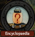
Encyclopedia Icon (Green)

The Encyclopedia Icon seems to be a Japanese style lamp with a question mark on it. I interpret this to be a symbol for a lamp that illuminates the unknown represented by the red question mark. It also leverages the commonly known iconography for help by using a question mark.

Encyclopedia Title
Encyclopedia Title

To reinforce that this is actually the Total War Encyclopedia, the icon is prominently displayed on the start page of the game, and is constantly visible in the game Encyclopedia with a clearly visible label.

Start Page Encyclopedia Icon

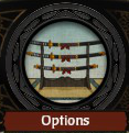
Options Icon (Red)

Start Page Options Icon

I’m not exactly sure what the Game Menu Icon (Red) is. I’d hazard a guess, and say it looked like a face that was wearing glasses, and had a Japanese castle like hat?

In the Start Page of the game for displaying the Options Icon they used an image of a sword rack with multiple blades. That icon made more sense to me as I interpreted it to mean an option of swords to choose.

Perhaps they could have used the same image for consistency? Perhaps it was an issue of space?

Shogun 2s User Interface, A Study

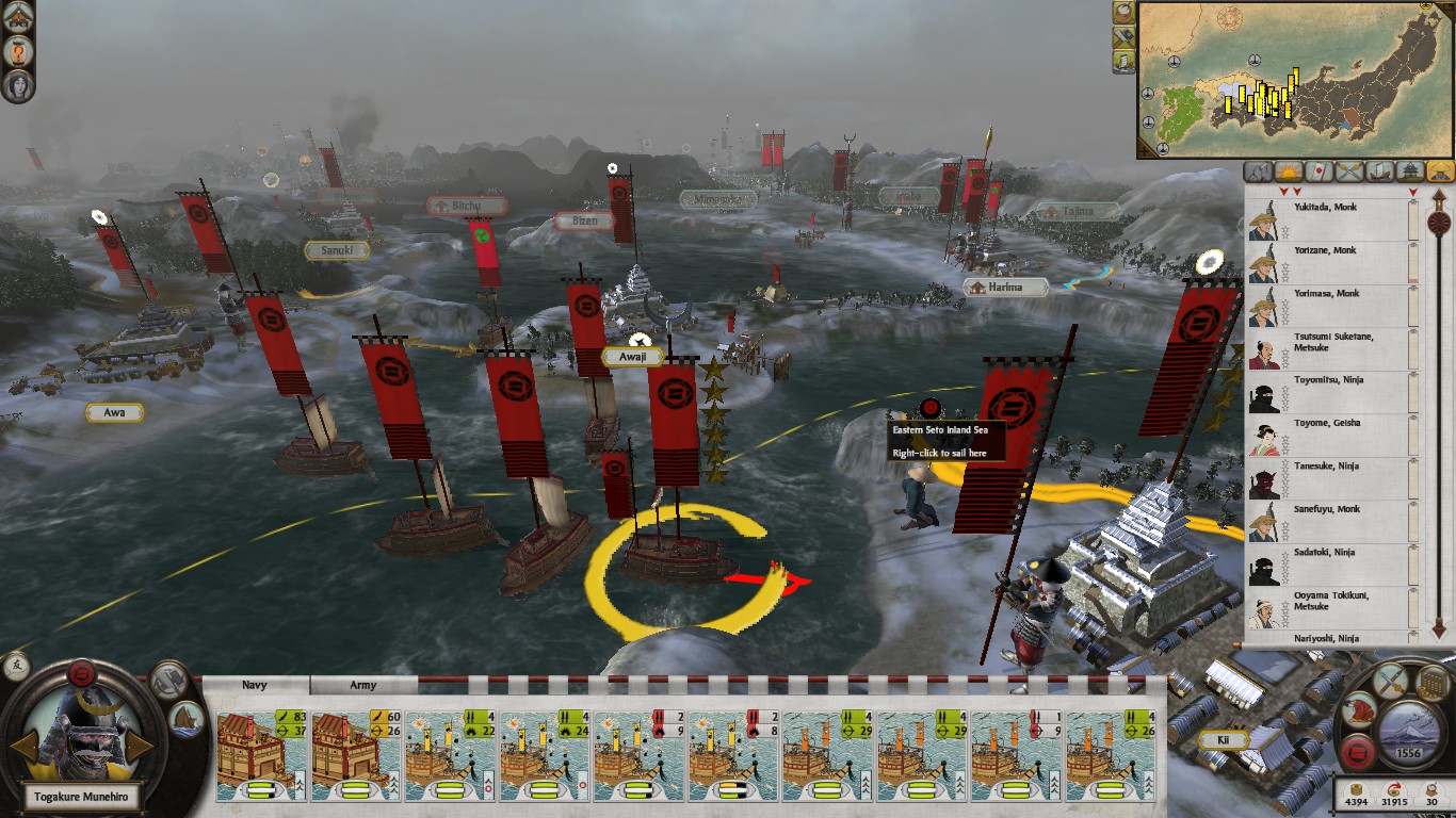
The purpose of this project is to further my understanding of good UI design by studying various elements of Shogun 2s User Interface (UI) used in its Sengoku Jidai Campaign Map.

This post will serve to discuss the Campaign Maps UI layout, and be an index post in a multi-post project of non comprehensive personal observations of Shogun 2s User Interface.

Disclaimer: The User Interface (UI) is not quite in its Vanilla form due to having the Steam mod by Radious installed at the time of the study.

Shogun 2s User Interface Screenshot
Shogun 2 Campaign UI

The focus of this piece will be mostly on the 2-D elements of the interface such as menus, tabs, pop-up, and icons NOT the ‘3-D’ campaign map itself. So lets start with the general layout of the the Campaign User Interface.

General Layout

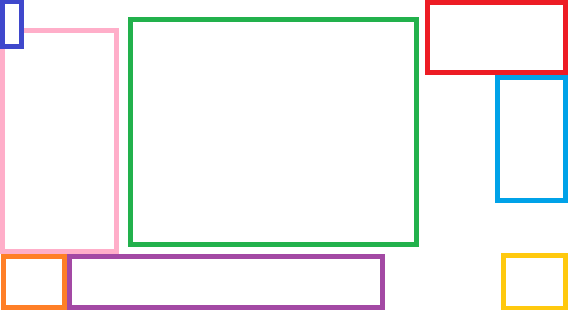
We can abstract Shogun 2s User Interface into an approximate layout with the following areas:

Shogun 2s User Interface General Layout
Interface Layout – Not to Scale
  • Dark Blue – Help and Options.
  • Green – Screen Center.
  • Light Blue – Map Lists.
  • Orange – ‘Selection’ Dial.
  • Pink – Description Popup area.
  • Purple – ‘Selection’ Banner.
  • Red – Map and Global effects.
  • Yellow – Management Dial.

Continue reading Shogun 2s User Interface, A Study

Thrillseeker – Game Jam Project

Thrillseeker is a game jam submission on the theme “You Are Your Own Worst Enemy” designed and created by my friend Sangseo Lee and I. The core mechanic of the game is that whilst flying close to passing asteroids gives you a higher score, doing so greatly increases your chance of crashing. It’s like Burnout in that the player is rewarded for high risk game play.

thrillseeker
In-Game Screenshot

To play it, download this zip file and run the executable inside (it’s a GameMaker exe file)!

Immunity – Game Jam Project

immunity

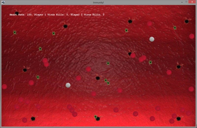
White blood cells play a vital role for our health, without them we’d be easy pickings to the likes of even the common cold. Play a moment in the life of a white blood cell and battle against an ever growing hordes of viruses and protect the red blood cells to keep your heart beating. Even better, do it with a friend! Happy hunting!

Immunity is a coop game that I worked on with Sangseo Lee, for the Global Game Jam 2013 at Edinburgh. It took second place in the local competition and was noted by the judges for best design. At the moment it’s written in Java using the Slick framework and can run on Windows, Linux, Mac and Solaris. Check it out at the Global Game Jam website here!

A Trial of Platforms Part 2 – Building a Simple Platformer Engine in Game Maker

platforming

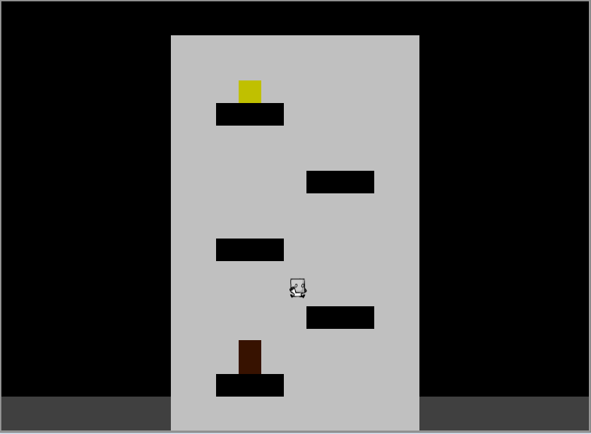
Writing a good, feature rich platformer engine takes a lot of work. Building a simple platformer engine is considered a case of ‘reinventing the wheel’. So it makes sense why some choose to find a pre-built engine to plug in to their game.

The trouble with this can be:

  1. Getting it plugged in.
  2. Figuring out how it works.
  3. Finding it doesn’t do exactly what you what.

Seeing as the feature needs for a game I’m building are simple. I instead decided to learn the basics then build such an engine in Game Maker. For now, I’ll briefly run through the resources that helped me build a major part of what I’ve implemented. Collision detection.

Implementing collision detection can be a head ache if your new to ‘game physics’. So to help you on your way here is a good video by Shaun Spaulding which gives an in-depth look into how to create a platformer in Game Maker. I’d recommend watching the whole thing, in particular where he explains the basic concept of collisions at about 22:30.
collisions

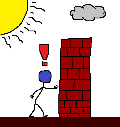
The system he describes is basically a method of checking several pixels ahead per frame. If a situation arises where two objects intersect, move the moving object to a point where they are next to each other but not intersecting. This is the method I choose; there are many many ways of doing it.

Continue reading A Trial of Platforms Part 2 – Building a Simple Platformer Engine in Game Maker

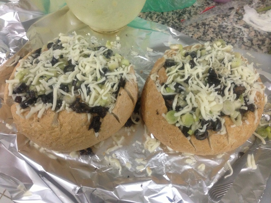
Cheesy Mushroom Pull Apart Bread

finished-bread

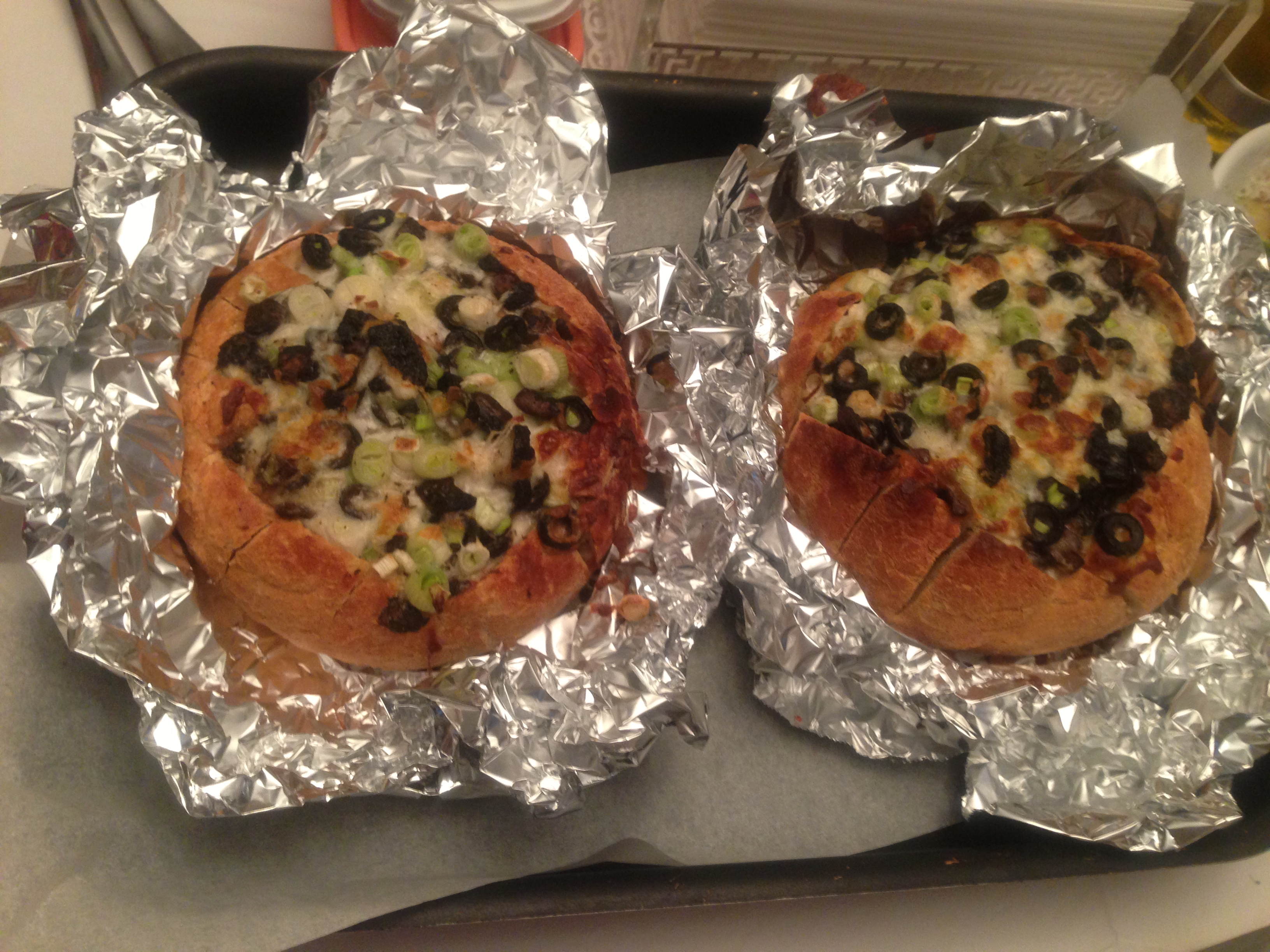
Here’s a great bread recipe for Cheesy Mushroom Pull Apart Bread that I tried recently. Now it’s great as is, but I decided to make a few changes. Instead I used:

  • Portobello Mushrooms.
  • Extra Mozzarella Cheese.
  • Black Olives.
  • 1/4 cup of butter rather than 1/2 cup.

Pre-Oven Pull Apart Bread

The only thing I’d suggest when making this is to scoop out some bread from the inside of the loaf. More space = More filling! Additionally I suggest adding a decent amount of good quality olive oil into the filling area before placing it in the oven.

Nonetheless it proved to be a hit. So give it a try and let me know what you think!

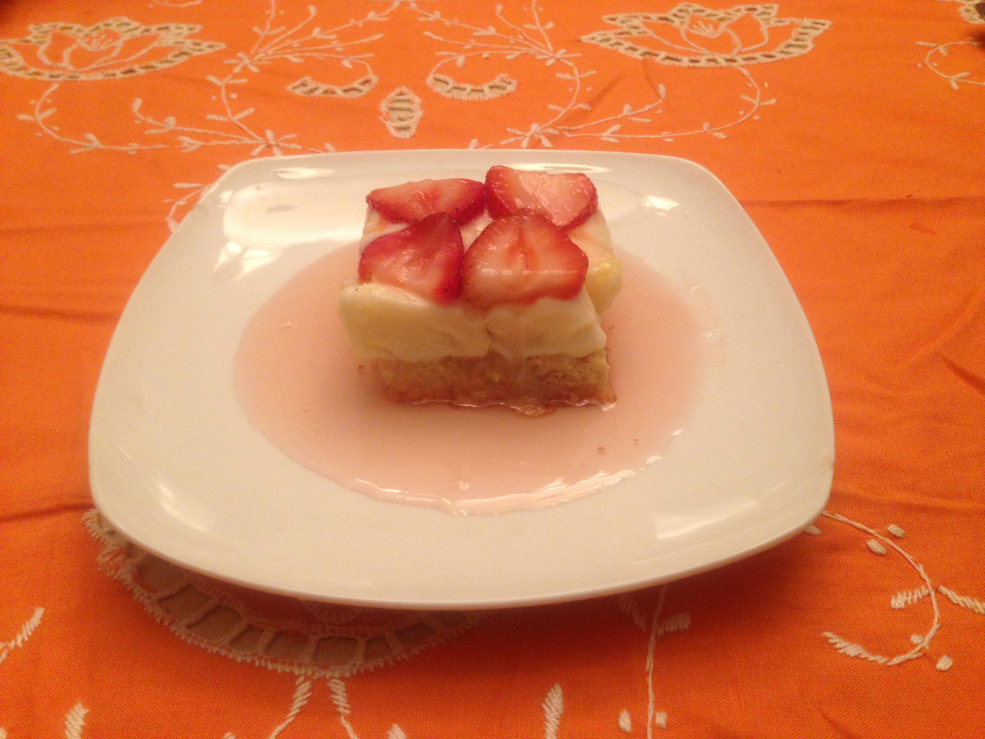
Macadamia Shortbread with Lemon Sorbet, Strawberries and Syrup

macadamia-lemon-strawberry

This creation has three parts:

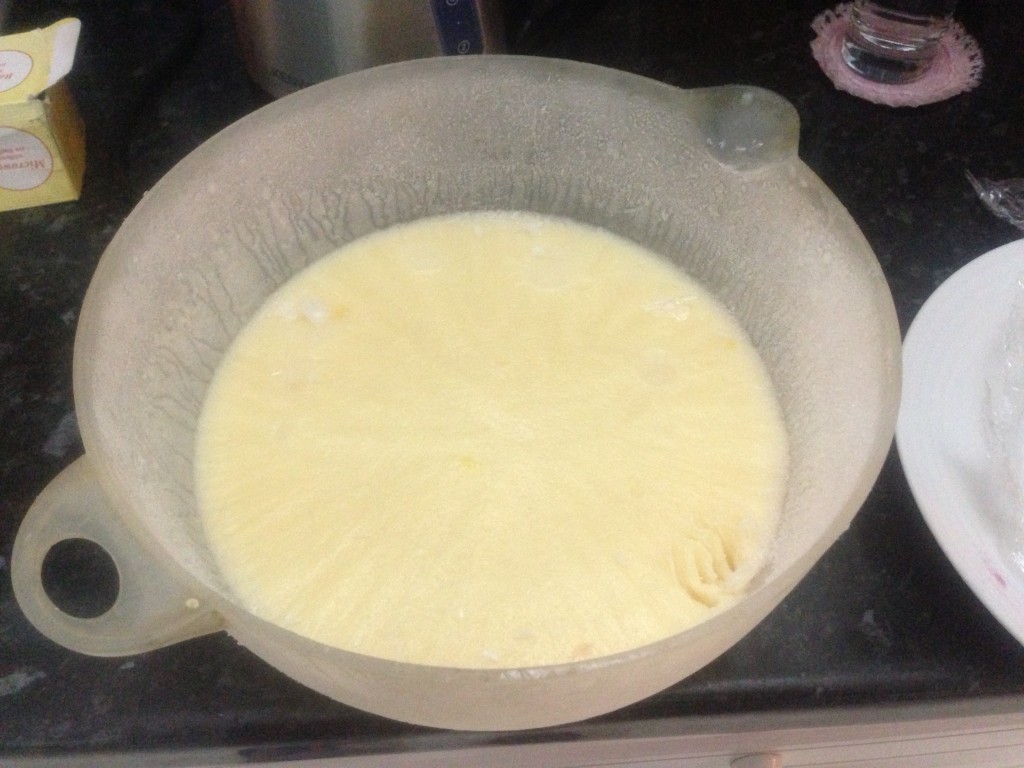
My friend Abdul Aziz and I first started with the Lemon Ice Cream the night before.

Lemon Ice Cream
Lemon Ice Cream Pre-Serving

We slightly deviated from the reciepe by stopping heating when the mixture had become silky smooth rather than a custard texture, the result; an ice cream with a similar consistency as a thick sorbet.

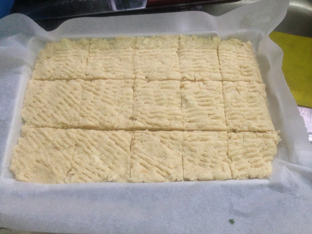
The next day we prepared the shortbread, preparing it an hour before we baked it. We made a small addition to the reciepe by adding about 100g more of butter to the shortbread mix.

Pre-Oven Shortbread
Pre-Oven Shortbread

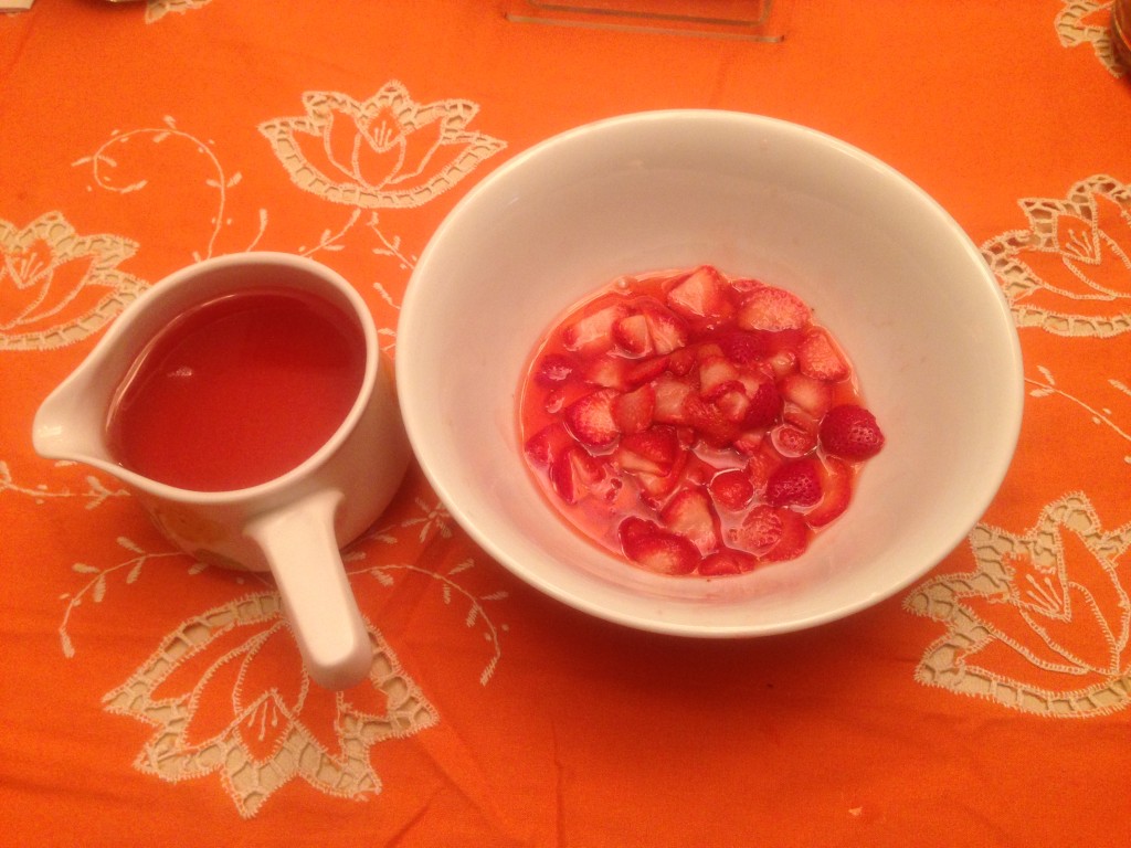
Leaving it in the oven for about 25 mins, we prepared the strawberries and syrup while we waited. To make the syrup red, instead of dipping the strawberries in the syrup mixture to glaze them, we put the strawberries back in the saucepan and heated the sauce pan for a few minitues.

Strawberries and Syrup

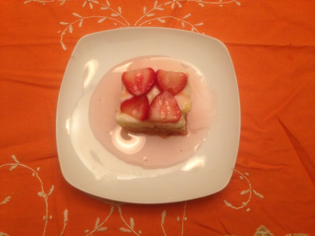
Plating was done first with a slice of the shortbread, then a slice of the lemon ice-cream with the syrup poured round it and strawberries for a decorative touch.

The result.

macadamia-lemon-strawberry-2

Enjoy!

So what do you think? Please let me know in the comments below!

Spider Queen and Company

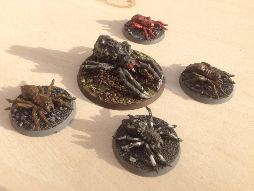
Here’s an painting project I did several years back when I was playing Games Workshop Lord of the Rings table top board game. The models are the Spider Queen (without her swarms) and four Giant Spiders.

Spider Queen and Company

To paint these models I followed the Fall of The Necromancer Sourcebook painting guide on page 25, so a big thanks to Games Workshop for such a great book. Unfortunately it’s no longer available, but there are of course still ways to get a copy…

Continue reading Spider Queen and Company

A Trial of Platform’s – Part 1

So I’ve decided to start creating a game (about time). This isn’t the first game I’ve made, but it will be the first time I’ll try to document my design process through this blog.

Here are some important questions that I’ll need to answer:

  1. What kind of game do you want to make?
  2. What will be your major design concepts/mechanics?
  3. How are you going to build it?
  4. What are you doing for art?
  5. What are you doing for sound?

These five questions I think are the beginning of a good place to start for a project. Now you may not have the answers to them from the get go, and heck they will probably change throughout the projects life cyle, but giving them some thought is a must.

Continue reading A Trial of Platform’s – Part 1