The Top Right UI Element in Shogun 2s Sengoku Jidai Campaign Map consists of three primary elements.
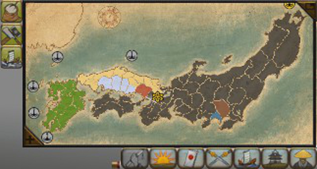
Map & Global Effects
The first element is a Map of Japan. Known clans territories are marked with a representative color (e.g Purple), and clicking the elements of the map takes you to that element on the 3-D map.
In addition selecting the Map Tabs results in icons appearing on the map e.g Navy, and Army symbols which when pressed take you to the unit. Certain symbols are given different styles depending on whether they are ‘active’ or not. An example of an inactive symbol is the trading post (Yellow), an example for active is the symbol used for the city of Kyoto which has been captured in this Campaign (Green).
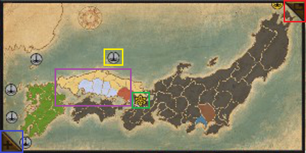
- Blue – Expand Button.
- Green – Active Icon Style.
- Purple – Multiple Clan Colors.
- Red – Minimize Button.
- Yellow – Inactive Icon Style.
The Map can be expanded and minimized with the button in the top right corner (Red) of the Map (placement follow a standard for window closing making it more intuitive), and expand (Blue) is located in the bottom left corner which makes sense given it expands in that direction.
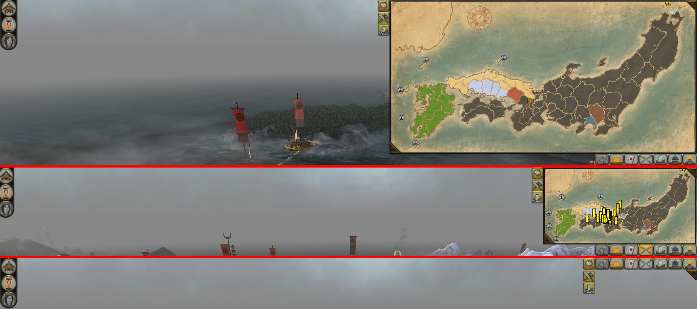
The space difference when resizing can be somewhat judged by the above diagram. When expanded the Map takes up approximately a quarter of the screen, when minimized it disappears completely leaving only the Map Tabs and Global-Effects.

The second element is a list of Global Effects located at the top left corner of Map. This area displays an icon for each Global effect e.g. Master Builders which reduces construction costs. Perhaps leveraging perceptions of color, positive effects are displayed with a green background.
Map Tabs
The final element are several Map Tabs which when press expand into lists detailing important aspects of the campaign map including: Agents, Armies, Clans, Events, Navy, Objectives, Provinces.

- Blue – Provinces.
- Dark Blue – Armies.
- Light Green – Navies.
- Orange – Objectives.
- Purple – Agents.
- Red – Events.
- Yellow – Clans.
Some additional observations are that:
- Map Tabs are grayed out, acting as a visual indicator, when there are no entries to display in the list.
- The selected Map Tab is highlighted as a visual indicator to clearly convey to the player what has been selected.
- Lists expanded from the Map Tabs follow a general design where generally the objects image, and description are the leftmost elements, and the Map Tabs slider is the rightmost element.
- Lists have many options for filtering and filtering functionality is conveyed with a bright red arrow above the filterable element.
- Sliders appear when lists overflow the allotted tab space.
- Left clicking entries in the list takes the player to that agent, and right clicking opens up e.g an Agents Page. These features make the Map Tabs an time efficient management tool.
- That majority of elements have on hover tool tips with helpful concise descriptions.
- Faint yet visible lines are used as a means of visibly segmenting each entry in the Tab list.
Agent (Purple)
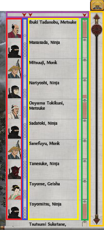
- Dark Blue – Agent Rank.
- Dark Yellow – Slider.
- Green – Action Points.
- Purple – Filter options.
- Red – Character 2D portrait.
- Yellow – Character Description.
Red and blue are closely related hence is makes sense to group them together
The icon for the agents tab is most similar to that of a the monk type.
The character portraits (Red) are distinctive and clearly convey both the agent type and ranking (Blue), (high ranking agents are aesthetically enhanced) since they are related it makes sense that they are grouped together.
The character descriptions (Yellow) is thematic giving character unique names as well as include their agent type.
Army (Dark Blue)
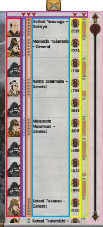
- Blue – Character Description.
- Dark Blue – Agent Rank.
- Light Green – Action Points.
- Purple – Filter options.
- Pink – Slider.
- Orange – Loyalty.
- Red – Character 2D portrait.
- Yellow – Army Strength.
The icon used are two crossed swords, which is popular army iconography.
The Army tab is largely similar to the agents tab (make anchor link to agents).
Except for a loyalty indicator (Orange), and Army Strength (Yellow).
Clans (Yellow)
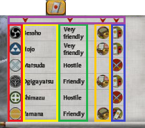
- Dark Blue – Diplomatic Status.
- Green – Attitude.
- Light Yellow – Clan Name.
- Orange – Objectives.
- Purple – Filter Options.
- Red – Clan Emblem.
- Yellow – Trade Status.
The Clan Map Tab displays attributes relating to the players standing and relations with other clans.
Details such as trading status, diplomatic status and attitude. The clans emblem grouped with the name of the clan.
Images are grouped compactly and the attitude text is placed near the clan name.
Even empty spaces convey meaning. In the case of trade, and empty space means no trading is occurring.
Event (Red)
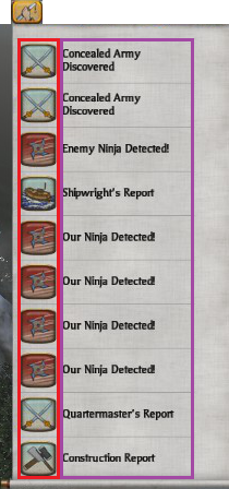
- Red – Distinctive Event Icons.
- Purple – Event Description.
Clicking an event entry opens up an event screen in the center of the screen.
Image icon is hand holding a scroll.
Navy (Light Green)
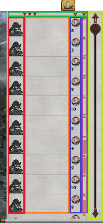
- Dark Blue – Navy Strength.
- Green – Filter options.
- Purple – Action Points.
- Light Green – Slider.
- Orange – Character Description.
- Red – Character 2D portrait.
Navy follows the same, as army. No navy general in screenshot otherwise would see its the same.
Picture of boat is appropriate consider navy comprises of them.
Objectives (Orange)
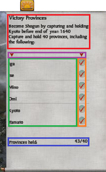
- Dark Blue – Victory description.
- Green – Province list.
- Orange – Victory checklist.
- Purple – Filter options.
- Red – Province count.
The Objectives Map Tab display essential details related to the players campaign objectives.
A description of the objective.
Details like what victory provinces need to be taken and a check mark for tracking if they are or not.
A total number of provinces.
Provinces (Blue)
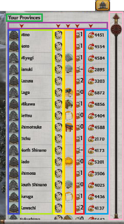
- Blue – Province Income.
- Dark Blue – Stronghold Image.
- Dark Green – Province Tab Title.
- Orange – Special Resource Indicator.
- Pink – Slider.
- Purple – Filter options.
- Red – Provinces Net Food.
- Yellow – Public Order.
Of all the tabs the province tab is the most compact.
Following the standard of icon and description on the left the rest of the information displays key information about the province such as income, public order, net food production, and special resource.