Tag Archives: Design

Final Fantasy 9 – Initial Design Impressions

Steams recent winter sale had Final Fantasy 9 on discount. I saw it as a great opportunity to revisit a beloved franchise. The following are ‘designery’ thoughts from the first several hours of play:

Like

  • FF9 starts you off in a dark room where it easy to focus on your player and understand movement. It then lights up the wider environment.
  • Narrative reinforcement – One moment where the player must select the princesses name whilst going over the kidnapping plan.
  • Level Exploration – In the scene below your character enters the scene from the bottom of the screen. Once you have control of the character the world fulfills the expectation of continuity by providing an area that’s the opposite way the player is encouraged to go (using the crowd who moves forward).

Lots of and easy to find initial pick ups from environment to quickly establish and encourage exploring the environment for rewards.

  • Storytelling Moments – Initial area showcases poverty/class differences through characters in the scene.
  • Lots of encouragement to explore through cutscenes. For example Steiner locked in room and the cutscene shows you are treasure chest which encourages you to go there.
  • Love the variation of activities right from the start such as finding the knights of pluto, and a scene of quick time events of sword fighting.
Continue reading Final Fantasy 9 – Initial Design Impressions

Al-Hambra Fortress – Uncharted Exercise

The following is a pitch for a section of a level set in the Uncharted franchise, inspired by the Al-Hambra fortress in Granada Spain.

Level Pitch

Hot on the trail of a big find, Nathan Drake’s destination is Al-Hambra’s Alcazaba (fortress) in search of a vital clue. Unfortunately for him, his arch-nemesis Doctor UptoNoGood and his mercenaries are already on the scene! Now our plucky adventurer must contend with them in-order to reach his goal!

Objective

Traverse the layout to the indicated door, and defeat any enemies encountered along the way.

Characters

Main Character

Nathan Drake: The player is Nathan Drake.

Enemies

Mercenaries: Foreign mercenaries hired by Doctor UptoNoGood. 

Please refer to the enemy design doc for behavior details.

Look and Feel

The layout is inspired by the Al-Hambra Alcazaba in Granada. Accordingly the look and feel should reflect as such.

The playable area should be derived from the Al-Hambra complex.

The layouts background should be a mix of the Spanish countryside and the city that surrounds the Alcazaba.

Continue reading Al-Hambra Fortress – Uncharted Exercise

Skadi’s Ice Temple – God of War Exercise

The following is Skadi’s Ice Temple, a level pitch for God of War (2018).

Overview

Atreus has been kidnapped by Skadi the Goddess of Winter in the previous level. With Atreus in tow Skadi has fled to her Temple in the snowy mountains. Kratos, chasing the Goddess, has finally arrived at Skadi’s Temple and now must ascend it to save his son.

Throne Room Reference Image

Beat 1 – Temple Entrance

Kratos storms into Skadi’s Temple. He is awestruck not only by the scale of the Temple, but by the great statue that is carved into the side of the Temples tower. Unfortunately Kratos has no time to dwell on such thoughts as he is not alone.

Dev Note – The view of the statue is foreshadowing Beat 3.

1.1. Skadi was well aware that Kratos was coming, but is overconfident. Standing atop a pyramid of stairs in front of an elevator, Skadi summons a massive ice wall across the room to block Kratos’s way forward. Next she commands her minions to attack, and proceeds up the elevator. As a result Kratos’s goal is established as reaching the elevator.

1.2. Following Skadi’s command a weak group of Temple Priests attack Kratos at the entrance.

Dev Note – The overall theme of the level is desecration. So having Kratos kill the Temple’s Priests feeds into that.

1.3. Kratos notices a huge chandelier above the ice wall with giant chains that hold it in place. Therefore he decides to destroy the chains that hold up the chandelier in-order to create a hole in the ice wall.

1.4. On approaching the first chain a stronger group of Temple Priests appear. They are more difficult because they have a height advantage and ranged units.

A partial view of one side of the room

1.5. Once they have been dispensed with Kratos proceeds to destroy the chandelier chain, and collect the nearby loot.

Cinematic Moment – Kratos tears the chain out of the wall. On doing so the chandelier drops violently. Cracks can be heard, the room shakes.

1.6. Noting the chain on the other side of the room Kratos heads towards it.

1.7. After defeating a more difficult group of enemies Kratos destroys the other chain (and again collects loot).

Cinematic Moment – Kratos tears the chain out of the wall causing one side of the massive chandelier to slam into the ice wall which destroys a large section of it, and
causes structural damage to the Temple Entrance.

Dev Note – Foreshadow the major structural collapse of Beat 3.

1.8. Kratos proceeds to climb the fallen chandelier, using it to proceed to the elevator.

Continue reading Skadi’s Ice Temple – God of War Exercise

Pocket Circuit Track Design – Yakuza 0

Recently I’ve been playing Yakuza 0. Though there were a couple of things I didn’t like (the occasional unskippable cut scene!), in general I loved it. As well as an absolutely world class story with fantastic voice acting, the game provides a wealth of content. Content that includes making a custom Pocket Circuit Track in a RC car racing mini-game. As a design exercise I thought this would be fun to do!

The track creation tool is fairly straightforward to use, and making tracks was fairly simple. Saying that I failed on my first attempt as I maxed the route length!

Slope City

For my first Pocket Circuit Track I started with an image in my mind which I drew.

First I made the basic shape. Seeing it in 3D I felt a desire to add lots of slopes to emphasize the windy nature of the track.

Continue reading Pocket Circuit Track Design – Yakuza 0

Battlefield 5

Introduction: I once again had the opportunity to work for DICE LA. This time round I was given additional ownership, and made contributions in Battlefield 5’s content Chapter’s 3 and 4.

Platform: PC, Xbox One, PlayStation 4 Time: 1 year |  Role: Multiplayer DesignerTeam Size: ~100

Design Goal: Support Battlefield 5’s live service pipeline with high quality content for players.

My Contributions

Chapter 3: Trial by Fire

Firestorm

  • Augmented EA Criterion’s design of Lake Village a major point of interest in Battlefield 5’s Firestorm game mode.
    • Using Confluence I created level design notes for implementation by level artists of natural areas, major and minor POI’s in a several 1km areas of the Firestorm launch map.
    • The note format prepared in confluence was set by EA Criterion as a standard for level designers on the project.

Mercury

  • Initial fortification design, then iteration with a senior designer.
  • Level design feedback – cover, sightlines, layout.
  • Map maintenance assistance.

Chapter 4: Defying the Odds

Marita

  • Level design feedback.
  • Squad conquest layout proposals, and implementation.

Provence

  • Iteration of the Provence map.
  • Scheduling playtests and conducting post playtest feedback discussions.
  • Map maintenance – spawn points, floating objects, blocking off areas.
  • Supported level design with visual scripting efforts implementing:
    • Fortification prefab clusters that were used in multiple levels.
    • A means of blocking off second story floors.

General

  • Gathering telemetry to present to senior and lead designers.
  • Writing and iterating documentation to improve work processes.
  • Fixed bugs reported by QA on JIRA.

Battlefield 1

Introduction: Over the summer of 2017 I interned at DICE LA, a studio of Electronic Arts. My time was spent working with DICE LA to ship the downloadable content In the Name of The Tsar for Battlefield 1.

Platform: PC, Xbox One, PlayStation 4 Time: 12 weeks |  RoleGame Designer | Team Size: ~90

Design Goal:

  • Deliver high quality level content through iteration.
  • Develop my ability to analyze and critique level design in a professional environment.
  • Practice supporting the efforts and vision of senior designers on the team.

My Contributions:

  • Bolstered Battlefield 1’s DLC content with map analysis. This took the form of:
    • Collecting, processing, and documenting Battlefield 1 level data for use by senior level designers.
    • Offering map feedback on flow, map features, cover, spawn placement, and play space volumes.
  • Used Frostbite’s visual scripting language to implement:
    • Content bug fixes from JIRA tickets.
    • Then iterate based on feedback of game modes such as Supply Drop, Team Death Match, War Pigeons, and Domination for multiple levels in the DLC pack.

Jedi Challenges: Darkside Expansion Duels

Platform: iOS, Android Time: 12 weeks |  RoleGame Designer | Team Size: 7

Design Goals:

  • Create a functional and effective game tutorial.
  • Design and implement a unique and enjoyable Rey lightsaber battle across three difficulties.

My Contributions:

  • Contributed to team and design focused brainstorming sessions.
  • Implemented, and iterated the games tutorial, and Rey lightsaber battle using behavior trees.
  • Designed a differentiated Rey battle experience through layering mechanics and developing combat sequences.

Tiny – Week 3

Kicking this week off we completed a paper prototype of idea 2 from week 2.

The paper prototype had the player make a sequence of angles including obtuse, acute, right angled, and straight angles to defeat a single enemy who approached them in a turn based manner. The decision for turn based gameplay over real time gameplay was made because we wanted to encourage strategic thinking. We named this prototype Angle Ninja.

Meeting Jesse

We met Jesse on Tuesday who looked at each of ideas and gave us some advice.

During our meeting Jesse suggested the use of various lenses.

Jesse also commented that ‘spatialization’ was a good avenue to investigate for teaching angles. So considering his advice we adapted Angle Ninja. Instead of making gestures to create obtuse, acute, right angled, and straight angles to defeat a single enemy we would instead have multiple enemies which we would attack from a fixed position on the iPad.

The shift in design was due to wanting to focus on the fundamental lesson of teaching familiarity with angles rather than the more advanced one of the special properties of angles.

This slideshow requires JavaScript.

Continue reading Tiny – Week 3

Tiny – Week 2

At the start of the week we presented the ideas we had in mind from week 1 to our supervisors. Our supervisors gave us feedback and we filtered down the initial ideas based on complexity and technical issues.

On Wednesday, we met Jesse and presented our initial ideas to him. Jesse gave us advice about our project suggesting we look into a number of educational games such as Battleship Numberline, and create lots of prototypes.

On Friday, the team visited the clients. We met Audrey from Intermediate Unit 1 and the students & teacher from Colonial School. We used the visit as an opportunity to collect information about our client and our players:

  • We presented a number of pictures to the students to gauge their art interest.
  • As them what kind of games they played
  • Asked them what kind of music they listen to
  • Spoke the the teacher and narrowed down a subject

We documented this research.

This slideshow requires JavaScript.

Based on what we learned from the visit, we had a better understanding about our audience. We then came up with many new ideas based on angles which was confirmed to be the main subject.

Our lead programmer Carl then built a prototype on the iPad based on one of our ideas. The prototype detected the drawing of acute and obtuse angles to explore teaching the special properties of angles (obtuse, acute, straight, right angle).

Tiny – Week 1

The new semester has finally started, and we are excited to work on this new project with Colonial School!

In the first week we setup our project room, had a bunch of meetings with our advisers and came up with a general idea about what we are going to do.

Later in the week we spoke to our client Audrey Mory who offered us lots of freedom in scope as long as it is an entertaining math-based educational game for children from 9 to 11 years old. The deliverable at the end of the semester should be an ready-to-ship game for Apple store.

This slideshow requires JavaScript.

We then started with competitive analysis playing many educational games available on the market, and decided what worked for them and what did not. We also had a brainstorming session, sketching out 10 game ideas.

This slideshow requires JavaScript.

Team Tiny

Team Tiny is a four person project at Carnegie Mellon’s Entertainment Technology Center tasked with building an educational iPad game for Colonial School in Pittsburgh Pennsylvania.

The following is a week by week look into the project with a focus on design.

  1. Week 1 – Setup & Initial Brainstorming
  2. Week 2 – Client meeting, more brainstorming and first prototype
  3. Week 3 – More prototypes and iterations on prototypes.
  4. Week 4 – Development of ideas for 1/4 presentations
  5. Week 5 – Playtesting and new direction
  6. Week 6 – Focus, meeting with Zynga
  7. Week 7 – GDC!
  8. Week 8 – First digital prototype playtests
  9. Spring Break! – Playtesting!
  10. Week 9 – Puzzle crafting
  11. Week 10 – Further puzzle crafting, playtest day
  12. Week 11 – Finishing puzzles, map and reward system, deeper puzzle analysis, scaffolding introduction
  13. Week 12 – UX Considerations and more polish
  14. Week 13 – More UX Changes, Polish & Playtests
  15. Week 14 – Finals Presentations & Publish to App Store
  16. Week 15 – Final polish

Grapes of Wrath – Map Design Lessons

Last week I designed Grapes of Wrath, a concept for a multiplayer level in Battlefield 1. Reflecting on the experience I will detail my process, and lessons learned in the hope of enriching myself and others.

I initially split design into two segments. Theme & Structure.

Theme

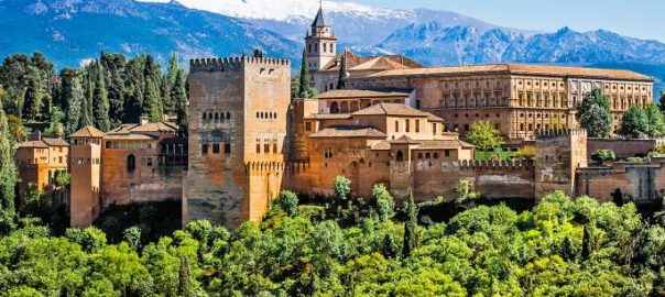
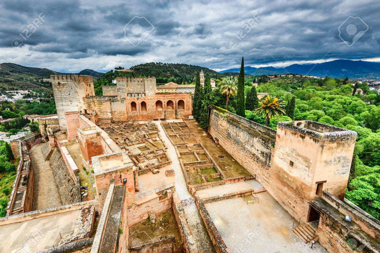
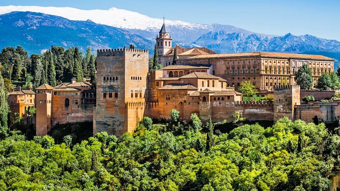
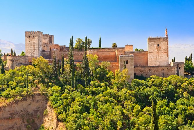
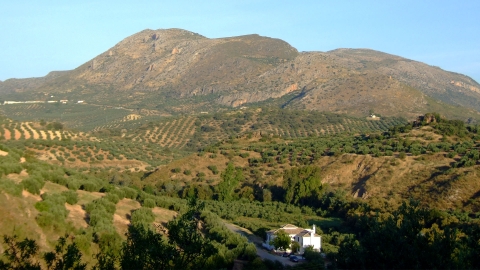
Given an aim to create a post apocalyptic theme I began my research with reference images.

This slideshow requires JavaScript.

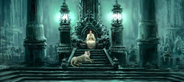
In addition to reference images I sought out other forms of media such as movies, book and games that were set in a post apocalyptic setting.

This slideshow requires JavaScript.

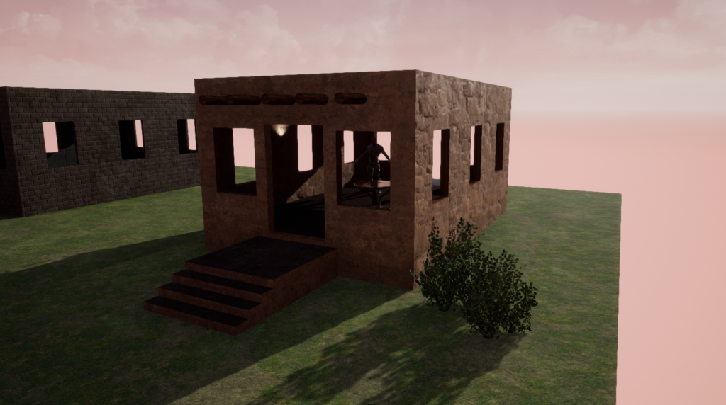
What struck me most when reviewing this material was the desolate landscapes, and ruinous infrastructure. I intended to include these elements in some manner in the map I designed.

Structure

In the context of Battlefield 1 I define structure as map objectives, points of interest, unit design, and player flow.

Research

My research into structure began with two of Battlefield 1’s modes, Conquest & Rush, both of which I intended to accommodate within my map design.

Modes

Not only did I experience these modes by playing them, but I used spectator mode to watch the battle play out at a meta level. This allowed me easily see how objective placement, and points of interest affected player flows.

This slideshow requires JavaScript.

Unit

I then looked at Battlefield 1’s units. A study of the different infantry classes, tanks, airplanes, and vehicles revealed sub-categories, each of which had different play styles:

  • Air
    • A fast but weak plane
    • A slow but powerful bomber
    • A hybrid plane
  • Tanks
    • Glass cannon artillery
    • A fast but weak tank
    • Slow but powerful tank
    • A hybrid
  • Infantry
    • Short
    • Medium
    • Long range
  • The Behemoth – A lead breaker

Battlefield 1 is a web of balance, and what I found was their vehicles cater to extreme playstyles with disadvantages, and usually a third averaged option.
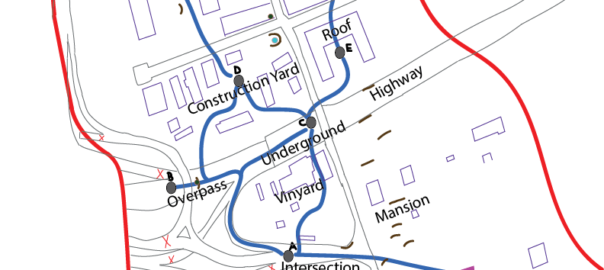
Cerebral Design

Combining map knowledge and player elements I created a ‘cerebral map’ for Rush and Conquest. These maps included player flows, and major elements such as the Behemoth route, and an underground bridge.

For Rush mode the map intended to convey that attackers would become weaker over time, and defenders stronger whereas in Conquest it should be balanced strength. I hoped to achieve this experience with various measures such as:

  • Placing map objectives progressively further from attackers and closer to defenders in Rush
  • Giving more elite kits and vehicles to defenders as the attackers captured objectives in Rush
  • Balancing elite kits and vehicle spawns in Conquest

This slideshow requires JavaScript.

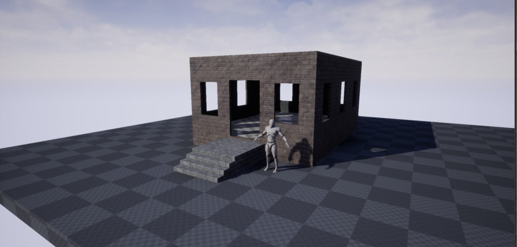
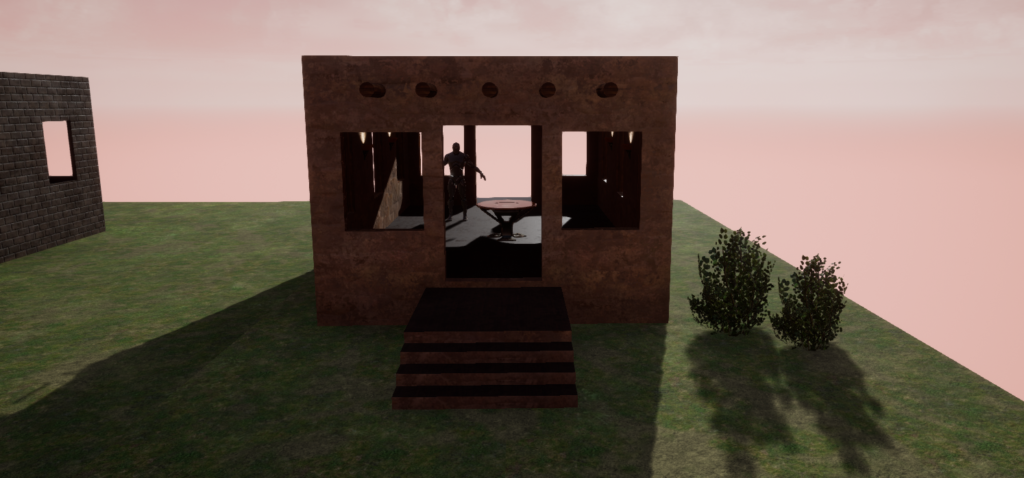
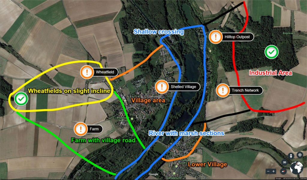
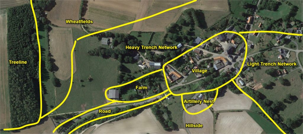
My cerebral map was an initial pass at an experience, which was all well and good, but it clearly was not a map! What I had created was akin to a disfigured skeleton which needed a layer of flesh, and its bones tweaked.  A location was needed to root these abstract concepts in. Therefore Location became the third segment of my design process.

Continue reading Grapes of Wrath – Map Design Lessons

Hopscotch Hamlet

As part of Jesse Schell’s Game Design course at The Entertainment Technology Center we required to analyze and ‘improve’ the game of Hopscotch.

The goal of the game is to complete Hopscotch Toss the fastest.

  1. In Hopscotch toss there are two teams which compete against each other on a standard Hopscotch board.
  2. Both teams have two players, a jumper and a catcher.
    1. The catcher stands at the final safe square on the Hopscotch board
    2. The jumper at the start of the Hopscotch board
  3. The jumper throws out three markers:
    1. When a marker is thrown the timer begins
    2. If a marker misses a square the marker is placed on the first square
  4. The jumper begins playing hopscotch with the aim of collecting and throwing markers to the catcher one at a time.
    1. If the catcher drops the marker the jumper must return to the start
  5. Once the jumper reaches the catcher who must have three markers in hand, the jumper turns round and continues playing Hopscotch.
  6. When the jumper reaches the start position reverse jumper and catcher roles. Now the second round of Hopscotch Toss starts.
  7. First team to complete two rounds wins.

Development

Part 1 - Analysis & Brainstorming

What makes a hopscotch a good game?

  • Simple to understand rules
  • Requires little equipment
  • Trains limb coordination
  • Easily extensible to multiplayer
  • Clear win state
  • Gamifies natural hopping movement
  • Low skill entry barrier
  • Immediate feedback on game state

Problems with the game your design might try to solve.

  1. Not friendly those with physical disabilities
  2. Can become boring due to its simple rule set
  3. Primary mechanic is jumps
  4. A static game space
  5. Minimalist Aesthetics
  6. Has no story
  7. Does not incorporate elements of modern technology
  8. Tests the body but not the mind e.g recall of facts, events etc.

Brainstorm 50 ideas on how you could improve Hopscotch

  1. Blindfolded
  2. With someone on your back while playing
  3. Jumping only when music is playing
  4. During a handstand
  5. On a climbing wall
  6. With multiple tokens
  7. Whilst singing
  8. Where you start with no squares and draw one turn by turn
  9. Three legged
  10. On stairs
  11. Backwards
  12. Eating icecream
  13. With two people at once
  14. With only one square
  15. On a board with tiles that turn in a pool
  16. Played using your fingers
  17. On a trampoline
  18. Interplanetary
  19. Over Skype in different countries
  20. Where you cant jump in squares based on a coloured dice, or coin?
  21. Story based, and where marker was thrown player has to participate in a story event and if they lose they dont get to score a point by playing a round of hopscotch
  22. Edible, where a player can eat one square but has to make another one with provided food
  23. Where the game space drawn from star constellations
  24. Meta – smaller hopscotch games feed in a larger one. Two people play against each other in each mini game, and the winner moves forward on one square on the board till they reach the meta game marker and return as in a normal game
  25. Color coded special square events which if a person steps in they have to do like shout a word, if they fail they have to go back to the start
  26. Place the marker not by a throw but by a dice roll
  27. People are put into teams based on costumes
  28. The person has to do a dance move when spinning round at the end
  29. The person has to do karate punches on each jump
  30. Throw the marker again when it is picked up
  31. Two people have to mirror each other on different games
  32. It is attached to another game that based on your speed gives you more points/ progresses more in the level
  33. In VR with rivers of lava
  34. Where each item rotates round and one has to jump from square to square
  35. One player throws the marker and stops at that position. Then throws the marker forward again. The next player jumps to the position of the last player who jumps to the next place the marker is now at. The process continues until the marker has been returns to the beginning.
  36. Competitive, two games of hopscotch, the marker can be thrown onto another hopscotch game to make it harder for them to complete the round
  37. On a dart board. Objective is to hit the center of squares avoiding the one other player threw the marker dart at.
  38. Three legged – two people tied together play
  39. Relay, where the marker has to passed from game to game.
  40. Players stand in Hopscotch squares and pass the marker to other players to complete the game.
  41. Where the panels light up and one must jump only on lit panels
  42. On the moon
  43. On a single wheel cycle
  44. With sword fighting battle rounds per block, losing sends you back to the start
  45. Complete Hopscotch in a tiger cage before the tiger is let loose in it
  46. With a slide at the end of the game
  47. There are two markers and those are the only ones that can be jumped in
  48. There are markers on every square and winning is jumping and picking up as many as possible in a given time.
  49. One person is continuously jumping and another person throws a marker and tries to have the player jumping fall on that marker.
  50. On a keyboard one has to press the 1-9 keys in the same pattern, and avoid the marker square set by the computer.

Part 2 - Selection

From your list of ideas select three and describe them in more detail

Based on number 25, 39 and 48

  1. Picto Hopscotch – Hopscotch is played in the traditional American school yard manner except for one difference. Each row has a picture associated with it. When the player jumps on any square of the row they must shout out the picture. If they do not the player has to go back to the beginning again.
  2. Relay Hopscotch – Two hopscotch play spaces are set up. One person from each hopscotch space begins playing, and completes a game and gives the marker to an awaiting second player who plays a game of Hopscotch. First team to complete both hopscotch games win.
  3. Hopscotch Toss – Two teams play Hopscotch competitively. Both teams have a jumper, and catcher. The jumper plays hopscotch and collects the markers and throws them to the catcher. The team with all the markers in the catchers hand and jumper at the end win.

Part 3 - Improvement

Hopscotch Toss

An Attempt at solving problem 3 by introducing throws

The goal of the game is to complete Hopscotch Toss the fastest.

  1. In Hopscotch Toss there are two teams which compete against each other on a standard Hopscotch board.
  2. Both teams have two players, a jumper and a catcher.
    1. The catcher stands at the final safe square on the Hopscotch board
    2. The jumper at the start of the Hopscotch board
  3. The jumper throws out three markers:
    1. If a marker misses then the player rethrows
    2. When the last marker is thrown the timer begins
  4. The jumper begin playing hopscotch with the aim of collecting and throwing markers to the catcher one at a time.
  5. The team is fastest to get all the markers in the catcher’s hand and the jumper at the end wins.

First Loop

The first iteration of gameplay showed me various areas that needed more detail and consideration. Useful moments that occurring during my playtests were:

  • Instructions should be short and concise otherwise they bore playtesters. So I should better prepare my rule for fast and easy digestion.
  • Great design moments had laughs or confusion which immediately drew my attention to areas of the game I needed to work on.
  • Playing the game exposed rules that I needed to clarify such as how to handle drops, fumbles of the jumper, missed throws.

Bad

  • I did not consider adding the throw to the timed phase of the game. Doing so might add tension to that part of the game.
  • The catcher reported wanting to do more.
  • I had only one game setup at a time, it would have been more enjoyable to have both games occurring simultaneously.

Good

  • Players clearly enjoyed throwing markers and catching them.
  • The game was picked up very quickly due to its rule set

Second Loop

With the second iteration I intend to adjust the rule set to include new cases for when the jumper and catcher fumbles.

  1. The jumper throw phase is included in timing.
  2. If the marker is thrown out of boundaries it is placed on the first Hopscotch square.
  3. If the catcher drops the marker the jumper stops moving until the catcher picks up the marker and returns to the safe zone.

Playtested with the above changes had the following effects:

  1. Heightened the tension during the beginning of the game.
  2. Made jumpers more careful with their throw. They would take safer shots, but those who successfully made riskier shots got greater rewards.
  3. Heightened the tension during drops, particularly on the catcher as they scrambled to get the marker..

Playtesters reported having an enjoyable more fluid experience. They also made two suggestions:

  1. The experience be ‘circular’. When the jumper reaches the catcher who has three markers in hand, the jumper turns round and continues their Hopscotch game (without the markers) instead of ending the game. On reaching the beginning of the Hopscotch board the Catcher now switches roles and becomes the Jumper, and the game continues.
  2. The jumper returns to the start if the catcher drops the marker.

Difficulty in Difficulty

How does one convey difficulty levels?

The most common method in video games is through a menu from which players choose terms to set the difficulty of the game. Such menus generally take the form of the following:

  1. Easier than Easy
  2. Easy
  3. Medium
  4. Hard
  5. Harder than Hard

With each term developers have two ‘paths’ they can take. A generic or idiosyncratic term.

  1. Generic – Commonly used terms which have no thematic basis in a game
  2. Idiosyncratic – Terms that have a thematic basis in a game

Generic

The following are examples of generic terms:

  1. Beginner
  2. Easy
  3. Medium / Normal
  4. Hard
  5. Expert

A clear advantage to using such terms is they are established concepts in the gamer zeitgeist making them more likely to be know across cultures, and languages.

On the other hand a number of issues arise when using generic terms such as:

  1. Different MeaningsNintendo Hard’s easy is harder than Western easy
  2. Different Connotations – There are many interpretations of the term. For example Easy can have negative connotations to a players self sense of skill though it may be appropriate. This may cause them to choose a higher difficulty than is appropriate resulting in a less enjoyable experience.
  3. Not Thematic – Alone they add little flavor to the game

Continue reading Difficulty in Difficulty

Shogun 2s User Interface, Bottom Left/Middle

The Bottom Left/Middle Area of Shogun 2s Campaign Map User Interface is an elegantly designed, helpful popup filled, context sensitive area that displays key information about a players Navies, Armies, Agents, Construction, Recruitment and Battles options.

The UI element as a whole is thematically suited to the time period, incorporating a Japanese battle banner, appropriate color scheme, and style to complement the rest of the UI. In addition a neat feature of this UI area is that depending on the context of a players selection this UI area will change. For example when a player clicks an empty space on the campaign map it is hidden, if an army is selected army information will appear in the form of a Tab.

All these design decision make this UI element a screen space efficient, compact, informative, aesthetically pleasing part of the campaign map that ‘fits’ well into its surroundings, and help build the experience of a general during the Sengoku Jidai..

Army Tab

Army Tab
Army Tab

The Army Tab displays information related to the selected army. The UI element is made up of a Dial and a Banner.

Dial

Army Tab Dial
Army Tab Dial

The Army Tab Dial can be broken up into the following sub-elements:

  • Red – Clan icon.
  • Teal – Army leaders name.
  • Dark Blue – Arrows allowing cyclical cycling through units of the same type, in this case army.
  • Purple – Army leaders image.
  • Yellow – Disband button.
  • Green – Chat.

Considering this element:

  • The layout of the dial is interesting being somewhat symmetric, and the dial art asset has a shine at the top of the dial which may attract a viewers eye.
  • The Purple and Teal elements are not necessary, but are welcome as a thematic elements for a player.
  • Functionally the Dark Blue, and Yellow elements allow a player to quickly jump from army to army, and disband them if necessary.
  • The other side of the campaign map, the bottom right, features a stylistically similar dial.

Banner

Army Tab Banner
Army Tab Banner

The Army Tab Banner is jam packed with vital information that can be broken down in the following manner:

  • Orange – Used for unit replenishment indicators, where a:
    • Green circle with a + means units are replenishing.
    • Green circle with a red slash means are not replenishing.
    • Skull which means units are suffering attrition.
  • Light Green – Unit experience.
  • Dark Red – Unit portrait with color coded background (Radious’s mod added this I believe).
  • Dark Green – Special Attributes e.g Accuracy, Improved Armour.
  • Yellow – Unit Rank.
  • Purple – Unit Strength. If the unit is being replenished a dark grey area will appear with a visual indicator of the new strength at the next turn.
  • Teal – Unit Type Icon.
  • Dark Blue – Recruitment Tab. This only appears when a general is present in the selected army.

Looking at the banner in totality, all the information fits neatly, and succinctly conveys a lot of information to the player with great use of clear icons in a consistent format.

Continue reading Shogun 2s User Interface, Bottom Left/Middle