
The Bottom Left/Middle Area of Shogun 2s Campaign Map User Interface is an elegantly designed, helpful popup filled, context sensitive area that displays key information about a players Navies, Armies, Agents, Construction, Recruitment and Battles options.
The UI element as a whole is thematically suited to the time period, incorporating a Japanese battle banner, appropriate color scheme, and style to complement the rest of the UI. In addition a neat feature of this UI area is that depending on the context of a players selection this UI area will change. For example when a player clicks an empty space on the campaign map it is hidden, if an army is selected army information will appear in the form of a Tab.
All these design decision make this UI element a screen space efficient, compact, informative, aesthetically pleasing part of the campaign map that ‘fits’ well into its surroundings, and help build the experience of a general during the Sengoku Jidai..
Army Tab
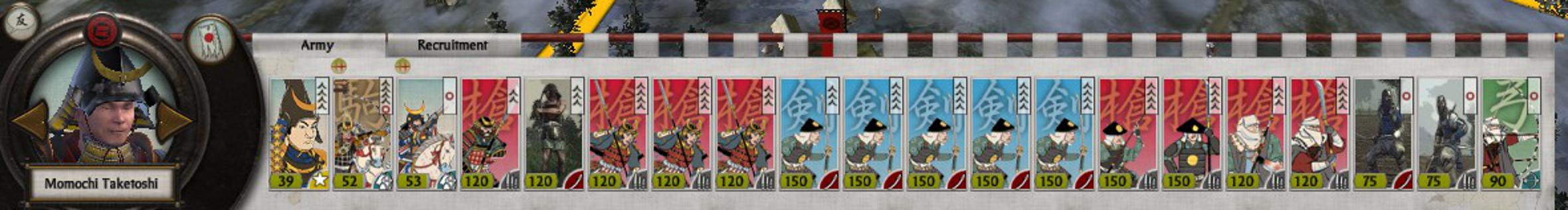
The Army Tab displays information related to the selected army. The UI element is made up of a Dial and a Banner.
Dial
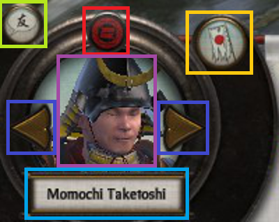
The Army Tab Dial can be broken up into the following sub-elements:
- Red – Clan icon.
- Teal – Army leaders name.
- Dark Blue – Arrows allowing cyclical cycling through units of the same type, in this case army.
- Purple – Army leaders image.
- Yellow – Disband button.
- Green – Chat.
Considering this element:
- The layout of the dial is interesting being somewhat symmetric, and the dial art asset has a shine at the top of the dial which may attract a viewers eye.
- The Purple and Teal elements are not necessary, but are welcome as a thematic elements for a player.
- Functionally the Dark Blue, and Yellow elements allow a player to quickly jump from army to army, and disband them if necessary.
- The other side of the campaign map, the bottom right, features a stylistically similar dial.
Banner
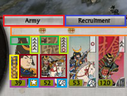
The Army Tab Banner is jam packed with vital information that can be broken down in the following manner:
- Orange – Used for unit replenishment indicators, where a:
- Green circle with a + means units are replenishing.
- Green circle with a red slash means are not replenishing.
- Skull which means units are suffering attrition.
- Light Green – Unit experience.
- Dark Red – Unit portrait with color coded background (Radious’s mod added this I believe).
- Dark Green – Special Attributes e.g Accuracy, Improved Armour.
- Yellow – Unit Rank.
- Purple – Unit Strength. If the unit is being replenished a dark grey area will appear with a visual indicator of the new strength at the next turn.
- Teal – Unit Type Icon.
- Dark Blue – Recruitment Tab. This only appears when a general is present in the selected army.
Looking at the banner in totality, all the information fits neatly, and succinctly conveys a lot of information to the player with great use of clear icons in a consistent format.
Continue reading Shogun 2s User Interface, Bottom Left/Middle