The Bottom Left/Middle Area of Shogun 2s Campaign Map User Interface is an elegantly designed, helpful popup filled, context sensitive area that displays key information about a players Navies, Armies, Agents, Construction, Recruitment and Battles options.
The UI element as a whole is thematically suited to the time period, incorporating a Japanese battle banner, appropriate color scheme, and style to complement the rest of the UI. In addition a neat feature of this UI area is that depending on the context of a players selection this UI area will change. For example when a player clicks an empty space on the campaign map it is hidden, if an army is selected army information will appear in the form of a Tab.
All these design decision make this UI element a screen space efficient, compact, informative, aesthetically pleasing part of the campaign map that ‘fits’ well into its surroundings, and help build the experience of a general during the Sengoku Jidai..
Army Tab

The Army Tab displays information related to the selected army. The UI element is made up of a Dial and a Banner.
Dial
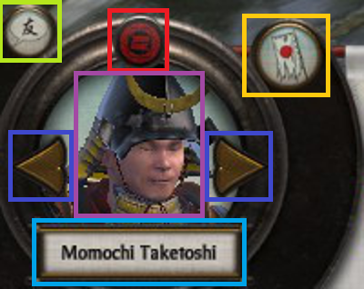
The Army Tab Dial can be broken up into the following sub-elements:
- Red – Clan icon.
- Teal – Army leaders name.
- Dark Blue – Arrows allowing cyclical cycling through units of the same type, in this case army.
- Purple – Army leaders image.
- Yellow – Disband button.
- Green – Chat.
Considering this element:
- The layout of the dial is interesting being somewhat symmetric, and the dial art asset has a shine at the top of the dial which may attract a viewers eye.
- The Purple and Teal elements are not necessary, but are welcome as a thematic elements for a player.
- Functionally the Dark Blue, and Yellow elements allow a player to quickly jump from army to army, and disband them if necessary.
- The other side of the campaign map, the bottom right, features a stylistically similar dial.
Banner
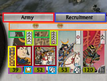
The Army Tab Banner is jam packed with vital information that can be broken down in the following manner:
- Orange – Used for unit replenishment indicators, where a:
- Green circle with a + means units are replenishing.
- Green circle with a red slash means are not replenishing.
- Skull which means units are suffering attrition.
- Light Green – Unit experience.
- Dark Red – Unit portrait with color coded background (Radious’s mod added this I believe).
- Dark Green – Special Attributes e.g Accuracy, Improved Armour.
- Yellow – Unit Rank.
- Purple – Unit Strength. If the unit is being replenished a dark grey area will appear with a visual indicator of the new strength at the next turn.
- Teal – Unit Type Icon.
- Dark Blue – Recruitment Tab. This only appears when a general is present in the selected army.
Looking at the banner in totality, all the information fits neatly, and succinctly conveys a lot of information to the player with great use of clear icons in a consistent format.
Agents

Agents can be embedded into armies giving armies various benefits such as movement, and protection from enemy Agents. Agents are displayed on the right most side of the Army Tab (Red) showing the Agents rank, icon, and portrait in a distinct manner per Agent type.
Navy Tab

The Navy Tab is similar to the Army Tab, the main difference being that a Navy unit can house an Army unit, Agent unit, or an Army with an embedded Agent unit.
Dial
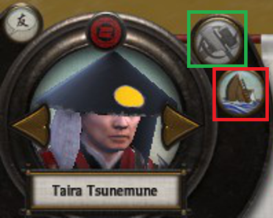
The Navy Dial sports two particularly interesting icons. The repair icon (Dark Green), and the disband icon (Red). Each icon clearly conveys its purpose, with the disband icon showing a boat sinking, and the repair icon showing two important tools used during repairs.
Banner
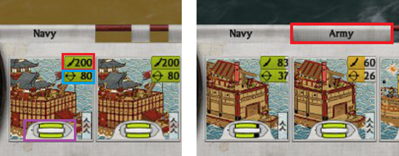
The Navy Banner shows various important information related to the selected fleet. The number of soldiers on board (Red), the number of archers on board (Teal), the health of the ship (Purple), the ships experience in the bottom right corner, and a pleasingly distinctive icon for each type of ship.
Construction Tab

The Construction Tab offers players plenty of useful information in-order to manage construction in a province. What is currently built in the province, the state of those buildings, what can and cant be built/upgraded with relevant technological, commodity, and money restrictions.
Building Constraints
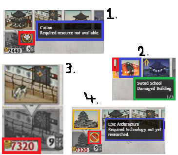
In images 1, 3, and 4 on the left constraints are displayed (Red). An icon representative of each constraint, and the building being greyed out is used to clearly convey that the player is unable to construct the building, and why.
In image 2 on the left the building (Dark Blue) is damaged, and therefore its use is suspended. This constraint is clearly shown with a dynamic fire animation, and a repair button to remedy the problem.
In image 1, 4 (Blue) and 2 (Green) are informative popups to explain the constraints.
Construction

Ongoing construction projects have a clear turn number, and grey dial overlay which visually displays an equally partitioned fraction based on the amount of construction completion.
Empty Plot & Improvements

- Blue – Constructions options.
- Green – Upgrade icon.
- Red – Empty plot image .
The building image for an empty slot has no building, and the tools for construction are both the same as the repair ship icon as well as quite prominent making it easy to see at a glance.
Recruitment Tab
Recruitment tabs appear when selecting:
- A province.
- A general.
In the first case the number of turns to recruit, and reach the selected general are shown (Yellow) with an hourglass icon that clearly suggest time. When hovering over the unit a helpful popup appears with a description (Lime Green). The cost of the unit is shown (Purple) with a consistently used icon for money, and there is a easily visible method of scrolling through available units that’s can be recruited (Red). Lastly a queue is displayed to the user to be able to easily see what units are expected to be produced (Teal).

In case 1 prerequisites are show with helpful popup menus (Green), and if agent production is possible in the province, agents can be recruited (Red) in this UI area with the option being displayed in a clearly partitioned area.

Agents
Agents are units that can act on the campaign map, and in that way have a tab of their own. Within the tab, and consistently used through the UI the agent details are clearly displayed with a rank (Red), and agent type icon (Blue). What is interesting about agents is that they can be attached to a naval, army, or province. In this way the Agent Tab is absorbed into the Army Tab with the Agent receiving a tab of its own (Orange).

A little issue I noticed is when an agent is alone in a castle, and the agent tab is selected the name of the agent does not appear. This would not trouble me, but if an Army was in the same scenario the name of the General would appear. I believe then that, either developers thought agent name not as important as the province name, which is fair enough, or it was perhaps a small oversight in consistency.

Battle Panes
Battles panes appear when two armies engage each other in the campaign map, but have not yet transitioned the the actual battle.
Army
The Army Battle Pane is I believe is another great example of good UI design, as it is designed in a manner similar to the diplomacy page from the management dial in the bottom right of the campaign UI. A players information is shown to the left of the page with the army composition (Lime Green), general and army details (Pink). The enemies details are shown to the right, and if there are multiple armies it is displayed with multiple general icons in an appropriate space (Yellow).

In the middle of the UI element battle conditions are shown. The armies relative strength indicator (Green), details of the battle location (Brown), and actions are shown, which are the ability to auto resolve (Red), manually fight the battle (Teal), retreat (Orange) and quick save (Purple). Together all these individual elements come together to provide a player essential information, as well as the ability to execute appropriate actions related to the battle at hand.
Navy

The Navy Battle Pane reuses most of the elements from the Army Battle Pane structure, with a small difference being how the number of units are displayed (Purple), in this the displayed numbers are number of ships/crew. We also see a different type of icon in this scenario where when clicked declines engaging in the battle which in the above scenario involves an ally which the player can choose to assist.
Siege

Again the Siege Battle Pane follows the usual Army Battle Pane standard. In this scenario the defenders of the province are sallying forth to fight the attacks. Players who choose to sally forth engage in an open battle with the attackers, and this action can be confirmed or aborted from the Siege Battle Pane using the return to castle looking icon (Red). In addition, there is a general present during this siege. The generals icon is displayed (Green) as well as his star rank. Having a highly ranked general present, modifies the options in the center (Yellow) as this general has the option of initiating a night battle which can be done by checking the check box.
