Tag Archives: Tiny

Tiny – Week 13

This week was spent working on UX changes as well as polish to the game.

UX Changes

A number of UX changes were made .

One Gem Solutions

One gem solutions are The changes this work consisted of solving a number of one gem solutions that appeared during playtesting.

Tutorial

Changed protractor tool tutorial to an earlier level, then introduced it again in a later level to hopefully increase the probability that players will use it.

Anti-Cheat

During our playtest it was revealed that slotting and removing a gem constantly could be used as a cheat to beat a level. We solved this issue technically by having a check for slotting, and not allowing a win to occur if a slot had occur within sometime.

Game Flow

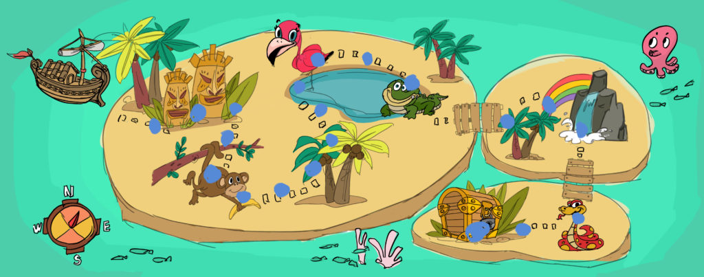
We reconsidered the flow of the first time play experience. Initially the first time players played the game they start directly at level one. The intention behind this was done in attempt to get players attention by showing them the most interesting thing first. This was changed to start with the map first because:

  1. It was our actual homepage.
  2. Many other games followed a standard of showing the map first rather than introducing the gameplay.
Tiny – Week 12

At the start of week twelve polishing the game was on the forefront of our minds. In this regard, design wise we continued to struggle with small, but vitally important decisions namely considering the visual representation of angles during gameplay and the introduction our scaffolding tool (the protractor from week eleven).

Hammertime!

We met with Jessica Hammer on Thursday to get a perspective on what we had done and the issues facing us. She told us the following:

  • Clarify our learning goals and sort it out into a table
  • UI buttons were confusing
  • Change to allow free form manipulation of gems
  • Pointed us towards Robert Siegler a professor of psychology at CMU
  • Make red and blue gems beam movement uniform, so red always goes anticlockwise, and blue always goes clockwise
  • Reconsider the visual representation of clockwise movements
  • Interest in protractor tool introduction and suggested we put it on level three where we introduce no new things and so cognitive load is not high

Jesse to the Rescue!

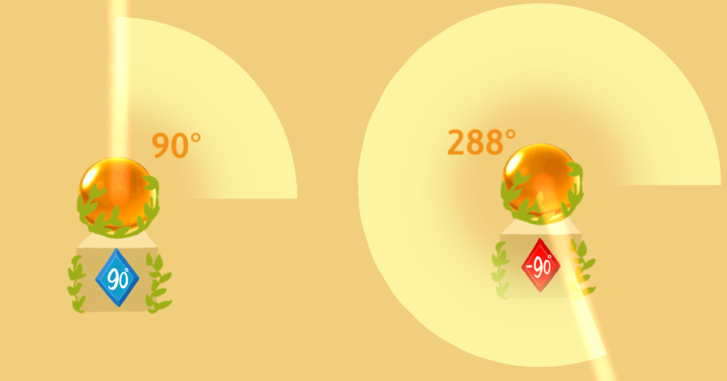
Following this we met with Jesse Schell on the evening of the same day. Being the masterful designer he is, Jesse gave us a suggestion of displaying the spatial representation of the angle.

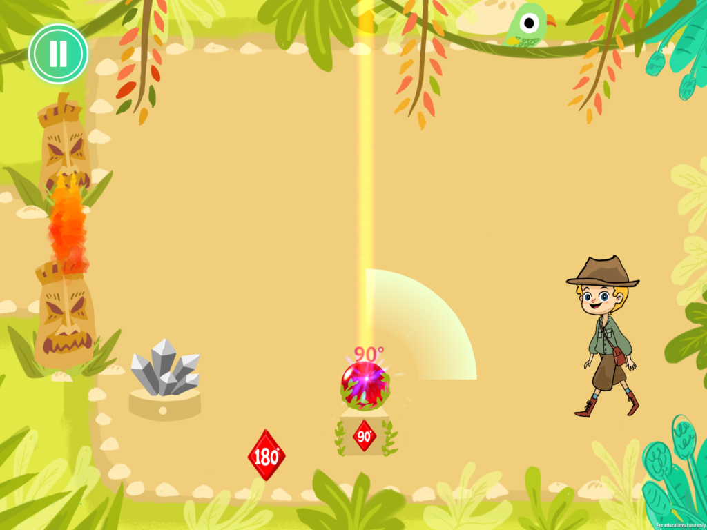
Jesse’s suggestion was when the beam rotated clockwise, the beam maker would make the full 360 degree representation pop out, and be subtracted from when the beam moved past 0. In the case of the beam rotating anticlockwise the sector would grow as the beam moved anticlockwise.

We implemented this feature, then spent the rest of the week playtesting the levels we had, and weeding out one gem solution angles.

Tiny – Week 11

Starting Week 11 we finished creating digital versions of our remaining puzzles. In addition we began working on the various aspects of the game that we presented to our playtesters at the end of Week 10.

More Pieces

We added a map to replace the original level select screen. The new map would serve two functions.

  1. It would display the progression of the game to the player
  2. Create a more visually appealing method of level section

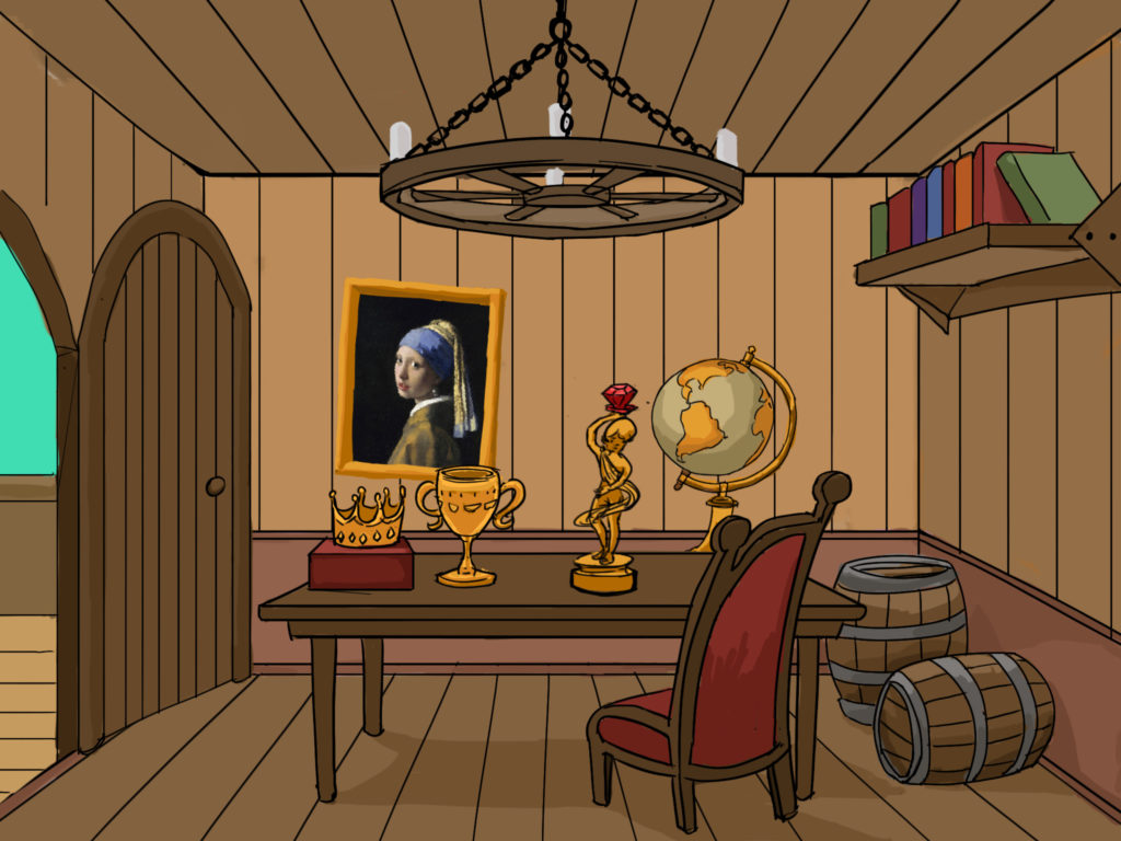
We also implemented a reward system in the form of trophy’s added to ones treasure room after completing a ‘boss level’.  We hoped such an addition would add a motivational factor for completing the game.

Later in the week Jesse Schell played the game, and suggested a new way to show treasure room. Instead of having trophys placed on the desk, have shelves arranged in a geometric way with numbers on them to reinforce the central theme of angles. In addition to this we considered including random treasures which we hoped would add a surprise factor.

Continue reading Tiny – Week 11

Tiny – Week 10

During Week Ten we prepared designs for the final levels of the game. These levels were in line with the complexity metrics we established during Week 9.

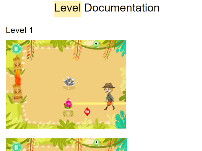
During this process we also documented our puzzles, and their solutions. This document would not only help recreate these puzzles during development, but could be handed off to teachers as a supporting document.

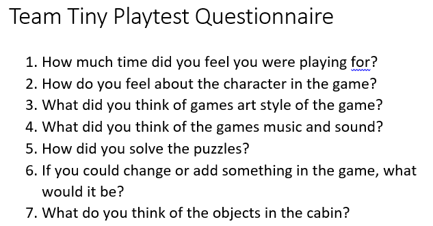
Meanwhile we began preparation for The Entertainment Technology Centers playtest day. This would involve members of our target demographic visiting our project rooms to playtest our game. For this day we came up with a number of questions to ask our playtesters as well as prepared video and screen recording equipment to capture gameplay footage.

Playtest Day

On Playtest day we had five groups of playtesters. Each group played the game for approximately fifteen minutes. We then conducted a short interview with them, and found several good insights such as:

  • They really enjoyed the game, we never had a case of a bored playtester
  • Even when playtesters got stuck they cried out for help, and we had cases of playtesters working together to solve puzzles
  • The protractor tool was useful, but since there was no clear tutorial playtesters found it by mistake
  • Playtesters liked the art, music as well as the treasures we would reward them with
  • Playtesters didn’t object to the main character, but found certain animations weird

This slideshow requires JavaScript.