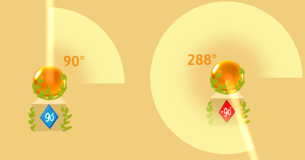
At the start of week twelve polishing the game was on the forefront of our minds. In this regard, design wise we continued to struggle with small, but vitally important decisions namely considering the visual representation of angles during gameplay and the introduction our scaffolding tool (the protractor from week eleven).
Hammertime!
We met with Jessica Hammer on Thursday to get a perspective on what we had done and the issues facing us. She told us the following:
- Clarify our learning goals and sort it out into a table
- UI buttons were confusing
- Change to allow free form manipulation of gems
- Pointed us towards Robert Siegler a professor of psychology at CMU
- Make red and blue gems beam movement uniform, so red always goes anticlockwise, and blue always goes clockwise
- Reconsider the visual representation of clockwise movements
- Interest in protractor tool introduction and suggested we put it on level three where we introduce no new things and so cognitive load is not high
Jesse to the Rescue!
Following this we met with Jesse Schell on the evening of the same day. Being the masterful designer he is, Jesse gave us a suggestion of displaying the spatial representation of the angle.
Jesse’s suggestion was when the beam rotated clockwise, the beam maker would make the full 360 degree representation pop out, and be subtracted from when the beam moved past 0. In the case of the beam rotating anticlockwise the sector would grow as the beam moved anticlockwise.

We implemented this feature, then spent the rest of the week playtesting the levels we had, and weeding out one gem solution angles.