Last week I designed Grapes of Wrath, a concept for a multiplayer level in Battlefield 1. Reflecting on the experience I will detail my process, and lessons learned in the hope of enriching myself and others.
I initially split design into two segments. Theme & Structure.
Theme
Given an aim to create a post apocalyptic theme I began my research with reference images.
In addition to reference images I sought out other forms of media such as movies, book and games that were set in a post apocalyptic setting.
What struck me most when reviewing this material was the desolate landscapes, and ruinous infrastructure. I intended to include these elements in some manner in the map I designed.
Structure
In the context of Battlefield 1 I define structure as map objectives, points of interest, unit design, and player flow.
Research
My research into structure began with two of Battlefield 1’s modes, Conquest & Rush, both of which I intended to accommodate within my map design.
Modes
Not only did I experience these modes by playing them, but I used spectator mode to watch the battle play out at a meta level. This allowed me easily see how objective placement, and points of interest affected player flows.
Unit
I then looked at Battlefield 1’s units. A study of the different infantry classes, tanks, airplanes, and vehicles revealed sub-categories, each of which had different play styles:
- Air
- A fast but weak plane
- A slow but powerful bomber
- A hybrid plane
- Tanks
- Glass cannon artillery
- A fast but weak tank
- Slow but powerful tank
- A hybrid
- Infantry
- Short
- Medium
- Long range
- The Behemoth – A lead breaker
Battlefield 1 is a web of balance, and what I found was their vehicles cater to extreme playstyles with disadvantages, and usually a third averaged option.
Cerebral Design
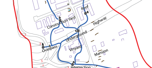
Combining map knowledge and player elements I created a ‘cerebral map’ for Rush and Conquest. These maps included player flows, and major elements such as the Behemoth route, and an underground bridge.
For Rush mode the map intended to convey that attackers would become weaker over time, and defenders stronger whereas in Conquest it should be balanced strength. I hoped to achieve this experience with various measures such as:
- Placing map objectives progressively further from attackers and closer to defenders in Rush
- Giving more elite kits and vehicles to defenders as the attackers captured objectives in Rush
- Balancing elite kits and vehicle spawns in Conquest
My cerebral map was an initial pass at an experience, which was all well and good, but it clearly was not a map! What I had created was akin to a disfigured skeleton which needed a layer of flesh, and its bones tweaked. A location was needed to root these abstract concepts in. Therefore Location became the third segment of my design process.
Location
In choosing a location I first conceptualized key constraints of my map such as:
- Include destroyed infrastructure such as an underground bridge
- It had to be in Europe
- Lent itself to a shift from rural to urban landscape
- Could accommodate flag and objective placements
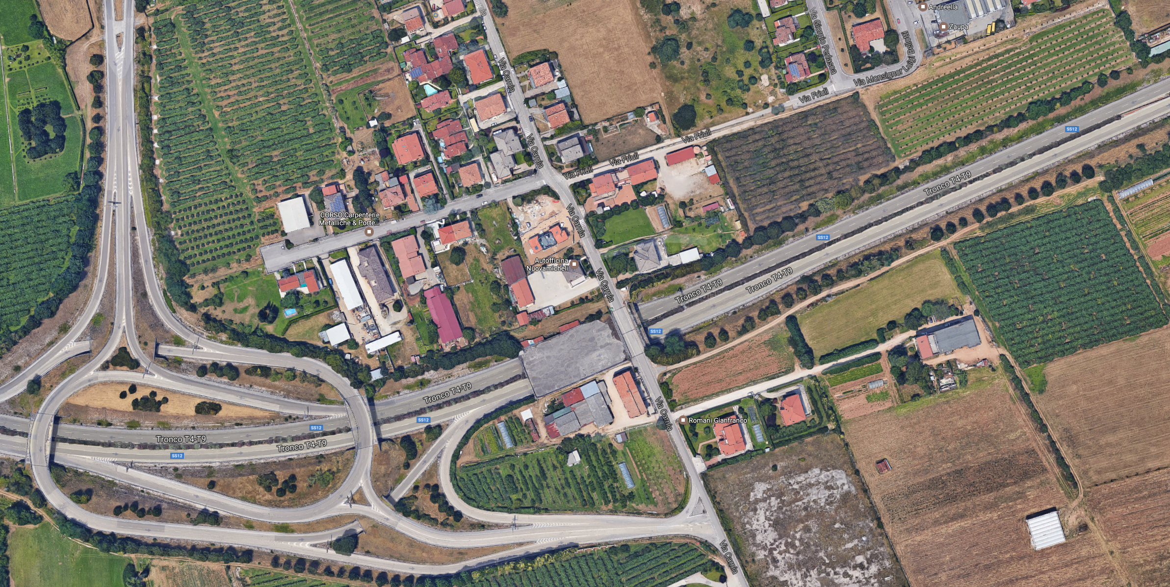
I searched Google looking at a number of cities in Europe until I found a suitable location in Italy. The location was split by a highway I believe would make a rural to urban shift more believable. More importantly it had an underground bridge which was a vital part of my cerebral design.

All Together
Putting Theme, Structure, and Location all together resulted in the following:
When placing objectives, assigning elite, choosing vehicle spawns, and selecting points of interest, I considered different types of players, and tried to create interesting choices. For example an area called Compound I converted into a fortress for my defenders last stand, rather than the groups of houses it originally was. Other areas were designed with the following rationale:
- Open areas and vantage points for snipers, but are vulnerable to air attacks
- Areas with good cover near objectives for close and medium range units, but surrounded by areas that are strong for long range units
- A road for vehicles allowing for a quick, but dangerous route to objectives
- A fortified base which requires significant manpower to effectively defend it
- An dangerously exposed route for flanking maneuvers
Throughout this process I kept in mind to balance advantages with disadvantages to create interesting trade-offs (interesting choices).
Conclusion
Is there a good way of going about designing a multiplayer map? My attempt was to consider Theme and Structure leaving Location by the wayside. The result was the creation of a deformed skeleton that needed tuning.
In hindsight my most important lesson has been the important of keeping Location in mind sooner rather than later. Structure, Theme, and Location are interconnected, and choices in one affect the other.
In conclusion, considering the entirety of my experience my takeaways are:
- Research the theme you are aiming for, look at a variety of media in that theme, and inform your design with that research
- Study the experience you intend to recreate, deconstruct its elements and how they are used
- Cater your map to different play styles
- Balance advantages with drawbacks to create interesting trade-offs
- Find a location early!
- Great tools are invaluable (shout out to Adobe Illustrator & Google Maps!)
- Location is actually better categorized as a form of Structure. I would then propose the following categorization:
- Theme – Map genre e.g. post apocalptic
- Internal Structure – Non-fixed map elements e.g unit design
- External Structure – Fixed map elements e.g. points of interest, map objectives, building placement
- Flow – The control resulting in the combination of internal and external structure
