Category Archives: Game Impressions

WIT – Stubbs Rebel Without a Pulse

Preface: Making games is hard. So any endeavor I applaud. The game I will be writing a few notes on is Stubbs Rebel Without a Pulse.
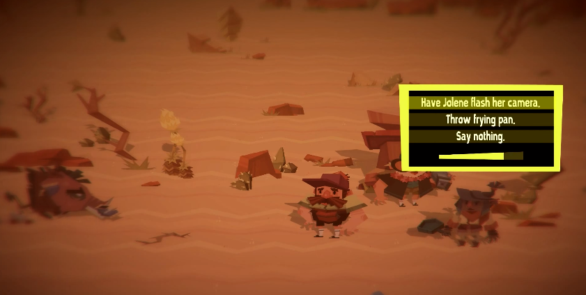
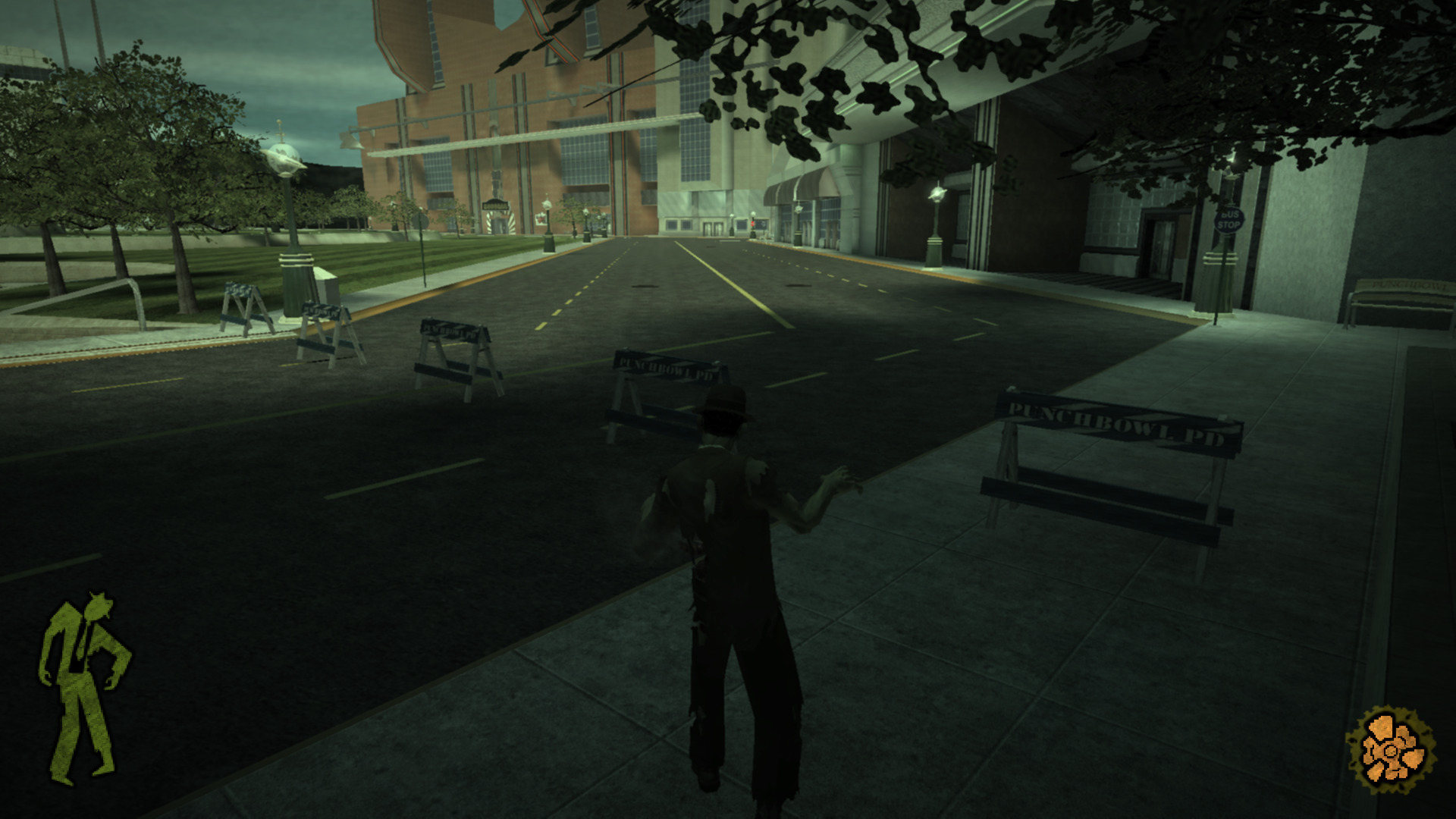
Boundary Signaling

A simplistic means to convey blocked off area which uses police barriers, and invisible collision heavily in a manner that is immersion breaking.

Modes

Stubb’s showcases a number of modes fairly early to keep things interesting.

Vehicle

An mode where players pilot a vehicle.
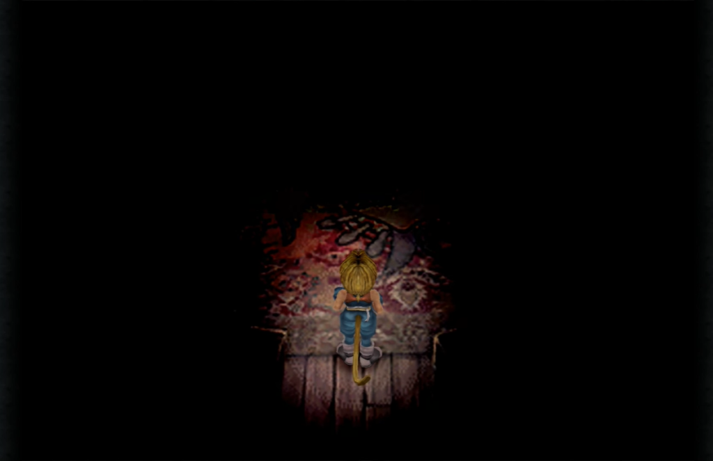
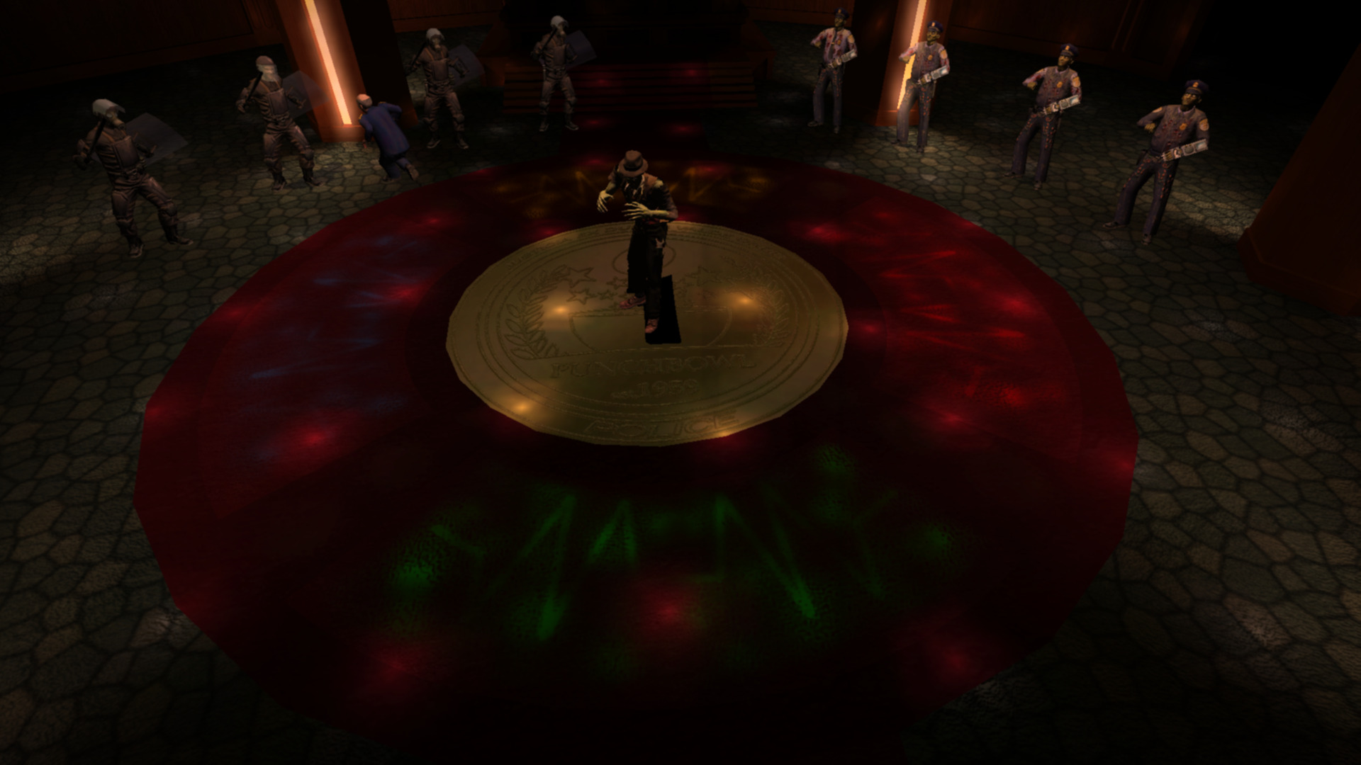
Dancing

A minigame where the player engages in a dance office with a boss.

The game begins with simplistic patterns that go around the gamepad. Patterns such as:

  • 2 lefts then 2 ups.
  • 2 downs then 2 rights.
Speed Increase

To increase difficulty the mini game increases the speed of input.

I have mixed feeling about this minigame. It’s very unforgiving. One has to memorize the pattern, and I had great difficulty if I didn’t have the pattern in mind.

To improve this section the game could increase the time for input or better foreshadow the next button press. Other games have done this with visualizing future button presses.

Additionally the mini-game has an unclear end state. When do I know when I win or lose? How many rounds left?

Hand

An alternate mode where the player controls Stubb’s hand. This mode is interesting in that the players:

  • Scale is changed.
  • Has a new means to navigate being able to crawl along surfaces.
  • Is able to mind control enemies

One improvement I would make here is having the surface crawling be connected to a player input rather than automatically occur when approaching a surface.

Continue reading WIT – Stubbs Rebel Without a Pulse

WIT – Shadow Warrior

Preface: Making games is hard. So any endeavor I applaud. The game I will be writing a few notes on is Shadow Warrior.

NPC Implicit Navigation Technique

Nice framing here. Though one can go right devs used the guy to the side who I believe subconsciously pushes you up the main path which is to the left.

Vista at the Fringes

I appreciate how the devs took time to create a static vignette on the fringes of the map. The image though is quite contrasting with the temple road and the bamboo abruptly ends. The transition could have been done better, but I understand a low value return on investment here.

Minor Note

The AOE of the attack of the Warlord was troublesome to dodge. Wish it was something like it created VFX crack projections that if the player wasn’t colliding with it would not damage them. 

WIT – Scratch X RPG Battle 2

Preface: Making a game is hard, so any endeavor I applaud. Additionally the time and Skill Level of Developer is Unknown. The game I will be writing some notes on is Scratch X RPG Battle 2 and can be played here.

Here are some notes on the experience:

  • Enjoyed the meteorite special ability, appreciate the effort in terms of attack animations.
  • Expected ultimate to be something different from meteor.
  • Classic JRPG style action menu.
  • Like how the background is akin to some of the special moves. Helps to create a sense of a larger environment.
  • Would have like a progression of enemies, boss super powerness reduce from the impact of abilities + not sure if the enemy can be beaten.
  • Some initial backstory might be cool to setup why I’m this character, what brings me to this place.
  • Some options not functional e.g. Items – likely scope related.
  • Health and mana could be different colors instead of different shades of blue to visually show their difference in function..
  • I’d consider making the ultimate ring an inner part of the three stats ring to show association between the two.
  • Unclear how to back out of current option, could use standard key like escape, since no ability to go back in menu and was out of menu got stuck and had to quit.
  • Reminds me of Dragon Ballz for some reason.
  • Boss projecting a power attack coming is good. Dark Souls does this well for attacks in general.
  • After a couple of tries I did win. It was hard, more playtesting and tuning seem to be in-order.

Octopath Traveller

Played Octopath Traveller.

Save 50% on OCTOPATH TRAVELER™ on Steam

Here is some thoughts:

Brave Narrative design

It takes courage to tell stories in such a manner that Octopath Traveller does. I suppose the cost of the permutations of these stories is many, and that comes with certain implications. From my sense playing so far (12 hours in only). It seems these stories will be told in parallel with not too much cross over. Regardless I maintain its brave to take on such a challenge at all. Good for them. 

Amazing Sound Track

Sunlands, Primrose the Dancer, amazing. Nothing left to say. Do checkout these tracks if you haven’t heard them awesome stuff. As well as these the game has even more to offer!

Endearing Art Style

The pixelated art style reminds me of JRPG’s of old. I happily reminisce once in awhile playing this game. 

Octopath Traveller PC review | Rock Paper Shotgun

Flower

It’s the end of 2020. I’m in Kuwait stuck in quarantine and COVID’s got the airports locked down. Therefore having some downtime on my hands I decided to dust off my PS3 and play Flower, a game developed by Thatgamecompany . Here are some brief notes (images from Full Playthroughs):

Like

World Transformation

  • Love the world transformation aspect. The world becoming colored is a popular trope used in film and games.
  • The finale level reminds me of a scene from One Piece when this massive Sakura Tree blooms.
  • Love the swap of elements that were once oppressive (in-organic metal structures) that you break which can create green grass, and more organic shapes that come out of the ground.
  • Another transformation aspect is the home screen. It’s ‘liveliness’ and color increases as the game progresses.

Player Guidance

  • Player guidance to flowers is supported with a ring that indicate the essential ones to grab.
  • Little to no words (e.g. diagram to explain controls and how to start).

Audio

  • Flower employs light piano music for what I interpret as a means to make the player feel free (heavy use in the finale level).
  • The audio soundscape consists of distinct tones for every action. For example destroying stuff, picking up flowers, and world transforming.

Progression

  • The growth of ‘player avatar’ is progress you can literally see.
  • The different colors you collect give a sense of history and memories. For example ‘oh I I remember collecting those yellow petals!’
  • Variety of color petals gives visual contrast.
  • Grandest level is the smallest flower (priming expectations for a surprise?)
  • Typical level pattern starts with a single petal which grows, then the level ends with a huge visual payoff.
  • Level structure felt like they saved the best for last.

Didn’t Like

  • Impreciseness of controls – wish for a button equivalent to some of the controls.
  • Feeling of having to collect flowers detracted sometimes from the experience.
  • In the home screen, what if all pots are visible but plant in that pot only appears and is selectable when level can be played, then when the level is complete the flower blooms? (Trade off of progression vs surprise?).

Final Fantasy 9 – Initial Design Impressions

Steams recent winter sale had Final Fantasy 9 on discount. I saw it as a great opportunity to revisit a beloved franchise. The following are ‘designery’ thoughts from the first several hours of play:

Like

  • FF9 starts you off in a dark room where it easy to focus on your player and understand movement. It then lights up the wider environment.
  • Narrative reinforcement – One moment where the player must select the princesses name whilst going over the kidnapping plan.
  • Level Exploration – In the scene below your character enters the scene from the bottom of the screen. Once you have control of the character the world fulfills the expectation of continuity by providing an area that’s the opposite way the player is encouraged to go (using the crowd who moves forward).

Lots of and easy to find initial pick ups from environment to quickly establish and encourage exploring the environment for rewards.

  • Storytelling Moments – Initial area showcases poverty/class differences through characters in the scene.
  • Lots of encouragement to explore through cutscenes. For example Steiner locked in room and the cutscene shows you are treasure chest which encourages you to go there.
  • Love the variation of activities right from the start such as finding the knights of pluto, and a scene of quick time events of sword fighting.
Continue reading Final Fantasy 9 – Initial Design Impressions

Entwined, Impressions

Entwined is a rhythm game developed by PixelOpus for the PlayStation 4, PlayStation 3 and PlayStation Vita.

Warning there be spoilers ahead! Read at your own peril!

Entwined’s gameplay can be broken down into two sections:

PowerUp

  • An on the rails experience in a tube game space with a fish and bird respectively confined to a half of the tube.

  • Each side of the tube has a PowerUp bar that is filled by the player collecting objects contained on that side.
  • Objects are collected through the player moving the fish and bird using their controllers joysticks.
  • When the bar is full the player morphs into a dragon and goes into the SkyWrite section.

SkyWrite

  • A freeroam experience where players use their controllers joysticks to fly around a fixed area collecting orbs till the sections PowerUp bar is filled.
  • Once the PowerUp bar is filled the player can SkyWrite leaving a persistant trail.
  • When SkyWriting is complete the player can proceed to the next PowerUp section to continue the game.

Like

  • Beautiful visuals
  • When the bird and fish come close together their color melds into a green, which is the same color of the dragon they later morph into.

This slideshow requires JavaScript.

  • Little orbs used to direct player to fly interesting areas

  • Powerup system links into joystick controls well
  • Great tutorial. The developers employed practical examples with clear visual indicators in both PowerUp and SkyWrite sections.

This slideshow requires JavaScript.

  • Good use of orange and blue which are strong color themes throughout game

This slideshow requires JavaScript.

Continue reading Entwined, Impressions

Heart of The Swarm, Impressions

Recently I’ve been playing Starcraft 2 Heart of The Swarm, a military science fiction real-time strategy video game developed and published by Blizzard Entertainment. The following are my notes:

There be spoilers ahead, read at your own peril!

Like

  • The Hyperion mission! Having to manage one unit with a continuous stream of battling non playable characters takes away the added task of micro management and lets me enjoy a feeling of ‘distinctiveness’

  • How ‘cutscenes’ meld into gameplay e.g when saving Raynor, Kerrigan’s Leviathan arms smash into the prison ship which then transitions into the game level

This slideshow requires JavaScript.

  • Evolution missions really helps players understand how an evolution works and how to use it

Dislike

  • After Kerrigan’s battle with Narud, I felt she recovered too quickly. It drew from the gravity of the fight. She should have been in an injured state for the Leviathan section where characters could comment on her fight. Then by the next mission having recovered, there would be a contextual piece of dialog about it

Continue reading Heart of The Swarm, Impressions

Dyscourse, Impressions

Recently I’ve been playing Dyscourse, a survival adventure video game developed and published by Owlchemy. The following are my notes:

There be spoilers ahead, read at your own peril!

Like

  • Effective non playable character ‘humanization’
    • Text – One character makes a reference to the main players clothes
    • Actions – Passing around of water bottles scene

This slideshow requires JavaScript.

  • Warm colorful storybook art style
  • Characters reflect ‘character’ through facial expressions, walking style, and speech which conveys the characters emotion
  • ‘Torchlight Talk’ mechanic, it makes sense that the fire goes out over time making talking limited

  • Time based events with clearly conveyed state e.g combo sequence required to defeat boar

  • Color coding for character dialog messages

  • Slight shine on wooden planks to attract players attention

  • Choice confirmation points that give a player a chance to again consider

  • Rewind feature, which allows player to go through the story again and try get the outcome they actually desire

Continue reading Dyscourse, Impressions

An Impression of 140

Melding music and game play is an interesting area of game development which games such as Crypt of the NecroDancer, Beat Buddy, and Guitar Hero, have explored. Whilst exploring my own shamefully large collection of untouched games on Humble Bundle I happened upon the game 140 which makes its own contribution to this area.

140_game_logo

With lead designer Jeppe Carlson, (co-designer of the well know title Limbo) 140 was created by Carlson Games. Paraphrasing Jeppe, he describes 140 as an old school platformer, where the challenge is in syncing up your moves, and jumps to the music controlled elements.

After a short time with 140 I thought to briefly note my impressions of the game.

Disclaimer – This is not a  thorough review, but notes of an impression based on approximately 20 minutes of game play. Everyone is fallible.

Impression Notes

  • On launching 140, the first thing that hit me was its minimalist art style. Its distinctive color scheme made it easy to identify puzzle patterns, and game elements.
  • In 140, music is at the heart of its game-play with appropriately pulsating background, and game elements used with rhythm based mechanics to make interesting puzzles.
  • 140 relies on players exploration of controls as I noticed no traditional tutorial which can be fine. Although some helpful information based on monitoring of the game state is good e.g explain to jump or move if a player hasn’t moved for a long time.
  • Like other titles in this area 140 suffers slightly from issues of repetitive music. This issue I believe essentially stems from player progression which is something hard to control. I felt this game handled this issue well by splitting music into short levels.

140_game_elements

  • The difficulty of the game quickly ramps up, likely making it less accessible to the casual gamer. On the other hand though, this meant 140 presented more challenging puzzles, which is delight for some. It’s good that the creators of 140 realized the game difficulty, and employed frequent checkpoints through out the game.
  • 140 bravely deviates off a more traditional pattern of game mastery by transitioning to a hail shooter from a rhythm based platformer at the first boss fight. I found the hail shooter boss encounter to be a disproportionately high increase in difficulty from the challenges before. The encounter left me frustrated (maybe I just sucked bad). Perhaps an easier encounter, or a series of checkpoints through the boss encounter would have been preferable.
  • Raph Koster said ‘noise is patterns we don’t understand’, and so it felt appropriate that the ‘death blocks’ were static noise. 140s creators took this concept even further during the first boss fight as static noise breaks down into music.

First Boss Fight
First Boss Fight

  • Like other titles in this area of game development, 140 suffers from issues of repetitive music. This issue I believe essentially stems from player progression which is something hard to control. 140 tackled this issue well by shortening levels, and splitting up music into those levels.
  • I liked how the levels key (item objective) was innately tied to the next level through music. When hearing the keys music was excited thinking about how it would later manifest itself as a mechanic.

Conclusion

All in all I enjoyed 140, being a nicely designed little gem it was a happy little surprise. Budding game designers should definitely give it a play as its a game well focused on how to meld music, and game-play.

Shogun 2s User Interface, Center

The central area of the Total War interface receives the highest attention from the player. This post will look at a number of the elements that appear there.

Total War Encyclopedia

There are many pages within the encyclopedia. A look at one page gives a good understanding of the user interface (UI) element given the consistency used throughout the encyclopedia.

Encyclopedia Page

  • Light Blue – Main Subject Categories.
  • Dark Blue – Scroll Bar.
  • Green – Navigation Buttons.
  • Light Green – Part of Page Description.
  • Orange – Topic Navigation.
  • Pink – Relevant UI Image.
  • Purple – Page Title.
  • Red – Main Title.
  • Yellow – Browser Breadcrumb.

Notes

  • The scroll bar (Dark Blue) is not themed, resulting in it looking quite out of place. Perhaps this area was not given as much priority which is understandable as perhaps players don’t use the encyclopedia so much? From my experience I didn’t, and that is a sign of good game design.
  • The designers used the encyclopedia icon next to the UI elements main title (Red) likely to subtly have a player associate the image with the words Total War Encyclopedia.
  • The cancel button, and the navigation buttons are grouped together (Green) in the top left. For this area the designers have used the Main Menu button for the Home Button in the encyclopedia, they rely an understanding of ‘importance’.
  • The use of bread crumbs is good for players to quickly backtrack when navigating (Yellow).
  • The on hover underlining used for the main page categories is more link like (Light Blue).
  • There is a further reading tab located at the bottom of the page (Orange) which makes sense since the read is likely to look there. At the bottom of the page, the left and right topic options are displayed based on related topics in the manual.
  • For the main article they used topic headings, text descriptions with images, and icons which prove to be very helpful (Pink & Light Green) in conveying the point of the article.

Continue reading Shogun 2s User Interface, Center

Shogun 2s User Interface, Bottom Left/Middle

The Bottom Left/Middle Area of Shogun 2s Campaign Map User Interface is an elegantly designed, helpful popup filled, context sensitive area that displays key information about a players Navies, Armies, Agents, Construction, Recruitment and Battles options.

The UI element as a whole is thematically suited to the time period, incorporating a Japanese battle banner, appropriate color scheme, and style to complement the rest of the UI. In addition a neat feature of this UI area is that depending on the context of a players selection this UI area will change. For example when a player clicks an empty space on the campaign map it is hidden, if an army is selected army information will appear in the form of a Tab.

All these design decision make this UI element a screen space efficient, compact, informative, aesthetically pleasing part of the campaign map that ‘fits’ well into its surroundings, and help build the experience of a general during the Sengoku Jidai..

Army Tab

Army Tab
Army Tab

The Army Tab displays information related to the selected army. The UI element is made up of a Dial and a Banner.

Dial

Army Tab Dial
Army Tab Dial

The Army Tab Dial can be broken up into the following sub-elements:

  • Red – Clan icon.
  • Teal – Army leaders name.
  • Dark Blue – Arrows allowing cyclical cycling through units of the same type, in this case army.
  • Purple – Army leaders image.
  • Yellow – Disband button.
  • Green – Chat.

Considering this element:

  • The layout of the dial is interesting being somewhat symmetric, and the dial art asset has a shine at the top of the dial which may attract a viewers eye.
  • The Purple and Teal elements are not necessary, but are welcome as a thematic elements for a player.
  • Functionally the Dark Blue, and Yellow elements allow a player to quickly jump from army to army, and disband them if necessary.
  • The other side of the campaign map, the bottom right, features a stylistically similar dial.

Banner

Army Tab Banner
Army Tab Banner

The Army Tab Banner is jam packed with vital information that can be broken down in the following manner:

  • Orange – Used for unit replenishment indicators, where a:
    • Green circle with a + means units are replenishing.
    • Green circle with a red slash means are not replenishing.
    • Skull which means units are suffering attrition.
  • Light Green – Unit experience.
  • Dark Red – Unit portrait with color coded background (Radious’s mod added this I believe).
  • Dark Green – Special Attributes e.g Accuracy, Improved Armour.
  • Yellow – Unit Rank.
  • Purple – Unit Strength. If the unit is being replenished a dark grey area will appear with a visual indicator of the new strength at the next turn.
  • Teal – Unit Type Icon.
  • Dark Blue – Recruitment Tab. This only appears when a general is present in the selected army.

Looking at the banner in totality, all the information fits neatly, and succinctly conveys a lot of information to the player with great use of clear icons in a consistent format.

Continue reading Shogun 2s User Interface, Bottom Left/Middle

Dawn of War 1

Recently I’ve been playing titles from Warhammer 40Ks Dawn of War 1. I’ve returned to these games multiple times now, and I have wondered why? My conclusion is that its the well designed battles.

Dawn of War 1 has taken many hours from me, and with this piece I think I’ll take something back.

Factions

Given the rich history of lore, previous video games, and an existing tabletop game there is plenty of meat for a game designer to sink ones teeth into during the design process.

By the end of Dawn of War 1 Soulstorm there were nine playable factions with varying mechanics. Each faction had a distinct identity, strengths and weaknesses. One faction I will briefly look at is one of my favorites, The Imperial Guard.

dawn_of_war_1_imperial_guard

Imperial Guard

Known as the Emperors Sledgehammer, The Imperial Guard are neither the Super Soldier Space Marines nor the Mystical Eldar Warlocks. The Imperial Guard are the common human, seemingly weak in strength, and spirit among the denizens of the universe.

Yet only seemingly.

dawn_of_war_imperial_guard_ingame

In Dawn of War 1 the core of the Imperial Guard are its Guardsmen. Imperial Guardsmen are numerous, and cheaply replaced. They are initially weak, their morale easily shattered facing slaughter at the hands of heavier infantry units. Their limitations can however be overcome.

With thematic enhancement options such as propaganda, decrees, equipment upgrades, and squad leaders. Guardsmen can be significantly augmented to become fierce fighters able to withstand, and even overcome opponents they were initially unable to.

Perhaps I’m reading into it too much, but I enjoyed how its designed that the common human with determination, equipment, training, and leadership. Can unlock their potential, can rise up, and defeat their enemies.

Still the common human has much more to offer.

Continue reading Dawn of War 1

Shogun 2s User Interface, Bottom Right

Bottom Right UI Element

The bottom right UI element is located in a circular image that suits a dial design. It balances well the circular dial located on the opposite side of the campaign map page. The UI element can be split into two major parts.

First is the management dial which contains the vast majority of this UI elements functionality. Secondly is the resource pane which includes an overview of the most important resources used in the game, money and food.

Management Dial

Management Dial
Management Dial

  • Blue – Technology.
  • Green – Turn.
  • Purple – Clan Management.
  • Red – Finance.
  • Yellow – Diplomacy.

The UI element is compact, containing a number of icons that are representative of their function. There is though a small risk of accidentally hitting the turn button given its size and position.

  • Diplomacy (Yellow) uses a bowing person which appears to be an envoy.
  • Clan Management (Purple) uses a Clan flag which is the best representative of a Clan, and since the image is used in many other places in game the player is familiar with the image.
  • Finance (Red), uses an abacus looking instrument which is a tool used for accounting, as well as images of the currency to associate the button with in-game money.
  • Technology (Blue) uses a picture of a sword and another item representative presumably related to technology.
  • The turn button (Green) reflects the season as well as the year written clearly in black.

Management Pages

A standard used throughout the management pages is the location of the help and exit buttons. The help icon is located on the top right, and the action buttons are centered at the bottom of the page. Perhaps the help button would have been better located on the top left to coincide with the position of the help button on the main campaign map page.

Clan (Purple)

On pressing the purple icon a clan management page opens that has a number of tabs.

Summary

The summary tab is the default tab that opens. The page includes several clan related thematic elements namely the clans symbol (Blue), the name of the daimyo and an in game image (Green).

shogun_2_interface_clan_management_summary

Continue reading Shogun 2s User Interface, Bottom Right

Shogun 2s User Interface, Top Right

The Top Right UI Element in Shogun 2s Sengoku Jidai Campaign Map consists of three primary elements.

Top Right UI Element

Map & Global Effects

The first element is a Map of Japan. Known clans territories are marked with a representative color (e.g Purple), and clicking the elements of the map takes you to that element on the 3-D map.

In addition selecting the Map Tabs results in icons appearing on the map e.g Navy, and Army symbols which when pressed take you to the unit. Certain symbols are given different styles depending on whether they are ‘active’ or not. An example of an inactive symbol is the trading post (Yellow), an example for active is the symbol used for the city of Kyoto which has been captured in this Campaign (Green).

shogun_2_interface_top_right_map

  • Blue – Expand Button.
  • Green – Active Icon Style.
  • Purple – Multiple Clan Colors.
  • Red – Minimize Button.
  • Yellow – Inactive Icon Style.

The Map can be expanded and minimized with the button in the top right corner (Red) of the Map (placement follow a standard for window closing making it more intuitive), and expand (Blue) is located in the bottom left corner which makes sense given it expands in that direction.

Map Resizing: Expanded(Top)/Default(Middle)/Minimized(Bottom)

The space difference when resizing can be somewhat judged by the above diagram. When expanded the Map takes up approximately a quarter of the screen, when minimized it disappears completely leaving only the Map Tabs and Global-Effects.

Global Effects
Global Effects

The second element is a list of Global Effects located at the top left corner of Map. This area displays an icon for each Global effect e.g. Master Builders which reduces construction costs. Perhaps leveraging perceptions of color, positive effects are displayed with a green background.

Continue reading Shogun 2s User Interface, Top Right

Shogun 2s User Interface, Top Left

Top Left UI Element
Top Left UI Element

The Top Left User Interface (UI) element of Shogun 2s Sengoku Jidai Campaign Map consists of three equally sized icons. Pressing these icons open up the Game Menu, Total War Encyclopedia, and Game Menu UI elements.

  • Blue – Adviser Toggle.
  • Green – Encyclopedia.
  • Red – Game Menu.

The Top Left UI Element is never hidden, and when large elements appear in the interface from the area underneath this UI element, this element often overlays the larger element which was likely done given that this UI element has a higher priority function.

Adviser Toggle (Blue)

The Icon for the Adviser Toggle button (Blue) was likely chosen because one adviser looks similar. The functionality of the Adviser pane can be changed to either appear when using a feature in the Campaign for the first time or, considering more experienced players, can be set to not appear at all.

Pressing the icon from the UI element at the top left of the screen opens the following pane.

Adviser Pane
Adviser Pane

  • Blue – Advice Toggle.
  • Green – Advice Subject.
  • Orange – Advice Details.
  • Red – Character Image.

The character image (Red) serves a thematic purpose, the arrows (Blue) are for cycling through Advice, and are grouped with the character image to avoid getting in the way of the Advice description space.

The Advice Title (Green), and Text (Orange) are positioned in a standard way for reading. The Advice description takes the most space of all the elements, and can expand if necessary in case of text overflows. The cancel button (Purple) is placed in a commonly expected place for exiting which is the top right.

Encyclopedia Icon (Green)

The Encyclopedia Icon seems to be a Japanese style lamp with a question mark on it. I interpret this to be a symbol for a lamp that illuminates the unknown represented by the red question mark. It also leverages the commonly known iconography for help by using a question mark.

Encyclopedia Title
Encyclopedia Title

To reinforce that this is actually the Total War Encyclopedia, the icon is prominently displayed on the start page of the game, and is constantly visible in the game Encyclopedia with a clearly visible label.

Start Page Encyclopedia Icon

Options Icon (Red)

Start Page Options Icon

I’m not exactly sure what the Game Menu Icon (Red) is. I’d hazard a guess, and say it looked like a face that was wearing glasses, and had a Japanese castle like hat?

In the Start Page of the game for displaying the Options Icon they used an image of a sword rack with multiple blades. That icon made more sense to me as I interpreted it to mean an option of swords to choose.

Perhaps they could have used the same image for consistency? Perhaps it was an issue of space?

Shogun 2s User Interface, A Study

The purpose of this project is to further my understanding of good UI design by studying various elements of Shogun 2s User Interface (UI) used in its Sengoku Jidai Campaign Map.

This post will serve to discuss the Campaign Maps UI layout, and be an index post in a multi-post project of non comprehensive personal observations of Shogun 2s User Interface.

Disclaimer: The User Interface (UI) is not quite in its Vanilla form due to having the Steam mod by Radious installed at the time of the study.

Shogun 2s User Interface Screenshot
Shogun 2 Campaign UI

The focus of this piece will be mostly on the 2-D elements of the interface such as menus, tabs, pop-up, and icons NOT the ‘3-D’ campaign map itself. So lets start with the general layout of the the Campaign User Interface.

General Layout

We can abstract Shogun 2s User Interface into an approximate layout with the following areas:

Shogun 2s User Interface General Layout
Interface Layout – Not to Scale

  • Dark Blue – Help and Options.
  • Green – Screen Center.
  • Light Blue – Map Lists.
  • Orange – ‘Selection’ Dial.
  • Pink – Description Popup area.
  • Purple – ‘Selection’ Banner.
  • Red – Map and Global effects.
  • Yellow – Management Dial.

Continue reading Shogun 2s User Interface, A Study

Jedi Knight: Jedi Academy – An Overview

Recently Humble Bundle had on offer a Star Wars Bundle which included an awesome entry from the Star Wars’s Jedi Knight: Jedi Academy.

jedi_academy_logo

I’d bought a physical copy of Jedi Academy years ago, and the memory of it was so endearing I thought I’d give it another play. This time with the difficulty set to max, and an eye open on elements of its design.

Continue reading Jedi Knight: Jedi Academy – An Overview

Darwinia – An Overview

darwinia

I recently finished the single player mode of Darwinia, and here’s a brief impression of it.

Good

  • Interesting game design. In particular I enjoyed the design of the Dawinians and how their management was handled well through the user of officers units.
  • Smart choice of aesthetics. The chosen look is simple and suited to both the environment and story. If there was a lacking the artistic department in terms of time/money/ability their choice covered it all nicely.
  • Enjoyable game play. The overall goal, and game play matched up nicely as it felt that you were cleaning up Darwinia due to the self-replicating nature of the virus.
  • Good use of sound. Behaviors and actions are clearly accented such as the sound of fear/fleeing of Darwinas, and the satisfying explosions of rockets.
  • Impressive file size. Clocking at a fantastically low 30MB makes this game very download friendly. In countries with fast internet this is a non-issue but with my slow internet, it makes a great difference.

Bad

  • UI was fiddly at times. I became frustrated with the gesture based interface, and fortunately a tab based interface was available as an alternative, but even there I faced some issues selecting what I wanted.

Conclusion

I enjoyed this game very much, it has great game play, and just enough story to go with it. Sad though that Multiwinia was just a ‘multiplayer’ expansion. I was hoping it would include another single player story that focused on Darwinian on Darwinian action with some additional complexity, as by far my favorite part of the game was the fighting between good and bad Darwinians on some of the final levels.

Overall an awesome little gem. Definitely worth checking out.

Supreme Commander 2 – An Overview

I recently completed the single player mode of Supreme Commander 2, and here are some brief notes on it.

supreme_commander_2

Good

  • Good in-game visuals. Top notch in-game animations in particular unit explosions.
  • Improved micro-management. Appreciated the removal of engineer and factory tiers from the first Supreme Commander, as well as being able to repeat build orders on factories allows one to focus on the fun part; commanding armies.
  • Game ran smoothly on my dated computer. I played the game on my fairly old laptop on the Medium graphics setting and it ran smoothly as well as looked good.

Bad

  • Pre-rendered cut scenes didn’t look good. To be fair though the game was released half a decade ago.
  • Single player mode was short. Supreme Commander one feature three seperate campaigns Supreme Commander 2 felt like it hacked together three half campaigns.
  • A weak story. The primary flaws with story are its underdeveloped characters, and a loosely strung together plot. It tries to have its ‘moments’ but unfortunately they fall flat given the lack of story depth.

Both

  • Smaller scale. Though the maps are smaller in scale, in some ways this is a benefit as you don’t have units travelling for ages to get to a battle, thus there is less time between ‘action’. Yet the point still stands that the overall scale of the battles have been shrunk, and with it the feeling of being the Supreme Commander.

Conclusion

Overall I enjoyed the experience. Supreme Commander 2 definitely has some improvements from the first game, though I get this feeling that the game is less that perhaps it intended to be. Perhaps due to time/budget constraints?

Nevertheless if  you enjoyed the first Supreme Commander the second is certainly worth checking out.