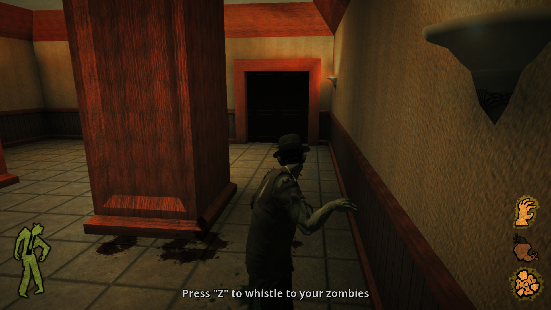
Preface: Making games is hard. So any endeavor I applaud. The game I will be writing a few notes on is Stubbs Rebel Without a Pulse.
Boundary Signaling
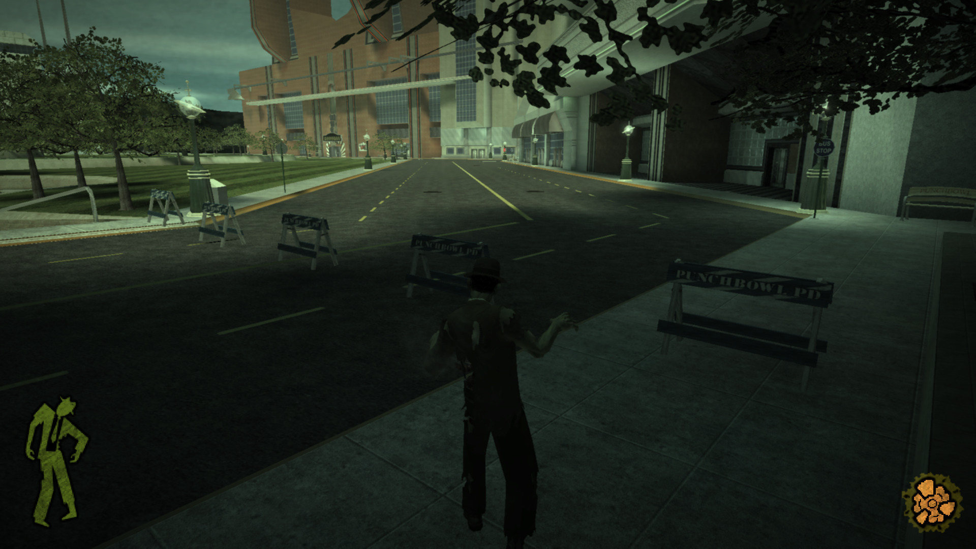
A simplistic means to convey blocked off area which uses police barriers, and invisible collision heavily in a manner that is immersion breaking.
Modes
Stubb’s showcases a number of modes fairly early to keep things interesting.
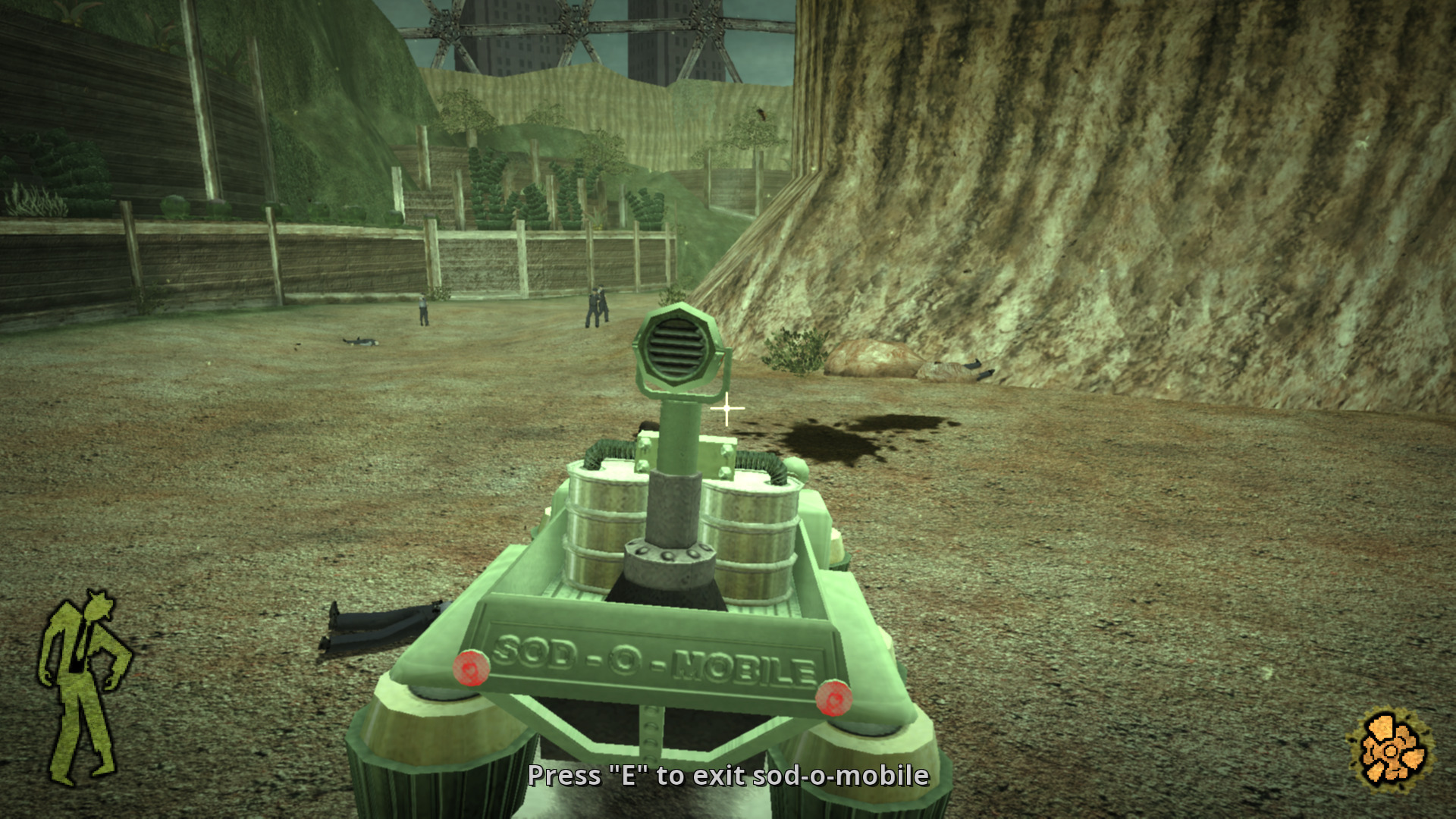
Vehicle
An mode where players pilot a vehicle.
Dancing
A minigame where the player engages in a dance office with a boss.
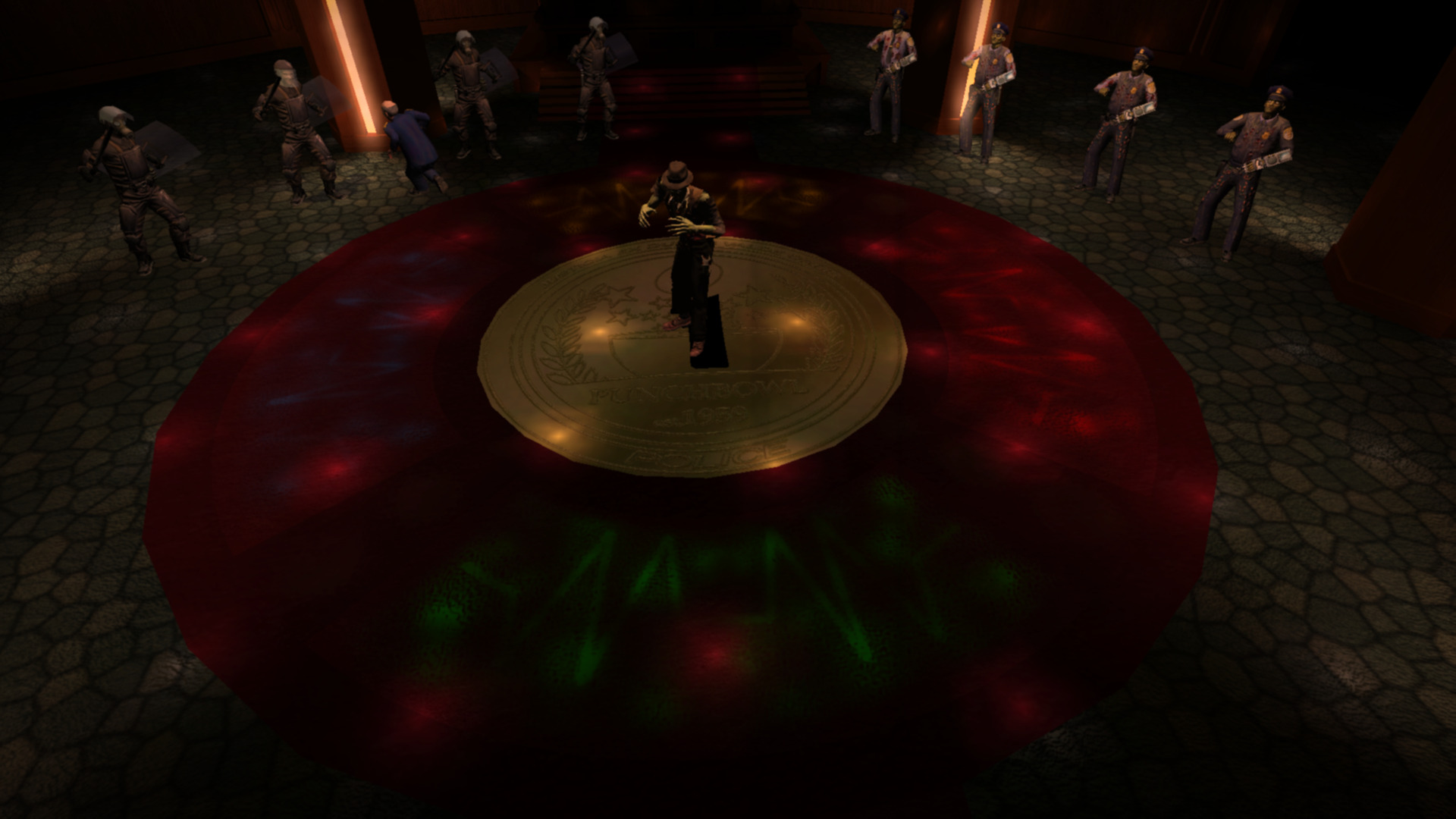
The game begins with simplistic patterns that go around the gamepad. Patterns such as:
- 2 lefts then 2 ups.
- 2 downs then 2 rights.
Speed Increase
To increase difficulty the mini game increases the speed of input.
I have mixed feeling about this minigame. It’s very unforgiving. One has to memorize the pattern, and I had great difficulty if I didn’t have the pattern in mind.
To improve this section the game could increase the time for input or better foreshadow the next button press. Other games have done this with visualizing future button presses.
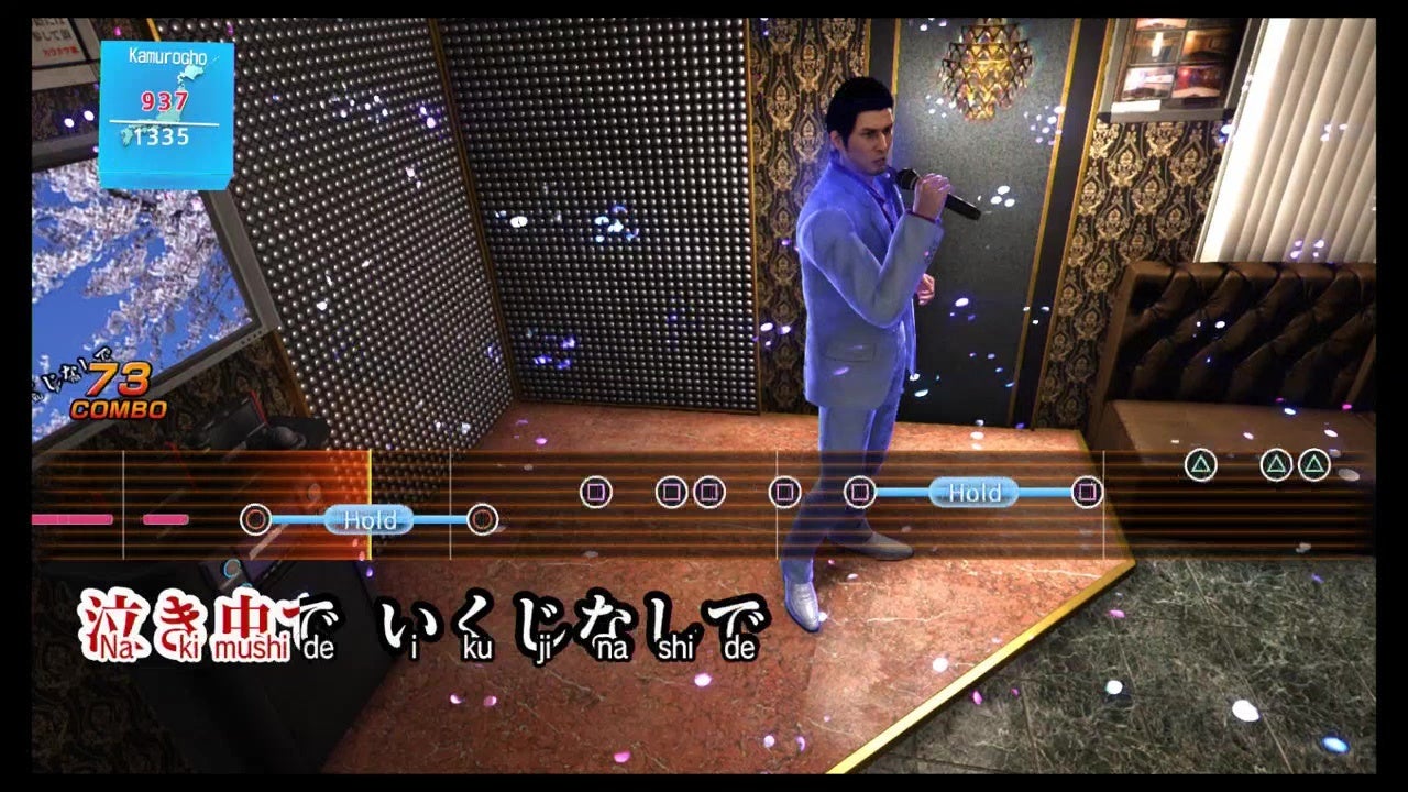
Additionally the mini-game has an unclear end state. When do I know when I win or lose? How many rounds left?
Hand
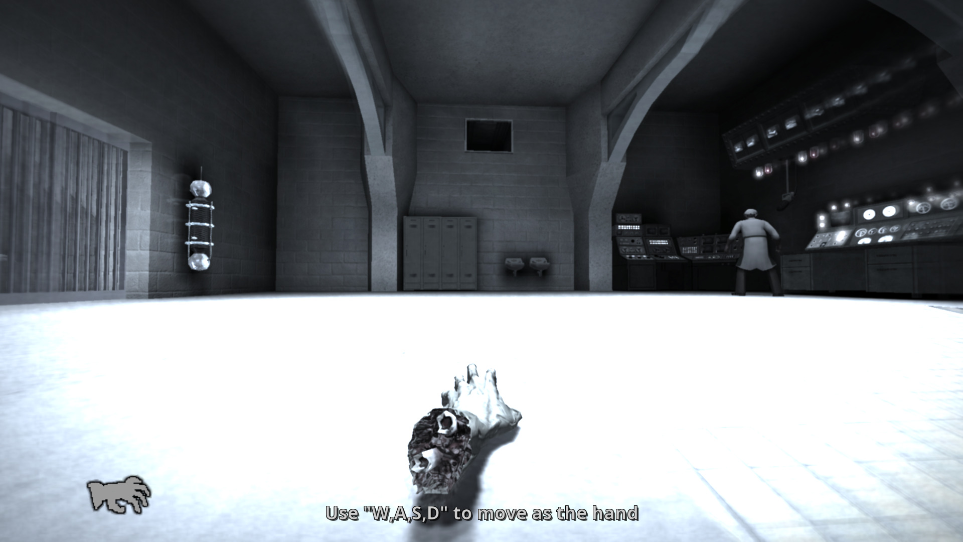
An alternate mode where the player controls Stubb’s hand. This mode is interesting in that the players:
- Scale is changed.
- Has a new means to navigate being able to crawl along surfaces.
- Is able to mind control enemies
One improvement I would make here is having the surface crawling be connected to a player input rather than automatically occur when approaching a surface.
Transition Environmental Contrast
Means to get player to exit the area. It heavily contrasts with environment the player is currently in.
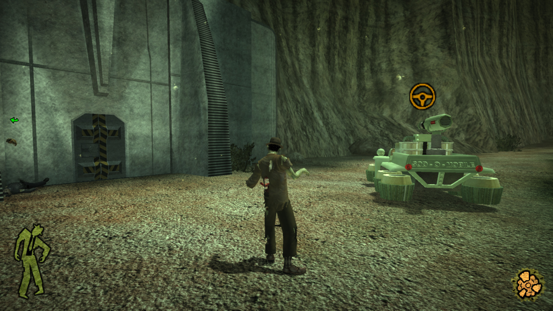
Living World Signaling
This is employed as a means of attracting the player using living world elements. Enemies in a location likely means you haven’t visited it.
Framing
The player spawns with the orientation to the exit of the room. Unfortunately this didn’t pan out for me as I beelined to the scientist to the right rather than the open vent. Perhaps having the scientist patrolling from left to right would improve the discoverability of the vent.
Delayed UI
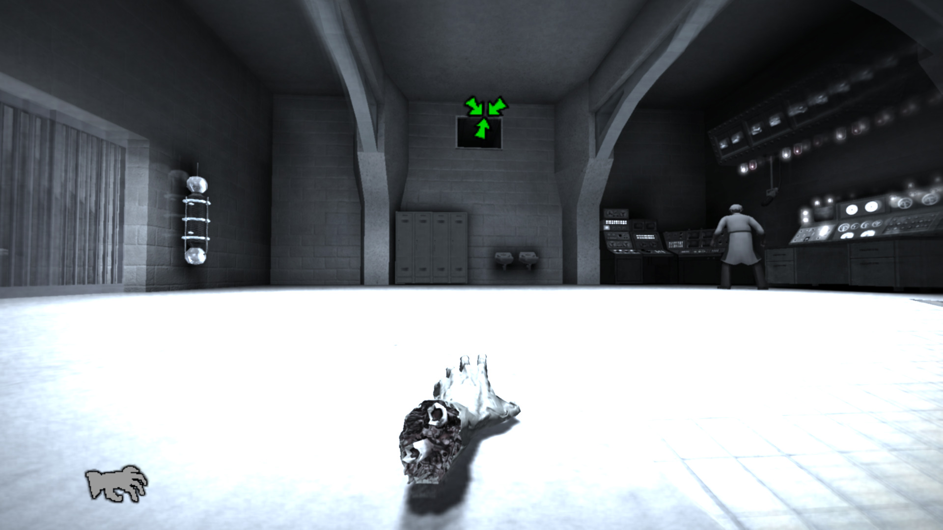
Use of delayed waypoint marker in the case the player doesn’t know what to do (I didn’t).
Texture
The texture has a sheen to it that helps to guide the player in the dark.
Vignette Opportunity
There is a section in the game where the player uses a detached hand to crawl through vents. There are views from the vents downstairs, and each are an opportunity for a vignette which is not used.
On the other hand including vignettes are an additional production expense that may not have good ROI (return on investment) if the expectation is set that all vent grates need a vignette.
Inconsistent Door Language
There seemed to me a missed opportunity for creating consistent enterable door language for one type of door. In this case the door has a star. This star could be used on both sides of the door. On the other hand there are other doors that are openable, they cant all have stars on them e.g. toilet doors.
