The Top Left User Interface (UI) element of Shogun 2s Sengoku Jidai Campaign Map consists of three equally sized icons. Pressing these icons open up the Game Menu, Total War Encyclopedia, and Game Menu UI elements.
- Blue – Adviser Toggle.
- Green – Encyclopedia.
- Red – Game Menu.
The Top Left UI Element is never hidden, and when large elements appear in the interface from the area underneath this UI element, this element often overlays the larger element which was likely done given that this UI element has a higher priority function.
Adviser Toggle (Blue)
The Icon for the Adviser Toggle button (Blue) was likely chosen because one adviser looks similar. The functionality of the Adviser pane can be changed to either appear when using a feature in the Campaign for the first time or, considering more experienced players, can be set to not appear at all.
Pressing the icon from the UI element at the top left of the screen opens the following pane.

- Blue – Advice Toggle.
- Green – Advice Subject.
- Orange – Advice Details.
- Red – Character Image.
The character image (Red) serves a thematic purpose, the arrows (Blue) are for cycling through Advice, and are grouped with the character image to avoid getting in the way of the Advice description space.
The Advice Title (Green), and Text (Orange) are positioned in a standard way for reading. The Advice description takes the most space of all the elements, and can expand if necessary in case of text overflows. The cancel button (Purple) is placed in a commonly expected place for exiting which is the top right.
Encyclopedia Icon (Green)
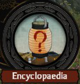
The Encyclopedia Icon seems to be a Japanese style lamp with a question mark on it. I interpret this to be a symbol for a lamp that illuminates the unknown represented by the red question mark. It also leverages the commonly known iconography for help by using a question mark.

To reinforce that this is actually the Total War Encyclopedia, the icon is prominently displayed on the start page of the game, and is constantly visible in the game Encyclopedia with a clearly visible label.

Options Icon (Red)

I’m not exactly sure what the Game Menu Icon (Red) is. I’d hazard a guess, and say it looked like a face that was wearing glasses, and had a Japanese castle like hat?
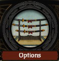
In the Start Page of the game for displaying the Options Icon they used an image of a sword rack with multiple blades. That icon made more sense to me as I interpreted it to mean an option of swords to choose.
Perhaps they could have used the same image for consistency? Perhaps it was an issue of space?