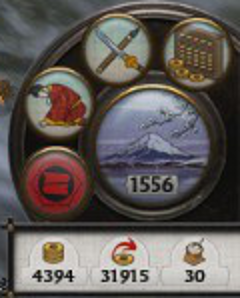
The bottom right UI element is located in a circular image that suits a dial design. It balances well the circular dial located on the opposite side of the campaign map page. The UI element can be split into two major parts.
First is the management dial which contains the vast majority of this UI elements functionality. Secondly is the resource pane which includes an overview of the most important resources used in the game, money and food.
Management Dial
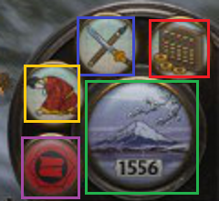
- Blue – Technology.
- Green – Turn.
- Purple – Clan Management.
- Red – Finance.
- Yellow – Diplomacy.
The UI element is compact, containing a number of icons that are representative of their function. There is though a small risk of accidentally hitting the turn button given its size and position.
- Diplomacy (Yellow) uses a bowing person which appears to be an envoy.
- Clan Management (Purple) uses a Clan flag which is the best representative of a Clan, and since the image is used in many other places in game the player is familiar with the image.
- Finance (Red), uses an abacus looking instrument which is a tool used for accounting, as well as images of the currency to associate the button with in-game money.
- Technology (Blue) uses a picture of a sword and another item representative presumably related to technology.
- The turn button (Green) reflects the season as well as the year written clearly in black.
Management Pages
A standard used throughout the management pages is the location of the help and exit buttons. The help icon is located on the top right, and the action buttons are centered at the bottom of the page. Perhaps the help button would have been better located on the top left to coincide with the position of the help button on the main campaign map page.
Clan (Purple)
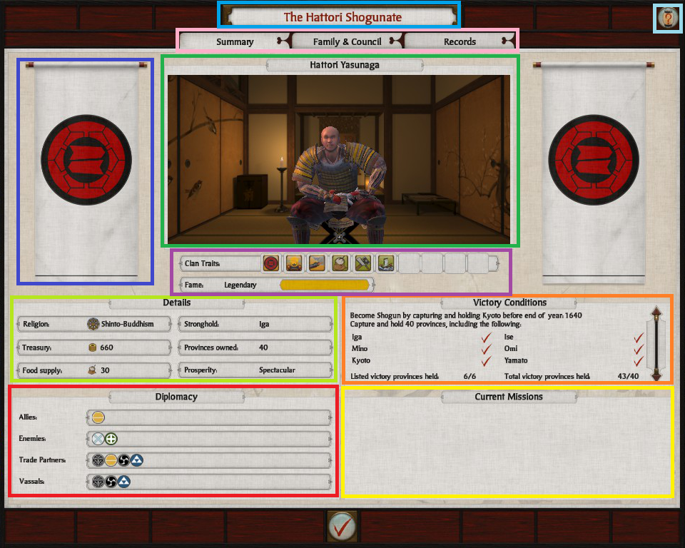
On pressing the purple icon a clan management page opens that has a number of tabs.
Summary
The summary tab is the default tab that opens. The page includes several clan related thematic elements namely the clans symbol (Blue), the name of the daimyo and an in game image (Green).
Family & Council
The family council page is designed to represent clan members in a hierarchical display. The head of the family is located at the top of the page (Green), the brothers to the right (Purple), and the children, descendants (Yellow), and generals (Red) below with the heir being specially marked.

Each non-family active general is listed below the family members, with visual indicators of rank, and loyalty as well as commissions. When a character is selected they appear in a more detailed section at the bottom of the page (Orange).
Records
Last of these tabs are statistics, events and territories information related to the players campaign.
On the right side of the UI element lists statistics which include clear labels on the left (Purple), and the corresponding figures to the right (Green), as well as a themed slider for scrolling the list.
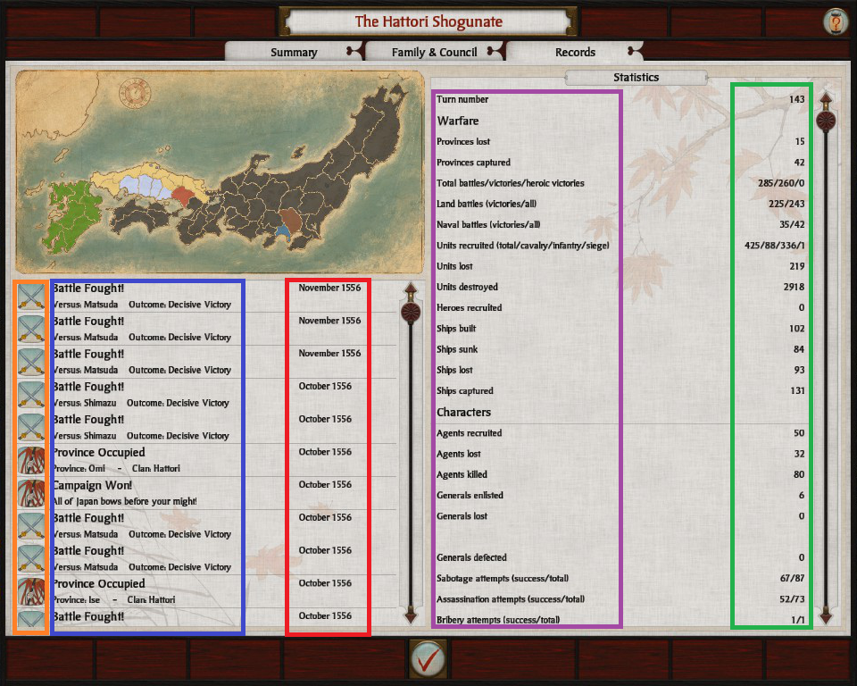
On the left side of the UI element lists events with icons (Orange) used in the campaign events, with titles and short descriptions (Blue), and the year of occurrence (Red). Above the list of events is a map of Japan marked with colors based on the owner of the territory.
Diplomacy (Yellow)
The diplomacy element is one of my favorite among these UI elements because of its board room-esque feel.
The players clans attributes and actions are kept separate on the left side of the ‘board room’ (Orange), and the other clan is on the right (Purple). Each clan area is headed by the clans title, a large clan symbol and the clans overall attributes.
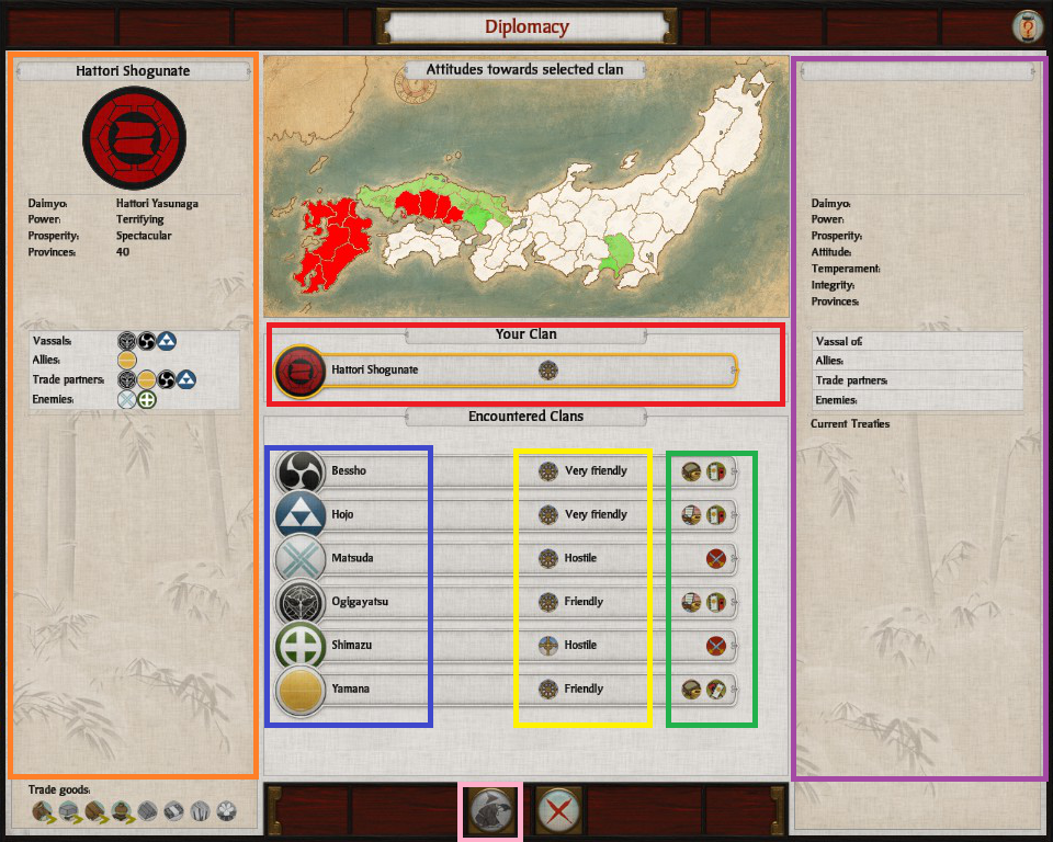
Within this UI element is a table in the middle that lists each clan in a table row style format. Each row consisting of various clan details such as the clans symbol and name (Blue) religion, and attitude towards the players clan (Yellow), and to the right most is the the the diplomatic status in terms of ‘if trading’ or at peace, vassal etc (Green).
The players clan is listed at the top (Red), and below it are listed every other encountered clan that can be entered into diplomatic negotiations with. Selecting an encountered clan changes the Purple area to that clans details. Negotiations can be entered using the button displaying an envoy (Pink). The button at Pink is nearly identical the diplomacy icon used from the management dial, but with the addition of a red arrow which signifies the act of sending a diplomatic envoy.
Negotiations
The Negotiations UI element builds off of the Diplomacy UI element. The clan information areas are nearly identical to the Diplomacy UI element where a clans attributes are shown (Red), as well as their diplomatic affiliations with other clans (Purple).
The difference is in the left of the UI element includes actions that can be taken by the player to affect the other clan, and the ‘corresponding’ zone on the right is a list which is generally determined by those actions (Blue).
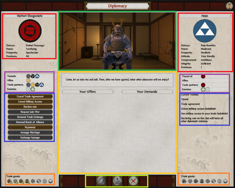
The central part of the screen is a middle ground between the two negotiating factions, where diplomatic actions are proposed, evaluated and settled. Actions relating to what has been proposed or leaving the negotiation are placed in the bottom middle of the UI element (Light Green).
To offer a more informative, and thematic experience an dynamic model is used of the character that is being negotiated with (Green) as well as a text of likelihood of success to indicate whether the proposal is likely to be accepted.
Lastly at the bottom of each of the clan areas lists trade goods that the clan has available, and what is being imported and exported. This information helps in evaluating the benefit of trade agreements.
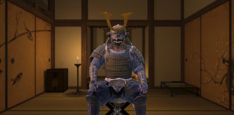
Friendly
Interestingly the dynamic model of the character being negotiated with is used to convey attitude and proposal likelihood. In the below image the other party has a friendly attitude. Notice the posture of the character is open and the character is directly facing the player, other such body language is used as well as responses and tone to make the experience more ‘realistic’.
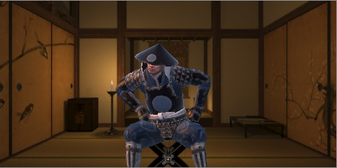
Unfriendly
As was done in friendly negotiations, the same is also done for unfriendly. The character does not face the player, the postured is more closed. This detail reflects a good understanding of body language in crafting a convincing negotiation like experience.
Finance (Red)
The finances UI element is again made up of three tabs. Taxes, Trade and Summary.
Taxes
Taxes are the first tab (Red) of the finance management page. Clearly titled (Green), it allows the control of tax levels across the players empire through either the use of a slider (Purple) with icons representing the effect of changing the slider position.
If players do not wish to manage taxes manually the option to auto manage taxes is available, as well as additional essential information (Yellow). Beneath this is shown the province with the lowest public order, which allows a player to quickly find areas of their empire to focus public order management efforts.
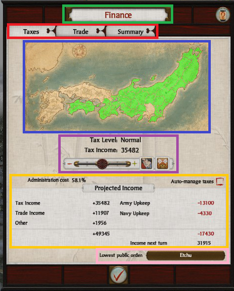
A fantastic feature worth noting is how public order levels are dynamically visualized on the map of Japan (Blue). Territories are colored based on their public order levels and can change color when the tax slider is adjusted allowing the player to observe and plan for the resulting change in public order.
Trade
The second tab of the finance management page displays data related to trade. The top of the page displays a players trade resources with produced resources on the left, and not acquired resources on the right (colored and non colored icons are used to emphasize this) as well as a price display of a unit of each respective resource.
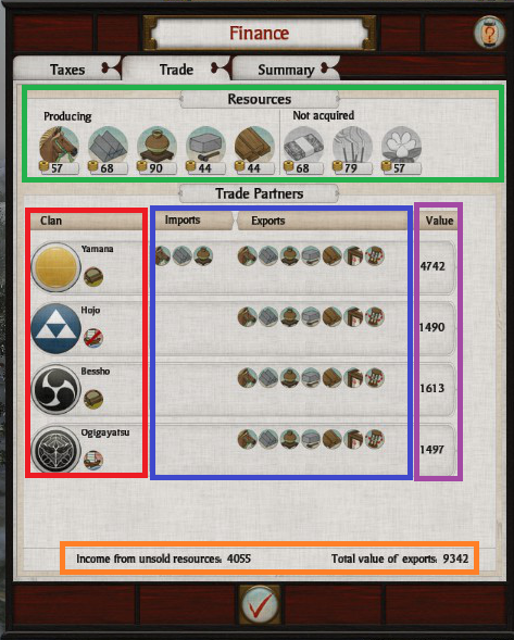
Beneath ones own resources are listed trade statistics related to other clans. These statistics include details such as trade type (land, sea etc), and clan symbol (Red). In addition what is being imported from the other clan and what is being exported to the other (Yellow), and value of trade relations (Purple) is also displayed.
Lastly totals are given (Orange) of the value of trade relations and unsold goods income. The value of the trade relations determine the location of the other clan in the trade partners table allowing a player to more easily priorities trade partners.
Summary
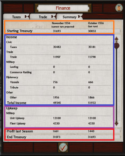
The final tab of the financial management page displays the summaries of the finances. Current assets are given at the top (Orange), income (Blue) and upkeep (Purple) have their own sections and are broken down accordingly. Finally the totals are calculated and displayed in a profit and closing asset amount (Red).
The format of the page perhaps borrows from standards set by the profession of accounting, and this makes most sense to do given how well those standards are suited/adapted to the task of displaying financial summaries.
Technology (Blue)
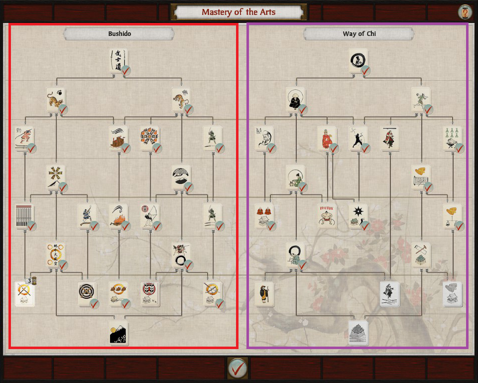
The technology page displays the two major technology trees of Shogun 2. Bushido/Military (Red) on the left, and the Way of Chi/Economy (Purple) on the right. The structure of each tree is somewhat similar, and faint lines are used to create a sense of comparative levels of advancement.
Resource Tray

Income, treasury, and food are resources that are grouped together, with images. Income is differentiated clearly through the use of a red arrow. All resource indicators have negative all have alternative displays.