Whilst at The South Asian Students Association (SASA) at The University of Edinburgh, we were tasked with the creation of a new logo for the society. Below was the first design drawn by Anakral Frakenburger Bulhan.

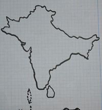
At this point the committee felt that the logo needed to incorporate what we represented, the South Asian Sub-Continent, into the logo.

Here’s the second design that was the result of work I did Gimp (a great free editor tool).

From the first design I:
- Enhanced both the SASA and sub-continent images, removing lines page and other items from the pictures.
- Combined both pictures, by adjusting the A and re-sizing each to equal sizes.
- Accentuated the line under SASA to make it somewhat resemble a pen.
- Including the societies full title in a suitable font and position.
