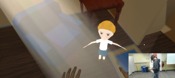
Introduction: A Playroom was a developed on the HTC Vive. A virtual reality device that allows a guest to walk around a calibrated virtual reality space with hand held controls.
Platform: HTC Vive in Unity 3D | Time: 2 weeks | Roles: Designer – Producer | Team Size: 5
Story: The setting of the game is in a play room where the guest encounters a ghost boy who needs help in-order to ‘move on’.
Design Challenge: To design a game for naive guests, conduct play tests, and make three predictions of what the guest will do all whilst having the guest ‘feel free’.
Design Goal: Round 2 of Building Virtual Worlds was indirect control round. This required we build an experience that felt free, and was intuitive enough for a guest to play from start to finish without any instruction or guidelines.
My Contributions: I analyzed, and designed the guests interactions as well as wrote our main non playable characters dialogue. In addition I conducted play tests which gave us invaluable feedback which we used to further develop the experience.
Development
Interaction Design
From this notion I created two different interaction models.
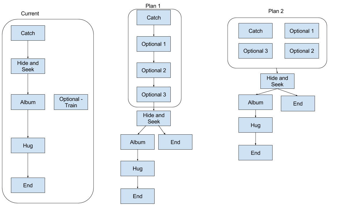
I then met with the team, presented my two plans. We choose plan 2 which I further developed into a more detailed version.
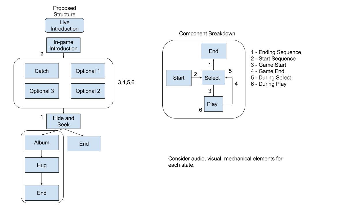
Audio would play a vital aspect in driving this interaction model therefore I worked with our sound designer on a script for the game which we iterated over based on feedback (script documents).
Playtesting
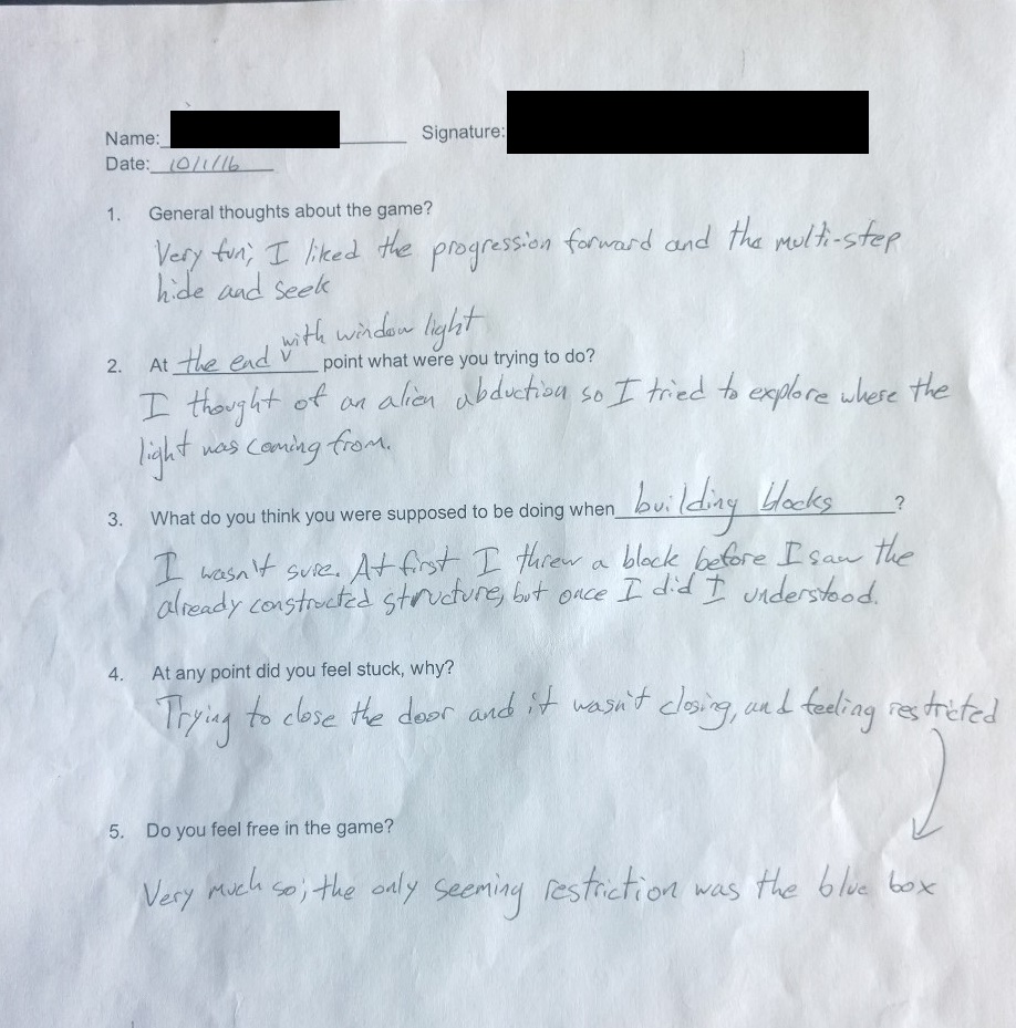
In conclusion we correctly predicted each of the three interactions, and the guest understood our story, all with no guidelines or instruction from us.
Full Story
We began our project with brain storming, and research into the platform on which we were developing. We came up with several ideas including:
- Darkness – Use light to guide the guest through a street.
- Space Exploration – Explore the universe, and pick a planet to colonize.
- Dreaming – Flying a plane, flying elephants, flowers turn to buildings (freedom from constraints).
- Empty Room – Furniture place (guide them to a correct place).
Having difficulty grappling with the concept of ‘freedom’ we spoke to a member of The Entertainment Technology Faculty Jesse Schell. After meeting with Jesse Schell we honed in on an idea of a ghost boy which we would help in some manner through objects around him.
Next we thought about location, which was first a storage room due to it making sense to have many object, we then changed to a play room as it offer the potential for a ‘warmer’ environment for guests to feel comfortable.
After creating a basic room with a simple number of interactions which included:
- Playing catch.
- Place a train on the train track.
- Hide & Seek.
- Give a hug.
We had a prototype ready for interim.
Interim
After interim our two main points of feedback were
- Make the boy and game generally less ‘creepy’.
- To develop our interactions.
Less ‘Creepy’
Point 1 was a significant design challenge which we tackled by investing time into solving by:
- Making our main game character look more human like.
- Soothing music.
- A warm game atmosphere.
- A friendly, light and clear character voice.
Interaction Design
I decided to tackle point 2 by first analyzing what we currently had, then writing a draft story design which was a rough version of what we would aim for. Our current game play was clearly a linear story experience, and I believed we could greater the sense of freedom by allowing a player a choice of what game to play.
From this notion I created two different interaction models.

After meeting with the team, presenting the two plans and convincing them of the need to carefully design the experience, we choose plan 2 which I then further developed into a more detailed version.

Implementation
Audio played a vital aspect in our experience so I worked with our sound designer on a script for the game which we iterated over three times based on feedback (script documents). In addition to audio we used a number of other techniques including:
- Lighting – To direct the players focus.
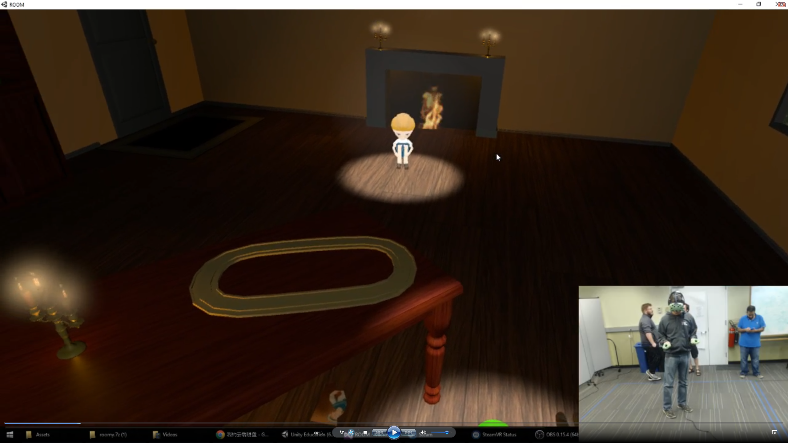
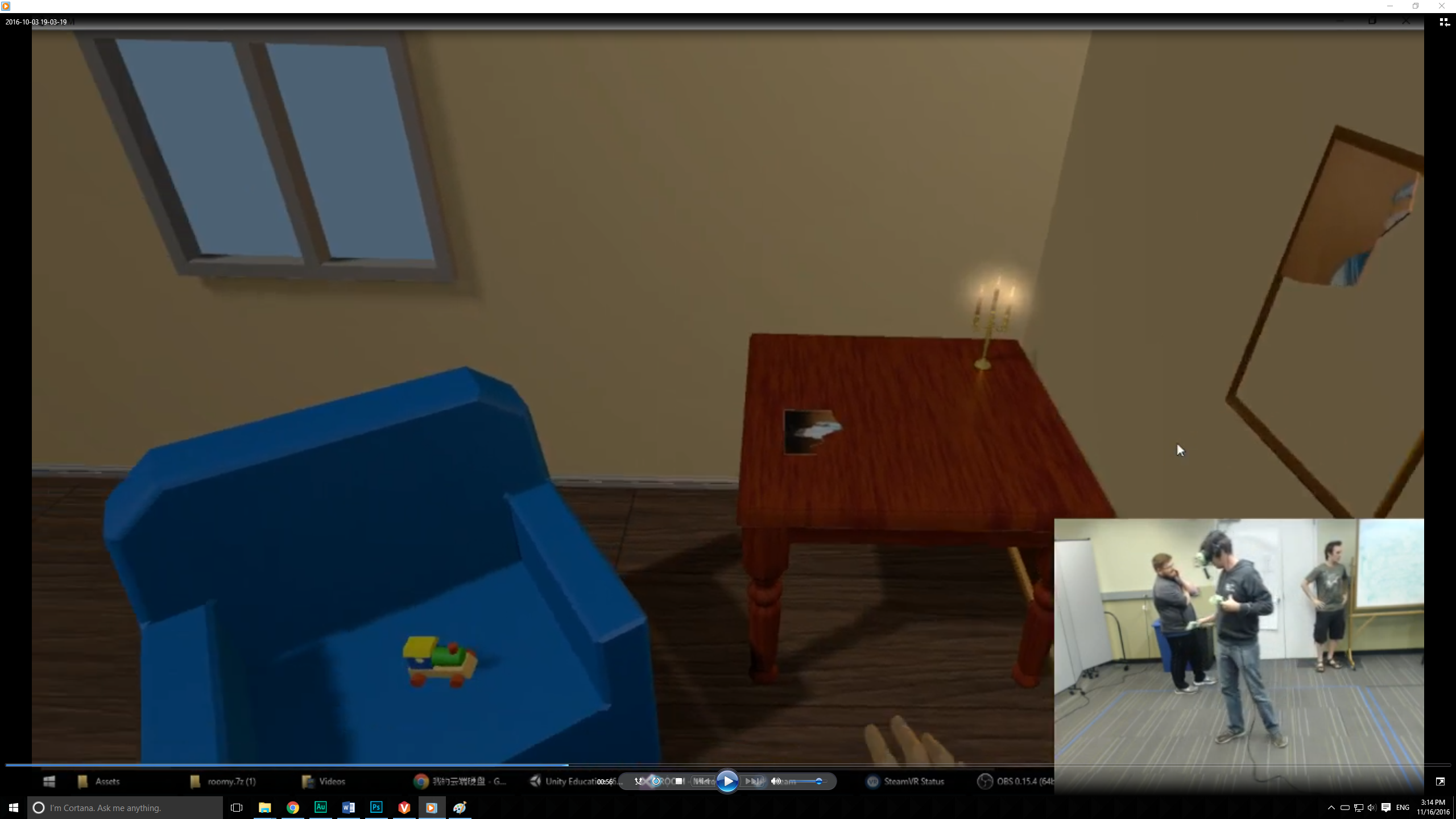
- Color – Brightly contrasting objects such as with the yellow train on a blue chair, and a red book on a beige floor caught the players attention.
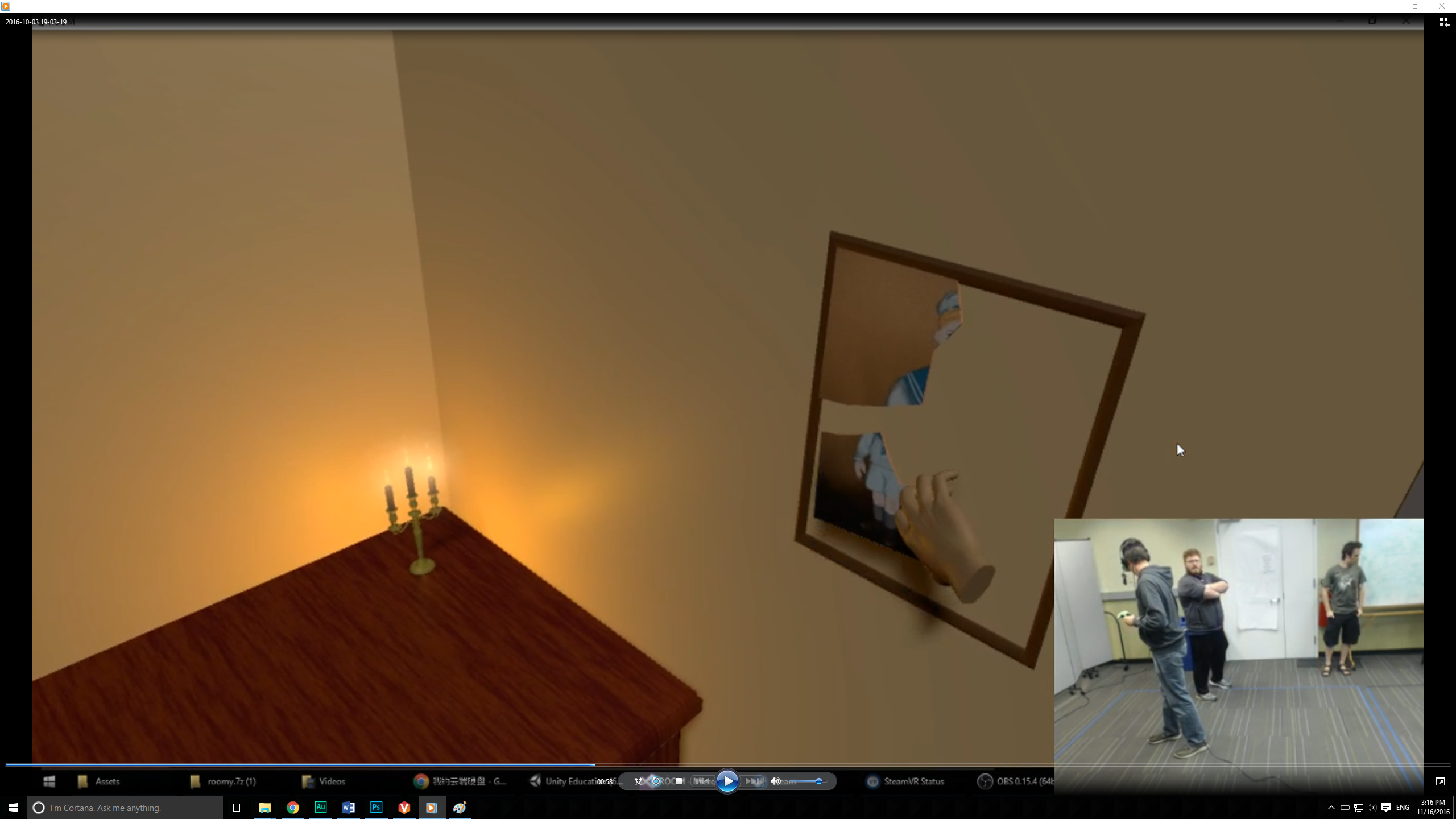
- Uniformity – A suggestive picture fragment was placed in the frame, and other similar looking puzzle pieces were placed around the level.
After implementing these features with a new interaction model we went about play testing the game. We conducted play tests with over fifteen naive guests which included an audience of fellow students, professors and non-students.

Based on the feedback we received we continued to polish elements of the game. The end result of our work was that not only did we accurately predict each of the three interactions, but the guest completely understood the story behind our world all with no guidelines or instruction from us.
