
The central area of the Total War interface receives the highest attention from the player. This post will look at a number of the elements that appear there.
Total War Encyclopedia
There are many pages within the encyclopedia. A look at one page gives a good understanding of the user interface (UI) element given the consistency used throughout the encyclopedia.
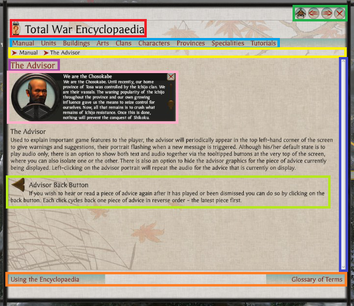
- Light Blue – Main Subject Categories.
- Dark Blue – Scroll Bar.
- Green – Navigation Buttons.
- Light Green – Part of Page Description.
- Orange – Topic Navigation.
- Pink – Relevant UI Image.
- Purple – Page Title.
- Red – Main Title.
- Yellow – Browser Breadcrumb.
Notes
- The scroll bar (Dark Blue) is not themed, resulting in it looking quite out of place. Perhaps this area was not given as much priority which is understandable as perhaps players don’t use the encyclopedia so much? From my experience I didn’t, and that is a sign of good game design.
- The designers used the encyclopedia icon next to the UI elements main title (Red) likely to subtly have a player associate the image with the words Total War Encyclopedia.
- The cancel button, and the navigation buttons are grouped together (Green) in the top left. For this area the designers have used the Main Menu button for the Home Button in the encyclopedia, they rely an understanding of ‘importance’.
- The use of bread crumbs is good for players to quickly backtrack when navigating (Yellow).
- The on hover underlining used for the main page categories is more link like (Light Blue).
- There is a further reading tab located at the bottom of the page (Orange) which makes sense since the read is likely to look there. At the bottom of the page, the left and right topic options are displayed based on related topics in the manual.
- For the main article they used topic headings, text descriptions with images, and icons which prove to be very helpful (Pink & Light Green) in conveying the point of the article.
Agents & Trees
Shogun 2 has a number of agents, each of which have an agent page and skill tree. The following is the agent page for a ninja agent.
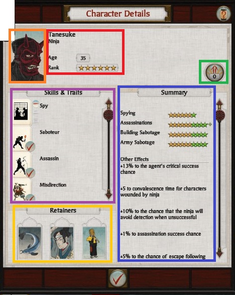
- Orange – Picture of Agent.
- Red – Agent Details.
- Green – Available Skill Points.
- Purple – Image Icons of Skills and Traits.
- Blue – Summary of Attributes.
- Yellow – Retainers.
Notes
- The layout combination of Orange & Red which contains the agents name, type, age, and rank is seen frequently creating consistency in the UI.
- When an agent levels up skill points become available, and Green becomes lit in a way to draw the attention of the player, which when clicked opens up the skill tree page.
- Purple, Blue, and Yellow are all details of modifiers of an agents stats. Pictures are used to make the area more interesting, and a slider is added when these details overflow their allotted area.
Geisha
The following is the character skill page of the Geisha Agent.
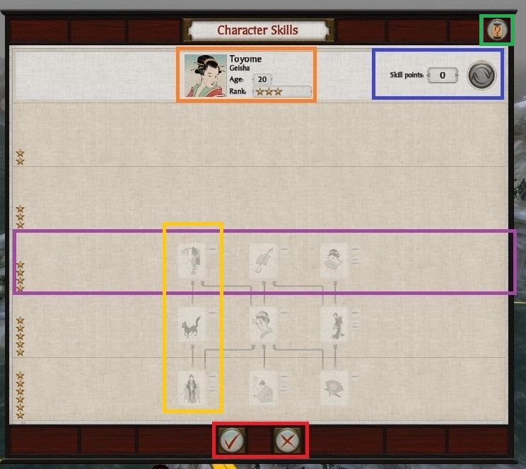
- Orange – Agent Attributes Overview.
- Blue – Available Skill Points.
- Yellow – Skill Tree.
- Purple – Available Skills Stage.
- Green – Help Button.
Notes
- Since skills points are spent on this page a method of tracking how many points are available, and undoing the selection before it is finalized is essential. Blue clearly provides such functionality.
- Skills are arranged in terms of trees, which are top to bottom structures (Yellow) with rank restrictions shown by stars to the left, and faint lines across the page (Purple). Dependencies between skills are shown with arrows that light up as skills become accessible.
- The useful, ever present help button (Green) is placed in a standard location with a standard icon through out the user interface making it easy to identify.
Main Menu
Pressing the top most Icon from the UI element at the top left of the screen opens up the following menu.
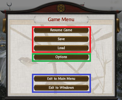
- Shogun 2’s Game Menu is artistically pleasant with a thematic look, using evenly spaced buttons grouped by general function, and buttons which fit the color scheme with nice bold text.
- Several buttons are used for game state manipulation. Start, load, and save are grouped into an area (Red). Green are game options which are more related to game state manipulation than Blue hence it makes more sense to group it in the UI with Red.
- The buttons in Blue are the exit options. It is good that the exit buttons are kept at a good distance from the rest of the buttons in the menu. Even better is how there is double confirmation built into the exit function to protect from lose of progress.
Events
Event screens appear in the center of the screen. They come in a number of forms.
Agent Related
The following screen relates to an event where the players ninja is located in a foreign province, and has been detected by opposing local authorities, and has therefore become vulnerable.
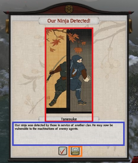
- Red – Thematic Elements.
- Blue – Description.
- Orange – Jump to Agent Button.
Notes
- Red adds stylistically to the event page with a beautiful image that adds a layer of physicality by representing the event in picture form, as well as adding the name of the agent perhaps to foster a sense of story.
- The description of the event (Blue) is clear, and concise.
- The jump to agent button (Orange) is an essential feature, which is very useful for finding an agent on the campaign map. This feature is particularly helpful when a players empire becomes large making finding the agent manually a time consuming task.
Recruitment
Recruitment in Shogun 2 has a number of pages, each type of unit has a recruitment page of its own. The following is for ships.
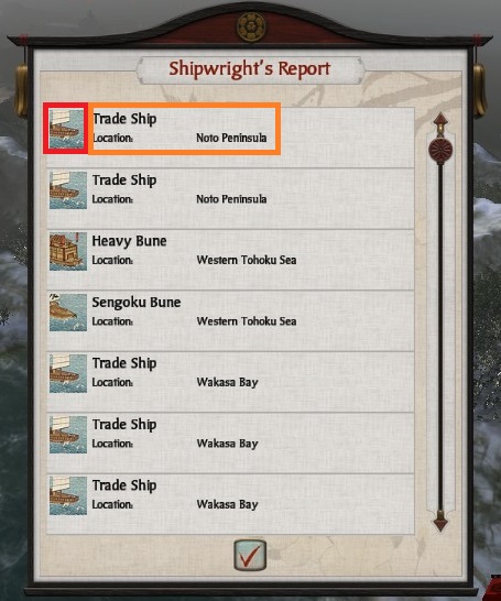
- Red – Ship Image.
- Orange – Ship Description & Location.
Notes
- The format used for displaying each recruited ship is quite similar to what is used in several places including in the agent section where the units icon (Red) is paired with details about it, in this case the units name and recruitment location (Orange).
Construction
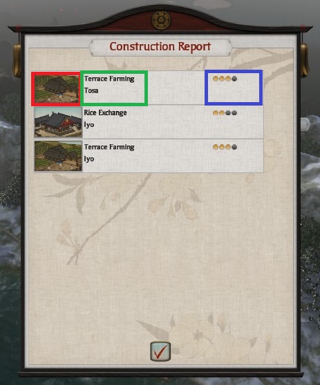
- Red – Building Image.
- Green – Building Description & Location.
- Blue – Upgrade Level.
Notes
- Once again the same format is used as the section above for conveying building details in a clear manner the difference being that a dot based method (Blue) has been added to display the level of building upgrade in-order to help track the structure development in the province.