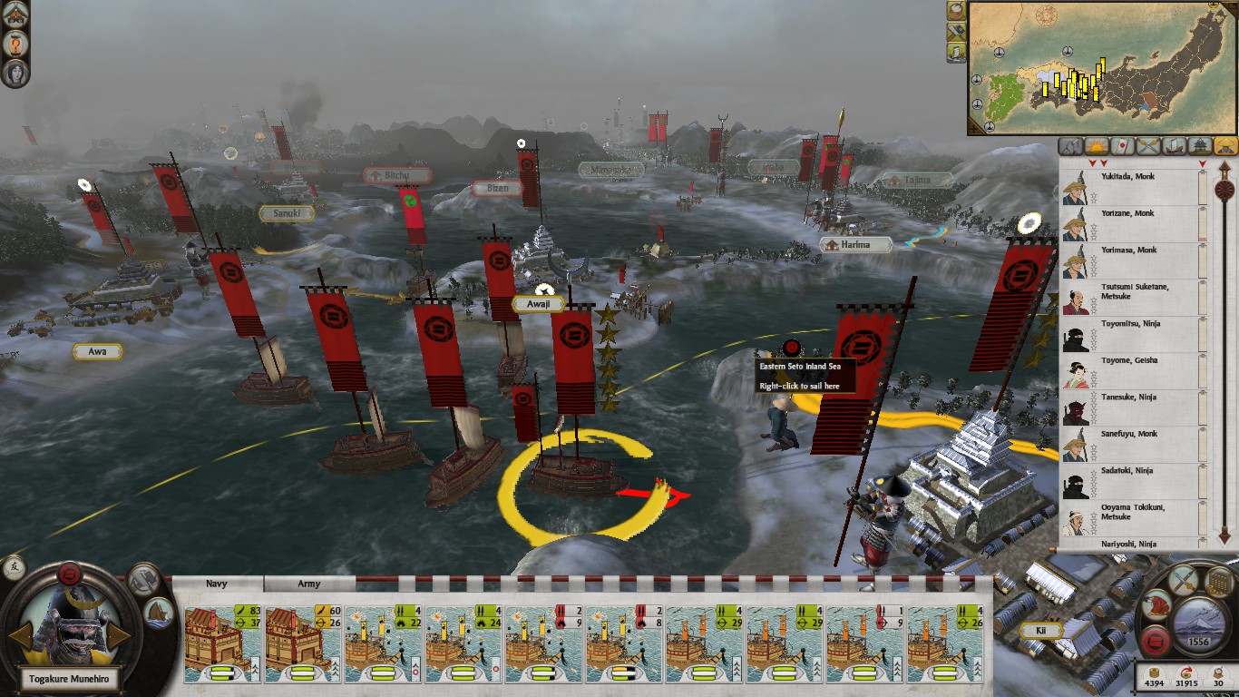
The purpose of this project is to further my understanding of good UI design by studying various elements of Shogun 2s User Interface (UI) used in its Sengoku Jidai Campaign Map.
This post will serve to discuss the Campaign Maps UI layout, and be an index post in a multi-post project of non comprehensive personal observations of Shogun 2s User Interface.
Disclaimer: The User Interface (UI) is not quite in its Vanilla form due to having the Steam mod by Radious installed at the time of the study.

The focus of this piece will be mostly on the 2-D elements of the interface such as menus, tabs, pop-up, and icons NOT the ‘3-D’ campaign map itself. So lets start with the general layout of the the Campaign User Interface.
General Layout
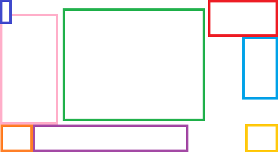
We can abstract Shogun 2s User Interface into an approximate layout with the following areas:

- Dark Blue – Help and Options.
- Green – Screen Center.
- Light Blue – Map Lists.
- Orange – ‘Selection’ Dial.
- Pink – Description Popup area.
- Purple – ‘Selection’ Banner.
- Red – Map and Global effects.
- Yellow – Management Dial.
Bottom Left & Middle

The Bottom Left and Middle (Orange, Purple) areas are context sensitive, and change depending on the users focus. UI elements here control aspects of recruitment, constructions, armies and navies. In addition to tool tips, when more information is required it is displayed above the Selection Dial (Pink).
For additional detail on this section follow this link!
Bottom Right

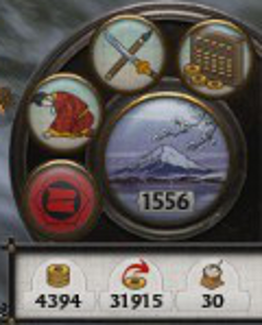
Bottom Right (Yellow) is offers features that pertain to Management of the Clan, Finance, Diplomacy and Technology (Mastery of the Arts). Selecting elements from here either open UI elements that appear in the Screen Center (Green) or Ends the Turn.
For additional detail on this section follow this link!
Center
The Screen Center (Green) is an area of high attention for a player. Its interesting that the layout of Shogun 2s User Interface in a sense forms a ‘U’ around the Screen Center keeping the Screen Center uncluttered for a clear view of the ‘3-D’ Campaign Map.
If UI elements do popup in the Screen Center most other elements are hidden which draws the players focus to elements such as Event Windows, the Games Main Menu, or the Total War Encyclopedia.
For additional detail on this section follow this link!
Top Left

The Top Left (Blue) of the Campaign Map is for Help and Options features. UI elements here either are the focus of attention, popping up UI elements into the Screen Center (Green), or in the case of the Adviser Button appear as a popup to the right of the Top Left UI element.
For additional detail on this section follow this link!
Top Right

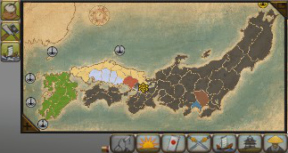
The Top Right (Light Blue & Red) displays the Map, Global Statuses, and a variety of icons. These icons open into lists that serve as directories of Agents, Armies, Clans, Navies, Objectives, and Provinces.
