Tag Archives: Strategy Game

Shogun 2s User Interface, Center

The central area of the Total War interface receives the highest attention from the player. This post will look at a number of the elements that appear there.

Total War Encyclopedia

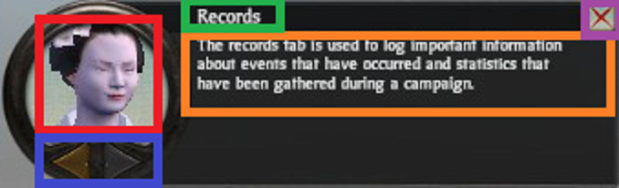
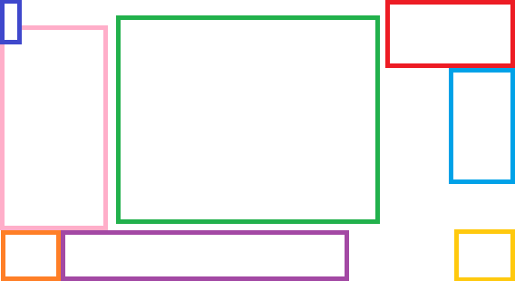
There are many pages within the encyclopedia. A look at one page gives a good understanding of the user interface (UI) element given the consistency used throughout the encyclopedia.

Encyclopedia Page

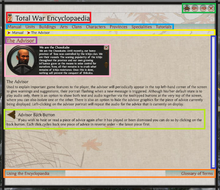
  • Light Blue – Main Subject Categories.
  • Dark Blue – Scroll Bar.
  • Green – Navigation Buttons.
  • Light Green – Part of Page Description.
  • Orange – Topic Navigation.
  • Pink – Relevant UI Image.
  • Purple – Page Title.
  • Red – Main Title.
  • Yellow – Browser Breadcrumb.

Notes

  • The scroll bar (Dark Blue) is not themed, resulting in it looking quite out of place. Perhaps this area was not given as much priority which is understandable as perhaps players don’t use the encyclopedia so much? From my experience I didn’t, and that is a sign of good game design.
  • The designers used the encyclopedia icon next to the UI elements main title (Red) likely to subtly have a player associate the image with the words Total War Encyclopedia.
  • The cancel button, and the navigation buttons are grouped together (Green) in the top left. For this area the designers have used the Main Menu button for the Home Button in the encyclopedia, they rely an understanding of ‘importance’.
  • The use of bread crumbs is good for players to quickly backtrack when navigating (Yellow).
  • The on hover underlining used for the main page categories is more link like (Light Blue).
  • There is a further reading tab located at the bottom of the page (Orange) which makes sense since the read is likely to look there. At the bottom of the page, the left and right topic options are displayed based on related topics in the manual.
  • For the main article they used topic headings, text descriptions with images, and icons which prove to be very helpful (Pink & Light Green) in conveying the point of the article.

Continue reading Shogun 2s User Interface, Center

Shogun 2s User Interface, Bottom Right

Bottom Right UI Element

The bottom right UI element is located in a circular image that suits a dial design. It balances well the circular dial located on the opposite side of the campaign map page. The UI element can be split into two major parts.

First is the management dial which contains the vast majority of this UI elements functionality. Secondly is the resource pane which includes an overview of the most important resources used in the game, money and food.

Management Dial

Management Dial
Management Dial
  • Blue – Technology.
  • Green – Turn.
  • Purple – Clan Management.
  • Red – Finance.
  • Yellow – Diplomacy.

The UI element is compact, containing a number of icons that are representative of their function. There is though a small risk of accidentally hitting the turn button given its size and position.

  • Diplomacy (Yellow) uses a bowing person which appears to be an envoy.
  • Clan Management (Purple) uses a Clan flag which is the best representative of a Clan, and since the image is used in many other places in game the player is familiar with the image.
  • Finance (Red), uses an abacus looking instrument which is a tool used for accounting, as well as images of the currency to associate the button with in-game money.
  • Technology (Blue) uses a picture of a sword and another item representative presumably related to technology.
  • The turn button (Green) reflects the season as well as the year written clearly in black.

Management Pages

A standard used throughout the management pages is the location of the help and exit buttons. The help icon is located on the top right, and the action buttons are centered at the bottom of the page. Perhaps the help button would have been better located on the top left to coincide with the position of the help button on the main campaign map page.

Clan (Purple)

On pressing the purple icon a clan management page opens that has a number of tabs.

Summary

The summary tab is the default tab that opens. The page includes several clan related thematic elements namely the clans symbol (Blue), the name of the daimyo and an in game image (Green).

shogun_2_interface_clan_management_summary

Continue reading Shogun 2s User Interface, Bottom Right

Shogun 2s User Interface, Top Right

The Top Right UI Element in Shogun 2s Sengoku Jidai Campaign Map consists of three primary elements.

Top Right UI Element

Map & Global Effects

The first element is a Map of Japan. Known clans territories are marked with a representative color (e.g Purple), and clicking the elements of the map takes you to that element on the 3-D map.

In addition selecting the Map Tabs results in icons appearing on the map e.g Navy, and Army symbols which when pressed take you to the unit. Certain symbols are given different styles depending on whether they are ‘active’ or not. An example of an inactive symbol is the trading post (Yellow), an example for active is the symbol used for the city of Kyoto which has been captured in this Campaign (Green).

shogun_2_interface_top_right_map

  • Blue – Expand Button.
  • Green – Active Icon Style.
  • Purple – Multiple Clan Colors.
  • Red – Minimize Button.
  • Yellow – Inactive Icon Style.

The Map can be expanded and minimized with the button in the top right corner (Red) of the Map (placement follow a standard for window closing making it more intuitive), and expand (Blue) is located in the bottom left corner which makes sense given it expands in that direction.

Map Resizing: Expanded(Top)/Default(Middle)/Minimized(Bottom)

The space difference when resizing can be somewhat judged by the above diagram. When expanded the Map takes up approximately a quarter of the screen, when minimized it disappears completely leaving only the Map Tabs and Global-Effects.

Global Effects
Global Effects

The second element is a list of Global Effects located at the top left corner of Map. This area displays an icon for each Global effect e.g. Master Builders which reduces construction costs. Perhaps leveraging perceptions of color, positive effects are displayed with a green background.

Continue reading Shogun 2s User Interface, Top Right

Shogun 2s User Interface, Top Left

Top Left UI Element
Top Left UI Element

The Top Left User Interface (UI) element of Shogun 2s Sengoku Jidai Campaign Map consists of three equally sized icons. Pressing these icons open up the Game Menu, Total War Encyclopedia, and Game Menu UI elements.

  • Blue – Adviser Toggle.
  • Green – Encyclopedia.
  • Red – Game Menu.

The Top Left UI Element is never hidden, and when large elements appear in the interface from the area underneath this UI element, this element often overlays the larger element which was likely done given that this UI element has a higher priority function.

Adviser Toggle (Blue)

The Icon for the Adviser Toggle button (Blue) was likely chosen because one adviser looks similar. The functionality of the Adviser pane can be changed to either appear when using a feature in the Campaign for the first time or, considering more experienced players, can be set to not appear at all.

Pressing the icon from the UI element at the top left of the screen opens the following pane.

Adviser Pane
Adviser Pane
  • Blue – Advice Toggle.
  • Green – Advice Subject.
  • Orange – Advice Details.
  • Red – Character Image.

The character image (Red) serves a thematic purpose, the arrows (Blue) are for cycling through Advice, and are grouped with the character image to avoid getting in the way of the Advice description space.

The Advice Title (Green), and Text (Orange) are positioned in a standard way for reading. The Advice description takes the most space of all the elements, and can expand if necessary in case of text overflows. The cancel button (Purple) is placed in a commonly expected place for exiting which is the top right.

Encyclopedia Icon (Green)

The Encyclopedia Icon seems to be a Japanese style lamp with a question mark on it. I interpret this to be a symbol for a lamp that illuminates the unknown represented by the red question mark. It also leverages the commonly known iconography for help by using a question mark.

Encyclopedia Title
Encyclopedia Title

To reinforce that this is actually the Total War Encyclopedia, the icon is prominently displayed on the start page of the game, and is constantly visible in the game Encyclopedia with a clearly visible label.

Start Page Encyclopedia Icon

Options Icon (Red)

Start Page Options Icon

I’m not exactly sure what the Game Menu Icon (Red) is. I’d hazard a guess, and say it looked like a face that was wearing glasses, and had a Japanese castle like hat?

In the Start Page of the game for displaying the Options Icon they used an image of a sword rack with multiple blades. That icon made more sense to me as I interpreted it to mean an option of swords to choose.

Perhaps they could have used the same image for consistency? Perhaps it was an issue of space?

Shogun 2s User Interface, A Study

The purpose of this project is to further my understanding of good UI design by studying various elements of Shogun 2s User Interface (UI) used in its Sengoku Jidai Campaign Map.

This post will serve to discuss the Campaign Maps UI layout, and be an index post in a multi-post project of non comprehensive personal observations of Shogun 2s User Interface.

Disclaimer: The User Interface (UI) is not quite in its Vanilla form due to having the Steam mod by Radious installed at the time of the study.

Shogun 2s User Interface Screenshot
Shogun 2 Campaign UI

The focus of this piece will be mostly on the 2-D elements of the interface such as menus, tabs, pop-up, and icons NOT the ‘3-D’ campaign map itself. So lets start with the general layout of the the Campaign User Interface.

General Layout

We can abstract Shogun 2s User Interface into an approximate layout with the following areas:

Shogun 2s User Interface General Layout
Interface Layout – Not to Scale
  • Dark Blue – Help and Options.
  • Green – Screen Center.
  • Light Blue – Map Lists.
  • Orange – ‘Selection’ Dial.
  • Pink – Description Popup area.
  • Purple – ‘Selection’ Banner.
  • Red – Map and Global effects.
  • Yellow – Management Dial.

Continue reading Shogun 2s User Interface, A Study