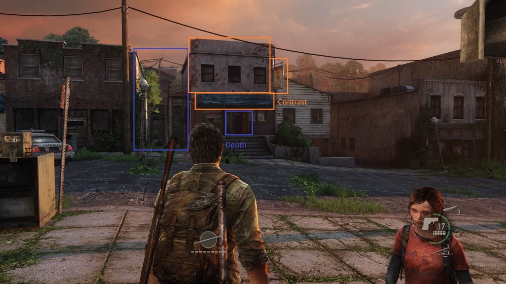
1 – Drawing Attention to a Building
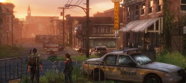
- Use of light texture.
- Billboard with red striking sign.
- Blue awning.
- Depth of side of building.
2 – Affordances
- We encounter a door that can be opened with a shiv. This in my mind established an accordance that doors that looked like this could be opened.

- Later on we may encounter another door that looks like that same shiv door from before, but this one doesn’t open (affordance confusion)!

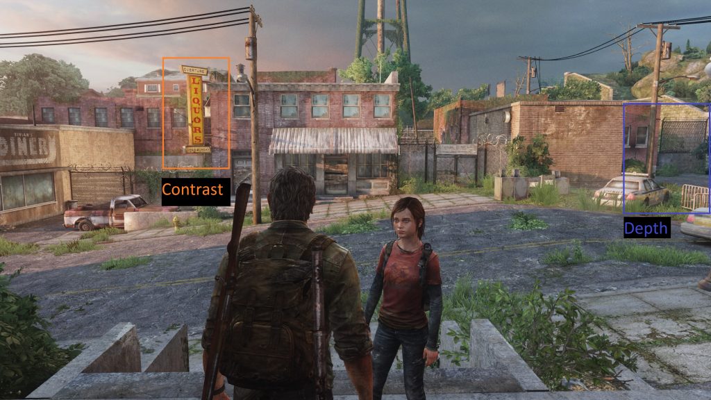
3 – Drawing Attention to Areas of Interest
- Like the contrast on the left side, draws my eye to the area where the safe is located.
- Sign as well as red car.
- Like the depth on the right side, draws my eye.
- Depth and blue police car.
4 – Lock Before The Key
In this section the player finds a safer that requires a numerical combination to be opened.
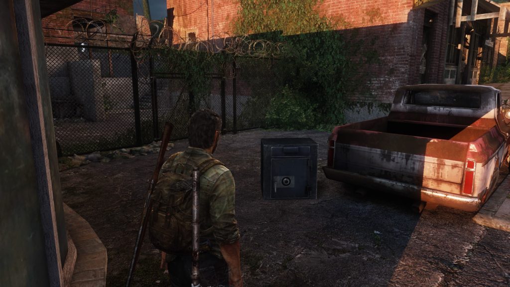
Further down the street the player sees the glint of a note against a dark junk wall, and finds the combination to the safe written on the note. I have an issue with this!
The player does need to do backtracking which isn’t ideal, but it isn’t much, my issue relates to getting the combination. When the player gets the combination it would be an additional plus to underscore receiving this important information with a touch of VO that hinted the relationship between the safe and note e.g “hmm wasn’t there a safe back there?”.
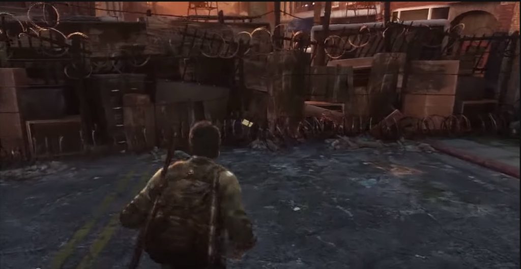
5 – Corridor
- Another nice use of color with a blue dumpster at the end of the corridor.
- Nice use of leading lines.
- Light on edge of building catches the eye.

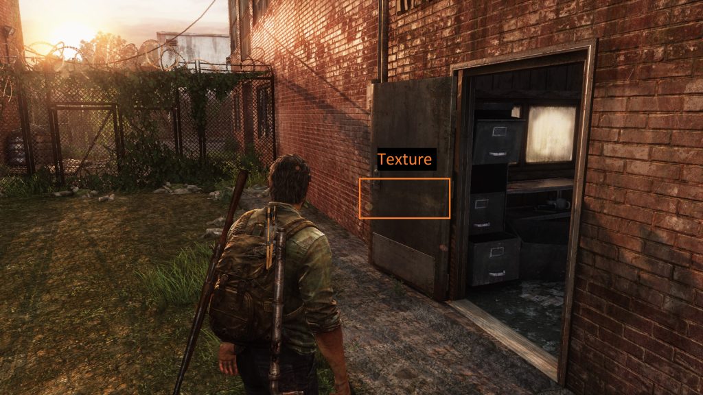
6 – Texture
I like the very subtle yellow paint line. The use of a close up texture to lead the player (that color yellow also associated with accessibility in other places e.g. a ledge you can climb).
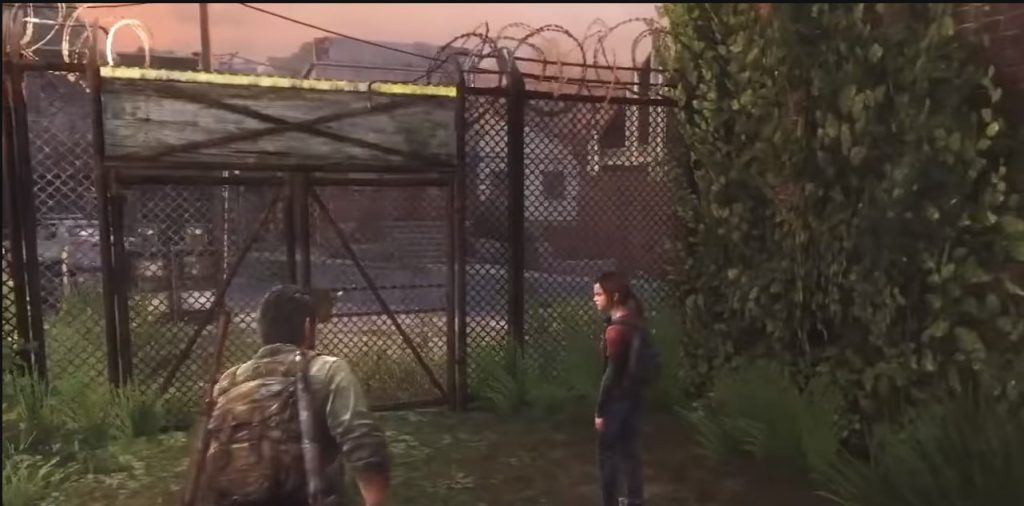
7 – Light
Love the colored light that comes through the panes of colored glass, it reminds me of Gaudis interior of Sagrada familia.
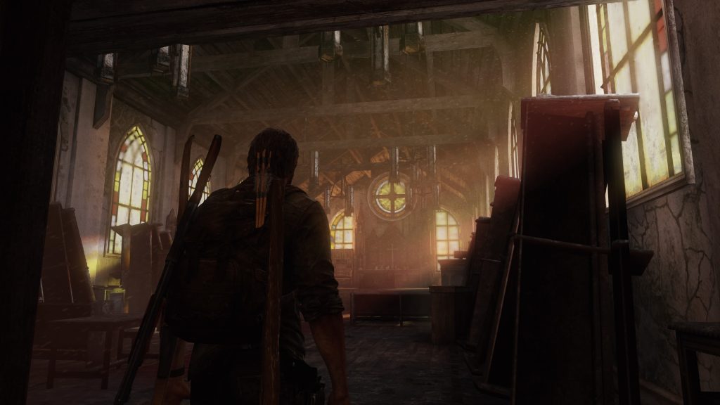

8 – Composition
Strong Christian iconography. I liked the composition of the elements.
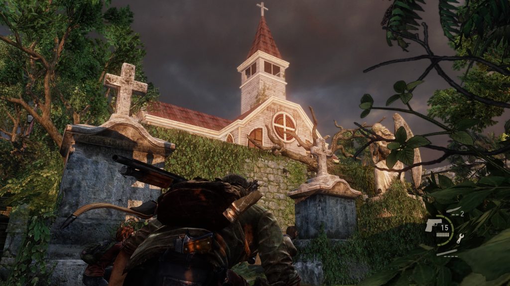
9 – Memory Lane
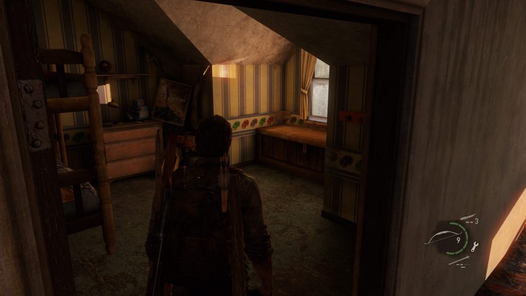
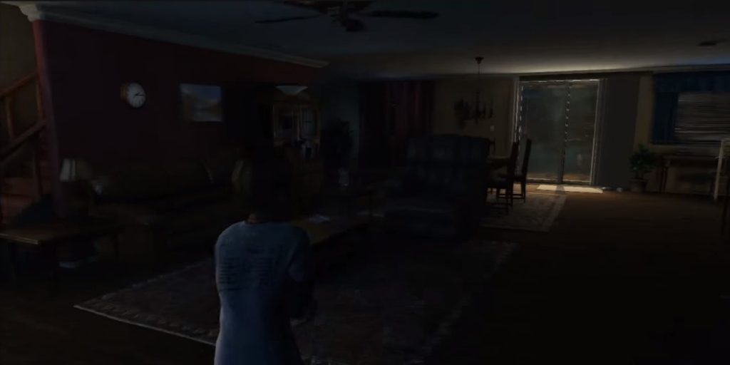
Went through what reminded me of Joels home. One room looked like a kids room. Feels like they are subtle reminders of Joels past.
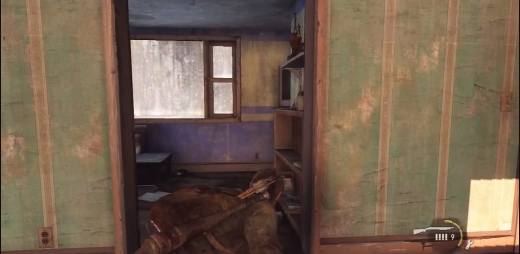
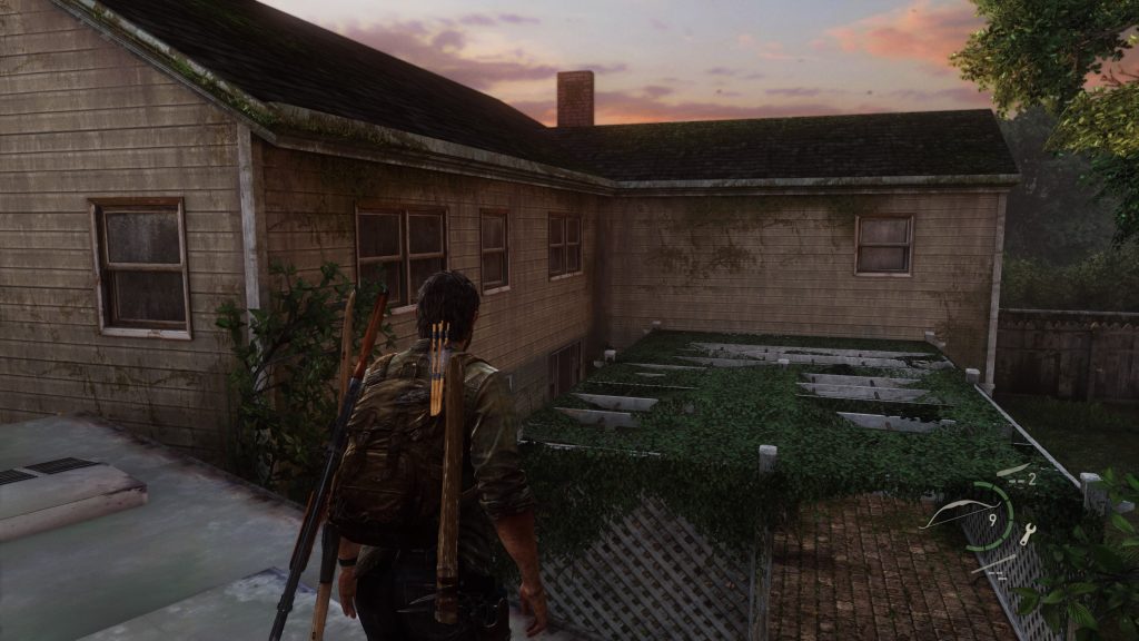
10 – Association
In another house the player can choose to engage in dialogue with Ellie. The backdrop being a child’s room. This combination summoned a reminder of Joel’s daughter.
