Tag Archives: Game Impressions

WIT – Scratch X RPG Battle 2

Preface: Making a game is hard, so any endeavor I applaud. Additionally the time and Skill Level of Developer is Unknown. The game I will be writing some notes on is Scratch X RPG Battle 2 and can be played here.

Here are some notes on the experience:

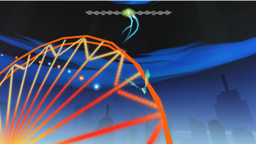
  • Enjoyed the meteorite special ability, appreciate the effort in terms of attack animations.
  • Expected ultimate to be something different from meteor.
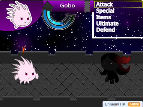
  • Classic JRPG style action menu.
  • Like how the background is akin to some of the special moves. Helps to create a sense of a larger environment.
  • Would have like a progression of enemies, boss super powerness reduce from the impact of abilities + not sure if the enemy can be beaten.
  • Some initial backstory might be cool to setup why I’m this character, what brings me to this place.
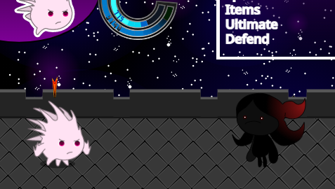
  • Some options not functional e.g. Items – likely scope related.
  • Health and mana could be different colors instead of different shades of blue to visually show their difference in function..
  • I’d consider making the ultimate ring an inner part of the three stats ring to show association between the two.
  • Unclear how to back out of current option, could use standard key like escape, since no ability to go back in menu and was out of menu got stuck and had to quit.
  • Reminds me of Dragon Ballz for some reason.
  • Boss projecting a power attack coming is good. Dark Souls does this well for attacks in general.
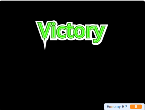
  • After a couple of tries I did win. It was hard, more playtesting and tuning seem to be in-order.

Entwined, Impressions

Entwined is a rhythm game developed by PixelOpus for the PlayStation 4, PlayStation 3 and PlayStation Vita.

Warning there be spoilers ahead! Read at your own peril!

Entwined’s gameplay can be broken down into two sections:

PowerUp

  • An on the rails experience in a tube game space with a fish and bird respectively confined to a half of the tube.

  • Each side of the tube has a PowerUp bar that is filled by the player collecting objects contained on that side.
  • Objects are collected through the player moving the fish and bird using their controllers joysticks.
  • When the bar is full the player morphs into a dragon and goes into the SkyWrite section.

SkyWrite

  • A freeroam experience where players use their controllers joysticks to fly around a fixed area collecting orbs till the sections PowerUp bar is filled.
  • Once the PowerUp bar is filled the player can SkyWrite leaving a persistant trail.
  • When SkyWriting is complete the player can proceed to the next PowerUp section to continue the game.

Like

  • Beautiful visuals
  • When the bird and fish come close together their color melds into a green, which is the same color of the dragon they later morph into.

This slideshow requires JavaScript.

  • Little orbs used to direct player to fly interesting areas

  • Powerup system links into joystick controls well
  • Great tutorial. The developers employed practical examples with clear visual indicators in both PowerUp and SkyWrite sections.

This slideshow requires JavaScript.

  • Good use of orange and blue which are strong color themes throughout game

This slideshow requires JavaScript.

Continue reading Entwined, Impressions

Heart of The Swarm, Impressions

Recently I’ve been playing Starcraft 2 Heart of The Swarm, a military science fiction real-time strategy video game developed and published by Blizzard Entertainment. The following are my notes:

There be spoilers ahead, read at your own peril!

Like

  • The Hyperion mission! Having to manage one unit with a continuous stream of battling non playable characters takes away the added task of micro management and lets me enjoy a feeling of ‘distinctiveness’

  • How ‘cutscenes’ meld into gameplay e.g when saving Raynor, Kerrigan’s Leviathan arms smash into the prison ship which then transitions into the game level

This slideshow requires JavaScript.

  • Evolution missions really helps players understand how an evolution works and how to use it

Dislike

  • After Kerrigan’s battle with Narud, I felt she recovered too quickly. It drew from the gravity of the fight. She should have been in an injured state for the Leviathan section where characters could comment on her fight. Then by the next mission having recovered, there would be a contextual piece of dialog about it

Continue reading Heart of The Swarm, Impressions

Dyscourse, Impressions

Recently I’ve been playing Dyscourse, a survival adventure video game developed and published by Owlchemy. The following are my notes:

There be spoilers ahead, read at your own peril!

Like

  • Effective non playable character ‘humanization’
    • Text – One character makes a reference to the main players clothes
    • Actions – Passing around of water bottles scene

This slideshow requires JavaScript.

  • Warm colorful storybook art style
  • Characters reflect ‘character’ through facial expressions, walking style, and speech which conveys the characters emotion
  • ‘Torchlight Talk’ mechanic, it makes sense that the fire goes out over time making talking limited

  • Time based events with clearly conveyed state e.g combo sequence required to defeat boar

  • Color coding for character dialog messages

  • Slight shine on wooden planks to attract players attention

  • Choice confirmation points that give a player a chance to again consider

  • Rewind feature, which allows player to go through the story again and try get the outcome they actually desire

Continue reading Dyscourse, Impressions

An Impression of 140

Melding music and game play is an interesting area of game development which games such as Crypt of the NecroDancer, Beat Buddy, and Guitar Hero, have explored. Whilst exploring my own shamefully large collection of untouched games on Humble Bundle I happened upon the game 140 which makes its own contribution to this area.

140_game_logo

With lead designer Jeppe Carlson, (co-designer of the well know title Limbo) 140 was created by Carlson Games. Paraphrasing Jeppe, he describes 140 as an old school platformer, where the challenge is in syncing up your moves, and jumps to the music controlled elements.

After a short time with 140 I thought to briefly note my impressions of the game.

Disclaimer – This is not a  thorough review, but notes of an impression based on approximately 20 minutes of game play. Everyone is fallible.

Impression Notes

  • On launching 140, the first thing that hit me was its minimalist art style. Its distinctive color scheme made it easy to identify puzzle patterns, and game elements.
  • In 140, music is at the heart of its game-play with appropriately pulsating background, and game elements used with rhythm based mechanics to make interesting puzzles.
  • 140 relies on players exploration of controls as I noticed no traditional tutorial which can be fine. Although some helpful information based on monitoring of the game state is good e.g explain to jump or move if a player hasn’t moved for a long time.
  • Like other titles in this area 140 suffers slightly from issues of repetitive music. This issue I believe essentially stems from player progression which is something hard to control. I felt this game handled this issue well by splitting music into short levels.

140_game_elements

  • The difficulty of the game quickly ramps up, likely making it less accessible to the casual gamer. On the other hand though, this meant 140 presented more challenging puzzles, which is delight for some. It’s good that the creators of 140 realized the game difficulty, and employed frequent checkpoints through out the game.
  • 140 bravely deviates off a more traditional pattern of game mastery by transitioning to a hail shooter from a rhythm based platformer at the first boss fight. I found the hail shooter boss encounter to be a disproportionately high increase in difficulty from the challenges before. The encounter left me frustrated (maybe I just sucked bad). Perhaps an easier encounter, or a series of checkpoints through the boss encounter would have been preferable.
  • Raph Koster said ‘noise is patterns we don’t understand’, and so it felt appropriate that the ‘death blocks’ were static noise. 140s creators took this concept even further during the first boss fight as static noise breaks down into music.

First Boss Fight
First Boss Fight

  • Like other titles in this area of game development, 140 suffers from issues of repetitive music. This issue I believe essentially stems from player progression which is something hard to control. 140 tackled this issue well by shortening levels, and splitting up music into those levels.
  • I liked how the levels key (item objective) was innately tied to the next level through music. When hearing the keys music was excited thinking about how it would later manifest itself as a mechanic.

Conclusion

All in all I enjoyed 140, being a nicely designed little gem it was a happy little surprise. Budding game designers should definitely give it a play as its a game well focused on how to meld music, and game-play.

Shogun 2s User Interface, Center

The central area of the Total War interface receives the highest attention from the player. This post will look at a number of the elements that appear there.

Total War Encyclopedia

There are many pages within the encyclopedia. A look at one page gives a good understanding of the user interface (UI) element given the consistency used throughout the encyclopedia.

Encyclopedia Page

  • Light Blue – Main Subject Categories.
  • Dark Blue – Scroll Bar.
  • Green – Navigation Buttons.
  • Light Green – Part of Page Description.
  • Orange – Topic Navigation.
  • Pink – Relevant UI Image.
  • Purple – Page Title.
  • Red – Main Title.
  • Yellow – Browser Breadcrumb.

Notes

  • The scroll bar (Dark Blue) is not themed, resulting in it looking quite out of place. Perhaps this area was not given as much priority which is understandable as perhaps players don’t use the encyclopedia so much? From my experience I didn’t, and that is a sign of good game design.
  • The designers used the encyclopedia icon next to the UI elements main title (Red) likely to subtly have a player associate the image with the words Total War Encyclopedia.
  • The cancel button, and the navigation buttons are grouped together (Green) in the top left. For this area the designers have used the Main Menu button for the Home Button in the encyclopedia, they rely an understanding of ‘importance’.
  • The use of bread crumbs is good for players to quickly backtrack when navigating (Yellow).
  • The on hover underlining used for the main page categories is more link like (Light Blue).
  • There is a further reading tab located at the bottom of the page (Orange) which makes sense since the read is likely to look there. At the bottom of the page, the left and right topic options are displayed based on related topics in the manual.
  • For the main article they used topic headings, text descriptions with images, and icons which prove to be very helpful (Pink & Light Green) in conveying the point of the article.

Continue reading Shogun 2s User Interface, Center

Shogun 2s User Interface, Bottom Left/Middle

The Bottom Left/Middle Area of Shogun 2s Campaign Map User Interface is an elegantly designed, helpful popup filled, context sensitive area that displays key information about a players Navies, Armies, Agents, Construction, Recruitment and Battles options.

The UI element as a whole is thematically suited to the time period, incorporating a Japanese battle banner, appropriate color scheme, and style to complement the rest of the UI. In addition a neat feature of this UI area is that depending on the context of a players selection this UI area will change. For example when a player clicks an empty space on the campaign map it is hidden, if an army is selected army information will appear in the form of a Tab.

All these design decision make this UI element a screen space efficient, compact, informative, aesthetically pleasing part of the campaign map that ‘fits’ well into its surroundings, and help build the experience of a general during the Sengoku Jidai..

Army Tab

Army Tab
Army Tab

The Army Tab displays information related to the selected army. The UI element is made up of a Dial and a Banner.

Dial

Army Tab Dial
Army Tab Dial

The Army Tab Dial can be broken up into the following sub-elements:

  • Red – Clan icon.
  • Teal – Army leaders name.
  • Dark Blue – Arrows allowing cyclical cycling through units of the same type, in this case army.
  • Purple – Army leaders image.
  • Yellow – Disband button.
  • Green – Chat.

Considering this element:

  • The layout of the dial is interesting being somewhat symmetric, and the dial art asset has a shine at the top of the dial which may attract a viewers eye.
  • The Purple and Teal elements are not necessary, but are welcome as a thematic elements for a player.
  • Functionally the Dark Blue, and Yellow elements allow a player to quickly jump from army to army, and disband them if necessary.
  • The other side of the campaign map, the bottom right, features a stylistically similar dial.

Banner

Army Tab Banner
Army Tab Banner

The Army Tab Banner is jam packed with vital information that can be broken down in the following manner:

  • Orange – Used for unit replenishment indicators, where a:
    • Green circle with a + means units are replenishing.
    • Green circle with a red slash means are not replenishing.
    • Skull which means units are suffering attrition.
  • Light Green – Unit experience.
  • Dark Red – Unit portrait with color coded background (Radious’s mod added this I believe).
  • Dark Green – Special Attributes e.g Accuracy, Improved Armour.
  • Yellow – Unit Rank.
  • Purple – Unit Strength. If the unit is being replenished a dark grey area will appear with a visual indicator of the new strength at the next turn.
  • Teal – Unit Type Icon.
  • Dark Blue – Recruitment Tab. This only appears when a general is present in the selected army.

Looking at the banner in totality, all the information fits neatly, and succinctly conveys a lot of information to the player with great use of clear icons in a consistent format.

Continue reading Shogun 2s User Interface, Bottom Left/Middle

Shogun 2s User Interface, Bottom Right

Bottom Right UI Element

The bottom right UI element is located in a circular image that suits a dial design. It balances well the circular dial located on the opposite side of the campaign map page. The UI element can be split into two major parts.

First is the management dial which contains the vast majority of this UI elements functionality. Secondly is the resource pane which includes an overview of the most important resources used in the game, money and food.

Management Dial

Management Dial
Management Dial

  • Blue – Technology.
  • Green – Turn.
  • Purple – Clan Management.
  • Red – Finance.
  • Yellow – Diplomacy.

The UI element is compact, containing a number of icons that are representative of their function. There is though a small risk of accidentally hitting the turn button given its size and position.

  • Diplomacy (Yellow) uses a bowing person which appears to be an envoy.
  • Clan Management (Purple) uses a Clan flag which is the best representative of a Clan, and since the image is used in many other places in game the player is familiar with the image.
  • Finance (Red), uses an abacus looking instrument which is a tool used for accounting, as well as images of the currency to associate the button with in-game money.
  • Technology (Blue) uses a picture of a sword and another item representative presumably related to technology.
  • The turn button (Green) reflects the season as well as the year written clearly in black.

Management Pages

A standard used throughout the management pages is the location of the help and exit buttons. The help icon is located on the top right, and the action buttons are centered at the bottom of the page. Perhaps the help button would have been better located on the top left to coincide with the position of the help button on the main campaign map page.

Clan (Purple)

On pressing the purple icon a clan management page opens that has a number of tabs.

Summary

The summary tab is the default tab that opens. The page includes several clan related thematic elements namely the clans symbol (Blue), the name of the daimyo and an in game image (Green).

shogun_2_interface_clan_management_summary

Continue reading Shogun 2s User Interface, Bottom Right

Shogun 2s User Interface, Top Right

The Top Right UI Element in Shogun 2s Sengoku Jidai Campaign Map consists of three primary elements.

Top Right UI Element

Map & Global Effects

The first element is a Map of Japan. Known clans territories are marked with a representative color (e.g Purple), and clicking the elements of the map takes you to that element on the 3-D map.

In addition selecting the Map Tabs results in icons appearing on the map e.g Navy, and Army symbols which when pressed take you to the unit. Certain symbols are given different styles depending on whether they are ‘active’ or not. An example of an inactive symbol is the trading post (Yellow), an example for active is the symbol used for the city of Kyoto which has been captured in this Campaign (Green).

shogun_2_interface_top_right_map

  • Blue – Expand Button.
  • Green – Active Icon Style.
  • Purple – Multiple Clan Colors.
  • Red – Minimize Button.
  • Yellow – Inactive Icon Style.

The Map can be expanded and minimized with the button in the top right corner (Red) of the Map (placement follow a standard for window closing making it more intuitive), and expand (Blue) is located in the bottom left corner which makes sense given it expands in that direction.

Map Resizing: Expanded(Top)/Default(Middle)/Minimized(Bottom)

The space difference when resizing can be somewhat judged by the above diagram. When expanded the Map takes up approximately a quarter of the screen, when minimized it disappears completely leaving only the Map Tabs and Global-Effects.

Global Effects
Global Effects

The second element is a list of Global Effects located at the top left corner of Map. This area displays an icon for each Global effect e.g. Master Builders which reduces construction costs. Perhaps leveraging perceptions of color, positive effects are displayed with a green background.

Continue reading Shogun 2s User Interface, Top Right

Shogun 2s User Interface, Top Left

Top Left UI Element
Top Left UI Element

The Top Left User Interface (UI) element of Shogun 2s Sengoku Jidai Campaign Map consists of three equally sized icons. Pressing these icons open up the Game Menu, Total War Encyclopedia, and Game Menu UI elements.

  • Blue – Adviser Toggle.
  • Green – Encyclopedia.
  • Red – Game Menu.

The Top Left UI Element is never hidden, and when large elements appear in the interface from the area underneath this UI element, this element often overlays the larger element which was likely done given that this UI element has a higher priority function.

Adviser Toggle (Blue)

The Icon for the Adviser Toggle button (Blue) was likely chosen because one adviser looks similar. The functionality of the Adviser pane can be changed to either appear when using a feature in the Campaign for the first time or, considering more experienced players, can be set to not appear at all.

Pressing the icon from the UI element at the top left of the screen opens the following pane.

Adviser Pane
Adviser Pane

  • Blue – Advice Toggle.
  • Green – Advice Subject.
  • Orange – Advice Details.
  • Red – Character Image.

The character image (Red) serves a thematic purpose, the arrows (Blue) are for cycling through Advice, and are grouped with the character image to avoid getting in the way of the Advice description space.

The Advice Title (Green), and Text (Orange) are positioned in a standard way for reading. The Advice description takes the most space of all the elements, and can expand if necessary in case of text overflows. The cancel button (Purple) is placed in a commonly expected place for exiting which is the top right.

Encyclopedia Icon (Green)

The Encyclopedia Icon seems to be a Japanese style lamp with a question mark on it. I interpret this to be a symbol for a lamp that illuminates the unknown represented by the red question mark. It also leverages the commonly known iconography for help by using a question mark.

Encyclopedia Title
Encyclopedia Title

To reinforce that this is actually the Total War Encyclopedia, the icon is prominently displayed on the start page of the game, and is constantly visible in the game Encyclopedia with a clearly visible label.

Start Page Encyclopedia Icon

Options Icon (Red)

Start Page Options Icon

I’m not exactly sure what the Game Menu Icon (Red) is. I’d hazard a guess, and say it looked like a face that was wearing glasses, and had a Japanese castle like hat?

In the Start Page of the game for displaying the Options Icon they used an image of a sword rack with multiple blades. That icon made more sense to me as I interpreted it to mean an option of swords to choose.

Perhaps they could have used the same image for consistency? Perhaps it was an issue of space?

Shogun 2s User Interface, A Study

The purpose of this project is to further my understanding of good UI design by studying various elements of Shogun 2s User Interface (UI) used in its Sengoku Jidai Campaign Map.

This post will serve to discuss the Campaign Maps UI layout, and be an index post in a multi-post project of non comprehensive personal observations of Shogun 2s User Interface.

Disclaimer: The User Interface (UI) is not quite in its Vanilla form due to having the Steam mod by Radious installed at the time of the study.

Shogun 2s User Interface Screenshot
Shogun 2 Campaign UI

The focus of this piece will be mostly on the 2-D elements of the interface such as menus, tabs, pop-up, and icons NOT the ‘3-D’ campaign map itself. So lets start with the general layout of the the Campaign User Interface.

General Layout

We can abstract Shogun 2s User Interface into an approximate layout with the following areas:

Shogun 2s User Interface General Layout
Interface Layout – Not to Scale

  • Dark Blue – Help and Options.
  • Green – Screen Center.
  • Light Blue – Map Lists.
  • Orange – ‘Selection’ Dial.
  • Pink – Description Popup area.
  • Purple – ‘Selection’ Banner.
  • Red – Map and Global effects.
  • Yellow – Management Dial.

Continue reading Shogun 2s User Interface, A Study

Supreme Commander 2 – An Overview

I recently completed the single player mode of Supreme Commander 2, and here are some brief notes on it.

supreme_commander_2

Good

  • Good in-game visuals. Top notch in-game animations in particular unit explosions.
  • Improved micro-management. Appreciated the removal of engineer and factory tiers from the first Supreme Commander, as well as being able to repeat build orders on factories allows one to focus on the fun part; commanding armies.
  • Game ran smoothly on my dated computer. I played the game on my fairly old laptop on the Medium graphics setting and it ran smoothly as well as looked good.

Bad

  • Pre-rendered cut scenes didn’t look good. To be fair though the game was released half a decade ago.
  • Single player mode was short. Supreme Commander one feature three seperate campaigns Supreme Commander 2 felt like it hacked together three half campaigns.
  • A weak story. The primary flaws with story are its underdeveloped characters, and a loosely strung together plot. It tries to have its ‘moments’ but unfortunately they fall flat given the lack of story depth.

Both

  • Smaller scale. Though the maps are smaller in scale, in some ways this is a benefit as you don’t have units travelling for ages to get to a battle, thus there is less time between ‘action’. Yet the point still stands that the overall scale of the battles have been shrunk, and with it the feeling of being the Supreme Commander.

Conclusion

Overall I enjoyed the experience. Supreme Commander 2 definitely has some improvements from the first game, though I get this feeling that the game is less that perhaps it intended to be. Perhaps due to time/budget constraints?

Nevertheless if  you enjoyed the first Supreme Commander the second is certainly worth checking out.

League of Legends

League of Legends is described by some as the equivalent of electronic basket ball, by others like AngryJoe as “crack”. I agree. This Multiplayer Online Battle Arena (MOBA), where team work is essential to success has players take control of a single unit in a multi-player match up, with the goal of destroying the opposing teams ‘Nexus’.

Nexus
The Nexus

A Short History

League of Legends or LOL (though well executed) is not an original idea. In fact it was originally conceived as Defense of the Ancients (DOTA). Based on a mission from Starcraft, DOTA was a custom game created by Eul on the popular Real Time Strategy game Warcraft 3: Reign of Chaos. Unfortunately Eul did not update his map, and so others created spin-offs; it was Steve ‘Guinsoo’ Freak who got it right.

Guinsoo created a variant of DOTA calling it DOTA: Allstars. He then put in an enormous amount of work in to adding new champions, items and game features. He later handed it over to Abdul ‘Icefrog’ Ismail who continued his work. At present IceFrog has gone onto become a lead designer at Valve working on the sequel DOTA 2.

DOTA: Allstars

Continue reading League of Legends

Reus

reus

In the beginning there is only an empty planet…

Using its last remaining power, the planet summoned four elemental giants in an attempt to restore life to it’s dead surface. These giants were charged with cultivating a suitable environment for life.

reus-four-giants

Welcome to Reus, a 2D god game by Abbey Games where under your control are these four giants; Forest, Rock, Ocean and Swamp.

Each giant has the ability to create a unique biome by terra-forming the planet. They can then place different types of resources within these biomes, and grant aspects which can augment their own, or other giants resources.

Multiple resources work together to create a ‘symbiosis’ that offers additional benefits to the surrounding area. These resources then attract nomads who settle in the cradles of life that you create, building villages that soon require more resources to grow.

The task that forms the lions share of the games complexity is a balancing act, between finding the combinations of resources that provide what a village needs, and keeping the villages ‘greed’ in check.

Simply put, greed is a mechanic where by bestowing a village with too much too quickly, they become greedy and destructive, to the point where it can result in a village destroying the very utopia you forged and even turning on you. If necessary you may have to destroy the offending village, its your choice.

Continue reading Reus

No One Has To Die

No One Has to Die’s comments on Newgrounds read “4 people are trapped in a building fire and need your help to escape”, now I’ve finished playing it, looking back it’s the tip of the iceberg… an awesome iceburg.

no-one-has-to-die-logo

An hour or so in length, this indie game manages to pack quite the punch. It isn’t particularly difficult and it’s not designed to be. The simplicity of its gameplay and mechanics, peel back to reveal the complexity one feels in considering the consequences of those simple choices, which in turn furthers the narrative in a ‘player-driven’ manner.

no-one-has-to-die

It’s art style is simple, functional, colorful and doesn’t detract from the game. The music is top notch, working well to build up an atmosphere in tune with what’s happening in-game. The writing of characters is good and given the length of game it’s enough to start to get a ‘feel’ for them.

No-One-Has-To-Die

All in all No One Has to Die is a thought provoking puzzle over life and death. Its great moments and emotional highs and lows leaves one with a joyously sweet aftertaste. This is one indie gem, is well worth your time.

So what are you waiting for! Play it!