Yearly Archives: 2016

Visual Story – Composition

In our Visual Story course we were tasked to take pictures demonstrating various visual concepts. Our first assignment involved composition, namely working with the following concepts in photography:

  • Balance
  • Filling the Frame
  • Frame Withing a Frame.
  • Lines.
  • Patterns.
  • Rule of Thirds.
  • Shapes.

Below are the pictures I took for each category with a little why for each.

Some of the following photos did not successfully capture the category, but I included them anyways because I enjoyed taking them.

Balance

Balance is a tricky concept well explained at photographylife.com. Essentially when I took my photos I focused on creating photos with two points of focus and symmetry.

This slideshow requires JavaScript.

Continue reading Visual Story – Composition

White Water Rafting – Pittsburgh

Have you ever gone white water rafting? With a lottery, a little yellow ticket, and the efforts of Carnegie Mellon Universities Graduate Student Assembly, I have.

white_water_rafting_gsa

So on a dreary Sunday morning we set off for the main university campus, got on a bus, and traveled to the lower Youghiogheny River.

white_water_rafting_leaving

When we finally arrived, we were dropped off at the outdoor office of our guides, The Laurel Highlands River Tours (imagine the following picture but grey and rainy).

white_water_rafting_laurel

On confirming our reservation we promptly collected our gear, ran through various vitally important safety measures, then began rafting. The experience required working together with ones raft cohabitants, and though we ‘frequently’ faced trials and tribulations, we always pulled through in the end.

white_water_rafting_boat

Continue reading White Water Rafting – Pittsburgh

Pursuit – A Painting Project

Introduction: Pursuit is a Japanese style decorative painting I designed, and painted with my sisters over the summer of 2016.

pursuit_unhung
Pursuit

Time: 4 weeks | Roles: Designer – Painter | Team Size: 4

Design Goal: To create an aesthetically pleasing well balanced Japanese style decorative painting.

My Contributions: As the designer of this project I researched, and drew the initial sketch of Pursuit as well as painting and supervising the whole of the way through.

Development

Pursuit started with a need for decoration, a desire for an oriental style painting, then a theme of the pursuit of ‘something’. Next a sketch with notes on elements that formed the foundation of this project.

Pursuit - Initial Sketch
Pursuit – Initial Sketch

Considering what I wanted, I paid Kuwait’s arts shops a visit for canvases. On finding said canvases I collected the dimensions of what was available.

Canvases
Canvases

Using those dimensions I created my desired layout with Google Sketchup, which I then printed to scale on A3.

Pursuit - A3 Layout
Pursuit – A3 Layout

With a layout I began the process of a creating a more detailed sketch, starting with drawings of more detailed items based on research of images reminiscent of Japan. Images such as Matsumoto Castle, the Cocoon Tower, Torii gates, wave styles, clouds, and villages.

This slideshow requires JavaScript.

With a solid idea of various details for the painting I sketched up a detailed draft of Pursuit on a to-scale A3 layout.

Pursuit - Detailed Sketch
Pursuit – Detailed Sketch

Once the detailed sketch was complete, I next created a digital copy by scanning the document. Using the digital copy and a projector I traced each section of the painting onto its respective canvas.

pursuit_projector

Meanwhile we constructed a easel to hold every canvas in the correct layout. In addition I thought it wise that before the first brush stroke, to create a colored digital image to help in visualizing the final product.

pursuit_digital_color

Continue reading Pursuit – A Painting Project

Painting IndoPak Independence in Pittsburgh

The 14/15th of August is Pakistan and India’s Independence day. As part of the celebration a bunch of Carnegie Mellon (CMU) students planned to paint CMU’s famous fence in both nations colors. Some friends and I tagged along to help out, and be a part of the old CMU tradition.

Independence_night_photo

The end result was something to be proud of.

Independence_painted_fence

An Impression of 140

Melding music and game play is an interesting area of game development which games such as Crypt of the NecroDancer, Beat Buddy, and Guitar Hero, have explored. Whilst exploring my own shamefully large collection of untouched games on Humble Bundle I happened upon the game 140 which makes its own contribution to this area.

140_game_logo

With lead designer Jeppe Carlson, (co-designer of the well know title Limbo) 140 was created by Carlson Games. Paraphrasing Jeppe, he describes 140 as an old school platformer, where the challenge is in syncing up your moves, and jumps to the music controlled elements.

After a short time with 140 I thought to briefly note my impressions of the game.

Disclaimer – This is not a  thorough review, but notes of an impression based on approximately 20 minutes of game play. Everyone is fallible.

Impression Notes

  • On launching 140, the first thing that hit me was its minimalist art style. Its distinctive color scheme made it easy to identify puzzle patterns, and game elements.
  • In 140, music is at the heart of its game-play with appropriately pulsating background, and game elements used with rhythm based mechanics to make interesting puzzles.
  • 140 relies on players exploration of controls as I noticed no traditional tutorial which can be fine. Although some helpful information based on monitoring of the game state is good e.g explain to jump or move if a player hasn’t moved for a long time.
  • Like other titles in this area 140 suffers slightly from issues of repetitive music. This issue I believe essentially stems from player progression which is something hard to control. I felt this game handled this issue well by splitting music into short levels.

140_game_elements

  • The difficulty of the game quickly ramps up, likely making it less accessible to the casual gamer. On the other hand though, this meant 140 presented more challenging puzzles, which is delight for some. It’s good that the creators of 140 realized the game difficulty, and employed frequent checkpoints through out the game.
  • 140 bravely deviates off a more traditional pattern of game mastery by transitioning to a hail shooter from a rhythm based platformer at the first boss fight. I found the hail shooter boss encounter to be a disproportionately high increase in difficulty from the challenges before. The encounter left me frustrated (maybe I just sucked bad). Perhaps an easier encounter, or a series of checkpoints through the boss encounter would have been preferable.
  • Raph Koster said ‘noise is patterns we don’t understand’, and so it felt appropriate that the ‘death blocks’ were static noise. 140s creators took this concept even further during the first boss fight as static noise breaks down into music.
First Boss Fight
First Boss Fight
  • Like other titles in this area of game development, 140 suffers from issues of repetitive music. This issue I believe essentially stems from player progression which is something hard to control. 140 tackled this issue well by shortening levels, and splitting up music into those levels.
  • I liked how the levels key (item objective) was innately tied to the next level through music. When hearing the keys music was excited thinking about how it would later manifest itself as a mechanic.

Conclusion

All in all I enjoyed 140, being a nicely designed little gem it was a happy little surprise. Budding game designers should definitely give it a play as its a game well focused on how to meld music, and game-play.

Shogun 2s User Interface, Center

The central area of the Total War interface receives the highest attention from the player. This post will look at a number of the elements that appear there.

Total War Encyclopedia

There are many pages within the encyclopedia. A look at one page gives a good understanding of the user interface (UI) element given the consistency used throughout the encyclopedia.

Encyclopedia Page

  • Light Blue – Main Subject Categories.
  • Dark Blue – Scroll Bar.
  • Green – Navigation Buttons.
  • Light Green – Part of Page Description.
  • Orange – Topic Navigation.
  • Pink – Relevant UI Image.
  • Purple – Page Title.
  • Red – Main Title.
  • Yellow – Browser Breadcrumb.

Notes

  • The scroll bar (Dark Blue) is not themed, resulting in it looking quite out of place. Perhaps this area was not given as much priority which is understandable as perhaps players don’t use the encyclopedia so much? From my experience I didn’t, and that is a sign of good game design.
  • The designers used the encyclopedia icon next to the UI elements main title (Red) likely to subtly have a player associate the image with the words Total War Encyclopedia.
  • The cancel button, and the navigation buttons are grouped together (Green) in the top left. For this area the designers have used the Main Menu button for the Home Button in the encyclopedia, they rely an understanding of ‘importance’.
  • The use of bread crumbs is good for players to quickly backtrack when navigating (Yellow).
  • The on hover underlining used for the main page categories is more link like (Light Blue).
  • There is a further reading tab located at the bottom of the page (Orange) which makes sense since the read is likely to look there. At the bottom of the page, the left and right topic options are displayed based on related topics in the manual.
  • For the main article they used topic headings, text descriptions with images, and icons which prove to be very helpful (Pink & Light Green) in conveying the point of the article.

Continue reading Shogun 2s User Interface, Center

Shogun 2s User Interface, Bottom Left/Middle

The Bottom Left/Middle Area of Shogun 2s Campaign Map User Interface is an elegantly designed, helpful popup filled, context sensitive area that displays key information about a players Navies, Armies, Agents, Construction, Recruitment and Battles options.

The UI element as a whole is thematically suited to the time period, incorporating a Japanese battle banner, appropriate color scheme, and style to complement the rest of the UI. In addition a neat feature of this UI area is that depending on the context of a players selection this UI area will change. For example when a player clicks an empty space on the campaign map it is hidden, if an army is selected army information will appear in the form of a Tab.

All these design decision make this UI element a screen space efficient, compact, informative, aesthetically pleasing part of the campaign map that ‘fits’ well into its surroundings, and help build the experience of a general during the Sengoku Jidai..

Army Tab

Army Tab
Army Tab

The Army Tab displays information related to the selected army. The UI element is made up of a Dial and a Banner.

Dial

Army Tab Dial
Army Tab Dial

The Army Tab Dial can be broken up into the following sub-elements:

  • Red – Clan icon.
  • Teal – Army leaders name.
  • Dark Blue – Arrows allowing cyclical cycling through units of the same type, in this case army.
  • Purple – Army leaders image.
  • Yellow – Disband button.
  • Green – Chat.

Considering this element:

  • The layout of the dial is interesting being somewhat symmetric, and the dial art asset has a shine at the top of the dial which may attract a viewers eye.
  • The Purple and Teal elements are not necessary, but are welcome as a thematic elements for a player.
  • Functionally the Dark Blue, and Yellow elements allow a player to quickly jump from army to army, and disband them if necessary.
  • The other side of the campaign map, the bottom right, features a stylistically similar dial.

Banner

Army Tab Banner
Army Tab Banner

The Army Tab Banner is jam packed with vital information that can be broken down in the following manner:

  • Orange – Used for unit replenishment indicators, where a:
    • Green circle with a + means units are replenishing.
    • Green circle with a red slash means are not replenishing.
    • Skull which means units are suffering attrition.
  • Light Green – Unit experience.
  • Dark Red – Unit portrait with color coded background (Radious’s mod added this I believe).
  • Dark Green – Special Attributes e.g Accuracy, Improved Armour.
  • Yellow – Unit Rank.
  • Purple – Unit Strength. If the unit is being replenished a dark grey area will appear with a visual indicator of the new strength at the next turn.
  • Teal – Unit Type Icon.
  • Dark Blue – Recruitment Tab. This only appears when a general is present in the selected army.

Looking at the banner in totality, all the information fits neatly, and succinctly conveys a lot of information to the player with great use of clear icons in a consistent format.

Continue reading Shogun 2s User Interface, Bottom Left/Middle

Farewell Lionhead Studios

Heading home from Switzerlands snowy alps after my school ski trip I was exhausted. Our flight had finally reached London, and we had some time to kill before our onward journey. Some chose to sleep. I chose to shop for games.

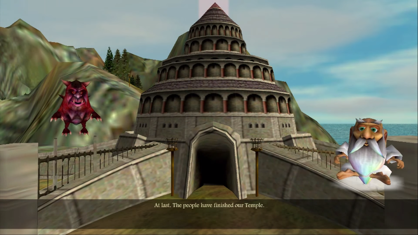
On shelves crowded by the ordinary, Black & White glinted at me. Painted with wondrous scenes of mystical grandeur I was unable to resist its sirens call. I scoured my pockets, hoping I had enough left from my spending spree on grossly overpriced bobbles, and delectable Swiss confectioneries.

Little did I know buying Black & White was to be an investment of a lifetime.

Black & White turned out to be one of the best games I’ve ever played, and its not an ‘objective’ best I’m referring to. When I say best, it’s because of the joy, and experience in that time and place which can never be recreated; no matter how advanced the graphics or sophisticated the A.I.

black_and_whit_logo

Finishing Black & White, I eagerly anticipated its sequel, going so far as to reach out of my introverted childhood and send Lionhead Studios an email as news of Black & White 2 trickled across the net.

I wish I still had that mail; alas a lost memento.

I recall asking about features. Would there be creature armor? What would it be like? Would there be more types of wild animals? What would their behaviors be?

If I could meet the boy who sent Lionhead that email, I’d have chastised him for his priorities, and compelled him to seek forgiveness for his god awful writing. Yet, more importantly, I’d also have given him a smile and a pat on the back for his sporadic naive bravery.

Can you believe they replied to that little boy? An intern actually went round their office with his questions. They took the time to reply to an email asking ‘silly’ questions about ‘silly’ details. They sprinkled a little color into a child’s imagination.

A small gesture, I’ll always be grateful for.

black_and_white_temple

Again it seems that time changes everything. Yet I’ve quietly kept wishing for more Black & White games. Now I guess I’ll put that wish away on my dusty shelf of dreams.

I’m not sad though, as I’ll exchange one wish for another. Now with your talent unleashed, perhaps I’ll again meet an incarnation of you?

Farewell Lionhead Studios.

Thanks for the good times.

lionhead_logo

Dawn of War 1

Recently I’ve been playing titles from Warhammer 40Ks Dawn of War 1. I’ve returned to these games multiple times now, and I have wondered why? My conclusion is that its the well designed battles.

Dawn of War 1 has taken many hours from me, and with this piece I think I’ll take something back.

Factions

Given the rich history of lore, previous video games, and an existing tabletop game there is plenty of meat for a game designer to sink ones teeth into during the design process.

By the end of Dawn of War 1 Soulstorm there were nine playable factions with varying mechanics. Each faction had a distinct identity, strengths and weaknesses. One faction I will briefly look at is one of my favorites, The Imperial Guard.

dawn_of_war_1_imperial_guard

Imperial Guard

Known as the Emperors Sledgehammer, The Imperial Guard are neither the Super Soldier Space Marines nor the Mystical Eldar Warlocks. The Imperial Guard are the common human, seemingly weak in strength, and spirit among the denizens of the universe.

Yet only seemingly.

dawn_of_war_imperial_guard_ingame

In Dawn of War 1 the core of the Imperial Guard are its Guardsmen. Imperial Guardsmen are numerous, and cheaply replaced. They are initially weak, their morale easily shattered facing slaughter at the hands of heavier infantry units. Their limitations can however be overcome.

With thematic enhancement options such as propaganda, decrees, equipment upgrades, and squad leaders. Guardsmen can be significantly augmented to become fierce fighters able to withstand, and even overcome opponents they were initially unable to.

Perhaps I’m reading into it too much, but I enjoyed how its designed that the common human with determination, equipment, training, and leadership. Can unlock their potential, can rise up, and defeat their enemies.

Still the common human has much more to offer.

Continue reading Dawn of War 1

To The Entertainment Technology Center

Over the past several months I’ve been busy applying to Masters programs in The United States of America. Pondering ones fate whilst waiting is at times nerve wracking, but the wait has been worth it. I am happy to say that awhile back I was admitted to The Entertainment Technology Center at Carnegie Mellon!

cmu_logo

After some serious consideration I believe that a practical focus on game design is exactly what I need. Therefore I intend to attend Carnegie Mellon for a two year Masters program come Fall 2016!

cmu_etc_logo

So fingers crossed! By August I hope to be doing a Masters in Entertainment Technology at The Entertainment Technology Center in Pittsburgh!

Elfen Lied – Episode One Overview

The format of this piece will be a description of Elfen Lied Episode 1 Scene 4 with a to scale time line with emotion sections plotted with the following [itg-mediatip href=”http://somegamez.com/project/elfen-lied-study/attachment/episode_1_time_line” mediatip-type=”localimage” mediatip-content=”{&aquot;url&aquot;:&aquot;http://somegamez.com/wp-content/uploads/2016/02/episode_1_time_line.png&aquot;,&aquot;id&aquot;:2917,&aquot;link&aquot;:&aquot;http://somegamez.com/project/elfen-lied-study/attachment/episode_1_time_line&aquot;}” mediatip-link=”undefined”]Key[/itg-mediatip], where [itg-tooltip style=”color: #ca3c08; text-decoration: overline underline; font-style: italic;” tooltip-content=”<p>High Emotions refer to Emotions that connote ‘happy’ like feeling e.g Joy, Surprise and Love.</p>”]High Emotions[/itg-tooltip] are plotted below the time line (black line) and [itg-tooltip style=”color: #ca3c08; text-decoration: overline underline; font-style: italic;” tooltip-content=”<p>Low Emotions refer to Emotions that connote ‘sad’ like feeling e.g Anger, Fear and Sadness.</p>”]Low Emotions[/itg-tooltip] are plotted above.

Following this there will be a number of pie charts in the following format. Pie charts on the left are [itg-tooltip style=”color: #ca3c08; text-decoration: overline underline; font-style: italic; font-family: ‘Source Sans Pro’, Helvetica, sans-serif; font-size: 16px; font-variant: normal; font-weight: normal; letter-spacing: normal; line-height: 21.8182px; orphans: auto; text-align: start; text-indent: 0px; text-transform: none; white-space: normal; widows: 1; word-spacing: 0px; -webkit-text-stroke-width: 0px; background-color: #ffffff;” tooltip-content=”<p>A sum of the number of occurences of a category of emotion.</p>”]Totals[/itg-tooltip] of the scene, and pie charts on the right are [itg-tooltip style=”color: #ca3c08; text-decoration: overline underline; font-style: italic; font-family: ‘Source Sans Pro’, Helvetica, sans-serif; font-size: 16px; font-variant: normal; font-weight: normal; letter-spacing: normal; line-height: 21.8182px; orphans: auto; text-align: start; text-indent: 0px; text-transform: none; white-space: normal; widows: 1; word-spacing: 0px; -webkit-text-stroke-width: 0px; background-color: #ffffff;” tooltip-content=”<p>A sum of the time spent during the episode on each category of emotion.</p>”]Screen Time[/itg-tooltip]. Lastly the raw data for this scene will be presented in the form of a table.

Follow this link to the main entry for this article series.

Spoiler Alert! You’ve been warned!

Scene Overview

The first episode of Elfen Lied is indeed an interesting ride. As viewers we are introduced to a scene of violence and Horror, and though we find a glimmer of Joy, it serves only to fuel the Disgust and Rage we feel towards the one responsible for Kisaragi’s gruesome death.

The following scene shifts gear by employing a number of different emotions which creates significant contrast with the previous scene. Relief, Surprise, Sadness, extended periods of Cheerfulness are evoked with such methods as soothing music, nature, natural light, and the introduction to a more ‘normal’ world with ‘normal’ characters. Yet even then we sense sadness behind a veil of normality.

Gruesome
Gruesome

Continue reading Elfen Lied – Episode One Overview

Shogun 2s User Interface, Bottom Right

Bottom Right UI Element

The bottom right UI element is located in a circular image that suits a dial design. It balances well the circular dial located on the opposite side of the campaign map page. The UI element can be split into two major parts.

First is the management dial which contains the vast majority of this UI elements functionality. Secondly is the resource pane which includes an overview of the most important resources used in the game, money and food.

Management Dial

Management Dial
Management Dial
  • Blue – Technology.
  • Green – Turn.
  • Purple – Clan Management.
  • Red – Finance.
  • Yellow – Diplomacy.

The UI element is compact, containing a number of icons that are representative of their function. There is though a small risk of accidentally hitting the turn button given its size and position.

  • Diplomacy (Yellow) uses a bowing person which appears to be an envoy.
  • Clan Management (Purple) uses a Clan flag which is the best representative of a Clan, and since the image is used in many other places in game the player is familiar with the image.
  • Finance (Red), uses an abacus looking instrument which is a tool used for accounting, as well as images of the currency to associate the button with in-game money.
  • Technology (Blue) uses a picture of a sword and another item representative presumably related to technology.
  • The turn button (Green) reflects the season as well as the year written clearly in black.

Management Pages

A standard used throughout the management pages is the location of the help and exit buttons. The help icon is located on the top right, and the action buttons are centered at the bottom of the page. Perhaps the help button would have been better located on the top left to coincide with the position of the help button on the main campaign map page.

Clan (Purple)

On pressing the purple icon a clan management page opens that has a number of tabs.

Summary

The summary tab is the default tab that opens. The page includes several clan related thematic elements namely the clans symbol (Blue), the name of the daimyo and an in game image (Green).

shogun_2_interface_clan_management_summary

Continue reading Shogun 2s User Interface, Bottom Right

Elfen Lied Episode 1 Scene 4, Study

The format of this piece will be a description of Elfen Lied Episode 1 Scene 4 with a to scale time line with emotion sections plotted with the following [itg-mediatip href=”http://somegamez.com/project/elfen-lied-study/attachment/episode_1_time_line” mediatip-type=”localimage” mediatip-content=”{&aquot;url&aquot;:&aquot;http://somegamez.com/wp-content/uploads/2016/02/episode_1_time_line.png&aquot;,&aquot;id&aquot;:2917,&aquot;link&aquot;:&aquot;http://somegamez.com/project/elfen-lied-study/attachment/episode_1_time_line&aquot;}” mediatip-link=”undefined”]Key[/itg-mediatip], where [itg-tooltip style=”color: #ca3c08; text-decoration: overline underline; font-style: italic;” tooltip-content=”<p>High Emotions refer to Emotions that connote ‘happy’ like feeling e.g Joy, Surprise and Love.</p>”]High Emotions[/itg-tooltip] are plotted below the time line (black line) and [itg-tooltip style=”color: #ca3c08; text-decoration: overline underline; font-style: italic;” tooltip-content=”<p>Low Emotions refer to Emotions that connote ‘sad’ like feeling e.g Anger, Fear and Sadness.</p>”]Low Emotions[/itg-tooltip] are plotted above.

Following this there will be a number of pie charts in the following format. Pie charts on the left are [itg-tooltip style=”color: #ca3c08; text-decoration: overline underline; font-style: italic; font-family: ‘Source Sans Pro’, Helvetica, sans-serif; font-size: 16px; font-variant: normal; font-weight: normal; letter-spacing: normal; line-height: 21.8182px; orphans: auto; text-align: start; text-indent: 0px; text-transform: none; white-space: normal; widows: 1; word-spacing: 0px; -webkit-text-stroke-width: 0px; background-color: #ffffff;” tooltip-content=”<p>A sum of the number of occurences of a category of emotion.</p>”]Totals[/itg-tooltip] of the scene, and pie charts on the right are [itg-tooltip style=”color: #ca3c08; text-decoration: overline underline; font-style: italic; font-family: ‘Source Sans Pro’, Helvetica, sans-serif; font-size: 16px; font-variant: normal; font-weight: normal; letter-spacing: normal; line-height: 21.8182px; orphans: auto; text-align: start; text-indent: 0px; text-transform: none; white-space: normal; widows: 1; word-spacing: 0px; -webkit-text-stroke-width: 0px; background-color: #ffffff;” tooltip-content=”<p>A sum of the time spent during the episode on each category of emotion.</p>”]Screen Time[/itg-tooltip]. Lastly the raw data for this scene will be presented in the form of a table.

Follow this link to the main entry for this article series.

Spoiler Alert! You’ve been warned!

With that out of the way lets begin! (A video of the scene is at the end of the post if you wish to watch it first!)

Fourth Scene

We start with torrential rain, and darkness enshrouding (29) Koutas house, a complete contrast to its appearance in the episodes second scene. It is a foreboding transition from the previous scene where Kurama announced that Lucy should be killed, and not captured.

The scene shifts to a well lit room with Yuka speaking with some cheer (30), and Nyu looking inquisitively at the contents of Koutas bag. Nyu reaches out, and pulls at a box which falls opens to reveal a pink looking seashell.

On seeing the seashell Yuka inquires about it to which Kouta explains that it is indeed a memento of his sister Kanae, and we transition into a ‘Happy‘ memory at the beach (31). Sadly our brief Happiness turns to Sadness as we find out from Kouta that his sister has passed away.

Happy Memory
Happy Memory

Continue reading Elfen Lied Episode 1 Scene 4, Study

Shogun 2s User Interface, Top Right

The Top Right UI Element in Shogun 2s Sengoku Jidai Campaign Map consists of three primary elements.

Top Right UI Element

Map & Global Effects

The first element is a Map of Japan. Known clans territories are marked with a representative color (e.g Purple), and clicking the elements of the map takes you to that element on the 3-D map.

In addition selecting the Map Tabs results in icons appearing on the map e.g Navy, and Army symbols which when pressed take you to the unit. Certain symbols are given different styles depending on whether they are ‘active’ or not. An example of an inactive symbol is the trading post (Yellow), an example for active is the symbol used for the city of Kyoto which has been captured in this Campaign (Green).

shogun_2_interface_top_right_map

  • Blue – Expand Button.
  • Green – Active Icon Style.
  • Purple – Multiple Clan Colors.
  • Red – Minimize Button.
  • Yellow – Inactive Icon Style.

The Map can be expanded and minimized with the button in the top right corner (Red) of the Map (placement follow a standard for window closing making it more intuitive), and expand (Blue) is located in the bottom left corner which makes sense given it expands in that direction.

Map Resizing: Expanded(Top)/Default(Middle)/Minimized(Bottom)

The space difference when resizing can be somewhat judged by the above diagram. When expanded the Map takes up approximately a quarter of the screen, when minimized it disappears completely leaving only the Map Tabs and Global-Effects.

Global Effects
Global Effects

The second element is a list of Global Effects located at the top left corner of Map. This area displays an icon for each Global effect e.g. Master Builders which reduces construction costs. Perhaps leveraging perceptions of color, positive effects are displayed with a green background.

Continue reading Shogun 2s User Interface, Top Right

AI and Games – YouTube Channel

Since my time at The University of Edinburgh, one of my interests has been A.I in games. One great resource I came across that is both informative, and accessible is a YouTube Channel called AI and Games.

The channel is hosted by Tommy Thompson, an Artificial Intelligence researcher, computer science lecturer, and game developer. The channels videos/lectures, and accompanying articles on their site make useful materials for anyone interested in the field of AI and Games.

AI and Games
AI and Games

I’ve personally found these resources to have been most helpful. In particular an informative video that had a look at the A.I. used in the game F.E.A.R helped me write my notes on the A.I. employed by F.E.A.Rs NPCs.

If AI and Games is also one of your areas of interest, be sure to give this a channel a look! To kick things off, here’s a video by Tommy Thompson which serves as a good place to start.

Shogun 2s User Interface, Top Left

Top Left UI Element
Top Left UI Element

The Top Left User Interface (UI) element of Shogun 2s Sengoku Jidai Campaign Map consists of three equally sized icons. Pressing these icons open up the Game Menu, Total War Encyclopedia, and Game Menu UI elements.

  • Blue – Adviser Toggle.
  • Green – Encyclopedia.
  • Red – Game Menu.

The Top Left UI Element is never hidden, and when large elements appear in the interface from the area underneath this UI element, this element often overlays the larger element which was likely done given that this UI element has a higher priority function.

Adviser Toggle (Blue)

The Icon for the Adviser Toggle button (Blue) was likely chosen because one adviser looks similar. The functionality of the Adviser pane can be changed to either appear when using a feature in the Campaign for the first time or, considering more experienced players, can be set to not appear at all.

Pressing the icon from the UI element at the top left of the screen opens the following pane.

Adviser Pane
Adviser Pane
  • Blue – Advice Toggle.
  • Green – Advice Subject.
  • Orange – Advice Details.
  • Red – Character Image.

The character image (Red) serves a thematic purpose, the arrows (Blue) are for cycling through Advice, and are grouped with the character image to avoid getting in the way of the Advice description space.

The Advice Title (Green), and Text (Orange) are positioned in a standard way for reading. The Advice description takes the most space of all the elements, and can expand if necessary in case of text overflows. The cancel button (Purple) is placed in a commonly expected place for exiting which is the top right.

Encyclopedia Icon (Green)

The Encyclopedia Icon seems to be a Japanese style lamp with a question mark on it. I interpret this to be a symbol for a lamp that illuminates the unknown represented by the red question mark. It also leverages the commonly known iconography for help by using a question mark.

Encyclopedia Title
Encyclopedia Title

To reinforce that this is actually the Total War Encyclopedia, the icon is prominently displayed on the start page of the game, and is constantly visible in the game Encyclopedia with a clearly visible label.

Start Page Encyclopedia Icon

Options Icon (Red)

Start Page Options Icon

I’m not exactly sure what the Game Menu Icon (Red) is. I’d hazard a guess, and say it looked like a face that was wearing glasses, and had a Japanese castle like hat?

In the Start Page of the game for displaying the Options Icon they used an image of a sword rack with multiple blades. That icon made more sense to me as I interpreted it to mean an option of swords to choose.

Perhaps they could have used the same image for consistency? Perhaps it was an issue of space?

Elfen Lied Episode 1 Scene 3, Study

The format of this piece will be a description of Elfen Lied Episode 1 Scene 3 with a to scale time line with emotion sections plotted with the following [itg-mediatip href=”http://somegamez.com/project/elfen-lied-study/attachment/episode_1_time_line” mediatip-type=”localimage” mediatip-content=”{&aquot;url&aquot;:&aquot;http://somegamez.com/wp-content/uploads/2016/02/episode_1_time_line.png&aquot;,&aquot;id&aquot;:2917,&aquot;link&aquot;:&aquot;http://somegamez.com/project/elfen-lied-study/attachment/episode_1_time_line&aquot;}” mediatip-link=”undefined”]Key[/itg-mediatip], where [itg-tooltip style=”color: #ca3c08; text-decoration: overline underline; font-style: italic;” tooltip-content=”<p>High Emotions refer to Emotions that connote ‘happy’ like feeling e.g Joy, Surprise and Love.</p>”]High Emotions[/itg-tooltip] are plotted below the time line (black line) and [itg-tooltip style=”color: #ca3c08; text-decoration: overline underline; font-style: italic;” tooltip-content=”<p>Low Emotions refer to Emotions that connote ‘sad’ like feeling e.g Anger, Fear and Sadness.</p>”]Low Emotions[/itg-tooltip] are plotted above.

Following this there will be a number of pie charts in the following format. Pie charts on the left are [itg-tooltip style=”color: #ca3c08; text-decoration: overline underline; font-style: italic; font-family: ‘Source Sans Pro’, Helvetica, sans-serif; font-size: 16px; font-variant: normal; font-weight: normal; letter-spacing: normal; line-height: 21.8182px; orphans: auto; text-align: start; text-indent: 0px; text-transform: none; white-space: normal; widows: 1; word-spacing: 0px; -webkit-text-stroke-width: 0px; background-color: #ffffff;” tooltip-content=”<p>A sum of the number of occurences of a category of emotion.</p>”]Totals[/itg-tooltip] of the scene, and pie charts on the right are [itg-tooltip style=”color: #ca3c08; text-decoration: overline underline; font-style: italic; font-family: ‘Source Sans Pro’, Helvetica, sans-serif; font-size: 16px; font-variant: normal; font-weight: normal; letter-spacing: normal; line-height: 21.8182px; orphans: auto; text-align: start; text-indent: 0px; text-transform: none; white-space: normal; widows: 1; word-spacing: 0px; -webkit-text-stroke-width: 0px; background-color: #ffffff;” tooltip-content=”<p>A sum of the time spent during the episode on each category of emotion.</p>”]Screen Time[/itg-tooltip]. Lastly the raw data for this scene will be presented in the form of a table.

Follow this link to the main entry for this article series.

Spoiler Alert! You’ve been warned!

With that out of the way lets begin! (A video of the scene is at the end of the post if you wish to watch it first!)

Scene Three

Elfen Lied Episode 1 Scene 3 starts with a mangled ball of steel bathed in blood (25) and dead silence except the sound of dripping blood. It’s a big change from the previous scene, and is a shock into a short section of Horror.
bloody_structure

We move onto a shot of Kurama, his back stained with a bloody hand print left by Lucy (26), reminding us of her. Perhaps viewers might wonder what kind of relationship do they have? Why didn’t she kill him? Is it a mark of shame?

Continue reading Elfen Lied Episode 1 Scene 3, Study

Shogun 2s User Interface, A Study

The purpose of this project is to further my understanding of good UI design by studying various elements of Shogun 2s User Interface (UI) used in its Sengoku Jidai Campaign Map.

This post will serve to discuss the Campaign Maps UI layout, and be an index post in a multi-post project of non comprehensive personal observations of Shogun 2s User Interface.

Disclaimer: The User Interface (UI) is not quite in its Vanilla form due to having the Steam mod by Radious installed at the time of the study.

Shogun 2s User Interface Screenshot
Shogun 2 Campaign UI

The focus of this piece will be mostly on the 2-D elements of the interface such as menus, tabs, pop-up, and icons NOT the ‘3-D’ campaign map itself. So lets start with the general layout of the the Campaign User Interface.

General Layout

We can abstract Shogun 2s User Interface into an approximate layout with the following areas:

Shogun 2s User Interface General Layout
Interface Layout – Not to Scale
  • Dark Blue – Help and Options.
  • Green – Screen Center.
  • Light Blue – Map Lists.
  • Orange – ‘Selection’ Dial.
  • Pink – Description Popup area.
  • Purple – ‘Selection’ Banner.
  • Red – Map and Global effects.
  • Yellow – Management Dial.

Continue reading Shogun 2s User Interface, A Study

Elfen Lied Episode 1 Scene 2, Study

The format of this piece will be a description of Elfen Lied Episode 1 Scene 2 with a to scale time line with emotion sections plotted with the following [itg-mediatip href=”http://somegamez.com/project/elfen-lied-study/attachment/episode_1_time_line” mediatip-type=”localimage” mediatip-content=”{&aquot;url&aquot;:&aquot;http://somegamez.com/wp-content/uploads/2016/02/episode_1_time_line.png&aquot;,&aquot;id&aquot;:2917,&aquot;link&aquot;:&aquot;http://somegamez.com/project/elfen-lied-study/attachment/episode_1_time_line&aquot;}” mediatip-link=”undefined”]Key[/itg-mediatip], where [itg-tooltip style=”color: #ca3c08; text-decoration: overline underline; font-style: italic;” tooltip-content=”<p>High Emotions refer to Emotions that connote ‘happy’ like feeling e.g Joy, Surprise and Love.</p>”]High Emotions[/itg-tooltip] are plotted below the time line (black line) and [itg-tooltip style=”color: #ca3c08; text-decoration: overline underline; font-style: italic;” tooltip-content=”<p>Low Emotions refer to Emotions that connote ‘sad’ like feeling e.g Anger, Fear and Sadness.</p>”]Low Emotions[/itg-tooltip] are plotted above.

Following this there will be a number of pie charts in the following format. Pie charts on the left are [itg-tooltip style=”color: #ca3c08; text-decoration: overline underline; font-style: italic; font-family: ‘Source Sans Pro’, Helvetica, sans-serif; font-size: 16px; font-variant: normal; font-weight: normal; letter-spacing: normal; line-height: 21.8182px; orphans: auto; text-align: start; text-indent: 0px; text-transform: none; white-space: normal; widows: 1; word-spacing: 0px; -webkit-text-stroke-width: 0px; background-color: #ffffff;” tooltip-content=”<p>A sum of the number of occurences of a category of emotion.</p>”]Totals[/itg-tooltip] of the scene, and pie charts on the right are [itg-tooltip style=”color: #ca3c08; text-decoration: overline underline; font-style: italic; font-family: ‘Source Sans Pro’, Helvetica, sans-serif; font-size: 16px; font-variant: normal; font-weight: normal; letter-spacing: normal; line-height: 21.8182px; orphans: auto; text-align: start; text-indent: 0px; text-transform: none; white-space: normal; widows: 1; word-spacing: 0px; -webkit-text-stroke-width: 0px; background-color: #ffffff;” tooltip-content=”<p>A sum of the time spent during the episode on each category of emotion.</p>”]Screen Time[/itg-tooltip]. Lastly the raw data for this scene will be presented in the form of a table.

Follow this link to the main entry for this article series.

Spoiler Alert! You’ve been warned!

With that out of the way lets begin! (A video of the scene is at the end of the post if you wish to watch it first!)

Scene Two

Elfen Lied Episode 1 Scene 2 starts off with an atmospheric section to relieve us of the previous [itg-tooltip tooltip-content=”<p>A Low Scene is a scene where Low sections are greater in terms of both Totals and Screen Time.</p>”]Low Scene[/itg-tooltip] (1). It does this with several methods including:

  • Sound – Wind, birds, running water, and the rustle of trees.
  • Music – Light string background music that is sweet yet melancholy.
  • Color – Lots of light, bright colors, and plenty of contrast. Green foliage, blue water, and sky appear a good deal in the first section, as well pink blossom trees and their petals as high lights. The use of these colors help add life to the plain grey concrete.
Episode 1 Scene 2 Time Line

As a small aside, its worth noting the contrast in crafting between the cold, lifeless and deadly silent environment of the the previous scene, and this scene which is full of light and life.

Continue reading Elfen Lied Episode 1 Scene 2, Study

Rick and Morty – Cartoon Watch

One day surfing the web, watching videos on a great Youtube channel called Wisecrack. I came across a video discussing the philosophy of a show called Rick and Morty. Piquing my interest I decided to give the show a chance.

Rick and Morty is an adult animated television series created by Justin Roiland and Dan Harmon for Adult Swim, and it hasn’t disappointed. I’m happy I watched Wisecracks video beforehand as it gave me a deeper appreciation for the show, particularly regarding the exploration of Lovecraft’s Cosmic Horror.

Rick and Morty Logo

Adult Swim has renewed Rick and Morty for a third season. Hopefully it will be out sooner than the last gap between seasons. Until then if you live in the US, you might be able to watch episodes at Adult Swim or on TV.

Here is a clip from Rick and Morty. One of many fun little nuggets. Give it a watch!